Project Tag: conference room

  • GE Aerospace LEAP Engine Facility

    GE Aerospace LEAP Engine Facility

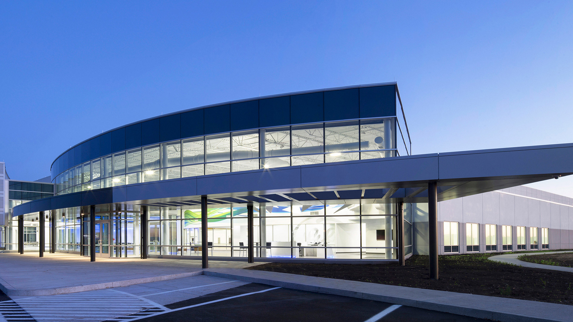
    The 35’ clear height manufacturing space included 80’ structural spans with 12.5 ton beam cranes, 10” thick, ultra-flat, polished concrete floors and generous amounts of natural light provided by expansive clerestory windows. The tiered ceiling panels within the assembly space help humanize the scale. They serve as a space transition and a subtle representation of flight. The finishes are intentionally light, clean, and neutral. This notion relates directly to the GE brand and the idea of intentional design without compromise.

    The office/administrative portion of the building was designed to express the aerodynamic curvature and the composite construction techniques of the LEAP engine, most notably its fan blade, by dramatically incorporating several overlapping layers of sinuously curved metal, glass, and steel.

    The interior design reinforces the intentional nature of the engine while embracing the technology. The central greeting point is a reception desk designed as a seamless, clean cone and constructed of solid surface. Beautifully crafted metal composite triangles are suspended above the reception desk representing the combustion technology present within the LEAP engine. In addition, this sculptural element contributes to the notion of movement so dominantly present within the architecture.

    ,

  • LDI, Ltd.

    LDI, Ltd.

    The interior design and corporate branding pay tribute to the rich heritage of the company in subtle ways such as the incorporation of the “Lacy Knot” in the pattern of a suspended ceiling and a custom conference table.


    There are a multitude of details that the design team was able to incorporate into the final design through careful research, in-depth visioning, and interview sessions with the client.

    ,

  • Allied Solutions Headquarters

    Allied Solutions Headquarters

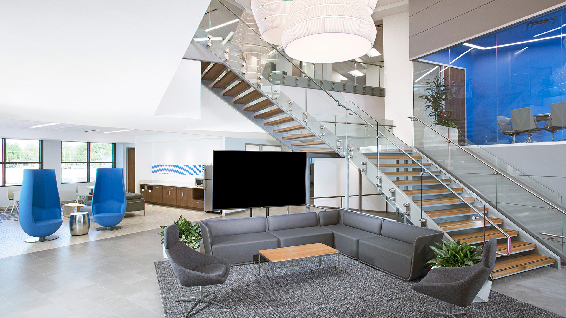
    The holistic interior design, and seamlessly incorporated branding elements are apparent immediately upon arrival to Allied’s second floor lobby. There, employees and visitors are enveloped by Allied Solutions’ “Blue Culture” with views to an atrium with a grand staircase, an informal mid-level conference room, social gathering spaces, and a 3rd level conference room.

    By design, the activity of the office is put on display in response to feedback provided by the user groups during their visioning sessions. Research and careful dissection of information from the visioning sessions gave designers the opportunity to carefully parallel Allied Solution’s unique culture in its interior environment. The result is a unique space that embodies the company’s cultural and business aspirations.

    ,

  • The Taft Center

    The Taft Center

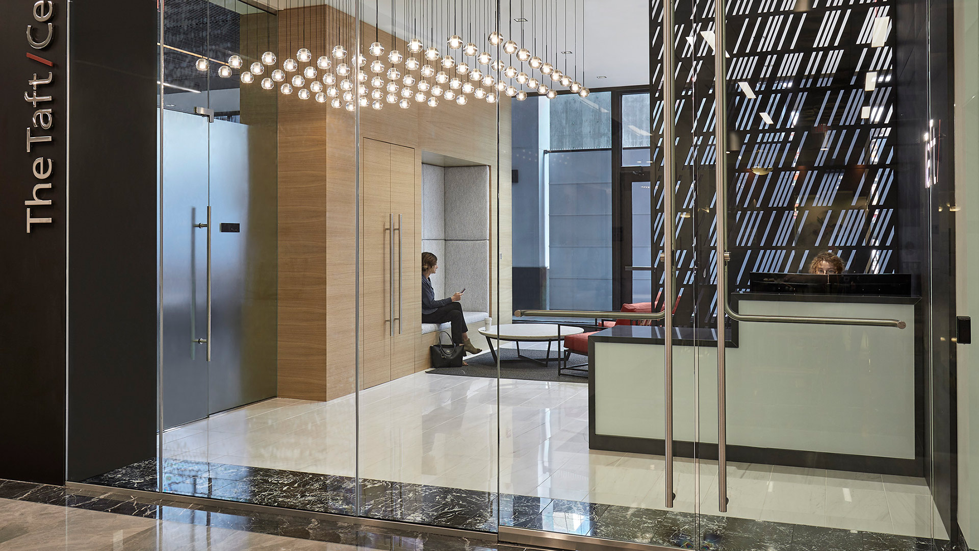
    Designers incorporated simple forms with classic material choices, balanced by distinctive design features. These elements, coupled with the playful constellation of lights and identifiable repetition of the signature Taft forward slash, create a space that is fresh and exclusive in the legal profession.

    Understanding the sensitivities of the business that Taft conducts, and their desire to maximize the glass within the conference rooms, the design team worked closely with CSO’s acoustician to design an all-glass system that maximizes acoustic benefits. This resulted in nearly uninterrupted walls of glass, which terminate at a back-printed glass panel that features downtown’s iconic Monument Circle.

    The café space, which is strategically located to incorporate a street-front presence, offers an inviting urban feel with a natural palette.

    ,

  • IBJ Media Headquarters

    IBJ Media Headquarters

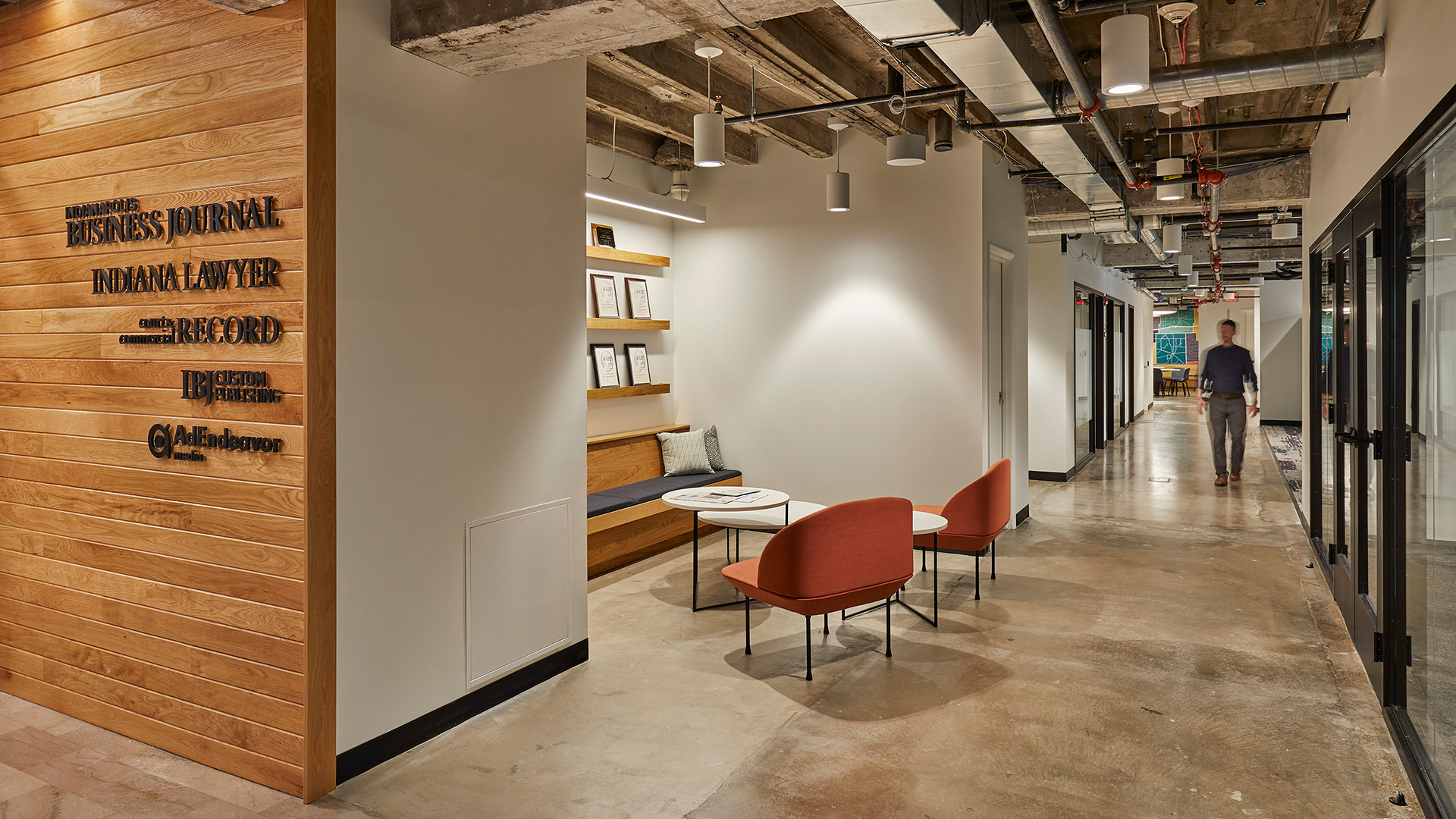
    Cursed with low ceilings and odd angles, the space presented challenges for space planning and capturing natural light. CSO’s interiors team focused on the positive – great views of Monument Circle and raw building materials that told the story of the building’s past. The designers embraced the odd building shape as an opportunity to carve out interesting spaces.

    Upon entering the IBJ’s new offices, visitors are greeted by a custom art installation created from rolled up pieces of the IBJ’s past publications. Working closely with CSO, the artist took great care to highlight quirky references to Indiana, setting a sophisticated-but-fun tone from the very beginning.

    The reception desk sits in front of a black-on-black logo, representing raised printing press letters covered in black ink, a reference to the history of the profession.

    Other creative decisions were guided by the mostly linear layout of a newspaper and by the idea of the old meeting the new. As we sit at a crossroads between digital and printed news consumption, this new office tells a beautiful story of those things working in harmony with each other both in function and aesthetic.

    ,

  • Barnes & Thornburg Vault

    Barnes & Thornburg Vault

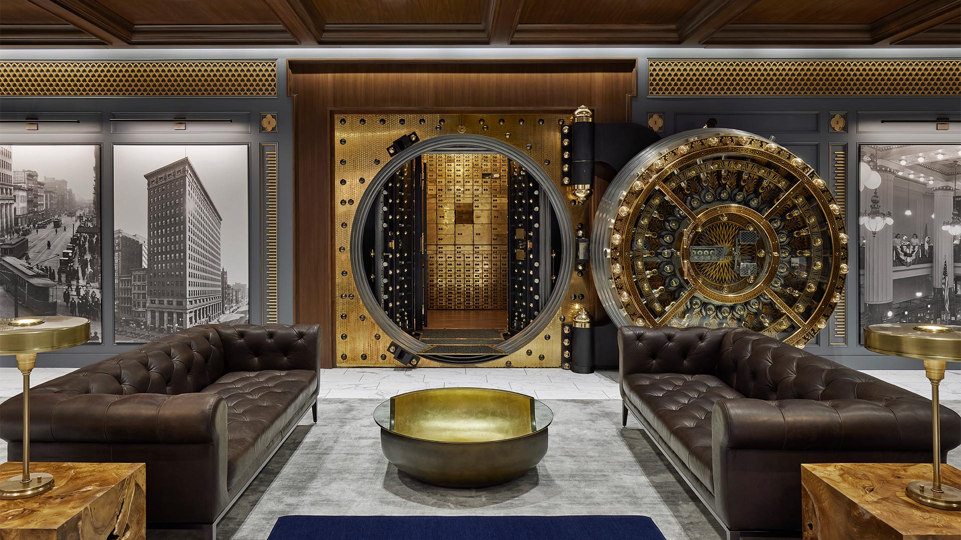
    The original space was comprised of multiple vaults, of varying sizes, within a larger secure area. Measuring at just 3,249 square feet, the space was going to need to maximize flexibility and style if it was going to satisfy the program. To accommodate the client’s goals for utilizing the space, the team also devised two furniture setups: lounge seating to support cocktail events or more casual gatherings, and a conference layout to support board meetings and other formal meetings. Each setup needed to look and function as if it was permanent so great care was taken to select pieces that looked substantial but could be easily moved.


    The primary, elaborate vault door was fully restored to become a focal point. When it was determined that one of the other vault doors needed to be removed it was deconstructed, with a portion of it becoming a feature inset into the floor.

    At either end of the newly created primary gathering space, bookcases are anchored with green safe deposit boxes which were intentionally preserved in their unrestored state, adding character to the design and embracing the vault’s storied journey.

    As a subtle reference to height markers often seen in mugshots, the design team added a quirky tick mark detail set into the trim that frames each set of doors. Above each of the tick-mark details is a quatrefoil with a key-hole detail, personalizing the classic detailing to this unique project.


    ,

  • Carr Workplaces – Central Park

    Carr Workplaces – Central Park

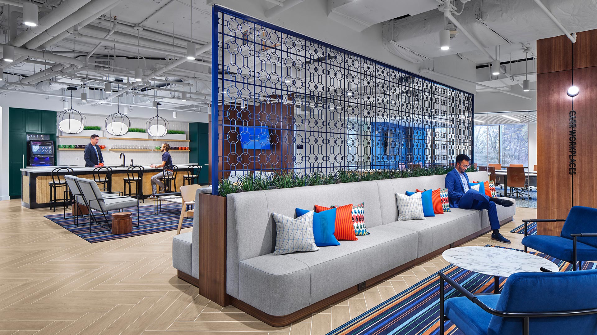
    The color palette draws inspiration from the natural surroundings by utilizing earth tones and wood contrasted with black and brass details. Arches, fluting, and stone-look countertops and flooring bring elegance into the space allowing it to evoke a grand demeanor. By combining a tranquil pallet with sleek finishes, the workplace becomes a space where glamour and elegance can coexist.

    .

    This coworking space aims to be a haven for professionals seeking a unique and inspiring work environment within the heart of New York City. It marries the timeless elegance of Art Deco with the practicality and functionality demanded by the modern workforce, creating a space where work and creativity thrive.

    ,

  • SEP Corporate Headquarters

    SEP Corporate Headquarters

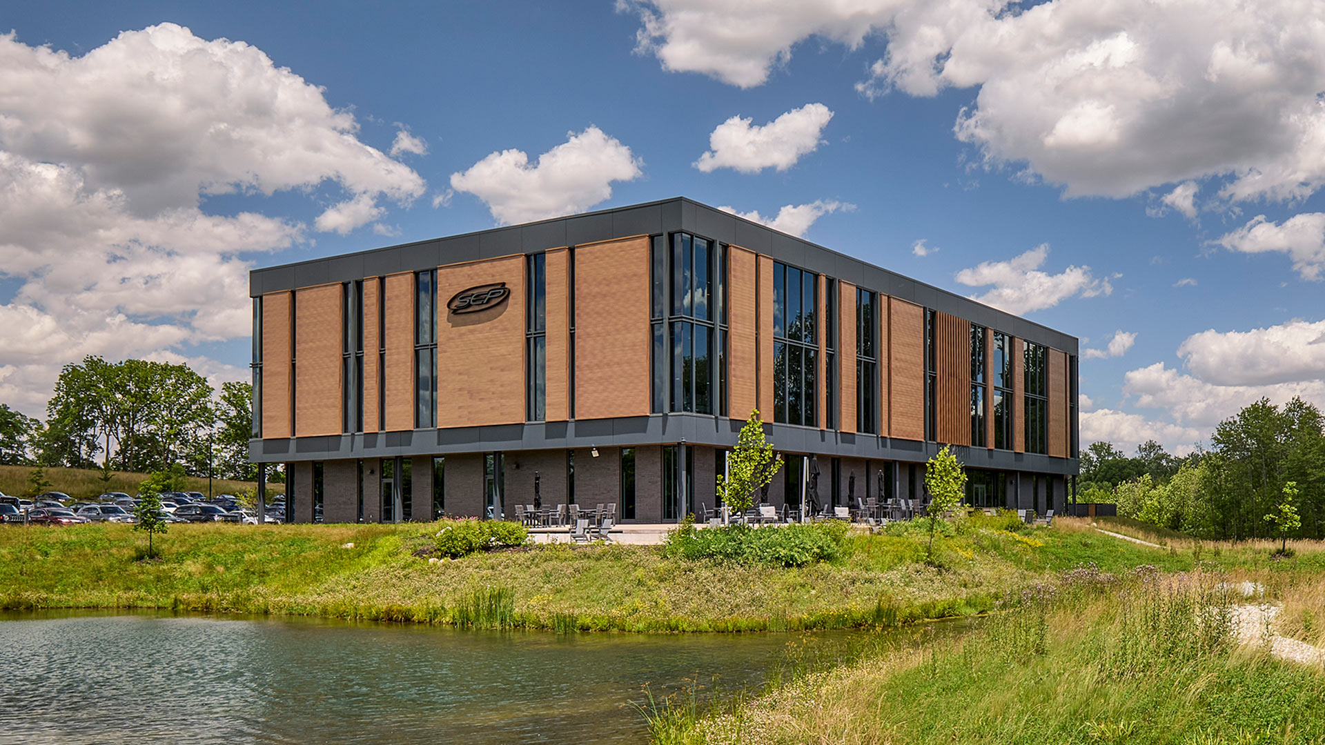
    Key architectural features, such as the random rhythm of the facade’s vertical lines, mimic the complexity, order and rhythms found in nature. This design statement allows the building to become one with the site while simultaneously establishing a strong brand presence to passing traffic on US 31.

    In addition, the large ribbons of glazing provide views and capture reflections of the adjacent protected wetlands and wooded surroundings, reinforcing the connection of SEP’s “forever home” to nature.

    CSO designed the project holistically, integrating the building’s design with its rolling site and context. The parking fields were strategically scaled and designed as a series of smaller areas of paving separated by stands of native plantings and grasses. This site master stroke, which mimics natural sedimentary rock outcroppings, worked with the site’s topography to minimize the visual impact of parking and to provide a creative opportunity to address storm water management. 

    The gentle bend in the building’s footprint also responds to and leverages the natural features of the site by nestling the building against the woodlands and pond in order to maximize views for the building’s inhabitants.


    The design team worked seamlessly from exterior to interior to further enhance the user and visitor experiences. The symbolic rhythm found on the façade was “tuned” in order to contribute in specific ways to the various interior work environments – enhancing collaborative spaces, piquing curiosity, and inspiring ingenuity. Biophilic design intentionally introduces nature into everyday spaces through calming, restorative options.

    The biophilic concepts of prospect and refuge work together to create spaces that feel both open and secure. Prospect refers to the ability to see across a space or landscape—providing awareness, orientation, and a sense of opportunity. Refuge offers a place of enclosure or protection where one can feel sheltered and at ease. When thoughtfully balanced, these elements mirror environments humans have historically sought in nature, such as a protected spot overlooking a clearing.

    Upon arrival visitors will notice an artful series of back-lit metal tabs peeling from a feature wall. This artistic expression pays homage to the scrum process while serving as a subtle branding component of the design. The design team further embraced the holistic design approach by crafting one-of-a-kind furniture pieces from timbers sourced from the SEP site.

    The unapologetic blend of nature and technology is evident within the new SEP headquarters. Today’s technology infuses a sense of hustle, and SEP challenged this notion by creating a space to be present within. It is a space in which to relax and find refuge. It is space in which to collaborate and nurture new ideas. It is space in which to entertain and to welcome clients and friends. It is a space that is uniquely SEP, and in their own words, it is their “Forever Home”.

    ,

  • Lacy School of Business

    Lacy School of Business

    The design provides visibility by creating transparent spaces that invite participation in central locations around the multi-story atrium at the heart of the building. In addition, the central, broad, open stairs and generous balconies encourage creative collisions as students, faculty, and visitors move and interact throughout the building.

    A Hub Where Learning, Business, and Collaboration Converge

    The Innovation Commons, which opens onto the central atrium, is equipped for students to start and run their own businesses as well as a wide range of other types of experiential learning. The Centers, distributed around the main level, provide space where business professionals, faculty, and students work together to solve business challenges. Glass overhead doors open to connect to the atrium and convey the importance and vitality of that work to the school and its guests.

    The Butler Business School is named in honor of Andre B. Lacy, a local, successful entrepreneur and philanthropist, as well as a committed family man and daring adventurer. CSO’s design honored his life with a series of installations that incorporate a collection of custom-designed icons representing his many facets. The icons appear throughout the building as design elements in areas such as the rug in the main atrium and small medallions that are hidden throughout the building.

    A timeline of Andre Lacy’s life takes the form of 25 envelopes, connecting his first job in a mailroom and the endowment gift, reminding students that their humble beginnings can build to something great.

    The design team also featured objects that were important to Lacy – the time clock Lacy once used to clock into his job and the motorcycle he rode across continents. These were both gifts from the family who were intimate collaborators on the project.

    The conference table in the board room adjacent to the Dean’s office features the Lacy family knot and is a duplication of a table that exists at Lacy’s corporate headquarters.

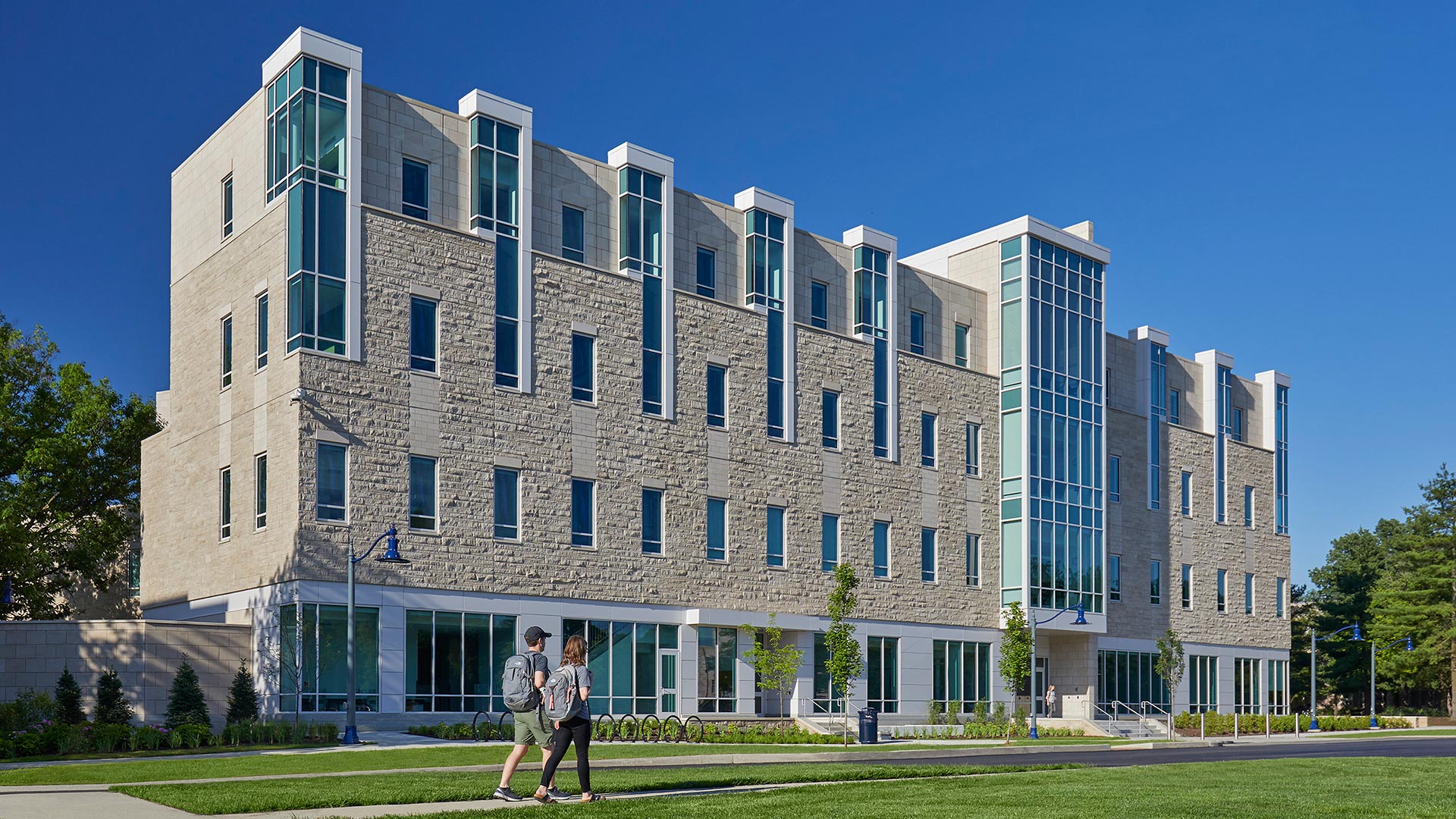
    Located in a prominent place on the campus, visible from the east entrance, the building completes the cross axis of the original campus masterplan. The building’s vertical towers and active silhouette reflect the characteristics of the much-loved historic campus. The building replaces a parking lot and defines the intersection of the two major green spaces at the center of the campus. CSO completed this project in collaboration with Goody Clancy.

    ,