The design vision was to create a space that feels grounded in place while supporting modern needs for flexibility, efficiency, and comfort.
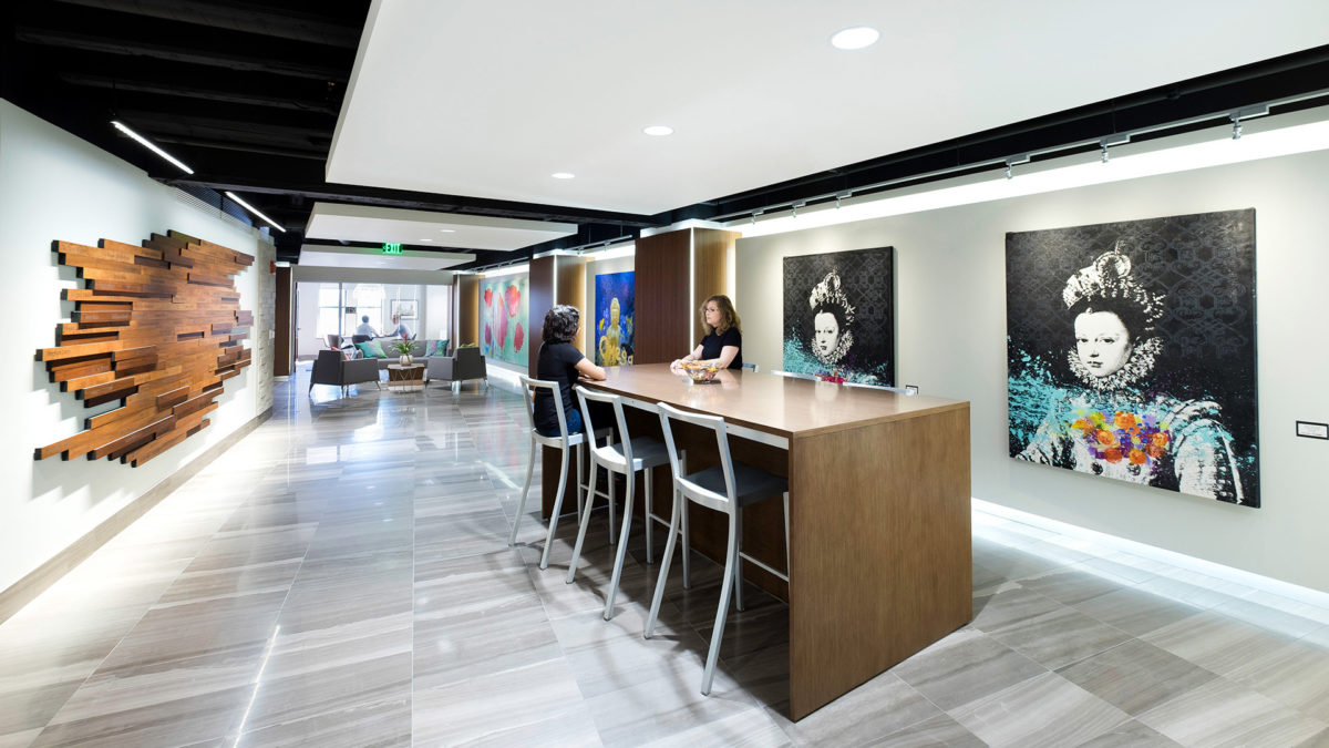
The client’s goals centered on delivering a professional yet approachable environment that honors the historic context while fostering productivity and visual interest. Further, this location’s primary client base are attorneys and lobbyists that have unique privacy requirements. Single-person offices and suites for larger clients were desired. To achieve this, the design team employed a rhythmic composition of repeated materials, forms, and finishes which echo the architectural cadence found in the Capitol Rotunda. This visual tempo guides users through the space intuitively, enhancing navigation and reinforcing a sense of place.
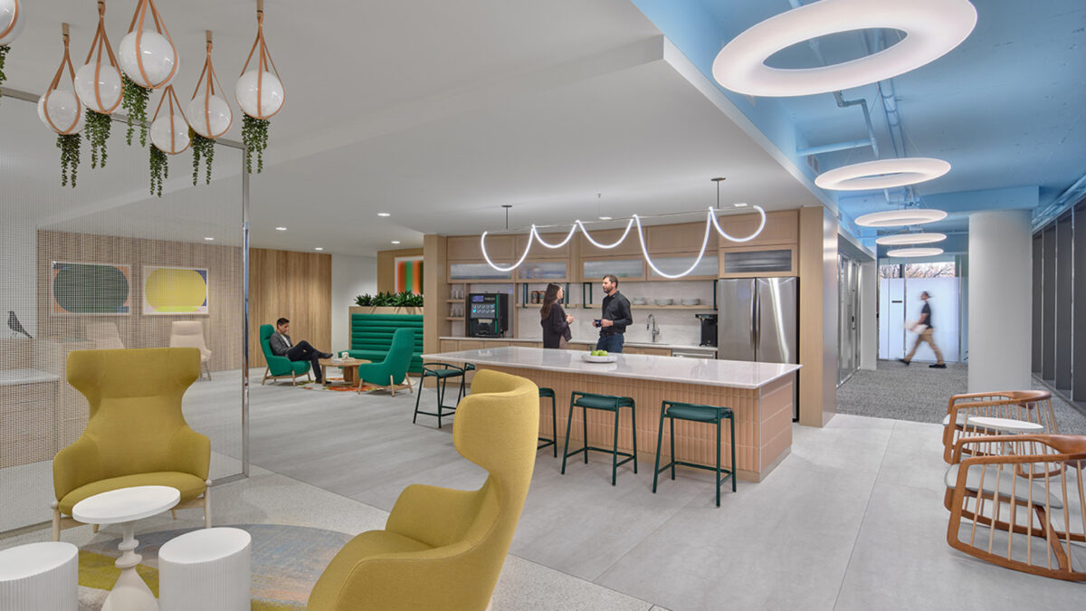
Warm, natural materials serve as the foundation of the interior palette, drawing from the timeless finishes of the Capitol. Wood tones, textured wallcoverings, and soft neutral textiles create a welcoming, tailored backdrop. This neutrality allows for curated bursts of color and bold patterns—found in art, upholstery, and wall treatments—to take center stage, echoing the spirited individuality of the neighborhood’s historic row houses.
The space’s refined aesthetic balances classical inspiration with modern sensibilities. Polished chrome elements—part of the existing glass system—are deliberately contrasted against matte finishes and organic materials, reinforcing a layered, curated environment. Strong architectural gestures found in detailed millwork are paired with contemporary furnishings and stylized motifs that subtly nod to tradition without overpowering it.
Design challenges, including the integration of modern building systems within a historically influenced design language, were resolved through thoughtful coordination and detailing. Lighting, HVAC, and acoustic systems were discreetly integrated to maintain the space’s architectural integrity while supporting occupant comfort and sustainability.
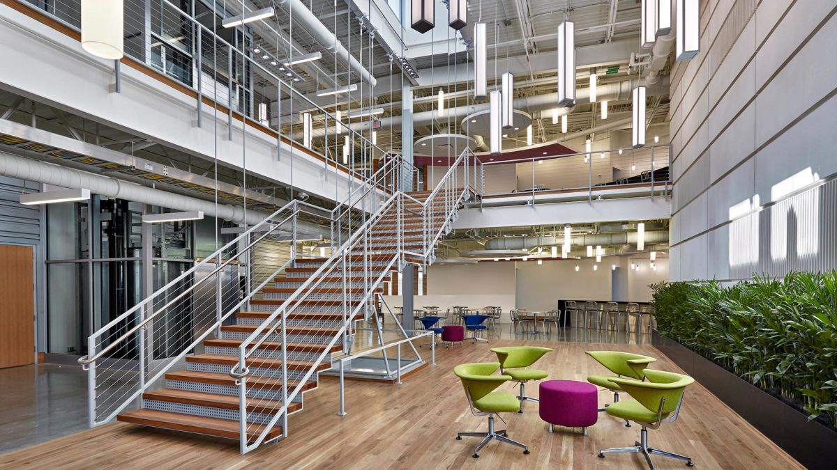
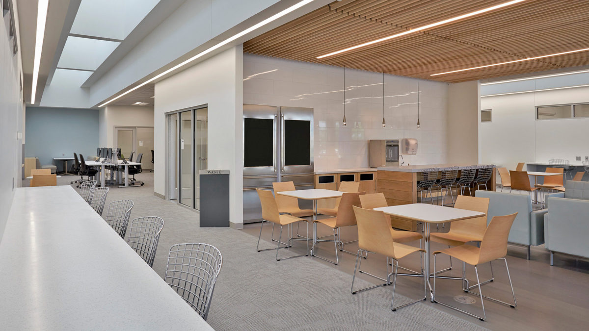
Spatial planning prioritized functionality and flexibility, with private offices, coworking zones, and shared amenities carefully arranged to promote efficient use of space and fluid circulation. Environmentally conscious choices such as energy-efficient lighting, sustainably sourced materials, and low-VOC finishes further support wellness and conservation goals.
By marrying the elegance of classical architecture with the needs of a modern workplace, the Capitol Hill location offers a space that is both inspiring and functional—a refined composition that celebrates its context while looking confidently toward the future.