

The Heart of the Workplace
A central amenity space includes a casual café which serves visitors and clients throughout the day.


A central amenity space includes a casual café which serves visitors and clients throughout the day.


,


In the reception area, the playful feature wall comprised of round perforations and additive cap-shaped dots done in a variety of colors, is an ode to the vibrant personalities of company and project leadership. Guests will follow the feature wall around a corner into a large social space, designed to put the energy of the office front-and-center. A wide variety of furnishings in colorful textiles were carefully selected to put employees and guests at ease.

Unique environmental branding reinforces the company’s culture.
A graphic installation in the center of a breakout area is the company logo “sparking the flame of innovation”. Dimensional wood sculptures appear in multiple locations.


Welcoming spaces support both quiet reflection and informal gathering.
Soft lighting, layered textures, and comfortable seating create a welcoming atmosphere that encourages people to slow down and connect. Warm wood tones, shelving, and curated details shape a space that supports both focus and relaxation—offering a place to recharge, collaborate, or pause during the workday.


,


Flexible training rooms, a community center, teaming areas, local office spaces, and huddle spaces encapsulate the programs within the headquarters, creating an environment that promotes interaction where employees and volunteers feel energized and accommodated. Employees are not assigned desks or specific workspaces, so the design of the facility is very flexible and adaptable. Amenities include a rooftop terrace that creates a respite and wellness destination, and a coffee house that connects and creates community.


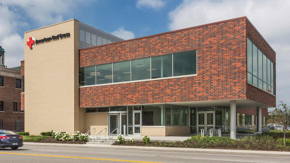
The building is extremely sustainable, with the exterior wrapped in red brick, seamlessly blending in with the surrounding architectural aesthetic.

The headquarters has large windows that welcome natural light creating a community-oriented atmosphere and providing views of the surrounding neighborhood of downtown Indianapolis.
Brand Identity Expressed Through History and Design
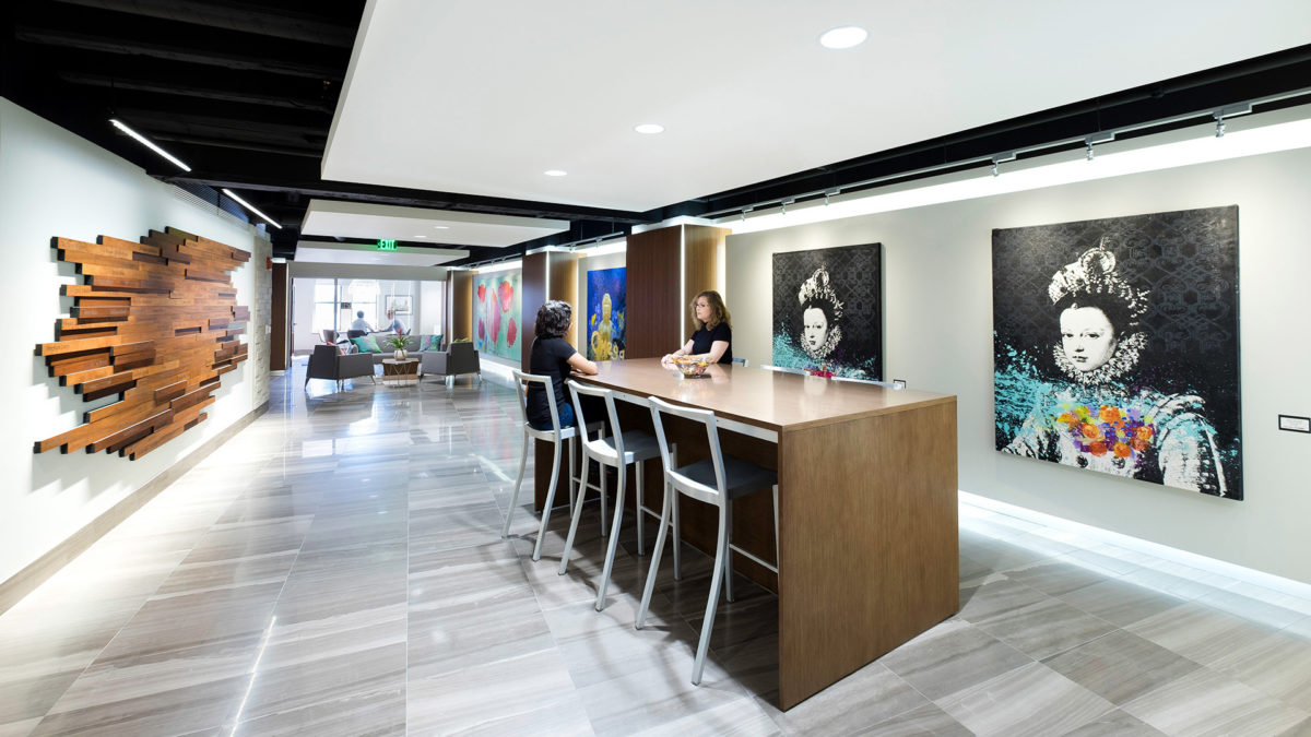
In addition, a key branding focal point is incorporated on the interior corridor that displays historical Red Cross artifacts, local to Indianapolis. The iconic, ARC-branded “red” is carried throughout the headquarters.


,


The interior design and corporate branding pay tribute to the rich heritage of the company in subtle ways such as the incorporation of the “Lacy Knot” in the pattern of a suspended ceiling and a custom conference table.


A Sculptural Staircase That Connects Floors and Company History
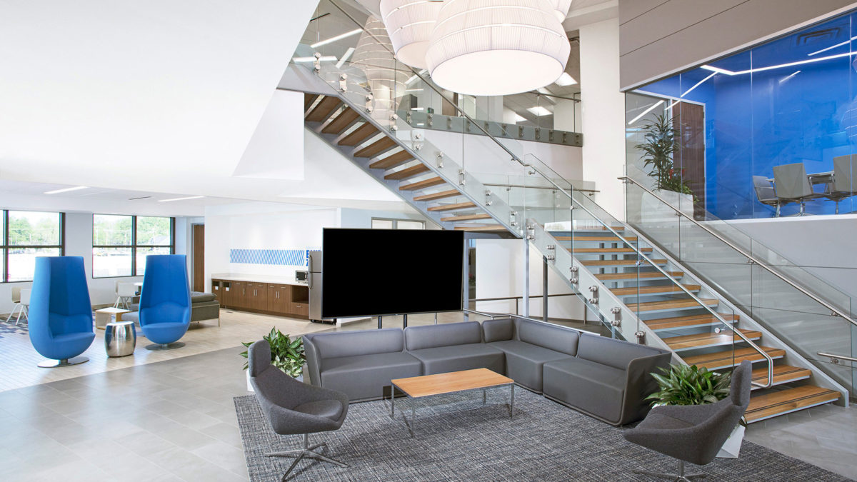
Additionally, the design includes a new staircase to connect their two floors of office space. The stair features custom sculptural details to pay homage to the company’s history in the corrugated paper industry and milestone dates.


There are a multitude of details that the design team was able to incorporate into the final design through careful research, in-depth visioning, and interview sessions with the client.


,


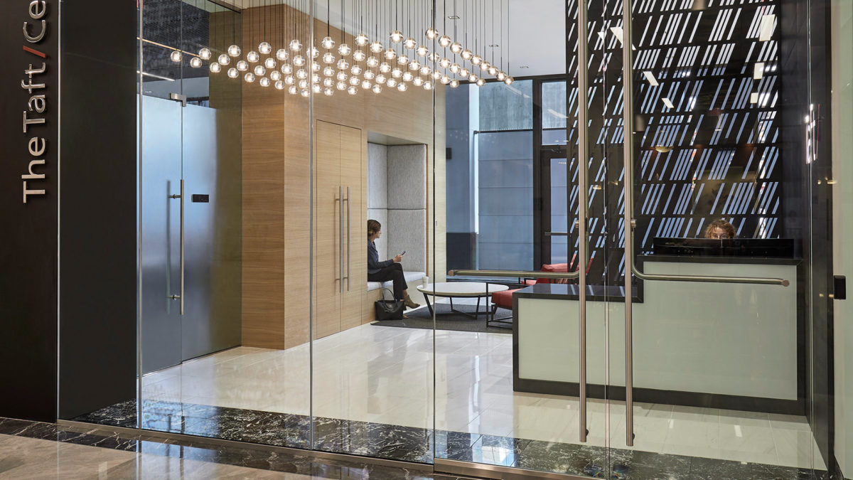
Designers incorporated simple forms with classic material choices, balanced by distinctive design features. These elements, coupled with the playful constellation of lights and identifiable repetition of the signature Taft forward slash, create a space that is fresh and exclusive in the legal profession.


Understanding the sensitivities of the business that Taft conducts, and their desire to maximize the glass within the conference rooms, the design team worked closely with CSO’s acoustician to design an all-glass system that maximizes acoustic benefits. This resulted in nearly uninterrupted walls of glass, which terminate at a back-printed glass panel that features downtown’s iconic Monument Circle.


The café space, which is strategically located to incorporate a street-front presence, offers an inviting urban feel with a natural palette.

,

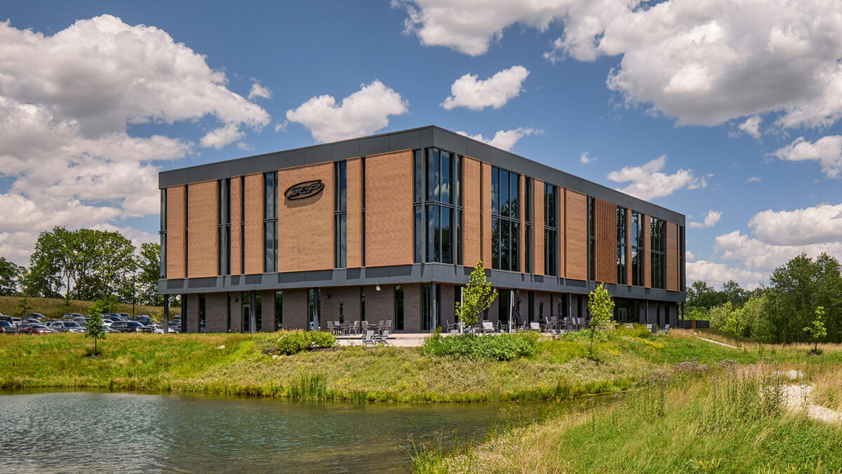
Key architectural features, such as the random rhythm of the facade’s vertical lines, mimic the complexity, order and rhythms found in nature. This design statement allows the building to become one with the site while simultaneously establishing a strong brand presence to passing traffic on US 31.


In addition, the large ribbons of glazing provide views and capture reflections of the adjacent protected wetlands and wooded surroundings, reinforcing the connection of SEP’s “forever home” to nature.
CSO designed the project holistically, integrating the building’s design with its rolling site and context. The parking fields were strategically scaled and designed as a series of smaller areas of paving separated by stands of native plantings and grasses. This site master stroke, which mimics natural sedimentary rock outcroppings, worked with the site’s topography to minimize the visual impact of parking and to provide a creative opportunity to address storm water management.

The gentle bend in the building’s footprint also responds to and leverages the natural features of the site by nestling the building against the woodlands and pond in order to maximize views for the building’s inhabitants.

Workstyle as Inspiration
Designers found inspiration and drew a connection between the view-accenting architecture and the company’s preferred style of work: scrum. In this method, employees will apply large numbers of post-its to walls. The shape of a post-it on a wall mimicked the shape of the building footprint, and designers used this connection to influence key design features

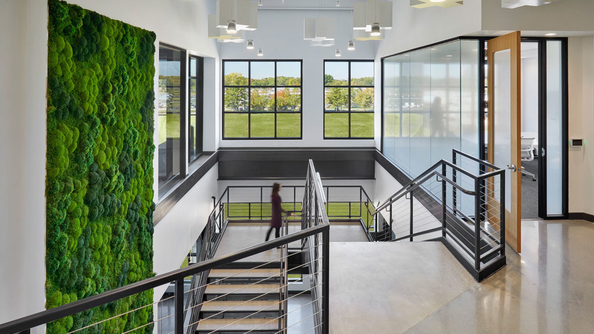
The design team worked seamlessly from exterior to interior to further enhance the user and visitor experiences. The symbolic rhythm found on the façade was “tuned” in order to contribute in specific ways to the various interior work environments – enhancing collaborative spaces, piquing curiosity, and inspiring ingenuity. Biophilic design intentionally introduces nature into everyday spaces through calming, restorative options.


The biophilic concepts of prospect and refuge work together to create spaces that feel both open and secure. Prospect refers to the ability to see across a space or landscape—providing awareness, orientation, and a sense of opportunity. Refuge offers a place of enclosure or protection where one can feel sheltered and at ease. When thoughtfully balanced, these elements mirror environments humans have historically sought in nature, such as a protected spot overlooking a clearing.


Upon arrival visitors will notice an artful series of back-lit metal tabs peeling from a feature wall. This artistic expression pays homage to the scrum process while serving as a subtle branding component of the design. The design team further embraced the holistic design approach by crafting one-of-a-kind furniture pieces from timbers sourced from the SEP site.


The unapologetic blend of nature and technology is evident within the new SEP headquarters. Today’s technology infuses a sense of hustle, and SEP challenged this notion by creating a space to be present within. It is a space in which to relax and find refuge. It is space in which to collaborate and nurture new ideas. It is space in which to entertain and to welcome clients and friends. It is a space that is uniquely SEP, and in their own words, it is their “Forever Home”.
,