SEP Corporate Headquarters

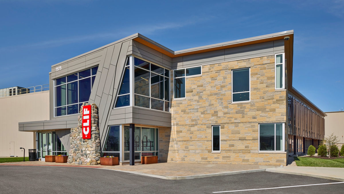
SEP is a local software company with a national footprint. When faced with the challenge of creating a new “forever home” for their headquarters, SEP and Pure Development turned to CSO. A site strategically placed along the US 31 corridor in Westfield became the front runner, and it aligned beautifully with their corporate culture and aspirations.

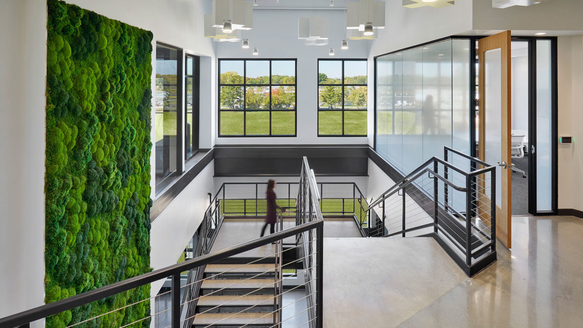
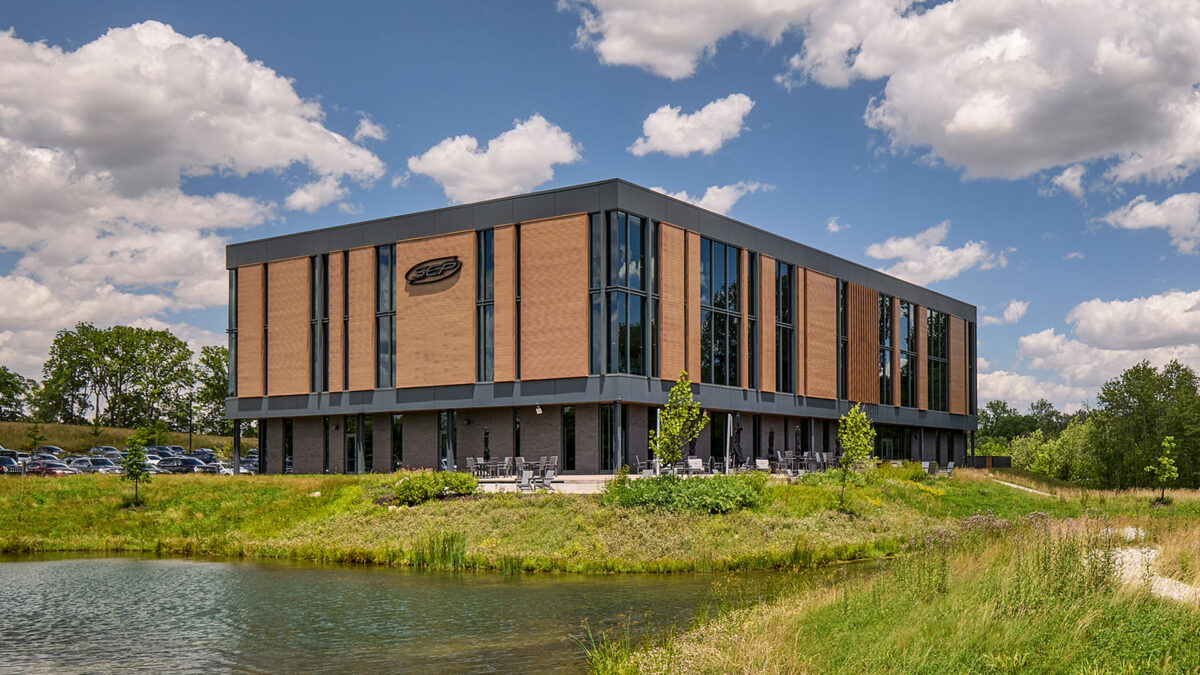
With the site selected, the design team worked hand in hand with key stakeholders to capture the essence of SEP and marry it with the natural environment of the site. Key architectural features, such as the random rhythm of the facade’s vertical lines, mimic the complexity, order and rhythms found in nature. This design statement allows the building to become one with the site while simultaneously establishing a strong brand presence to passing traffic on US 31. In addition, the large ribbons of glazing provide views and capture reflections of the adjacent protected wetlands and wooded surroundings, reinforcing the connection of SEP’s “forever home” to nature.

CSO designed the project holistically, integrating the building’s design with its rolling site and context. The parking fields were strategically scaled and designed as a series of smaller areas of paving separated by stands of native plantings and grasses. This site master stroke, which mimics natural sedimentary rock outcroppings, worked with the site’s topography to minimize the visual impact of parking and to provide a creative opportunity to address storm water management. The gentle bend in the building’s footprint also responds to and leverages the natural features of the site by nestling the building against the woodlands and pond in order to maximize views for the building’s inhabitants.

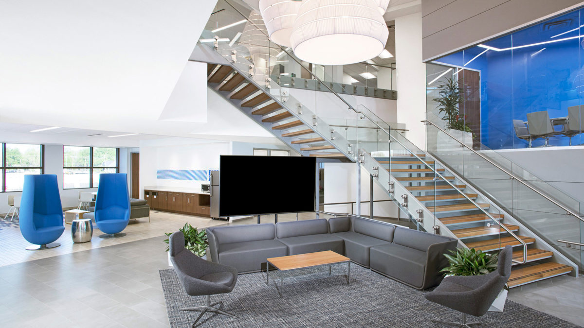
The design team worked seamlessly from exterior to interior to further enhance the user and visitor experiences. The symbolic rhythm found on the façade was “tuned” in order to contribute in specific ways to the various interior work environments – – enhancing collaborative spaces, peaking curiosity, and inspiring ingenuity. The natural assets of the site are further leveraged through the strategic placement of interior walls, the framing of views, and the selection of an intentionally restrained material palette.

SEP’s unique brand is on display throughout the design. Designers found inspiration and drew a connection between the view-accenting architecture and the company’s preferred style of work: scrum. In this method, employees will apply large numbers of post-its to walls. The shape of a post-it on a wall mimicked the shape of the building footprint, and designers used this connection to influence key design features. Upon arrival visitors will notice an artful series of back-lit metal tabs peeling from a feature wall. This artistic expression pays homage to the scrum process while serving as a subtle branding component of the design. The design team further embraced the holistic design approach by crafting one of a kind furniture pieces from timbers sourced from the SEP site.

The unapologetic blend of nature and technology is evident within the new SEP headquarters. Today’s technology infuses a sense of hustle, and SEP challenged this notion by creating a space to be present within. It is a space in which to relax and find refuge. It is space in which to collaborate and nurture new ideas. It is space in which to entertain and to welcome clients and friends. It is a space that is uniquely SEP, and in their own words, it is their “Forever Home”.

Clif Bar

Clif Bar is a private company guided by Five Aspirations focused on sustaining their business, brands, people, community, and the planet. When they set out to design a renovation and expansion of their Indianapolis facility, it was crucial that their chosen design firm embraced a like-minded approach to incorporating biophilic design, renewable energy, repurposed materials, and locally-sourced materials. The two-story addition doubled the size of their office space while providing a work environment that is centered around the well-being of their employees. Not a single facet of the design was proposed without linking it back to direct evidence that such a feature would matter to the people who would inhabit the space.

Biophilic Design was crucial in creating an interior and exterior that would be an invigorating and comfortable environment for workers who spend long shifts indoors. Drawing on inspiration from the native Indiana geology, the building is clad in rough limestone detailed to express horizontal strata, and utilizes shading devices which draw upon the complexity and order of natural patterns, creating a soft play of light similar to that of a deciduous woodland.

These themes of prospect and refuge continue inside, offering dynamic double-height spaces in which to host all-hands meetings, as well as intimate nooks for private rest and respite. By express intention, every single employee has the same arrival experience and amenities. Bakery staff and office workers alike are intermixed in social spaces under skylights and at critical building zones. Given prominence due to the people it serves, the employee breakroom occupies the outer portion of the second floor. It is afforded sweeping view of the outdoors, and is uniquely branded to reflect the spirit and diversity of Clif Bar’s employees.

CSO’s design process was enhanced through workplace research data provided by DORIS Research as well as input on biophilic design features from Terrapin Bright Green, who has developed biophilic design strategies for other Clif Bar facilities.

IBJ Media Corporate Headquarters

After nearly 40 years in the same office, IBJ Media had the opportunity to move to a historic building overlooking the iconic Monument Circle in downtown Indianapolis. CSO designed a space that features unique branding elements referencing the history of the printing industry while giving IBJ’s workplace a fresh new look.

Cursed with low ceilings and odd angles, the space presented challenges for space planning and capturing natural light. CSO’s interiors team focused on the positive – great views of Monument Circle and raw building materials that told the story of the building’s past. The designers embraced the odd building shape as an opportunity to carve out interesting spaces.

Upon entering the IBJ’s new offices, visitors are greeted by a custom art installation created from rolled up pieces of the IBJ’s past publications. Working closely with CSO, the artist took great care to highlight quirky references to Indiana, setting a sophisticated-but-fun tone from the very beginning. To the right, the reception desk sits in front of a black-on-black logo, representing raised printing press letters covered in black ink, a reference to the history of the profession.

Other creative decisions were guided by the mostly-linear layout of a newspaper and by the idea of the old meeting the new. As we sit at a crossroads between digital and printed news consumption, this new office tells a beautiful story of those things working in harmony with each other both in function and aesthetic.

MJ Insurance Corporate Headquarters

MJ Insurance is a national insurance firm headquartered in Carmel, Indiana. The company opened in 1964 with four employees and, upon moving into their new headquarters, had grown into a national firm with over 150 employees at their Indiana location alone. The design team led MJ Insurance through an involved visioning process, culminating in a series of principles to guide the project. These principles had a central theme: capitalize on and enhance an already positive company culture.

While many companies in the insurance industry build offices with high walls, MJ Insurance set out to buck norms. They moved to a highly collaborative open office environment unique to their industry. In order to support this culture-promoting design decision, the team included conference rooms, enclaves, and focus rooms of many shapes and sizes to ensure that both morale and productivity would increase in the new space. Designers worked to provide the right furniture solutions to support an open work environment with a strong need for both collaboration and privacy. Company leadership showed their commitment to the design by joining the employees in open office workstations.

The culture at MJ Insurance centers around six core values: Passion, Leadership, Personal Development, Incremental Growth, Innovation, and Fun. These values drove the entire design – from the open office configuration to the centrally located social areas – but they are most evident in a consistent branding concept. MJ’s boardroom connects to the lobby with a glass storefront, which allows a branded art installation to span the two spaces. At the far end of the conference room is a white grid with vibrant yellow plus signs at many of the intersections. That grid becomes a series of extruded white-and-yellow plus signs of various heights and sizes, suspended from the ceiling and streaming into the lobby until they end over the monumental stair. The grid represents the discipline required for leadership, personal development, and incremental growth while the shape and color of the plus signs connect to MJ’s values of passion and fun. The company instantly connected with the installation and used the concept to relaunch their national brand.

MJ Insurance asked for an infusion of fun in their space. Sliding felt panels, a carpet pattern developed, and a unique series of branding elements did just that for this hard-working group.

Allied Solutions Corporate Headquarters

CSO designers conducted extensive visioning sessions with focus groups from Allied Solutions to guide and inspire the design for their new headquarters. The Allied Solutions team had the following to say about the visioning process: “When you ask employees what they want in a new space, they are limited to envisioning only the environments in which they have personally experienced. The Visioning exercise developed by CSO draws out attitudes and ideas that employees otherwise would not be able to voice when asked, ‘what do you want in your space?’ This was a key part in the overall design strategy for Allied Solutions’ new headquarters, allowing our employees to voice their unique input for the company’s new space.”

The holistic interior design, and seamlessly incorporated branding elements are apparent immediately upon arrival to Allied’s second floor lobby. There, employees and visitors are enveloped by Allied Solutions’ “Blue Culture” with views to an atrium with a grand staircase, an informal mid-level conference room, social gathering spaces, and a 3rd level conference room. By design, the activity of the office is put on display in response to feedback provided by the user groups during their visioning sessions. Research and careful dissection of information from the visioning sessions gave designers the opportunity to carefully parallel Allied Solution’s unique culture in its interior environment. The result is a unique space that embodies the company’s cultural and business aspirations.

LDI, Ltd.

Recognizing that an up-to-date work environment would be a tool to help them enhance their culture and attract top talent, LDI hired CSO to guide them through a cultural shift to energize the office. Their goal was to provide an environment that facilitates interaction, collaboration, and the use of technology.

The interior design team at CSO led visioning sessions to determine the project’s guiding principles and interviewed representatives from each department to determine staff, work-flow needs, growth, and goals.

The interior design and corporate branding pay tribute to the rich heritage of the company in subtle ways such as the incorporation of the “Lacy Knot” in the pattern of a suspended ceiling and a custom conference table. Additionally, the design includes a new staircase to connect their two floors of office space. The stair features custom sculptural details to pay homage to the company’s history in the corrugated paper industry and milestone dates. There are a multitude of details that the design team was able to incorporate into the final design through careful research, in-depth visioning, and interview sessions with the client.

American Red Cross Indiana Region Headquarters

Through collaboration and funding with the City of Indianapolis, and donor support, Red Cross was able to achieve their goal of building a new, more efficient headquarters. The new building’s reduced footprint and efficient use of space allows the American Red Cross (ARC) to commit more dollars to what they do best: always being there in times of need. Flexible training rooms, a community center, teaming areas, local office spaces, and huddle spaces encapsulate the programs within the headquarters, creating an environment that promotes interaction where employees and volunteers feel energized and accommodated. Employees are not assigned desks or specific work spaces so the design of the facility is very flexible and adaptable. Amenities include a rooftop terrace that creates a respite and wellness destination, and a coffee house that connects and creates community.

The building is extremely sustainable, with the exterior wrapped in red brick, seamlessly blending in with the surrounding architectural aesthetic. The headquarters has large windows that welcome natural light creating a community-oriented atmosphere and providing views of the surrounding neighborhood of downtown Indianapolis. In addition, a key branding focal point is incorporated on the interior corridor that displays historical Red Cross artifacts, local to Indianapolis. The iconic, ARC-branded “red” is carried throughout the headquarters. The American Red Cross new Indiana Regional Headquarters is the first Red Cross facility to reflect new design standards developed for the organization by Perkins + Will.
Photography: © James Steinkamp

Cummins Seymour Technical Center

The new Cummins, Inc. Seymour Technical Center was designed as the Global Headquarters for High-Horsepower Design and Engineering. The 2-story office addition includes workspace and collaboration areas, a dining facility and social hub, new entrances, and a security and training pavilion for the engine plant. The building design is a bold expression of Cummins’ engineering prowess and its proud history of designing, manufacturing, and distributing the finest, most powerful engines in the world. The main entrances incorporate dramatically cantilevered steel canopies, which are reminiscent of Columbus, Indiana’s iconic red suspension bridge. The office building’s exterior was designed with an advanced engineered skin, incorporating an exterior daylighting and shading system. Each of the primary exterior façades has been purposefully designed to respond to its specific and unique solar orientation.

Cummins wanted to “bring the office into the plant, and the plant into the office.” Highly durable and raw industrial materials such as corrugated steel panels, polished concrete, and wood slats fastened to exposed metal studs were incorporated throughout the office environment. These same materials can be found on the plant floor, and therefore subtly reinforce the connection. The engine assembly and finishing process was carefully examined early in the design process with the goal of informing the final design. Elements of the manufacturing process are on display in the office area through the incorporation of design features such as the compound curves and finish found on powder-coated steel benches which mimic the sleek lines of the engines.

Highly flexible, ergonomic workspace solutions and state-of-the-art audiovisual collaboration systems allow the engineers to tailor how and where they work. A variety of flexible meeting rooms, focus booths, soft seating areas, and social hubs are available to accommodate the changing needs of their workforce and promote interaction, collaboration, and engineering innovation.

The Cummins Seymour Technical Center does more than provide much needed space for engineering staff – it uplifts their work force in beautiful spaces and is an inspiring reflection of Cummins’ proud tradition of world-class engineering.

Cummins Office Building

The building design focuses on sustainable features, including a highly detailed southern exposure curtain wall.  The articulated glass curtain wall features floor to ceiling windows which provides day-lighting and exterior views throughout.

Primarily planned for an open office workplace with internal offices, the upper floors have a central building core.  Glass enclosed conference rooms are located on the southeast and southwest corners with great views of the downtown square.  A flexible employee dining and conference center are located on the first floor southeast corner, with direct access to the adjacent Commons food court.

The primary emphasis for the open office workplace is natural light and expansive views out.  The southern façade daylighting is controlled with louvered sunscreen shading, shades, and photocell controlled perimeter lighting.  The western windows are shaded with vertical sun fins and occasional translucent glass.  The clear glass is insulated with low-e coating.  Energy-efficient lighting and mechanical systems were critical for lower operating costs.

Three years after the initial building was completed, a five-story addition was built adjacent to the existing building. The exterior façades were designed with varying heights in order to allow for a four-story atrium that joins the two buildings and a three-story front on the north side of the building to match the adjacent Commons building. The fourth floor of the addition features a corner terrace and a vegetated green roof. CSO collaborated with Koetter Kim Architects and Associates to design the original building and the addition.

Roche Diagnostics Building G

For many years Roche relied on a standard footprint for their open office areas, originally developed because of the need to reuse open office cubicles and their components, in various configurations as workplace needs evolved. In an effort to modernize their headquarters, Roche recognized the need to focus on leveraging workplace trends such as mobility and sustainability.

This project involved 28,844 square feet spread between two floors in an existing 69,632 square foot building. Through this design, CSO helped reinforce the value of the newly implemented alternative workplace strategies for Roche’s open office environments. The refreshed space focuses on overall flexibility and collaboration while allowing users to maximize resources and support Roche’s mission of innovation.

The updated work environment provides a free address system that allows individuals to make a choice about where to work depending on their individualized needs. It also provides ample space for collaboration and focused work as well as social hubs. CSO focused on re-imagining this workspace to create a work environment that aligns with the vision of the company, leverages technology to better support changes in the workplace, and incorporates sustainability and employee welfare as key components of the new environment.