
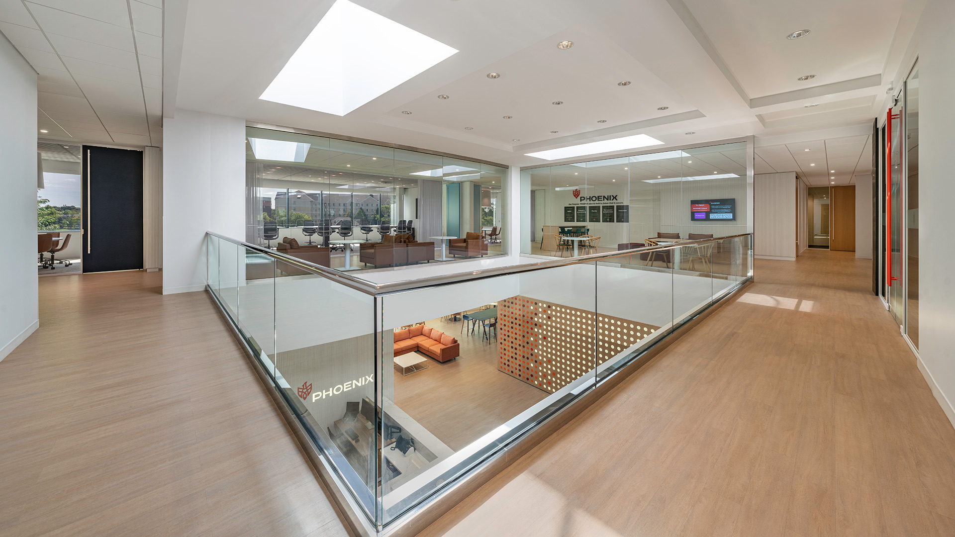
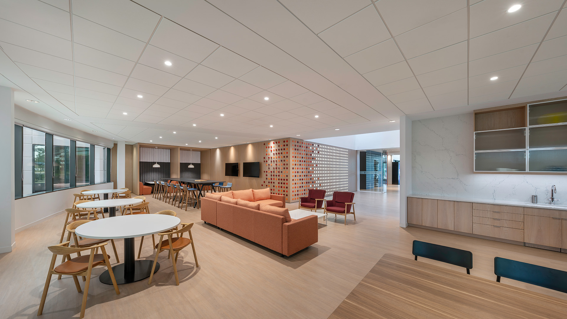
In the reception area, the playful feature wall comprised of round perforations and additive cap-shaped dots done in a variety of colors, is an ode to the vibrant personalities of company and project leadership. Guests will follow the feature wall around a corner into a large social space, designed to put the energy of the office front-and-center. A wide variety of furnishings in colorful textiles were carefully selected to put employees and guests at ease.
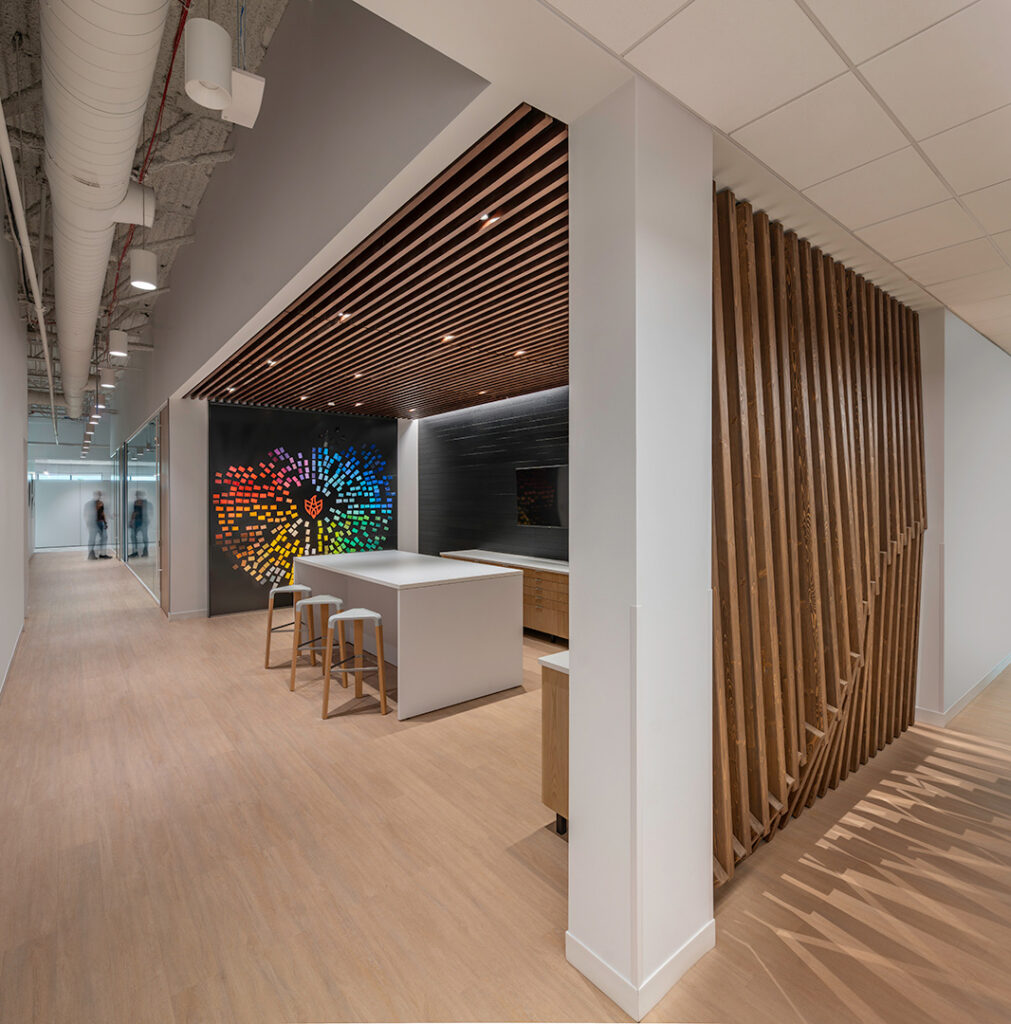
Unique environmental branding reinforces the company’s culture.
A graphic installation in the center of a breakout area is the company logo “sparking the flame of innovation”. Dimensional wood sculptures appear in multiple locations.
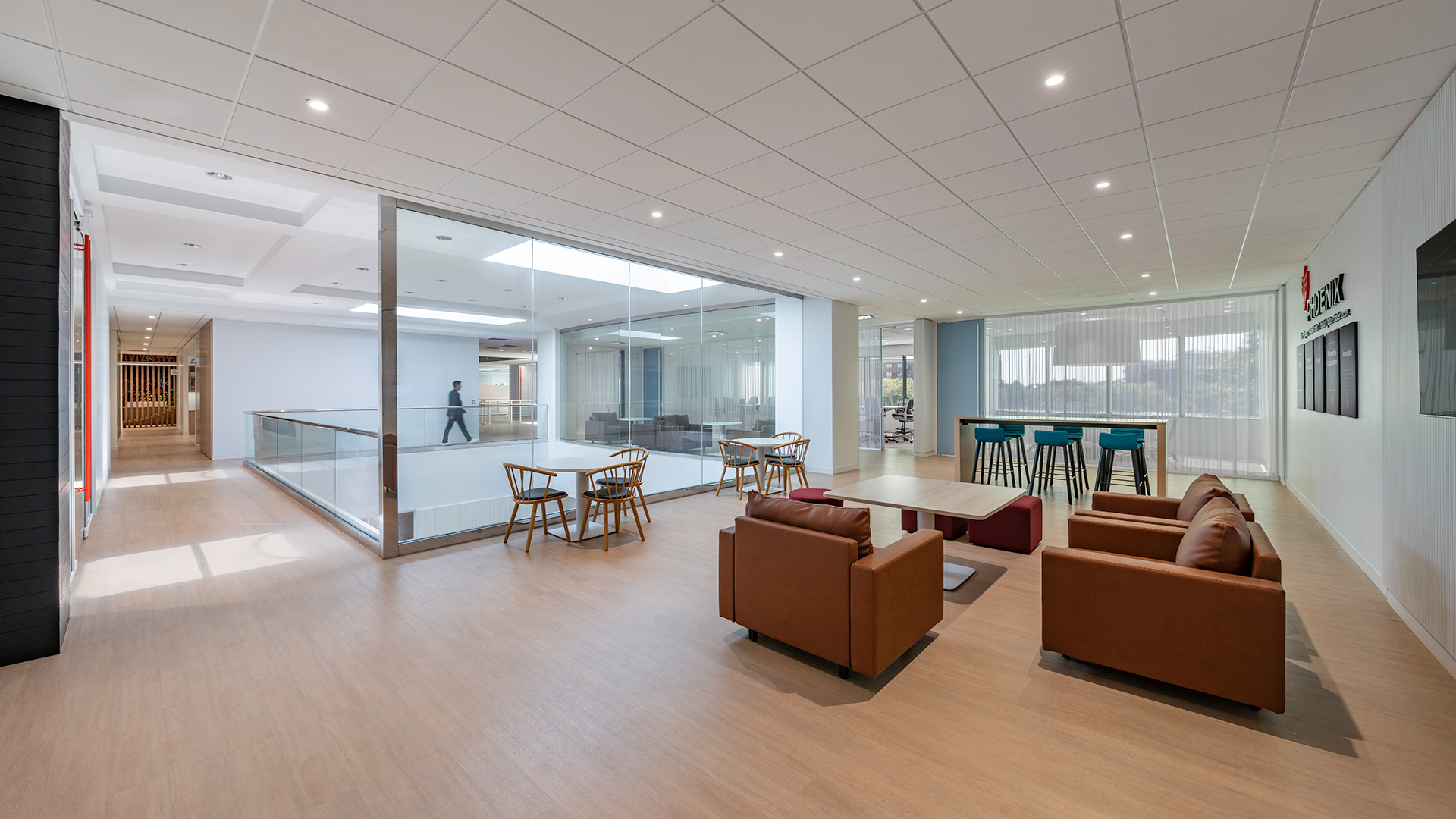
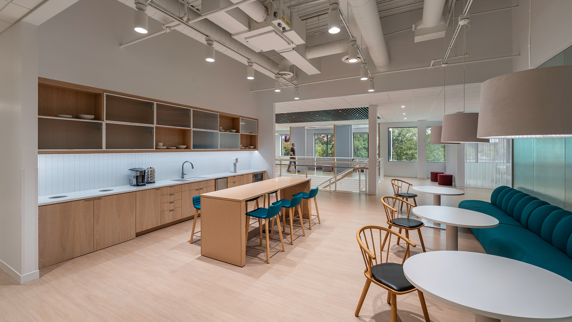
Welcoming spaces support both quiet reflection and informal gathering.
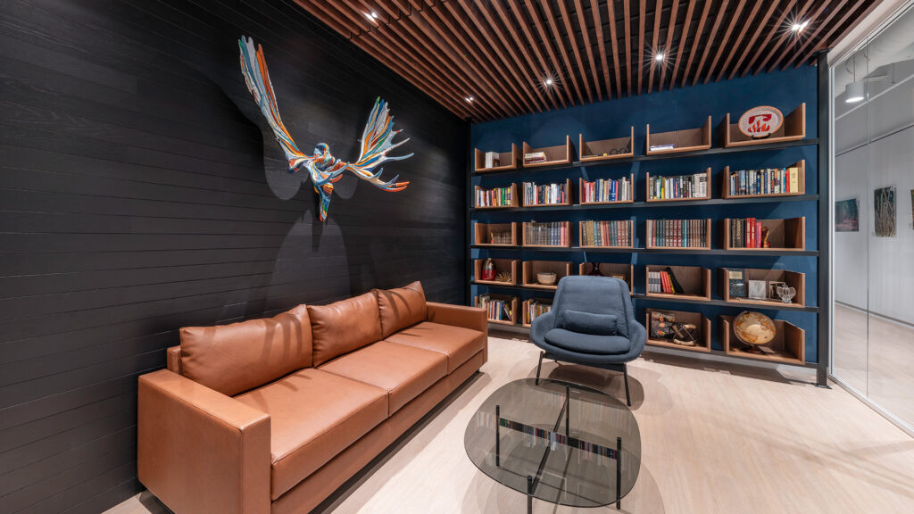
Soft lighting, layered textures, and comfortable seating create a welcoming atmosphere that encourages people to slow down and connect. Warm wood tones, shelving, and curated details shape a space that supports both focus and relaxation—offering a place to recharge, collaborate, or pause during the workday.
,

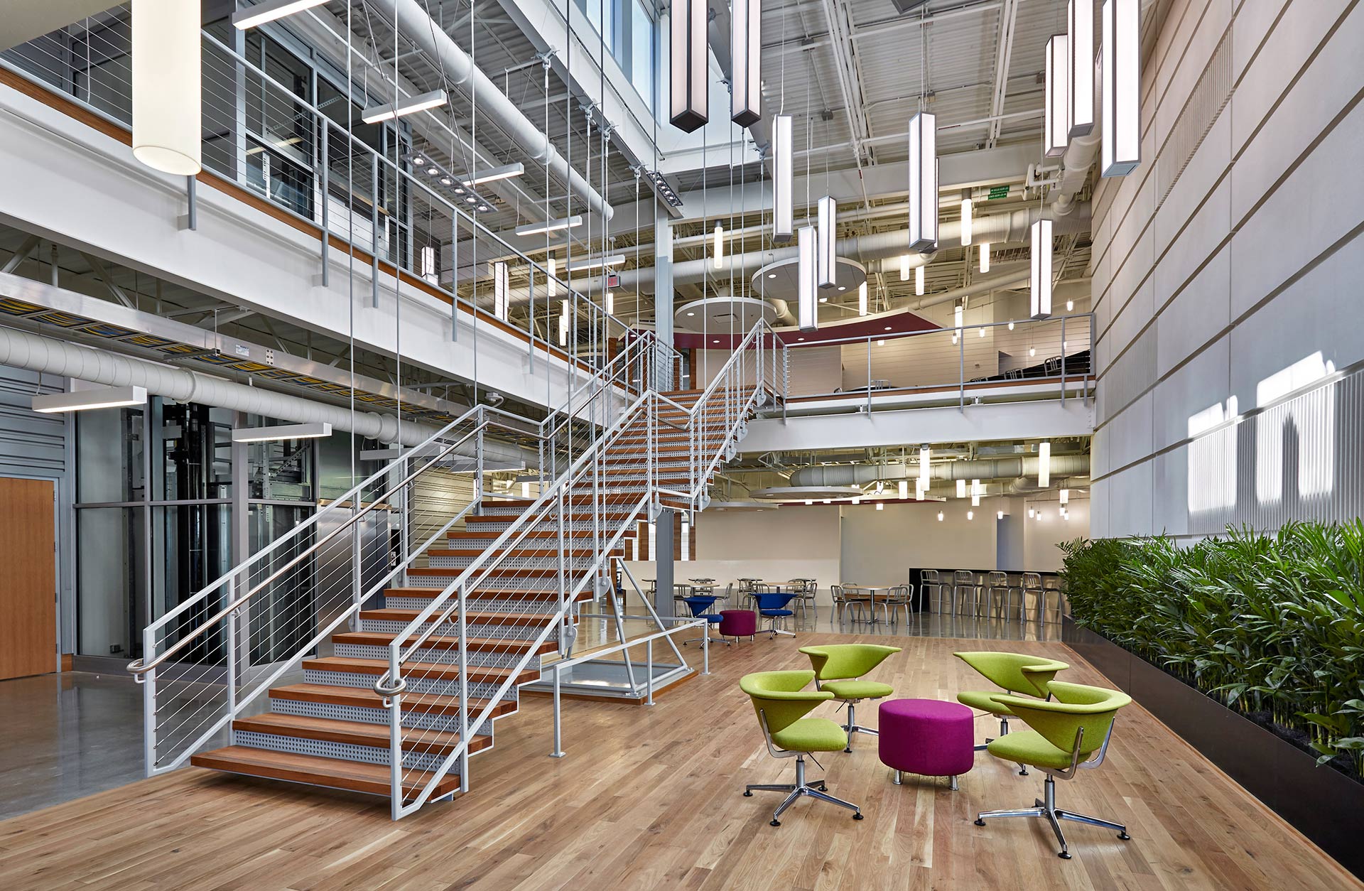
Upon entering the building, visitors are entrenched within the convergence ecosystem. Collaboration spaces including: community tables, informal lounge settings and private conference rooms surround the dynamic 2-story atrium. The artfully woven lighting above the atrium is symbolic of the idea exchange concept and serves as a subtle branded component. The balance of exposed structural steel elements and refined details speaks to the synergy between “Boilermakers” and corporate partnerships.
The Carr space continues the subtle color story of the atrium, and reimagines it as bold patterns and strategic color blocking. A neutral foundation of the iconic Purdue “black and gold” translates to steel and wood, and enables bright blues, oranges and greens to take center stage.
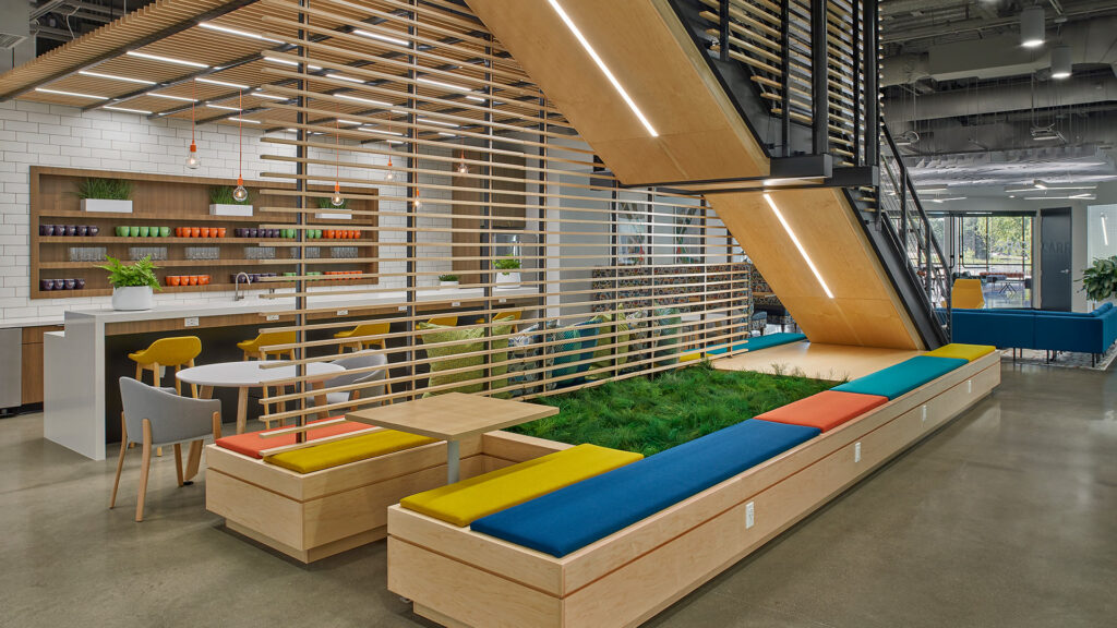
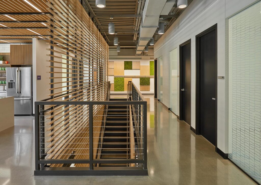
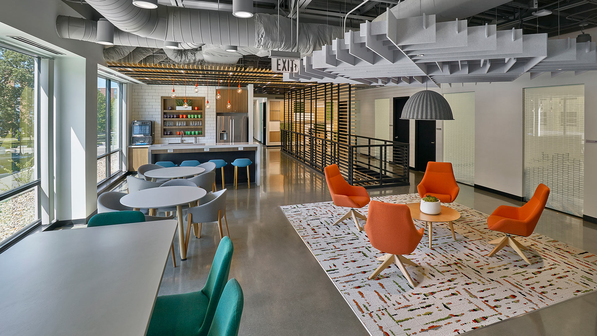
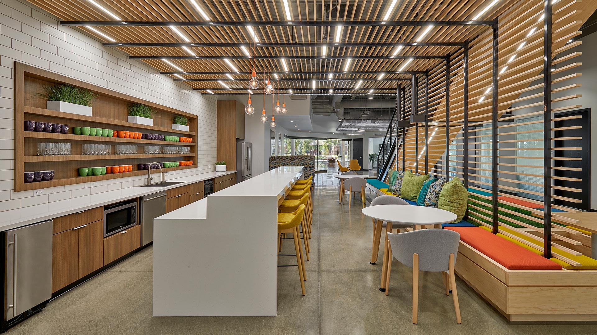
The artwork contributes seamlessly to the dynamic color integration, and reveals another layer of the complex design. Carefully curated art reminds users of the rich Purdue University heritage, and their contributions to Agriculture, Aeronautics, Engineering and Space Exploration.
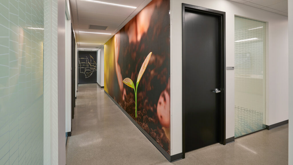
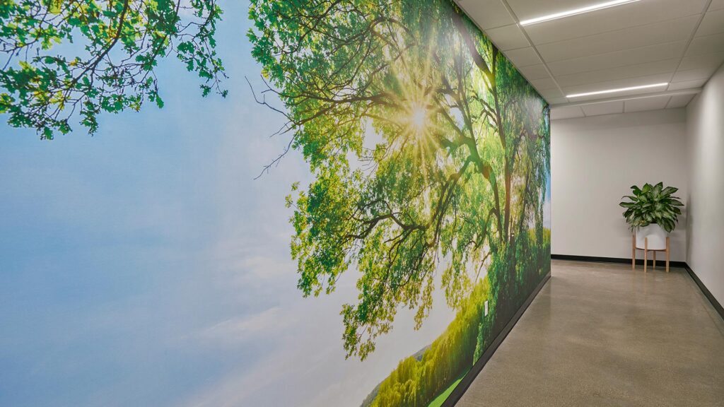
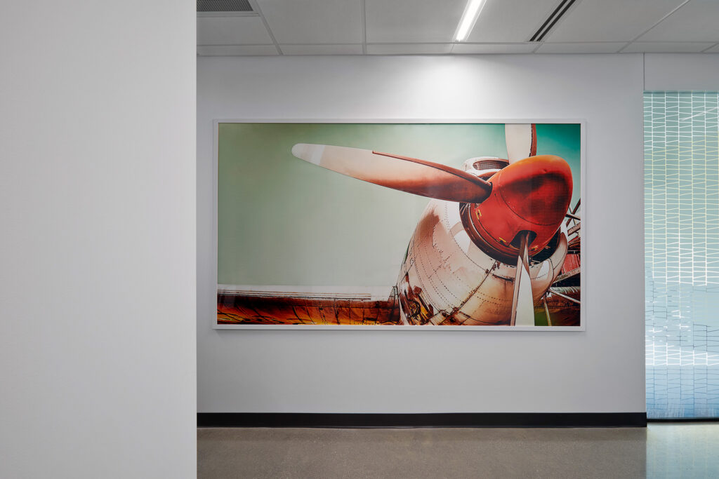
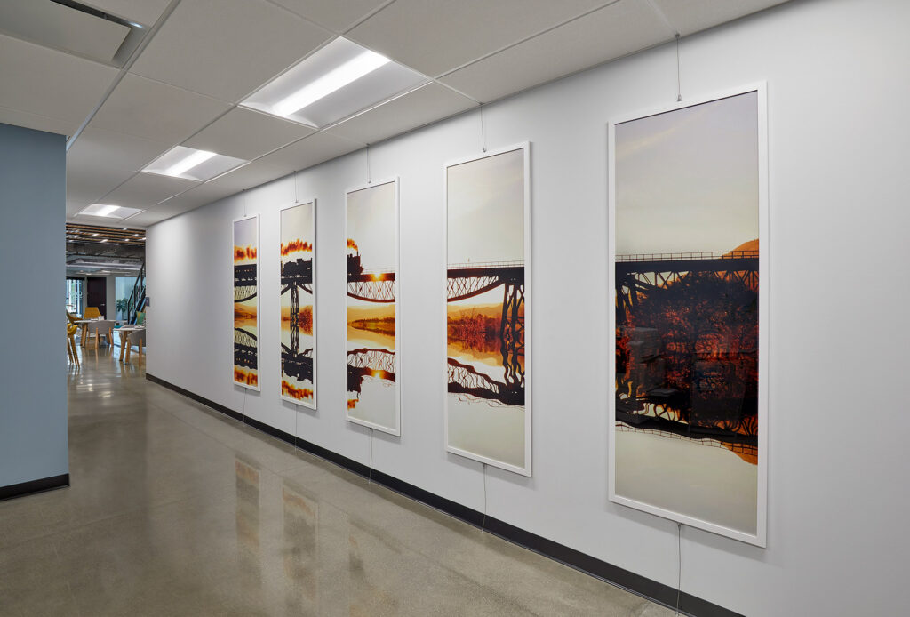
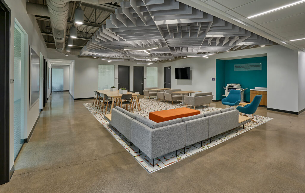
A diverse assortment of work settings allows users to tailor the space to meet their needs. The incorporation of neighborhood plazas places the opportunity to collaborate at the user’s doorstep. Both formal and informal settings support this exchange and further the opportunity to choose. Strategic circulation paths facilitate impromptu exchanges, and are designed to encourage wellness.
,
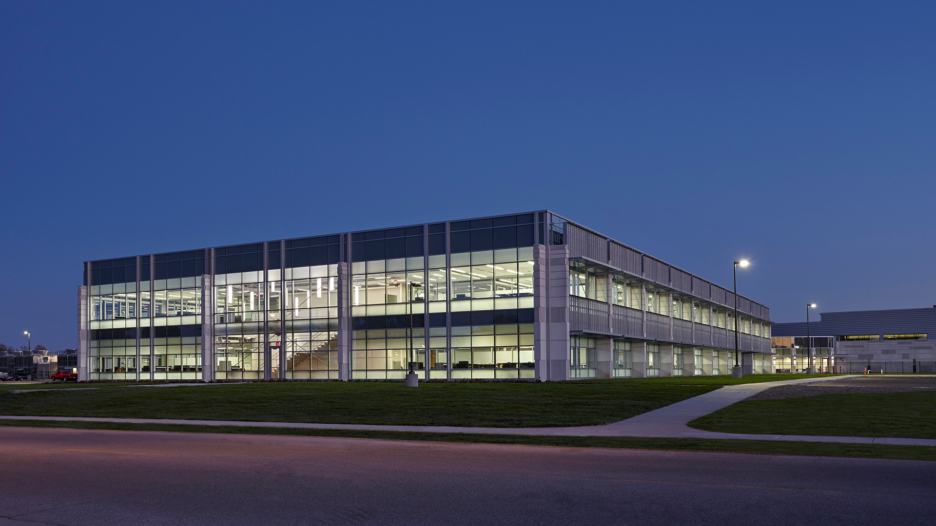
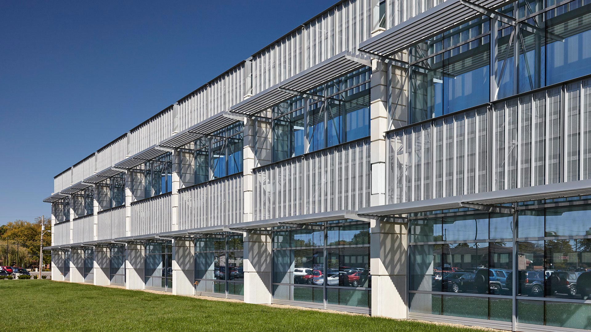
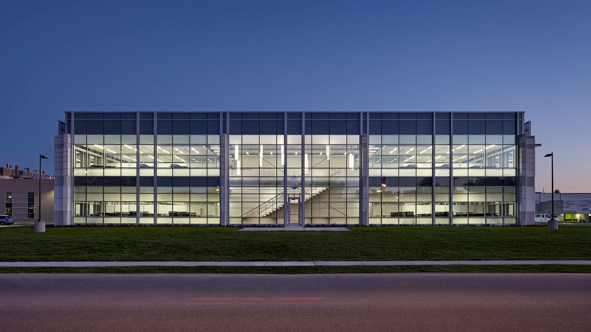
The main entrances incorporate dramatically cantilevered steel canopies, which are reminiscent of Columbus, Indiana’s iconic red suspension bridge. The office building’s exterior was designed with an advanced engineered skin, incorporating an exterior daylighting and shading system. Each of the primary exterior façades has been purposefully designed to respond to its specific and unique solar orientation.
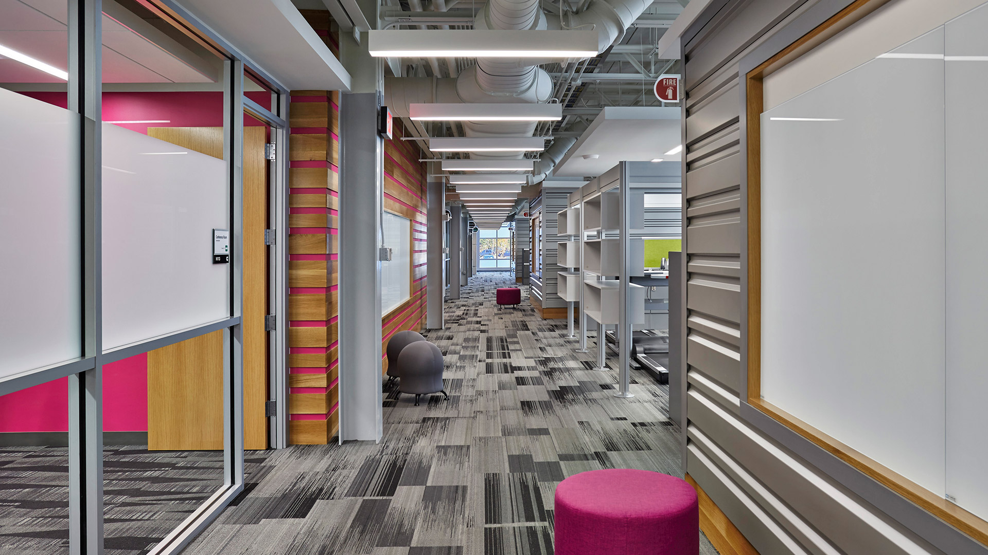
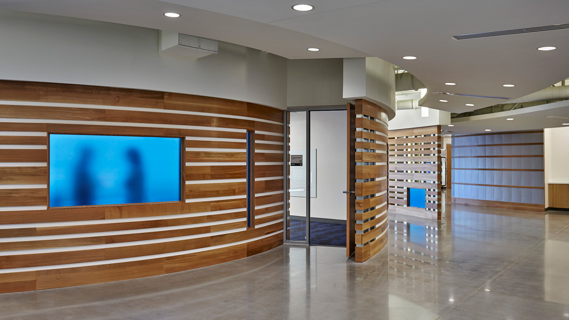
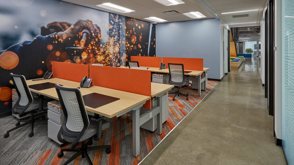
Cummins wanted to “bring the office into the plant, and the plant into the office.” Highly durable and raw industrial materials such as corrugated steel panels, polished concrete, and wood slats fastened to exposed metal studs were incorporated throughout the office environment. These same materials can be found on the plant floor, and therefore subtly reinforce the connection. The engine assembly and finishing process was carefully examined early in the design process with the goal of informing the final design. Elements of the manufacturing process are on display in the office area through the incorporation of design features such as the compound curves and finish found on powder-coated steel benches which mimic the sleek lines of the engines.
Highly flexible, ergonomic workspace solutions and state-of-the-art audiovisual collaboration systems allow the engineers to tailor how and where they work.
Flexible Workspaces for Collaboration and Focus
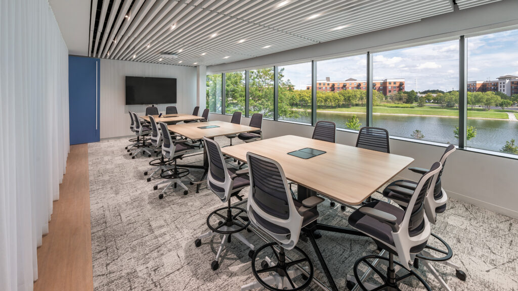
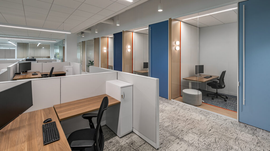
A variety of flexible meeting rooms, focus booths, soft seating areas, and social hubs are available to accommodate the changing needs of their workforce and promote interaction, collaboration, and engineering innovation.
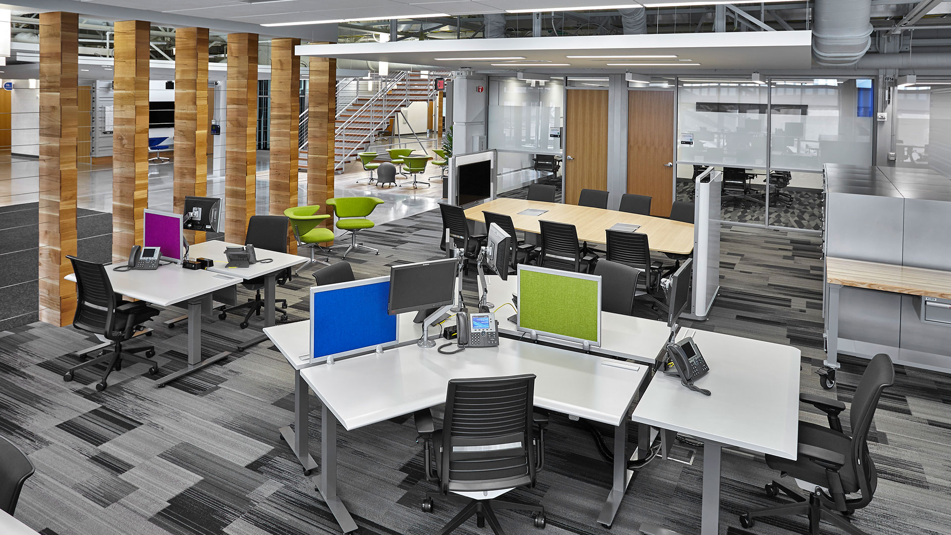
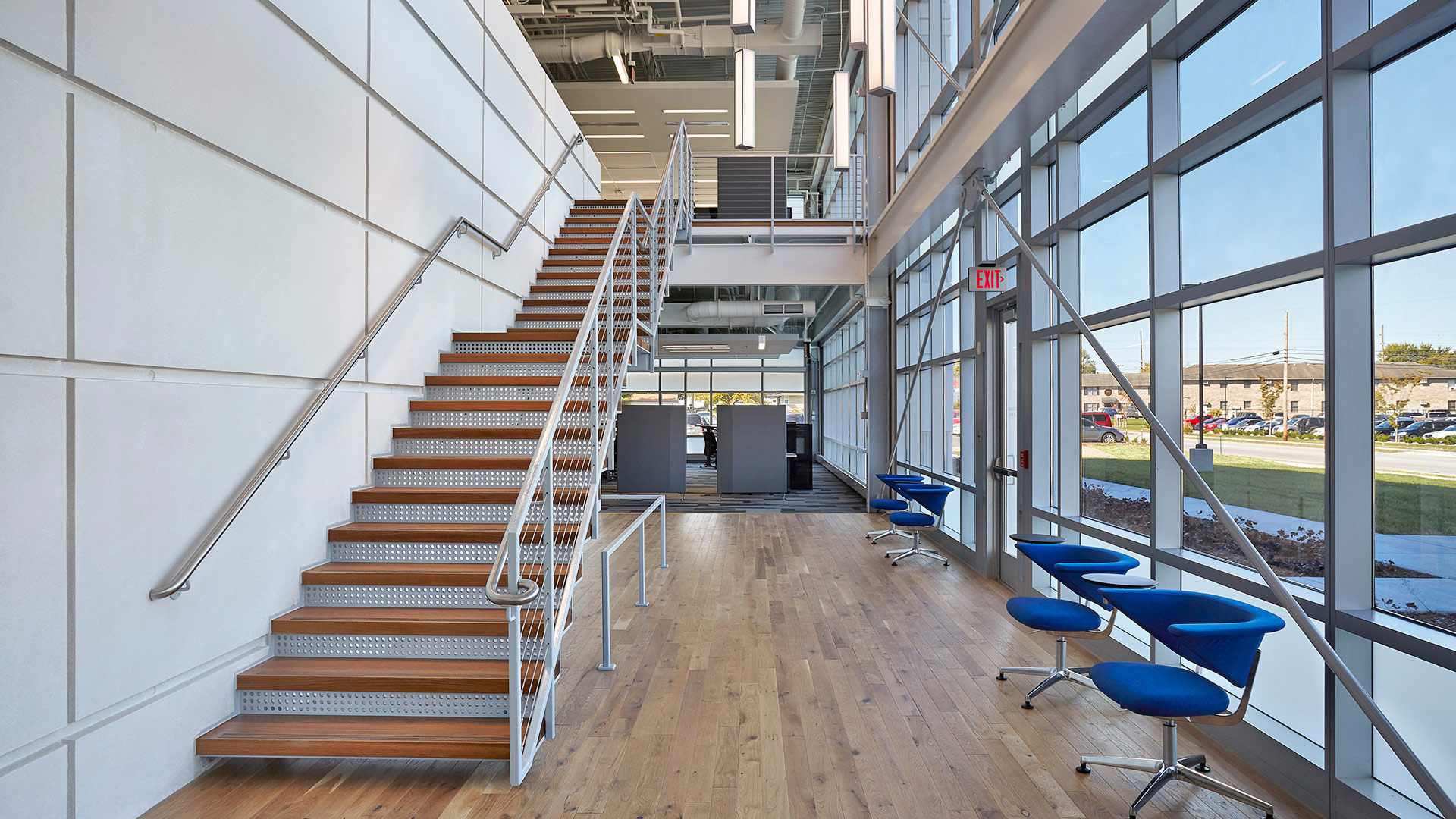
The Cummins Seymour Technical Center does more than provide much needed space for engineering staff – it uplifts their work force in beautiful spaces and is an inspiring reflection of Cummins’ proud tradition of world-class engineering.
,
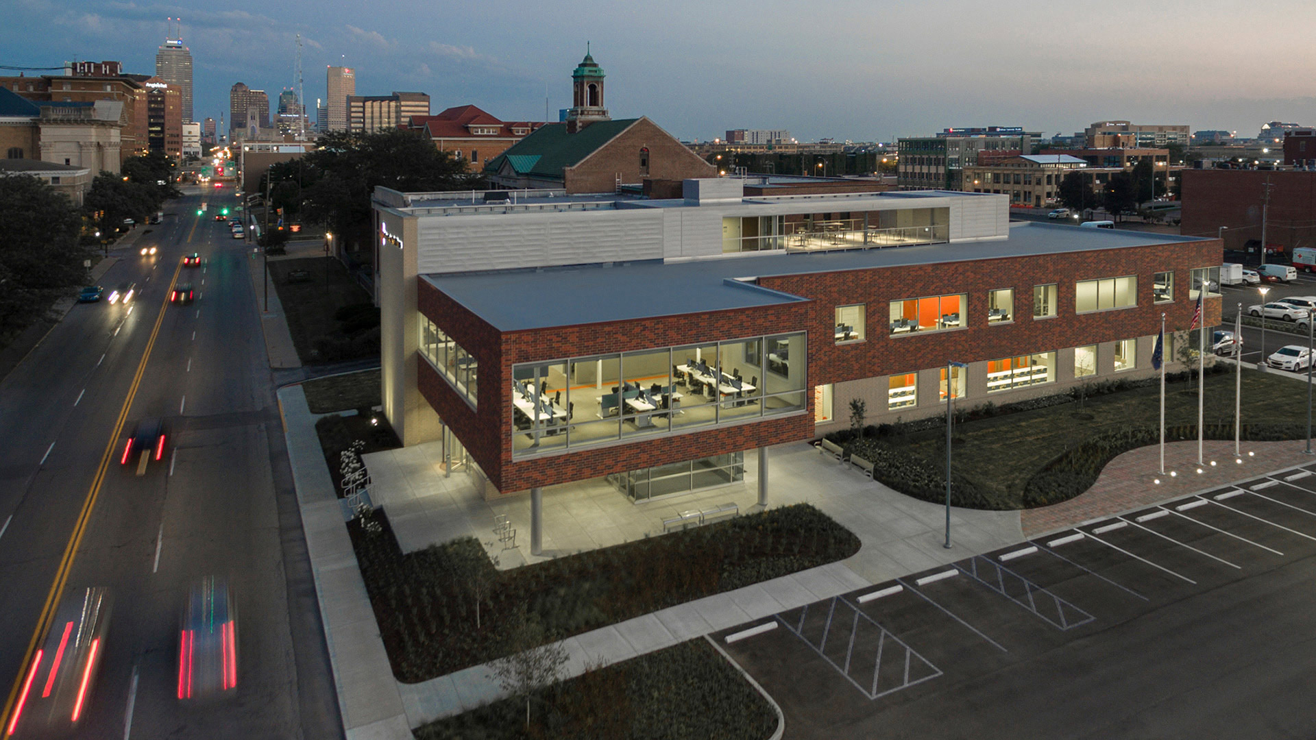
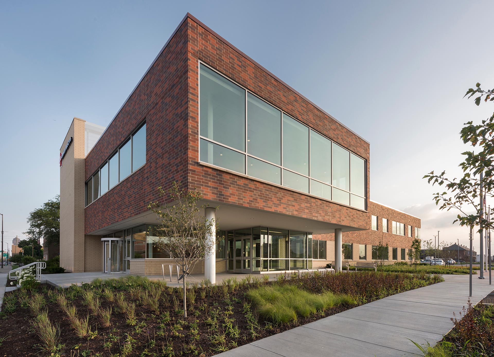
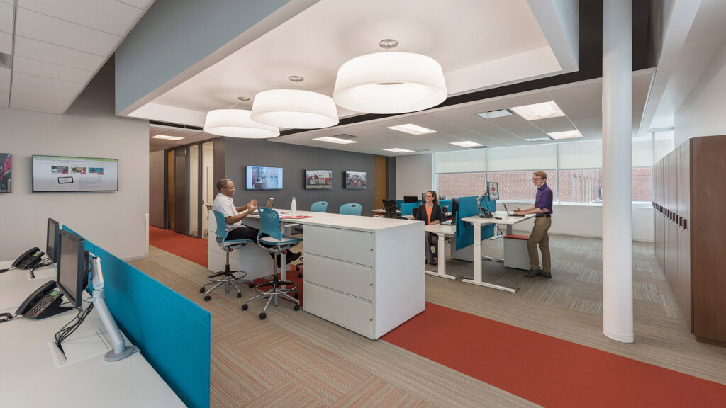
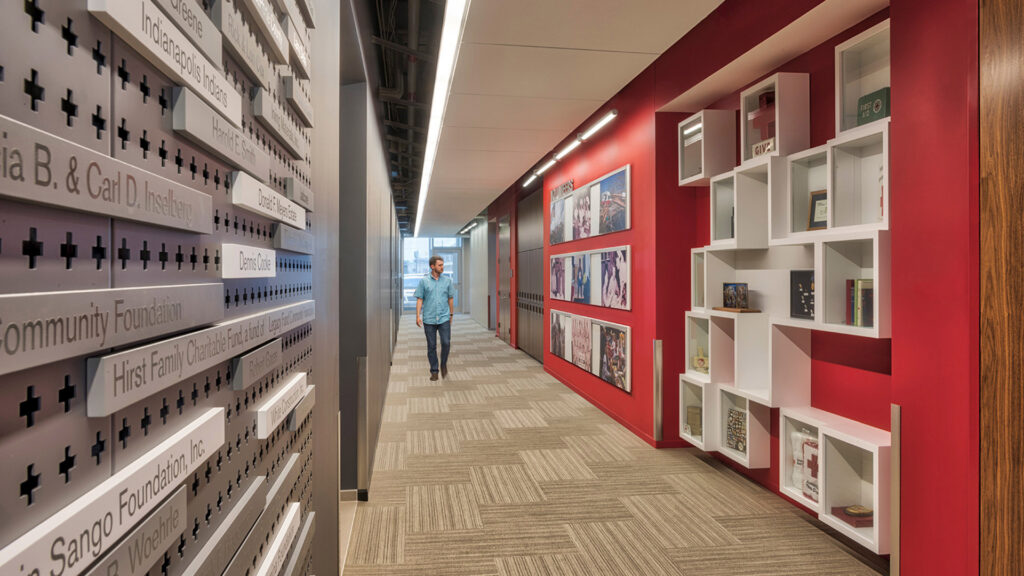
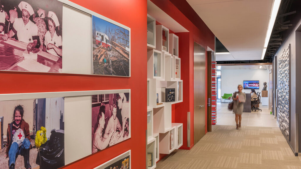
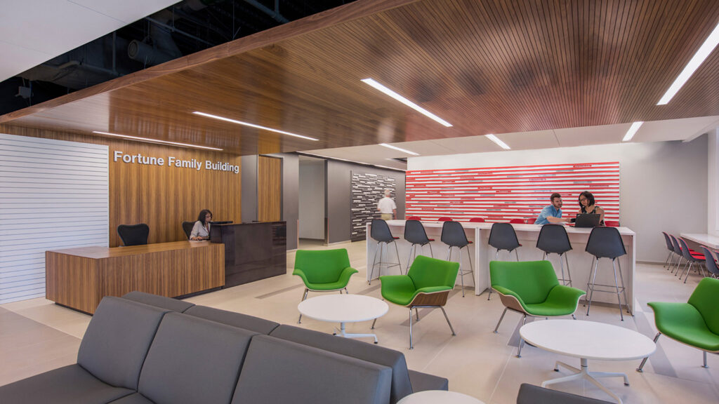
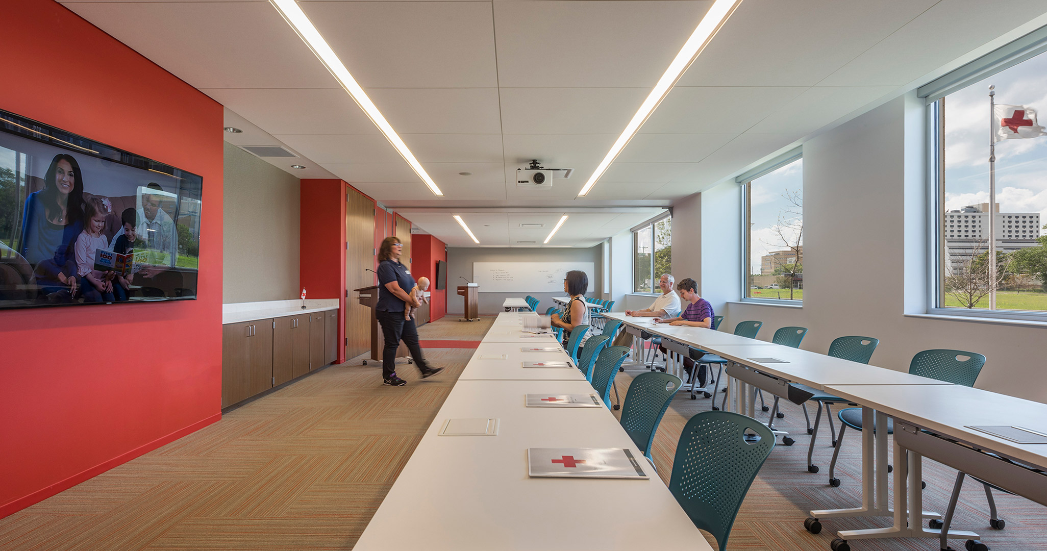
Flexible training rooms, a community center, teaming areas, local office spaces, and huddle spaces encapsulate the programs within the headquarters, creating an environment that promotes interaction where employees and volunteers feel energized and accommodated. Employees are not assigned desks or specific workspaces, so the design of the facility is very flexible and adaptable. Amenities include a rooftop terrace that creates a respite and wellness destination, and a coffee house that connects and creates community.
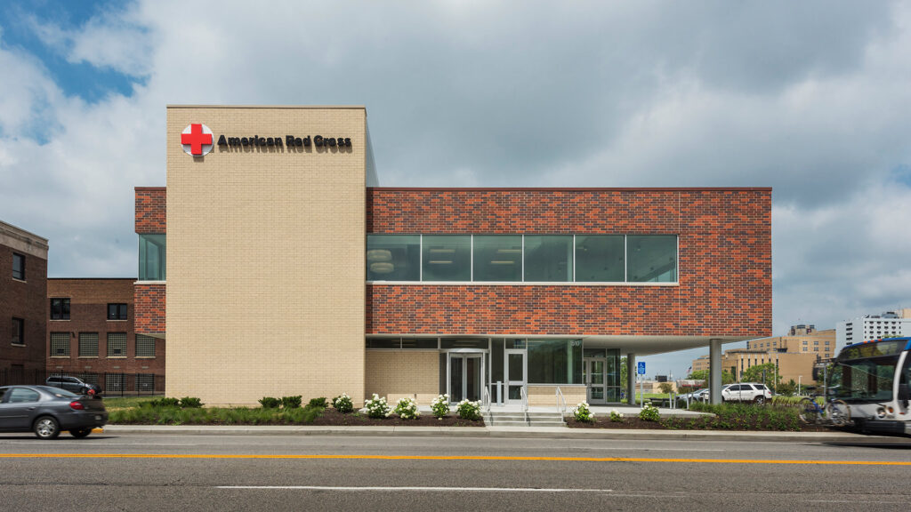
The building is extremely sustainable, with the exterior wrapped in red brick, seamlessly blending in with the surrounding architectural aesthetic.
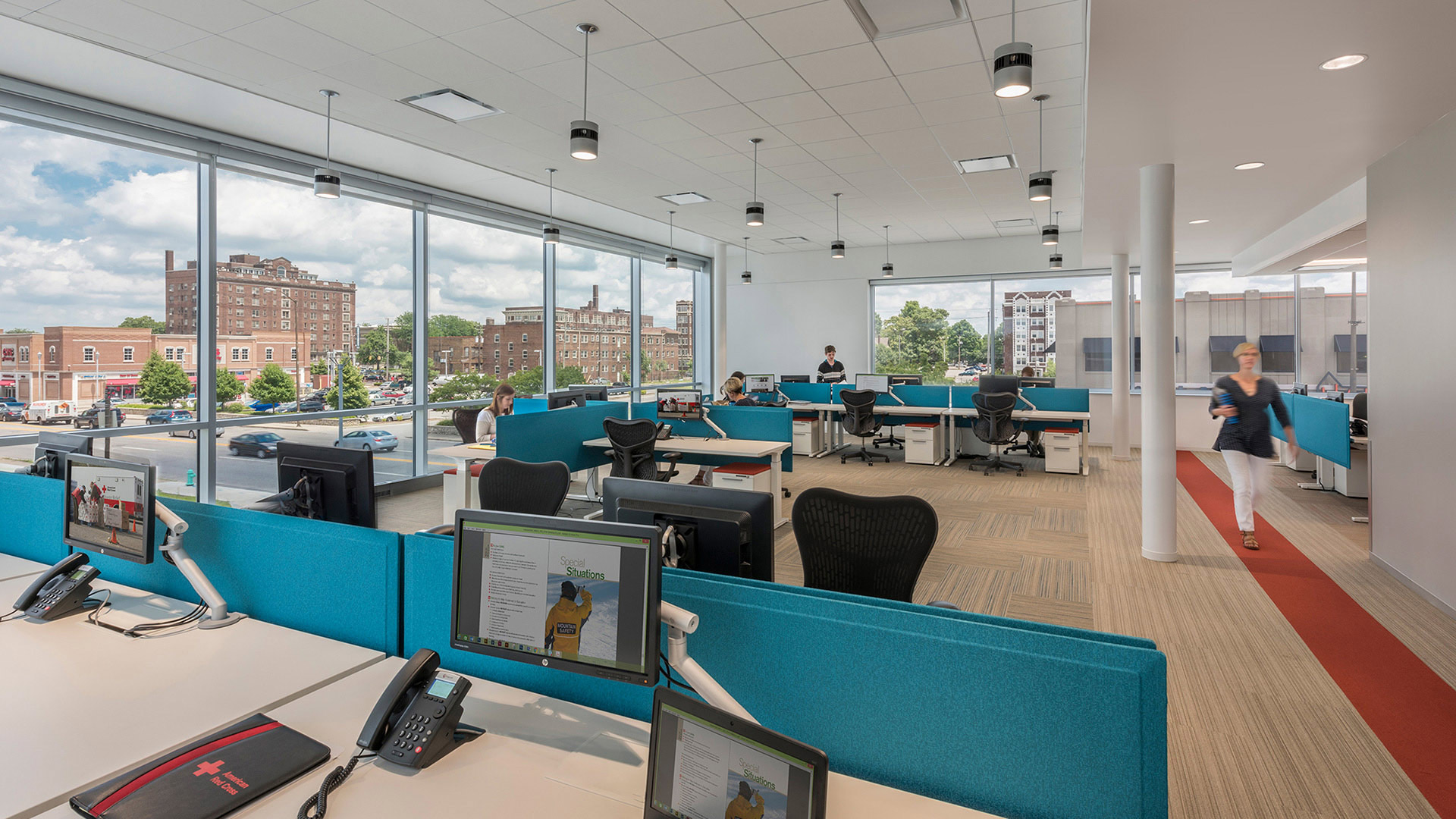
The headquarters has large windows that welcome natural light creating a community-oriented atmosphere and providing views of the surrounding neighborhood of downtown Indianapolis.
Brand Identity Expressed Through History and Design
In addition, a key branding focal point is incorporated on the interior corridor that displays historical Red Cross artifacts, local to Indianapolis. The iconic, ARC-branded “red” is carried throughout the headquarters.
,
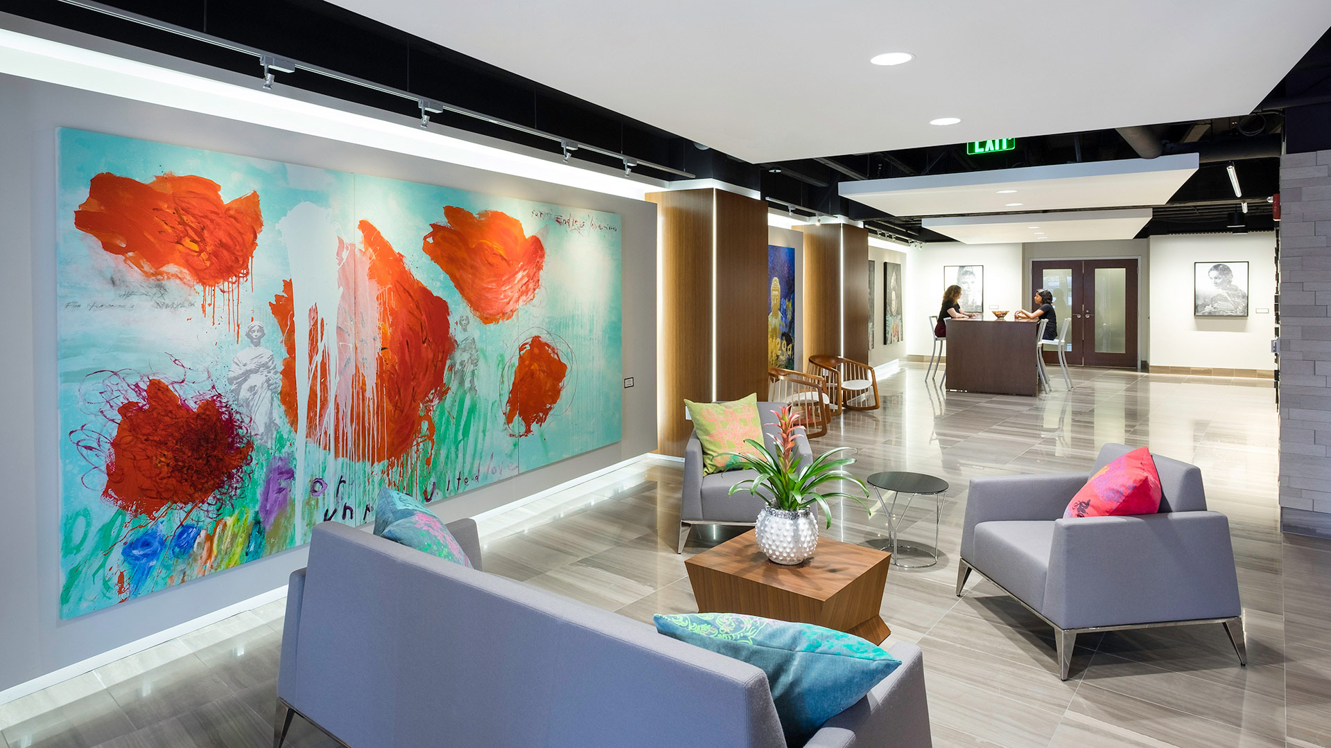
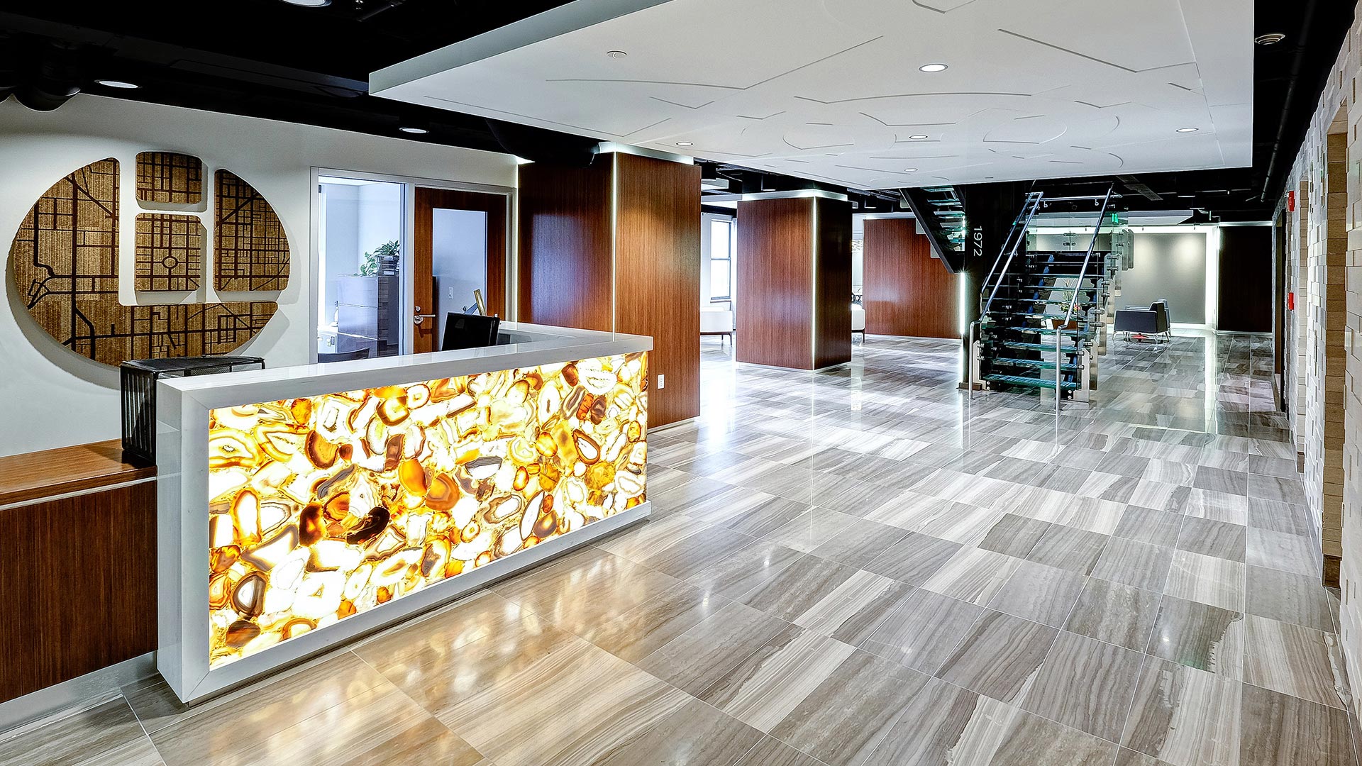
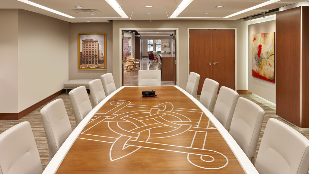
The interior design and corporate branding pay tribute to the rich heritage of the company in subtle ways such as the incorporation of the “Lacy Knot” in the pattern of a suspended ceiling and a custom conference table.
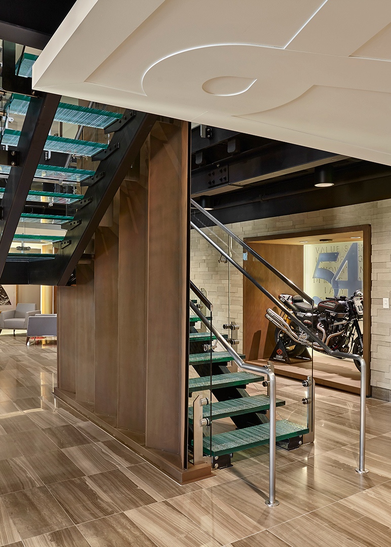
A Sculptural Staircase That Connects Floors and Company History
Additionally, the design includes a new staircase to connect their two floors of office space. The stair features custom sculptural details to pay homage to the company’s history in the corrugated paper industry and milestone dates.
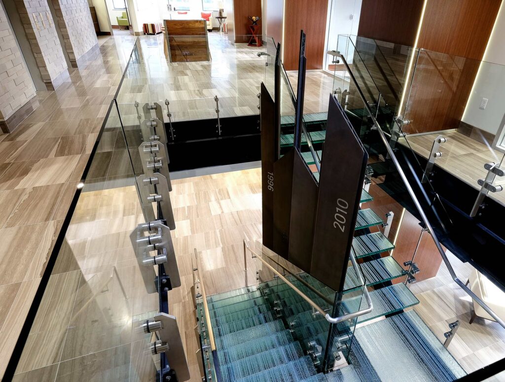
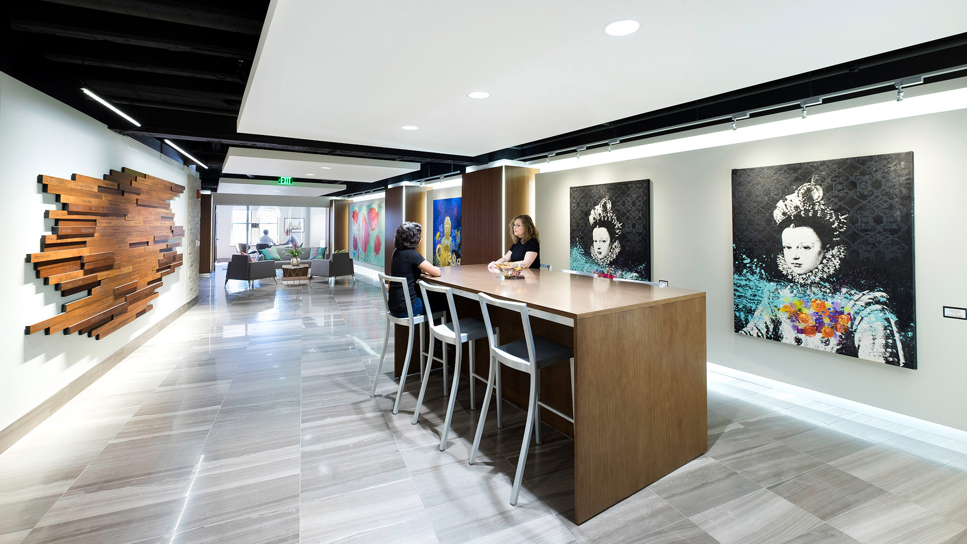
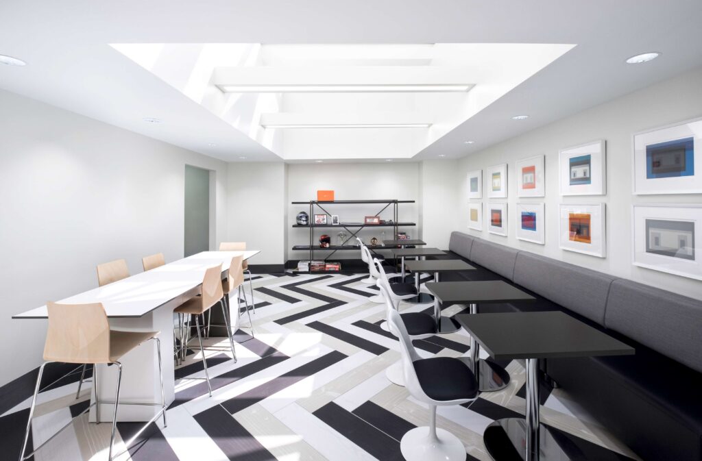
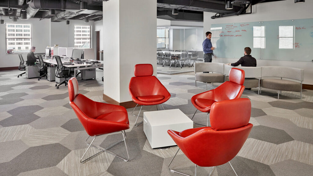
There are a multitude of details that the design team was able to incorporate into the final design through careful research, in-depth visioning, and interview sessions with the client.
,
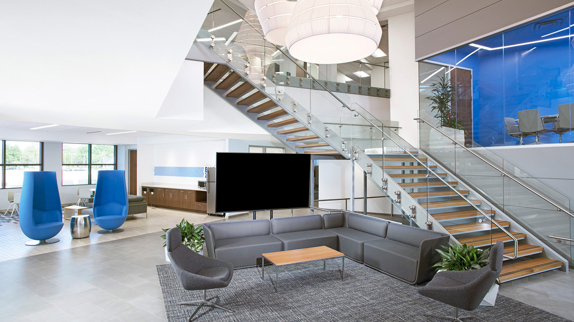
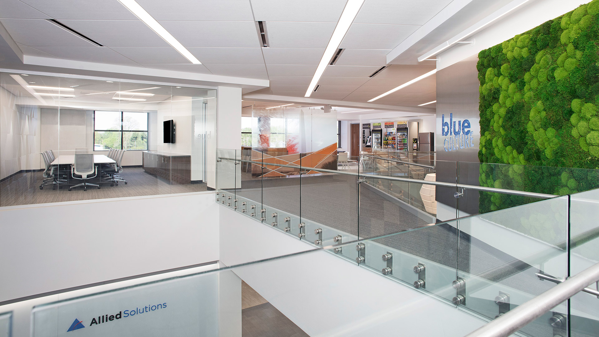
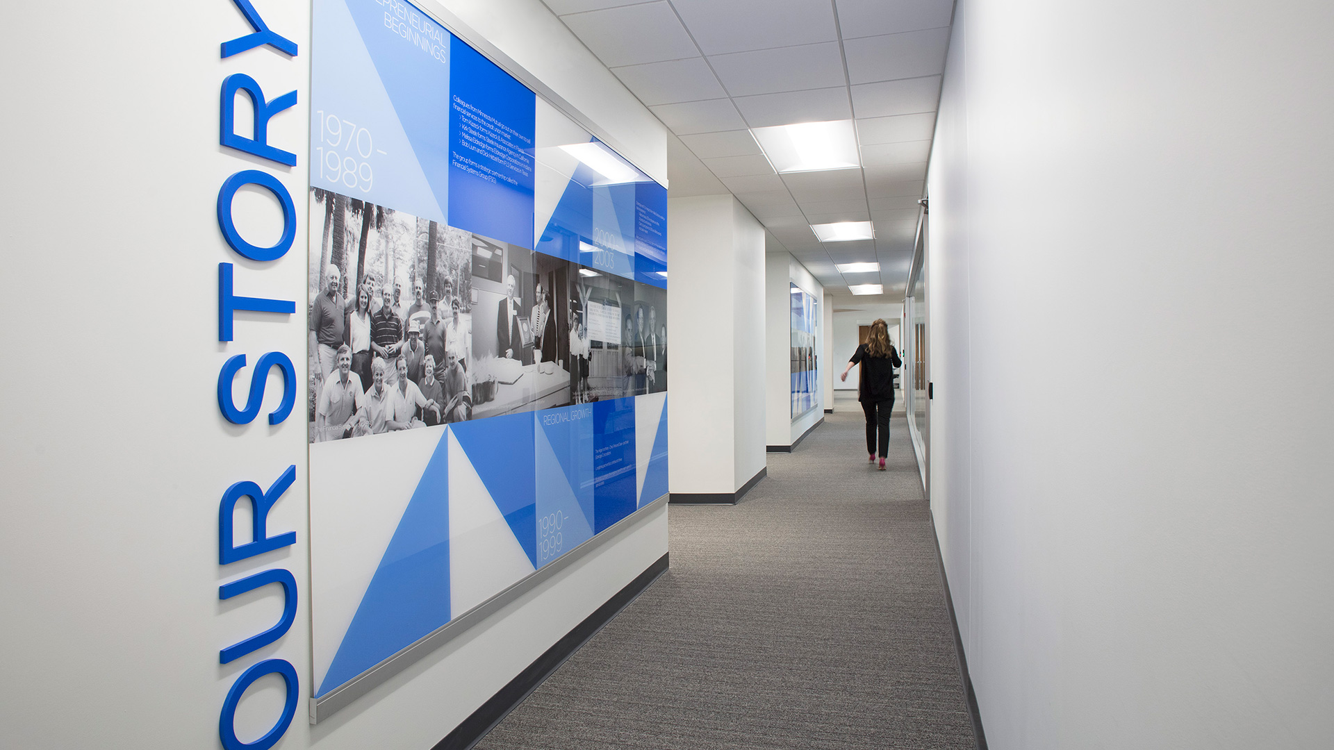
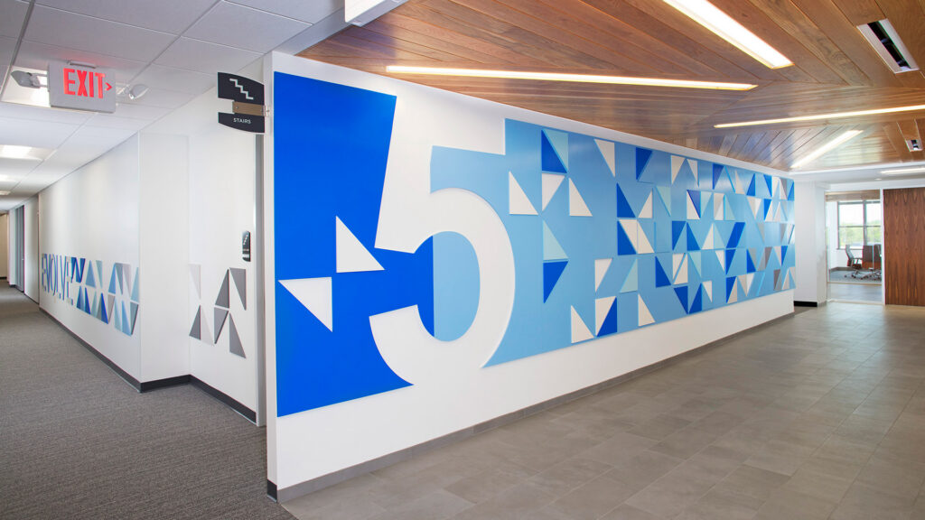
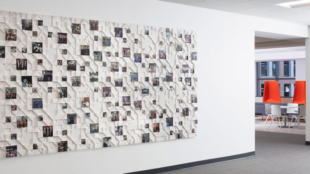
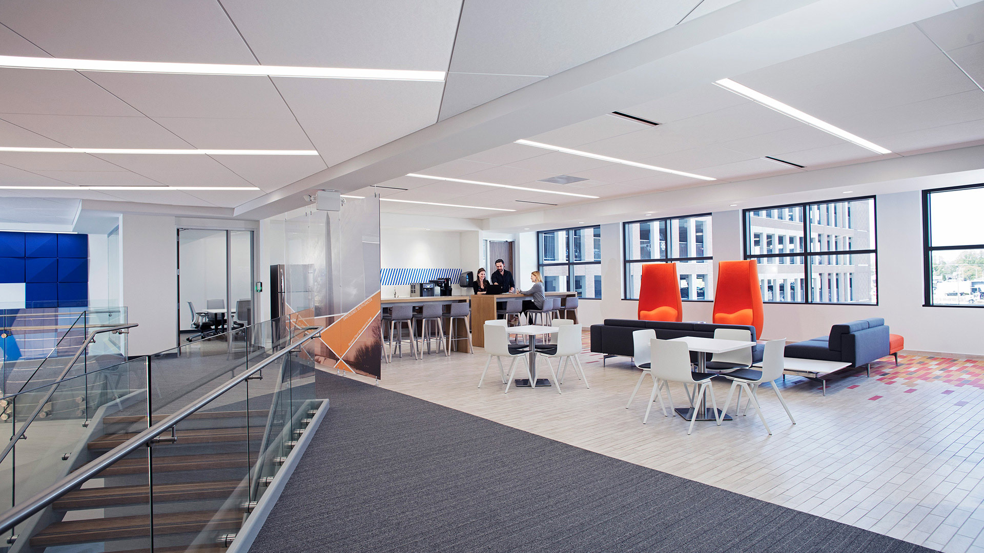
The holistic interior design, and seamlessly incorporated branding elements are apparent immediately upon arrival to Allied’s second floor lobby. There, employees and visitors are enveloped by Allied Solutions’ “Blue Culture” with views to an atrium with a grand staircase, an informal mid-level conference room, social gathering spaces, and a 3rd level conference room.
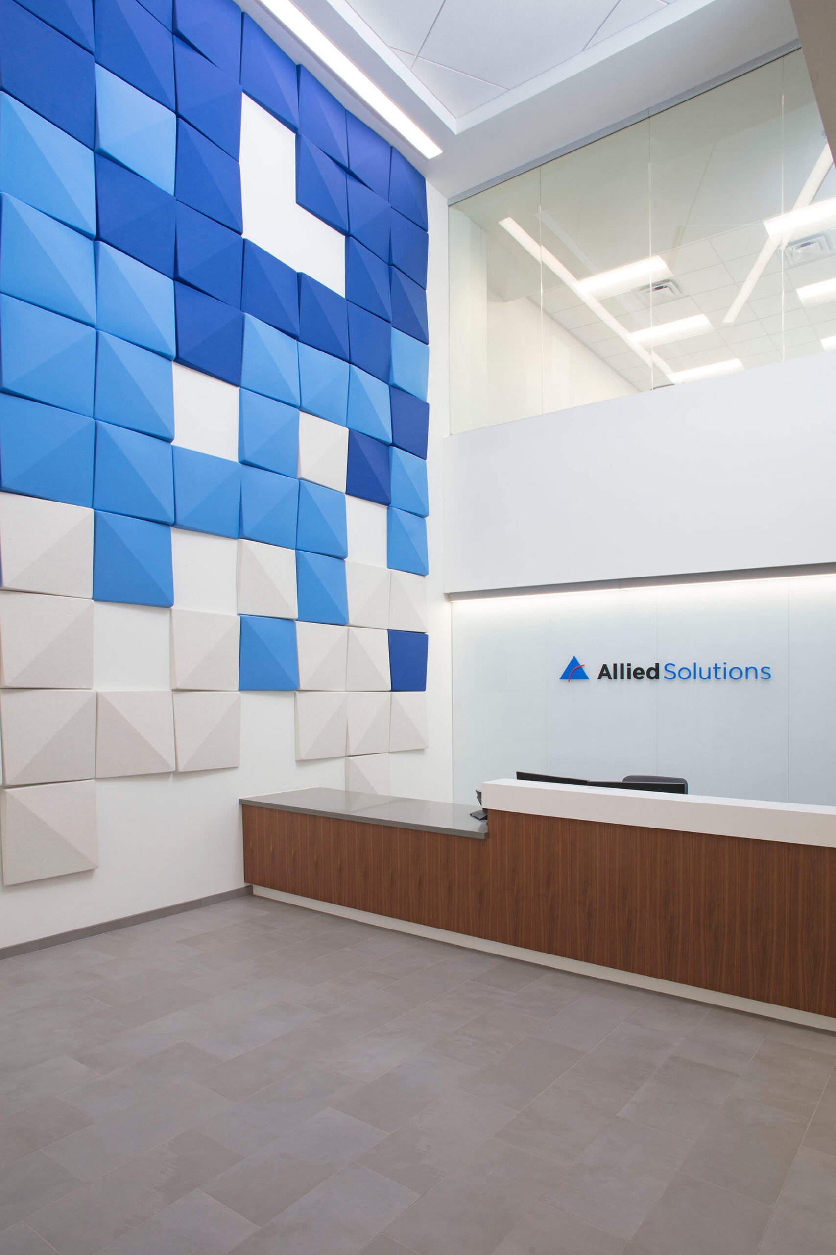
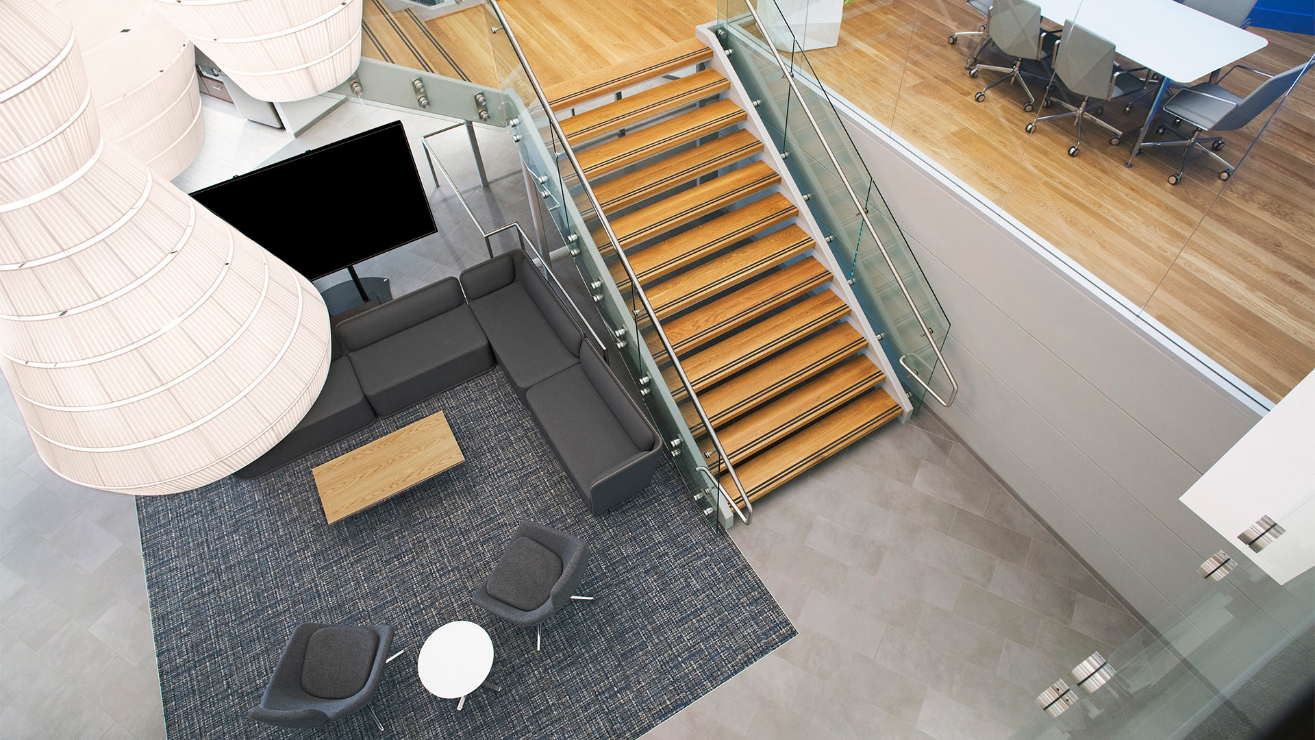
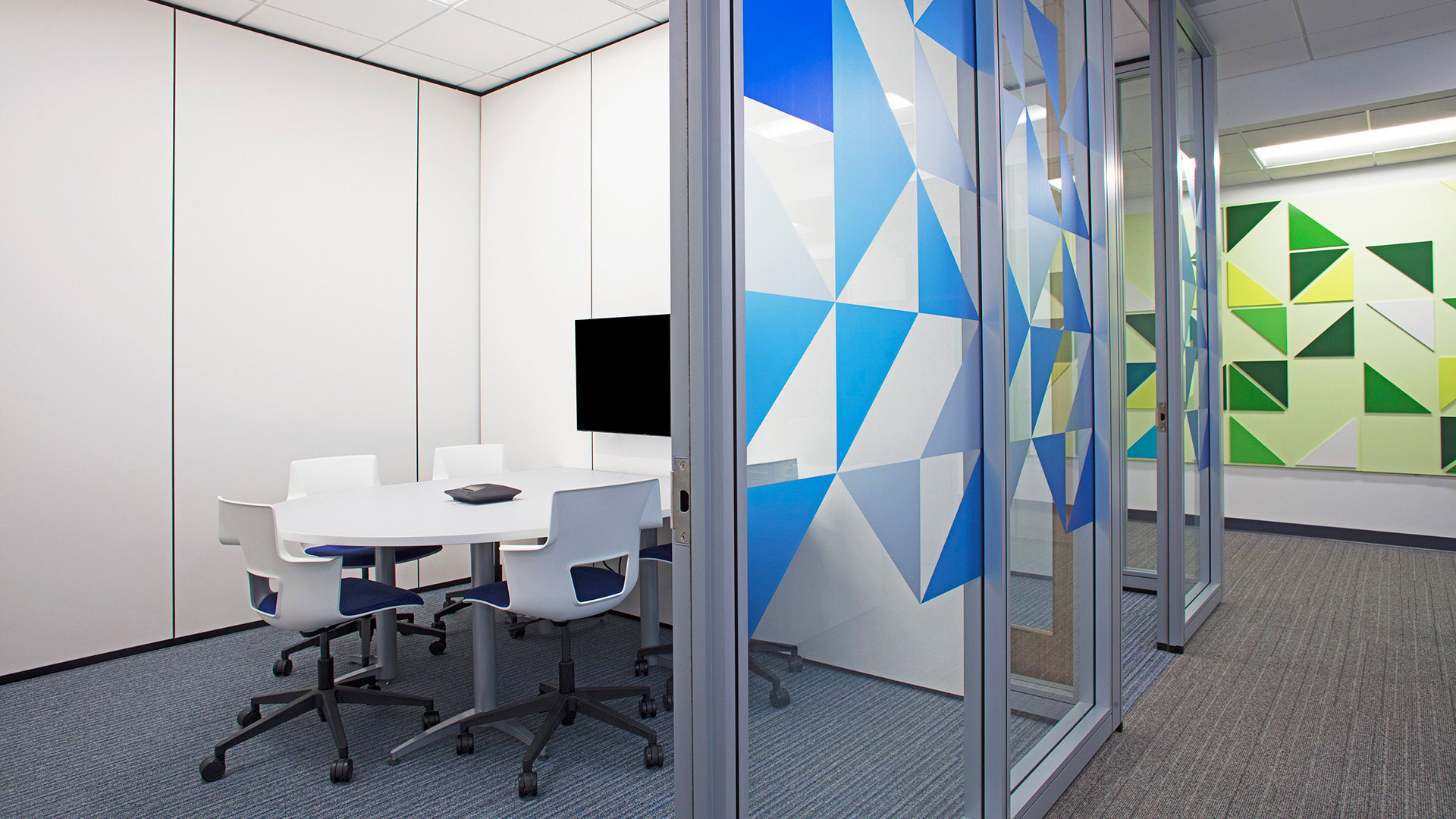
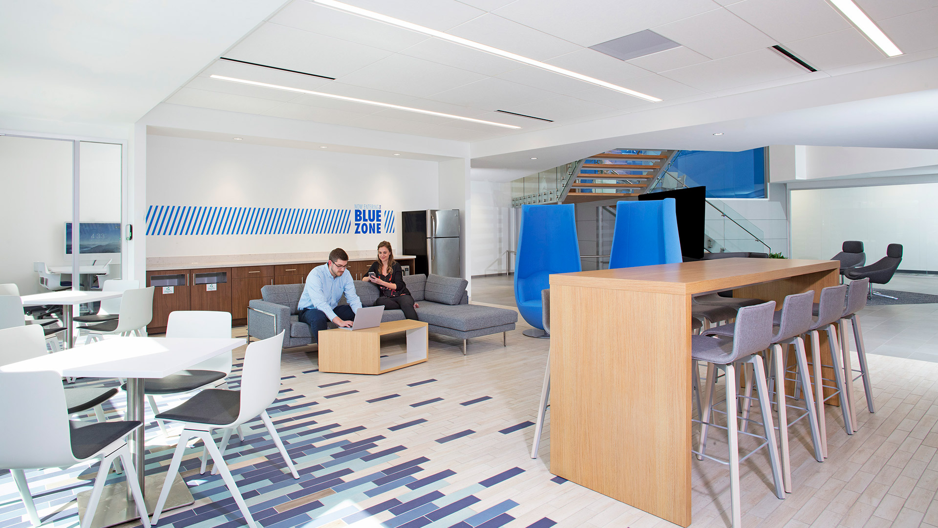
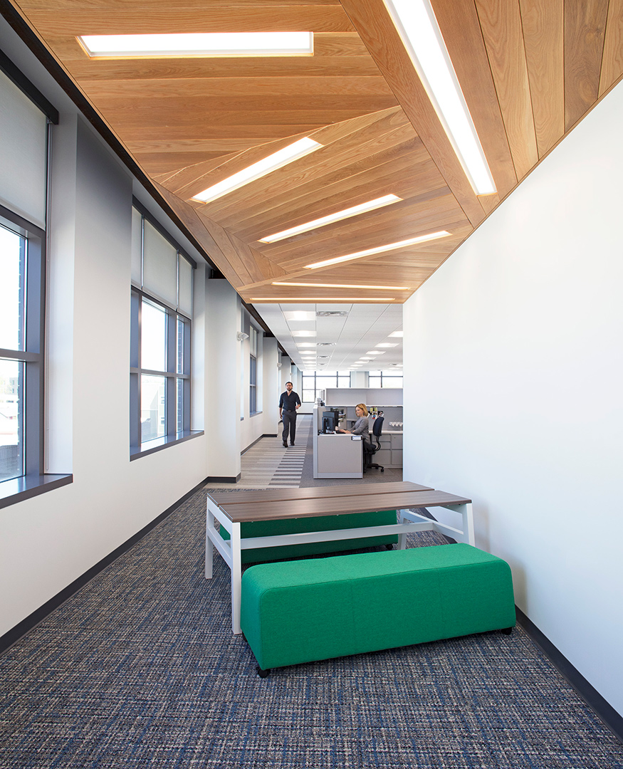
By design, the activity of the office is put on display in response to feedback provided by the user groups during their visioning sessions. Research and careful dissection of information from the visioning sessions gave designers the opportunity to carefully parallel Allied Solution’s unique culture in its interior environment. The result is a unique space that embodies the company’s cultural and business aspirations.
,
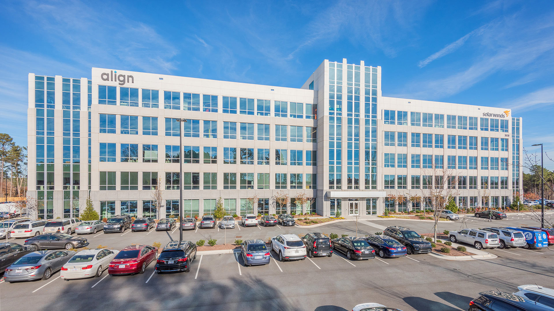
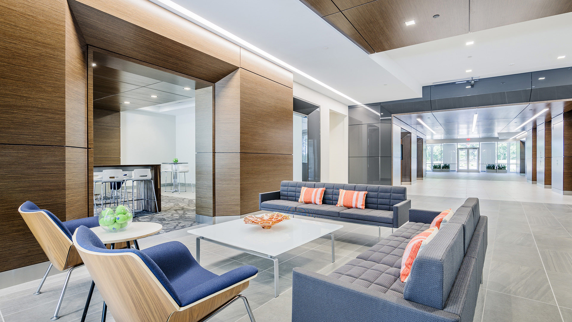
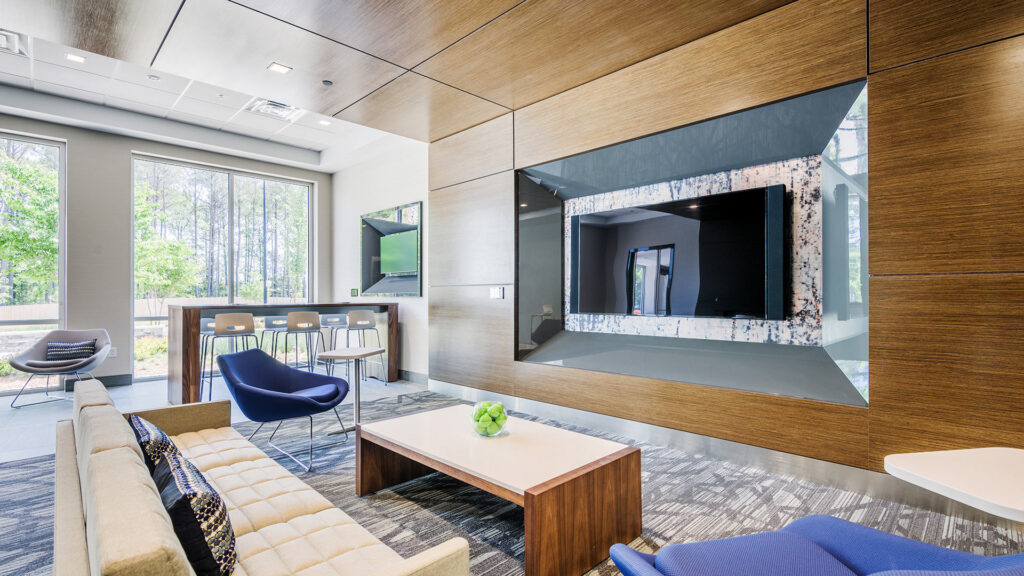
CSO’s interior designers worked with the owner to provide a lobby design that capitalizes on the concept of using the public area as an integrated community space. A social gathering lounge directly off the lobby provides space to meet, relax, and play. The finishes from the lobby stretch seamlessly into the lounge to create a connection and remove perceived barriers, thus breathing life into the lobby as well. A variety of seating options welcomes visitors and encourages them to utilize the space to meet their needs.
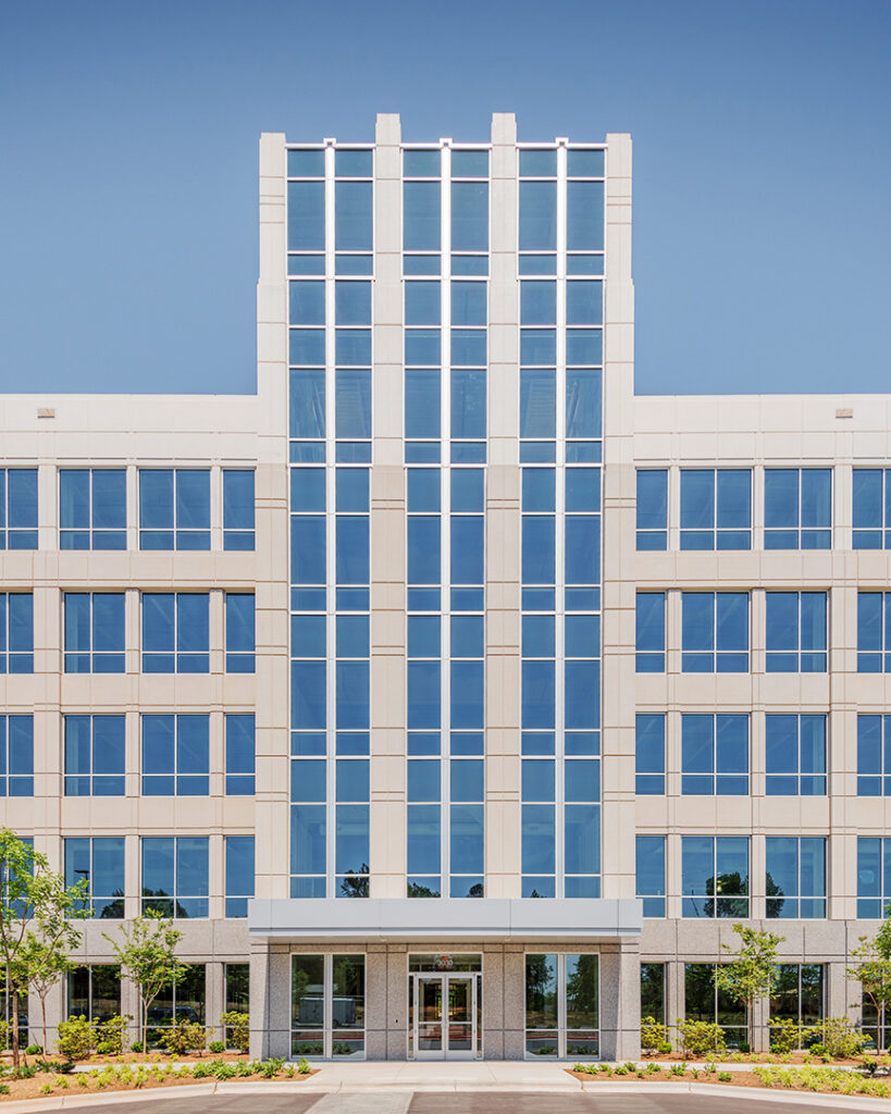
The architectural design reinterprets the classic base, middle, and top composition of commercial/public buildings in a more contemporary aesthetic. The exterior precast concrete skin uses three different colors and textures transcending from dark at the bottom to light at the top. The majority of the façade is composed of floor to ceiling punched windows, but incorporates sections of vertical precast panels and glass curtain wall to accent the main entrance and corners of the building.
,
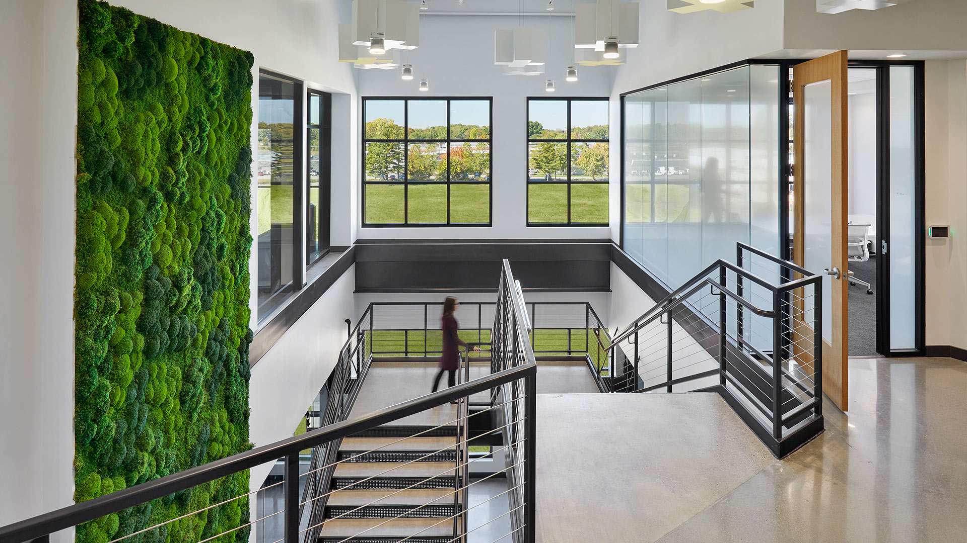
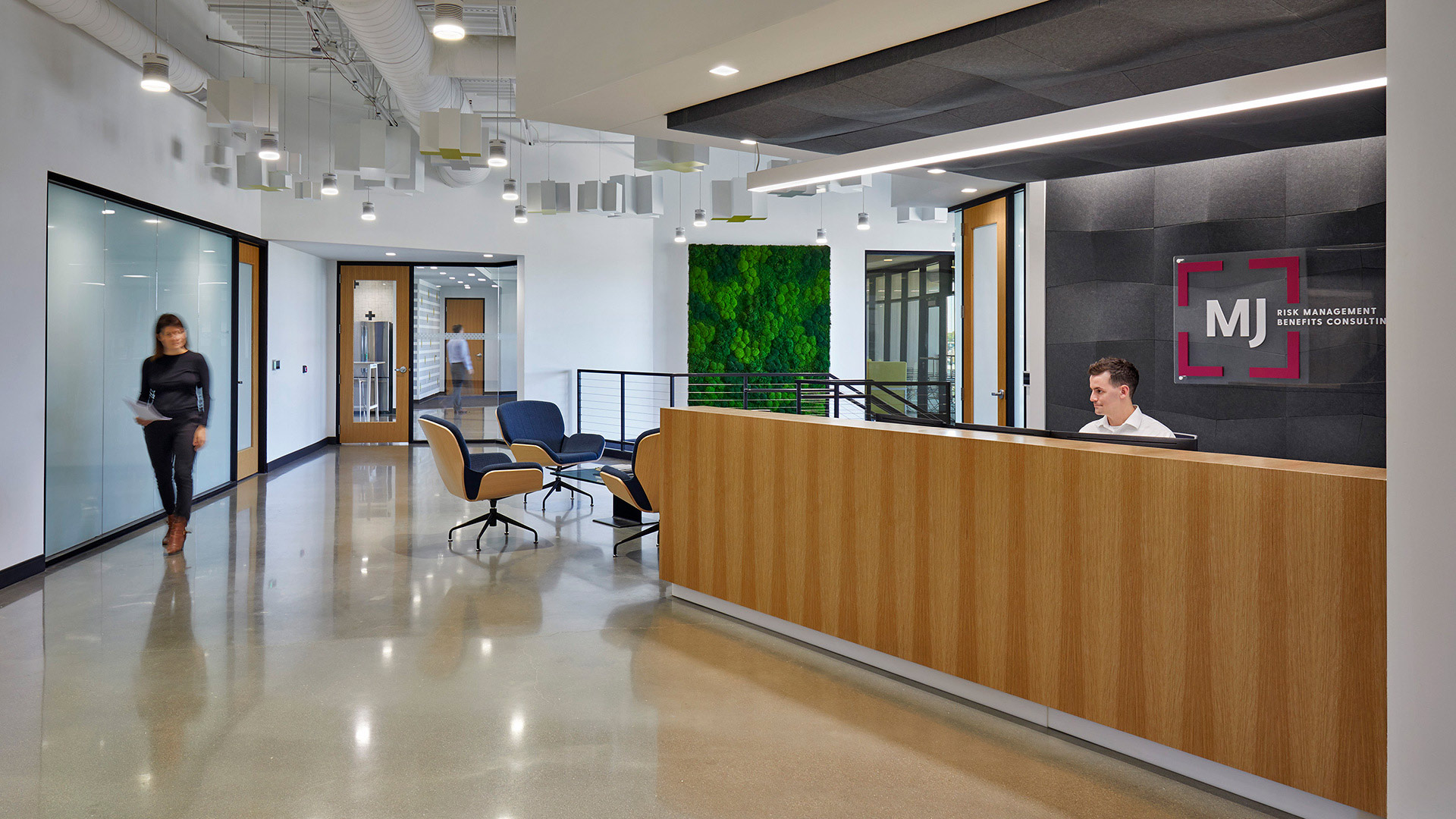
While many companies in the insurance industry build offices with high walls, MJ Insurance set out to buck norms. They moved to a highly collaborative open office environment unique to their industry. In order to support this culture-promoting design decision, the team included conference rooms, enclaves, and focus rooms of many shapes and sizes to ensure that both morale and productivity would increase in the new space.
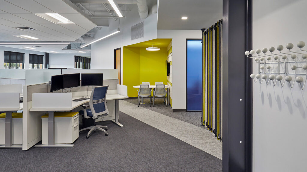
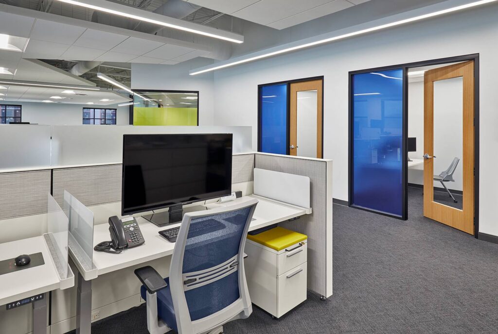
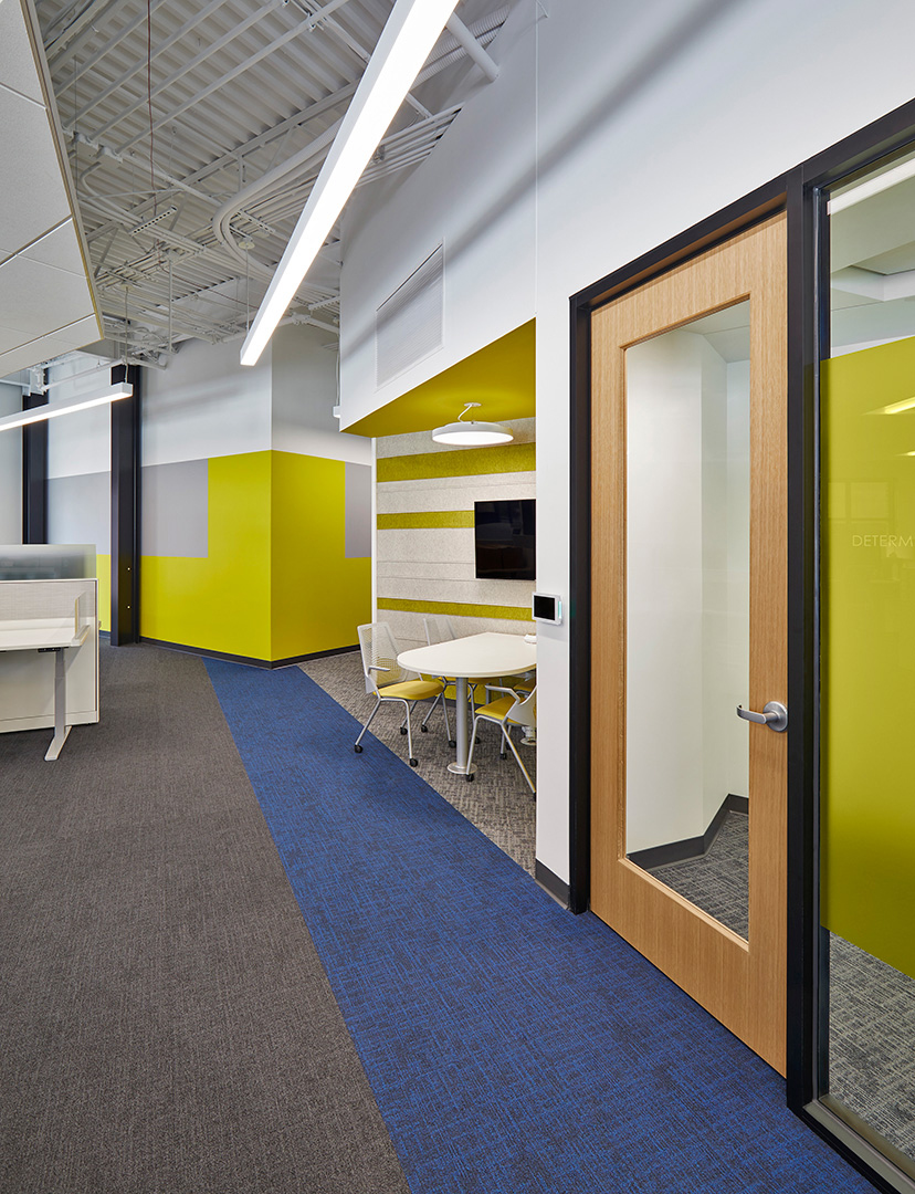
Designers worked to provide the right furniture solutions to support an open work environment with a strong need for both collaboration and privacy. Company leadership showed their commitment to the design by joining the employees in open office workstations.
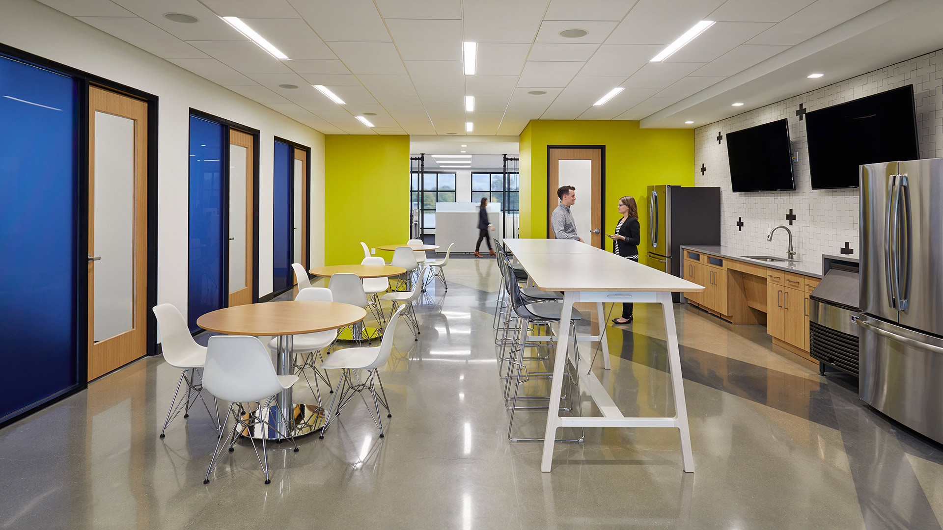
The culture at MJ Insurance centers around six core values: Passion, Leadership, Personal Development, Incremental Growth, Innovation, and Fun. These values drove the entire design – from the open office configuration to the centrally located social areas – but they are most evident in a consistent branding concept.
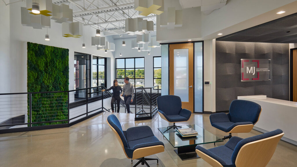
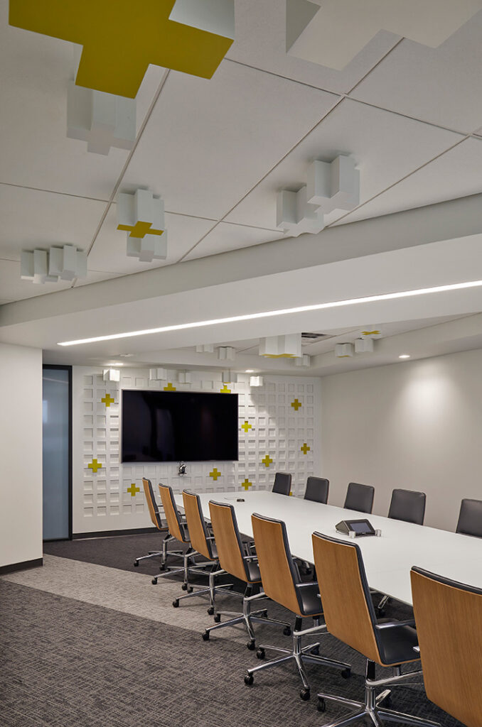
MJ’s boardroom connects to the lobby with a glass storefront, which allows a branded art installation to span the two spaces. At the far end of the conference room is a white grid with vibrant yellow plus signs at many of the intersections. That grid becomes a series of extruded white-and-yellow plus signs of various heights and sizes, suspended from the ceiling and streaming into the lobby until they end over the monumental stair. The grid represents the discipline required for leadership, personal development, and incremental growth while the shape and color of the plus signs connect to MJ’s values of passion and fun. The company instantly connected with the installation and used the concept to relaunch their national brand.
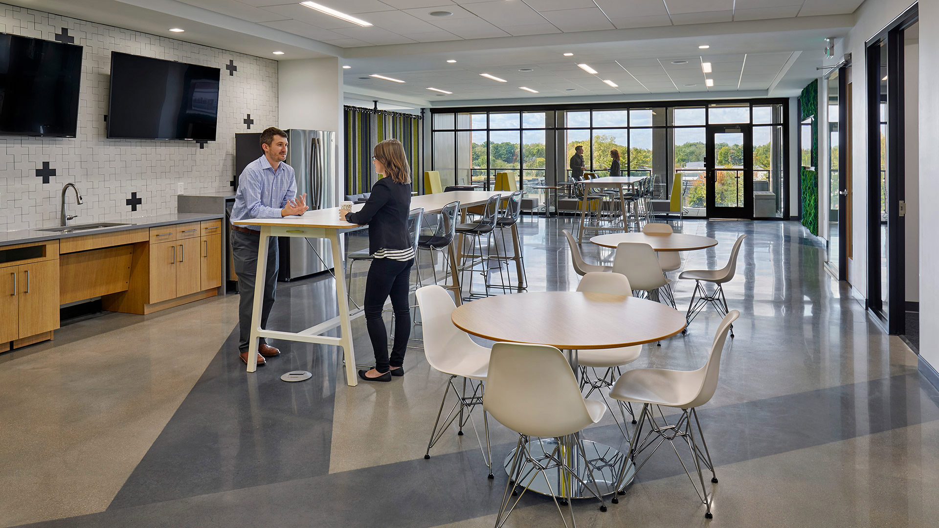
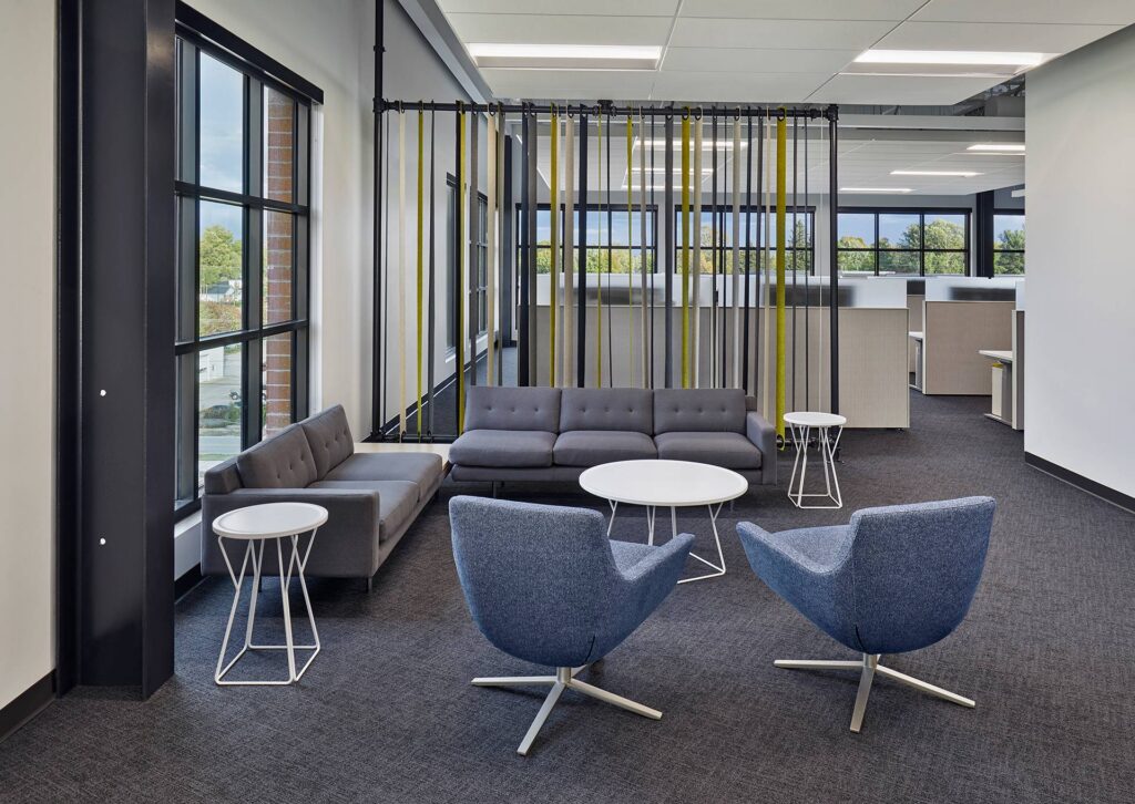
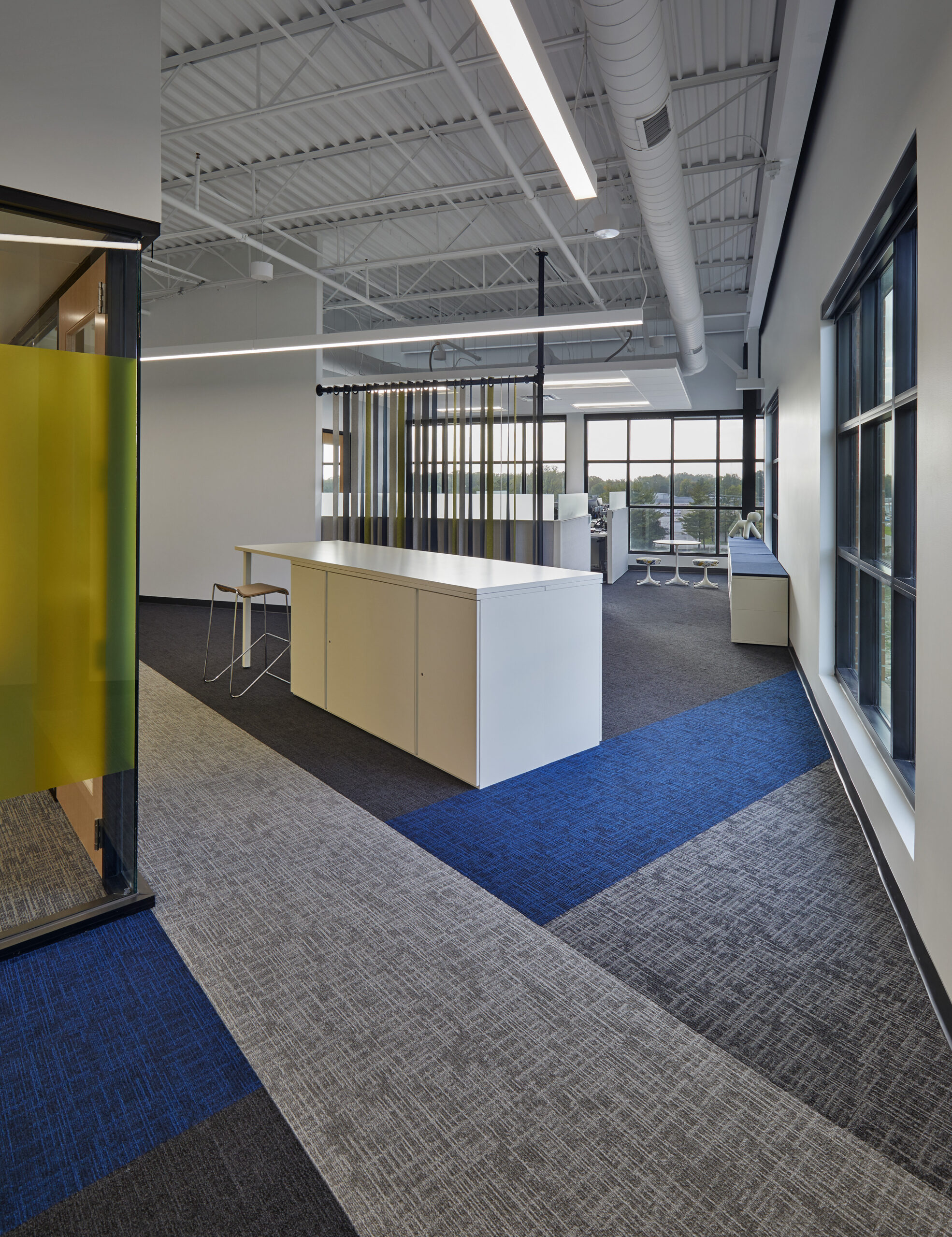
MJ Insurance asked for an infusion of fun in their space. Sliding felt panels, a carpet pattern developed, and a unique series of branding elements did just that for this hard-working group.
,
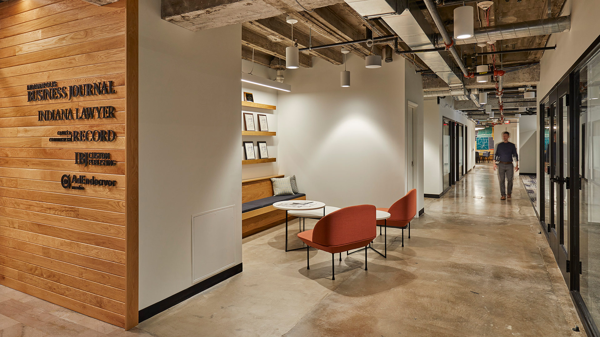
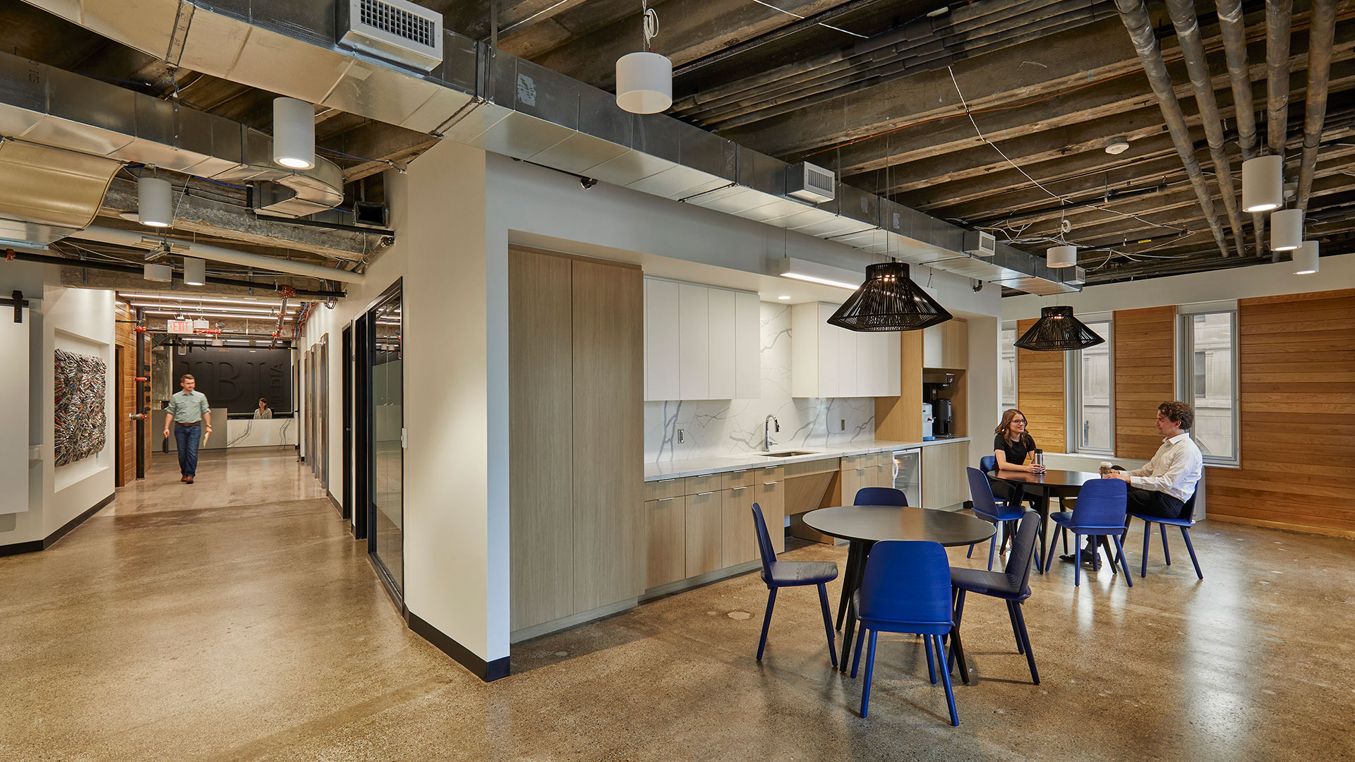
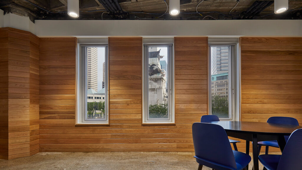
Cursed with low ceilings and odd angles, the space presented challenges for space planning and capturing natural light. CSO’s interiors team focused on the positive – great views of Monument Circle and raw building materials that told the story of the building’s past. The designers embraced the odd building shape as an opportunity to carve out interesting spaces.
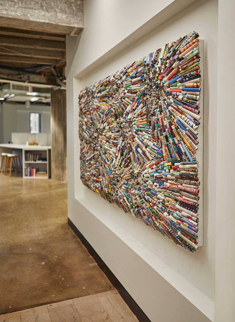
Upon entering the IBJ’s new offices, visitors are greeted by a custom art installation created from rolled up pieces of the IBJ’s past publications. Working closely with CSO, the artist took great care to highlight quirky references to Indiana, setting a sophisticated-but-fun tone from the very beginning.
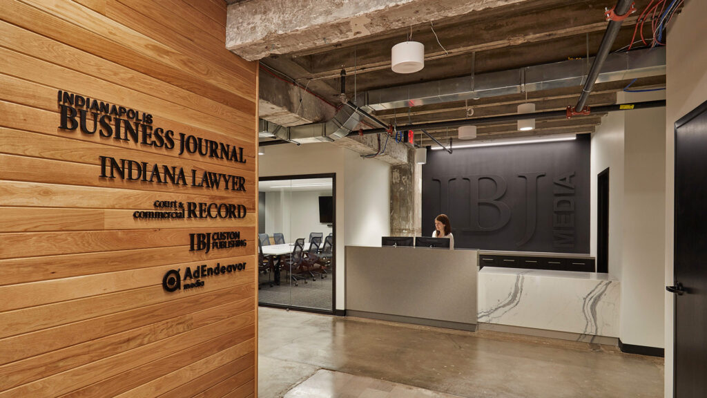
The reception desk sits in front of a black-on-black logo, representing raised printing press letters covered in black ink, a reference to the history of the profession.
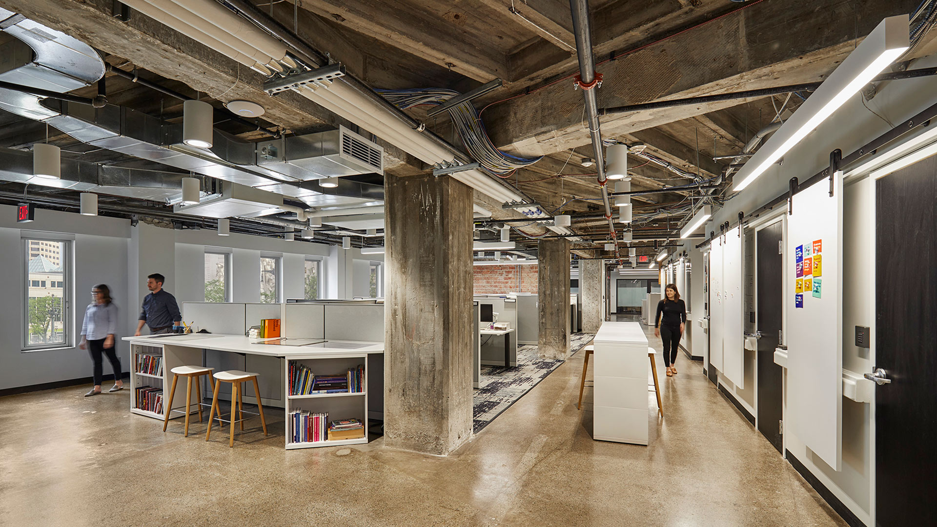
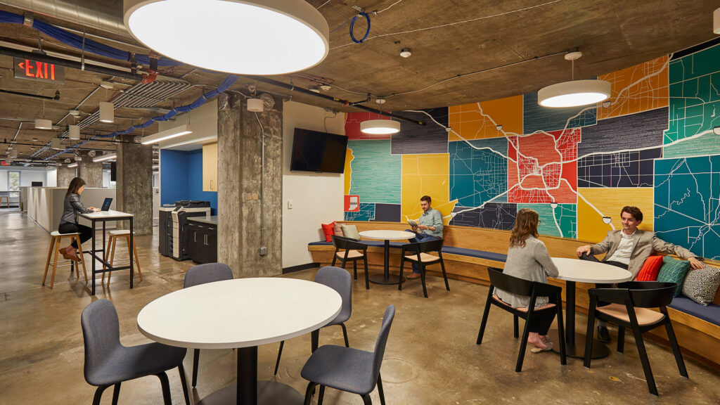
Other creative decisions were guided by the mostly linear layout of a newspaper and by the idea of the old meeting the new. As we sit at a crossroads between digital and printed news consumption, this new office tells a beautiful story of those things working in harmony with each other both in function and aesthetic.
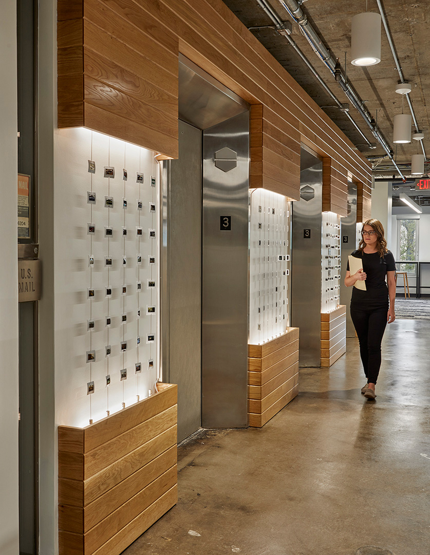
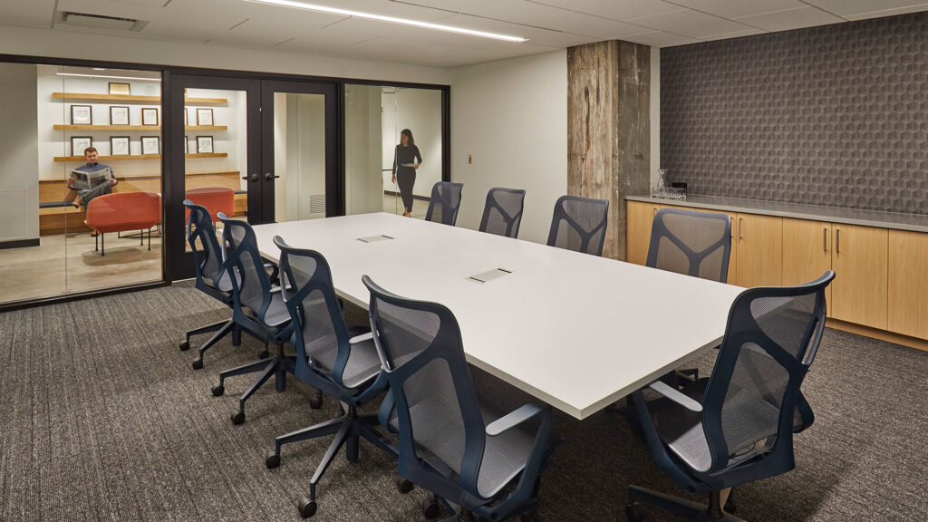
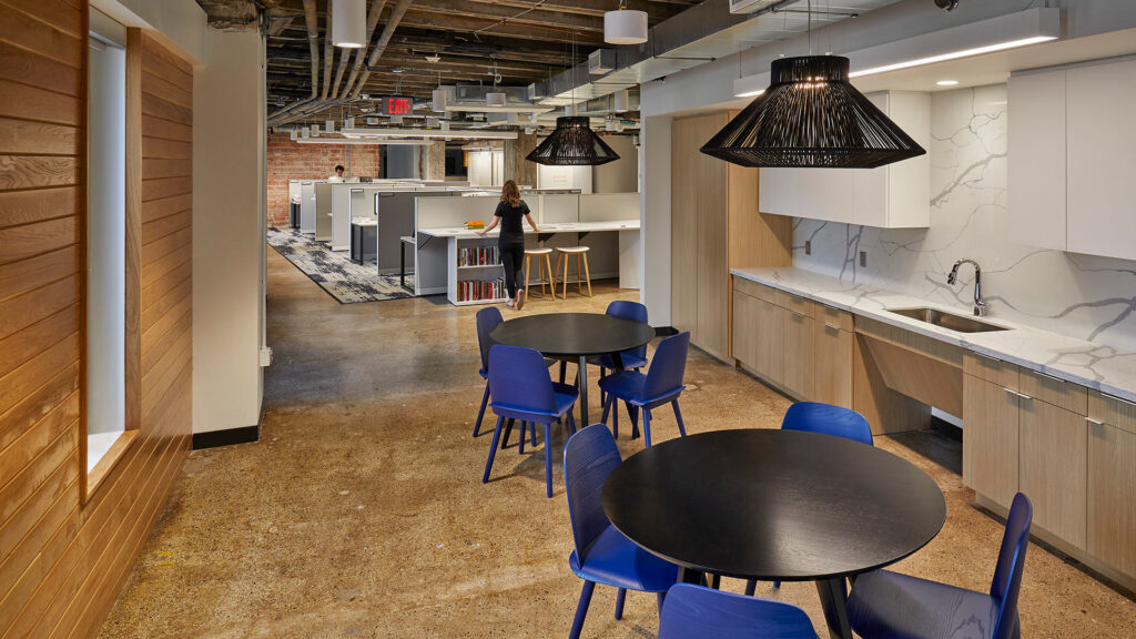
,
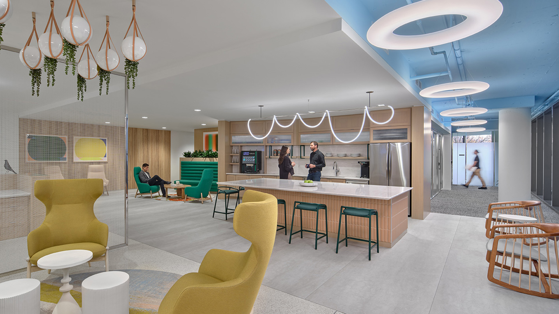
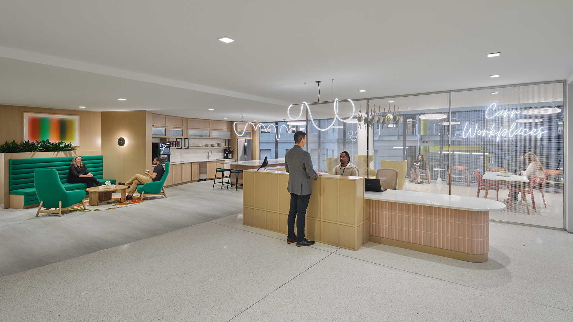
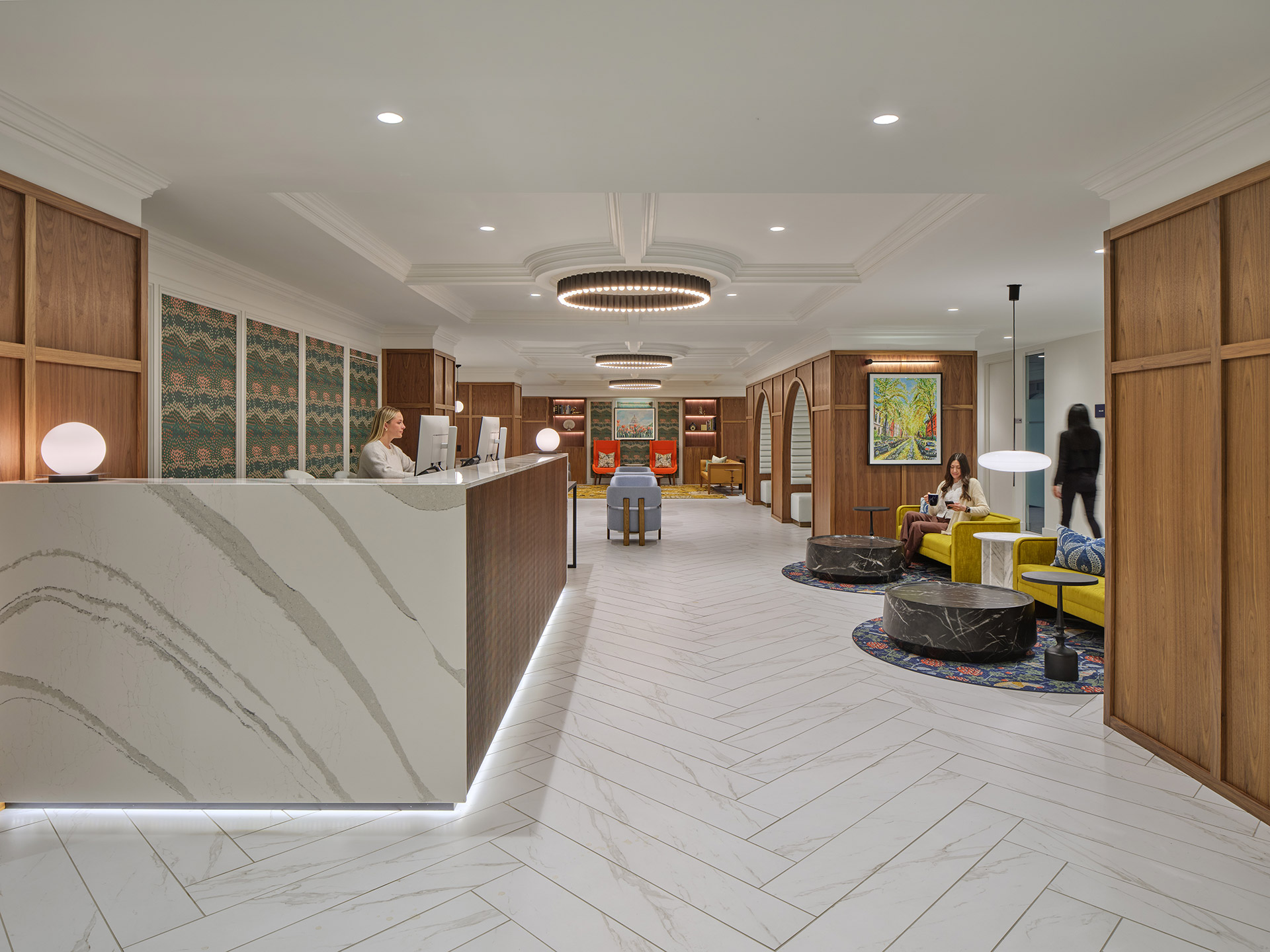
The space’s refined aesthetic balances classical inspiration with modern sensibilities. Polished chrome elements—part of the existing glass system—are deliberately contrasted against matte finishes and organic materials, reinforcing a layered, curated environment. Strong architectural gestures found in detailed millwork are paired with contemporary furnishings and stylized motifs that subtly nod to tradition without overpowering it.
Design challenges, including the integration of modern building systems within a historically influenced design language, were resolved through thoughtful coordination and detailing. Lighting, HVAC, and acoustic systems were discreetly integrated to maintain the space’s architectural integrity while supporting occupant comfort and sustainability.
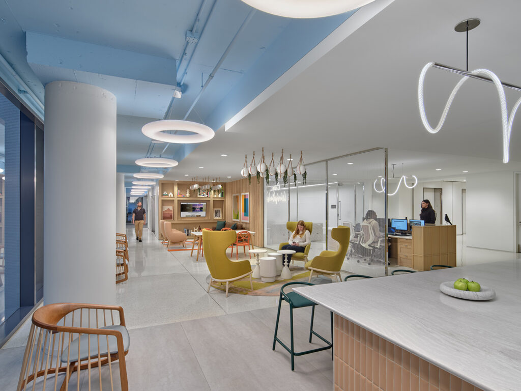
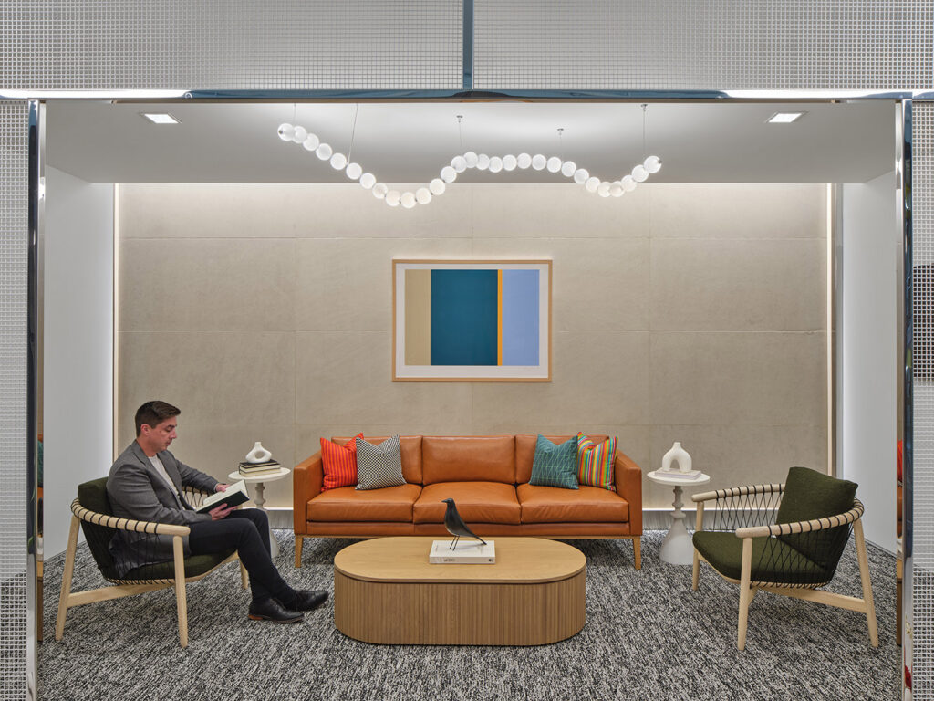
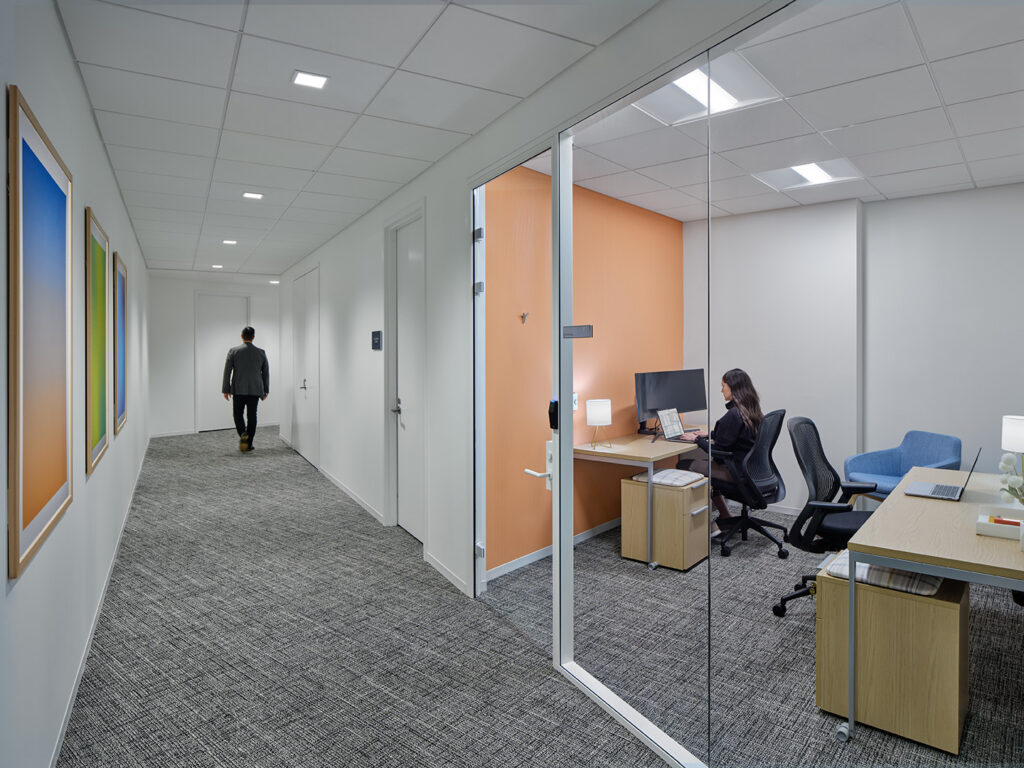
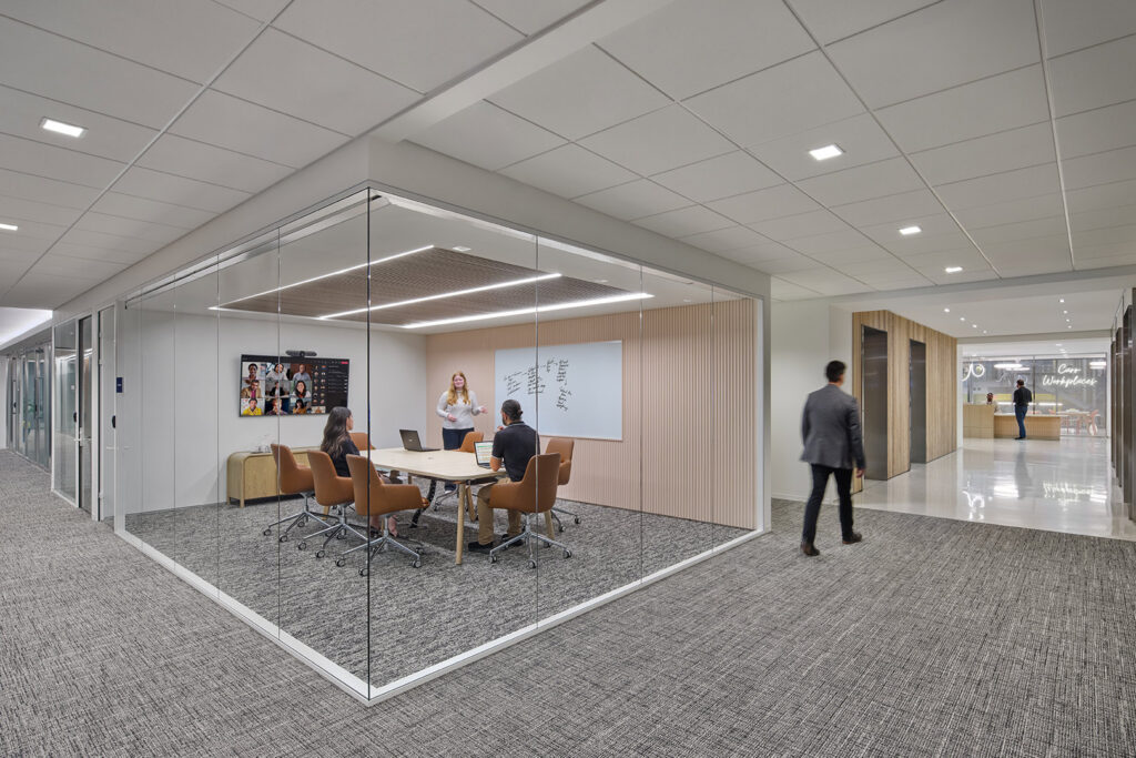
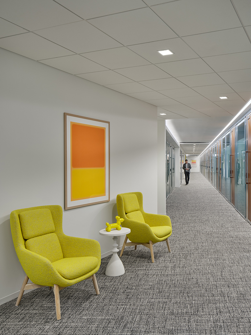
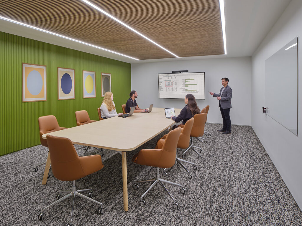
Spatial planning prioritized functionality and flexibility, with private offices, coworking zones, and shared amenities carefully arranged to promote efficient use of space and fluid circulation. Environmentally conscious choices such as energy-efficient lighting, sustainably sourced materials, and low-VOC finishes further support wellness and conservation goals.
By marrying the elegance of classical architecture with the needs of a modern workplace, the Capitol Hill location offers a space that is both inspiring and functional—a refined composition that celebrates its context while looking confidently toward the future.
,
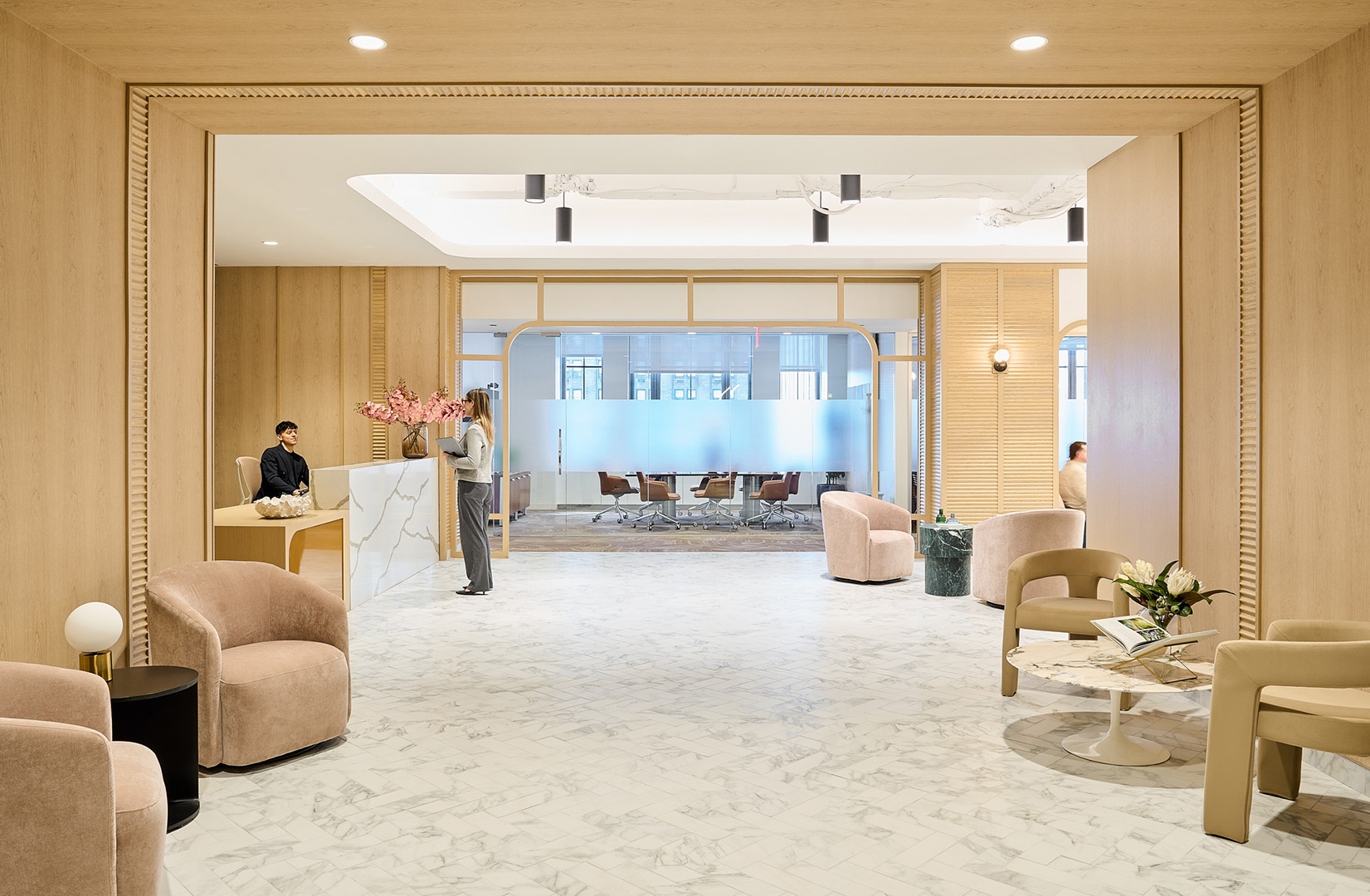
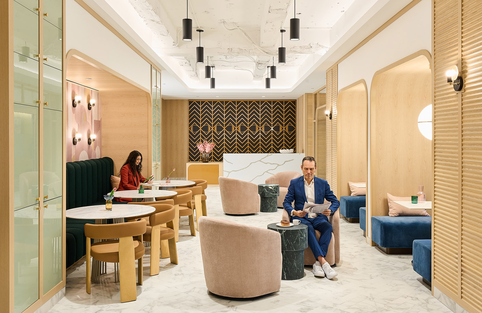
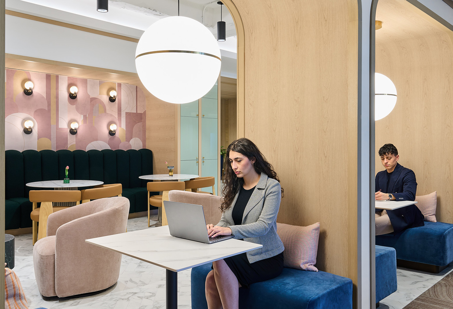
The color palette draws inspiration from the natural surroundings by utilizing earth tones and wood contrasted with black and brass details. Arches, fluting, and stone-look countertops and flooring bring elegance into the space allowing it to evoke a grand demeanor. By combining a tranquil pallet with sleek finishes, the workplace becomes a space where glamour and elegance can coexist.
.
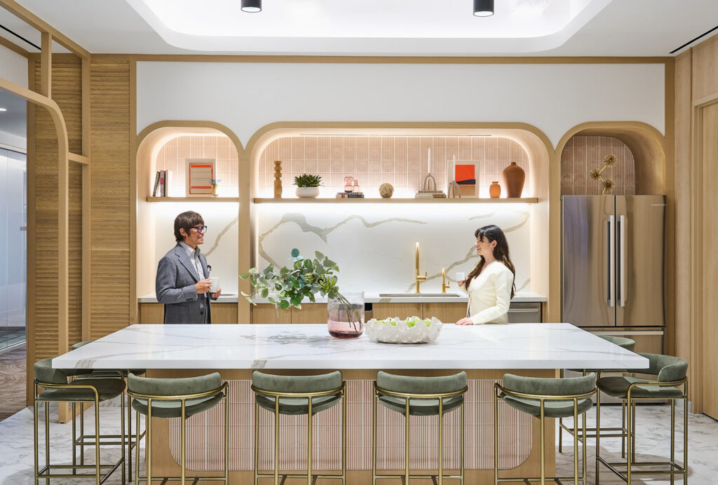
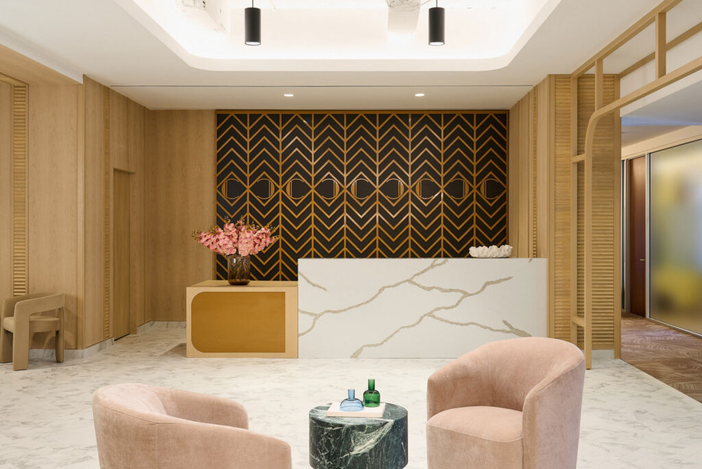
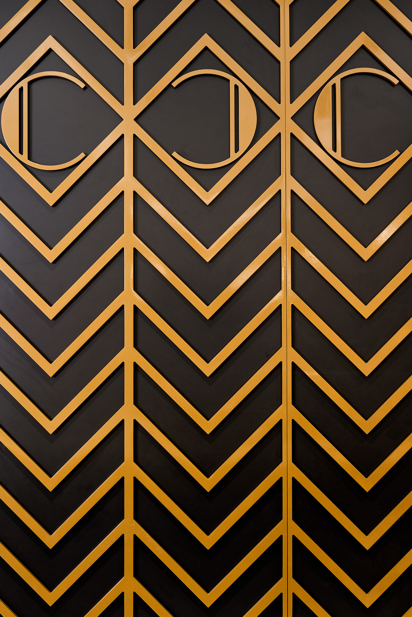
This coworking space aims to be a haven for professionals seeking a unique and inspiring work environment within the heart of New York City. It marries the timeless elegance of Art Deco with the practicality and functionality demanded by the modern workforce, creating a space where work and creativity thrive.
,

Expanded Facilities Support Hands-On Learning and Student Collaboration
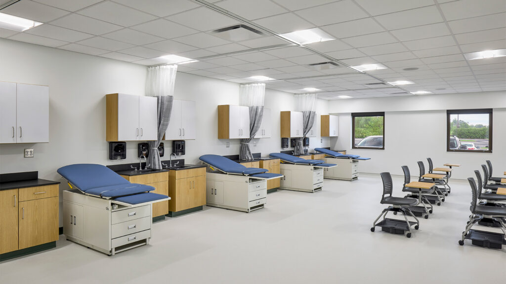
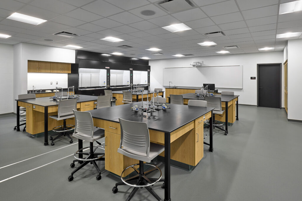
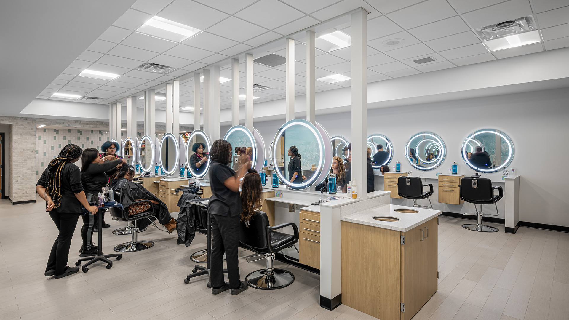
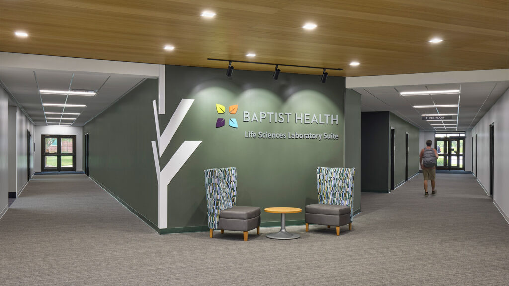
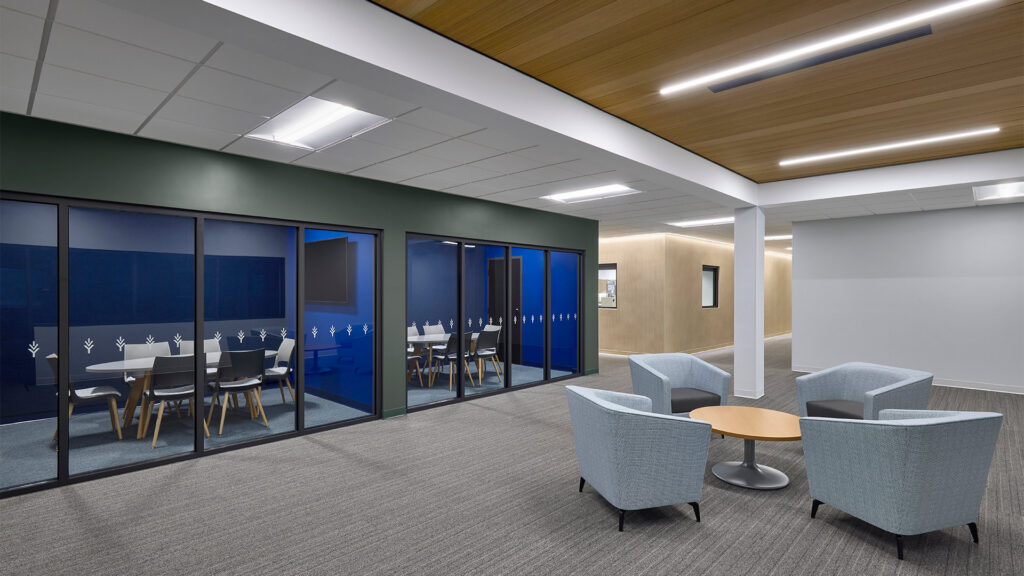
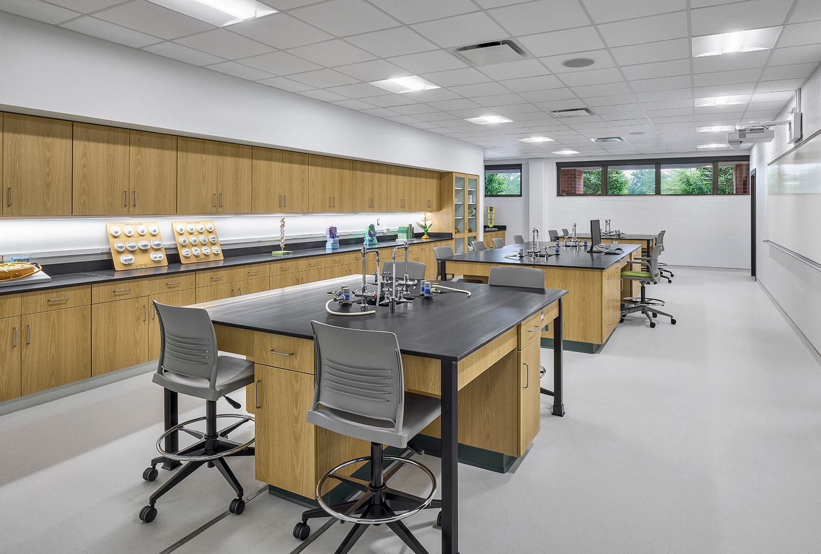
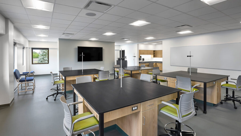
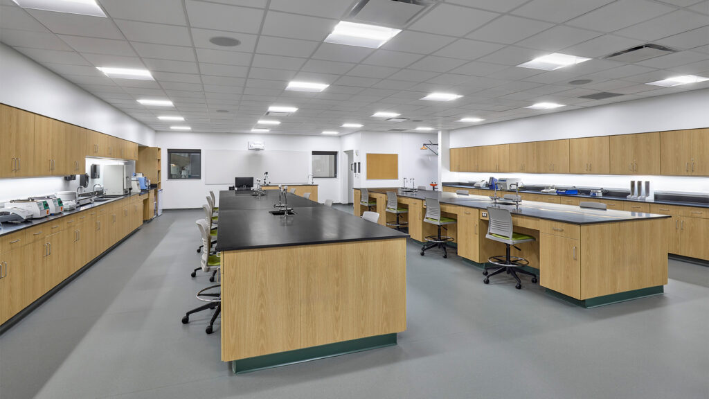
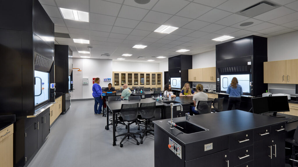
The second area of interior renovation included an 8,800 sf renovation for the Life and Physical Sciences program. Renovated lab spaces include Anatomy, Biology, Microbiology, and Chemistry labs. Each of the labs includes large laboratory prep areas with separate exhaust hoods and storage. Many of these labs existed previously within Pfau Hall, but this project relocated them to a central location and completely modernized the spaces.
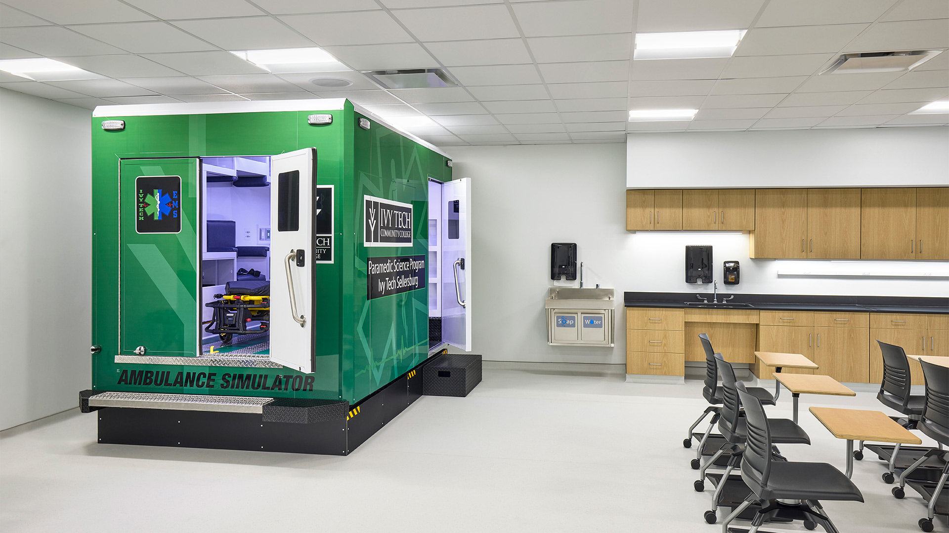
Renovation to all areas included a new space / wall layout, all new finishes, new mechanical/electrical/plumbing systems (including HVAC systems and LED lighting throughout), new information technology infrastructure, and a new fire suppression system because the existing building was not sprinkled.
,
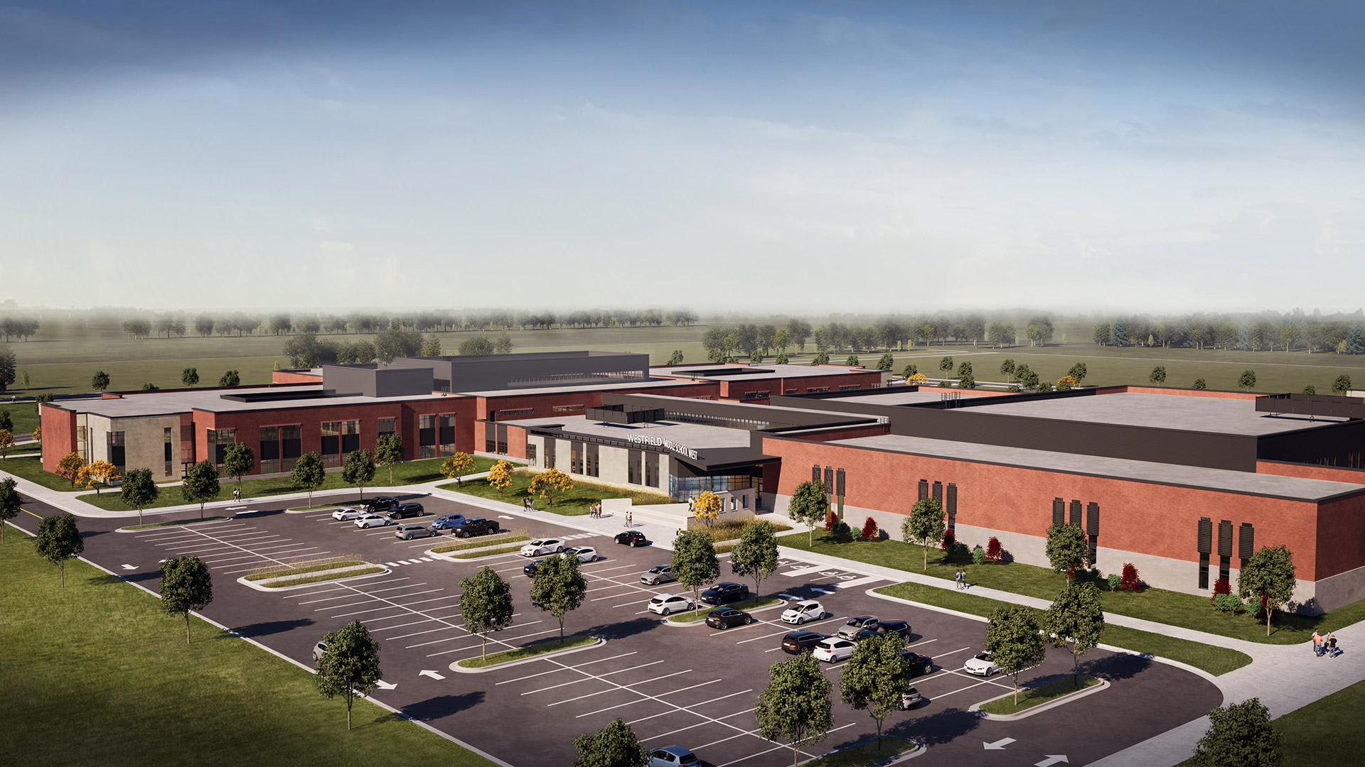
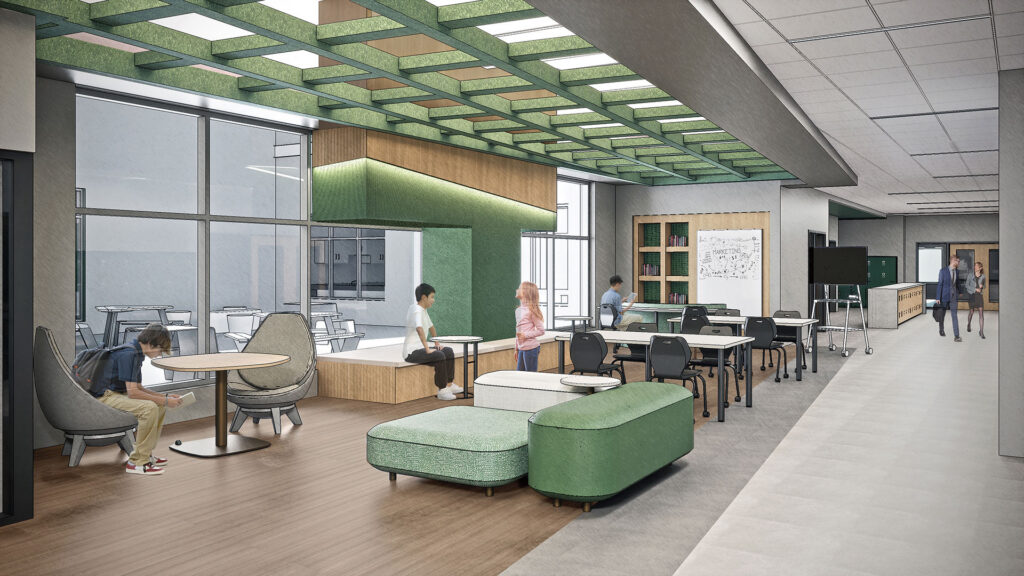
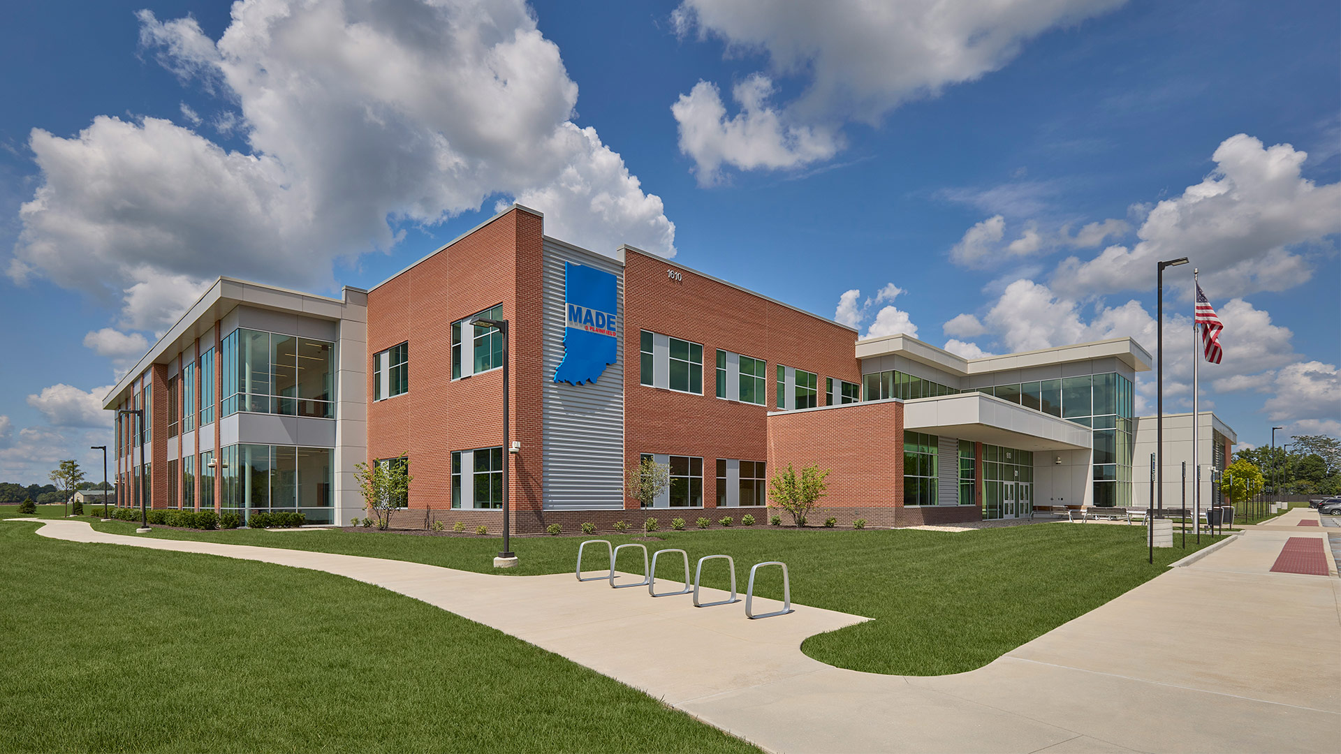
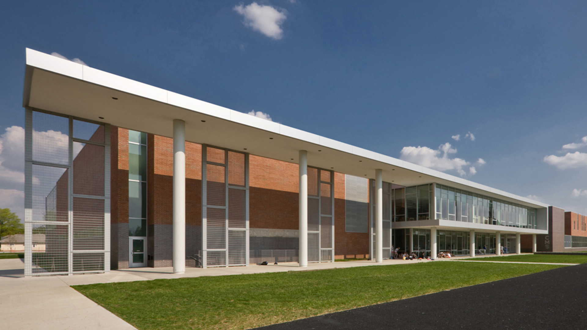
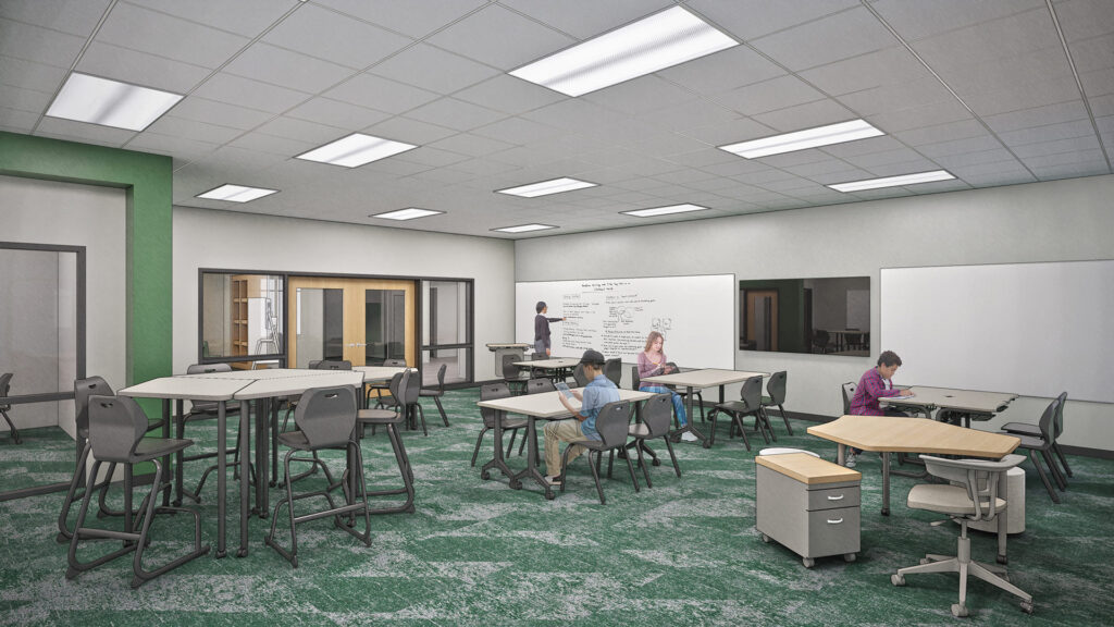
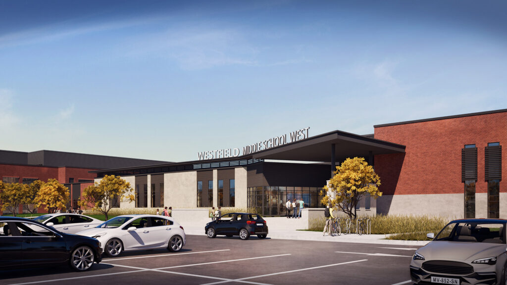
Each grade-level “Academic House” consists of a shared common area, four classrooms with small group rooms in between, restrooms, and a shared STEM lab.
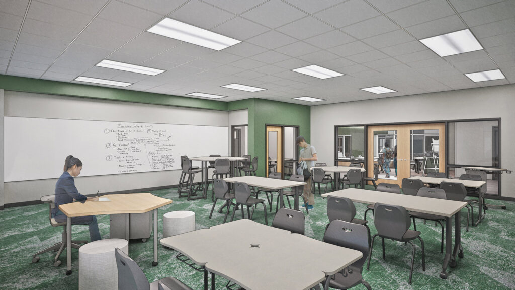
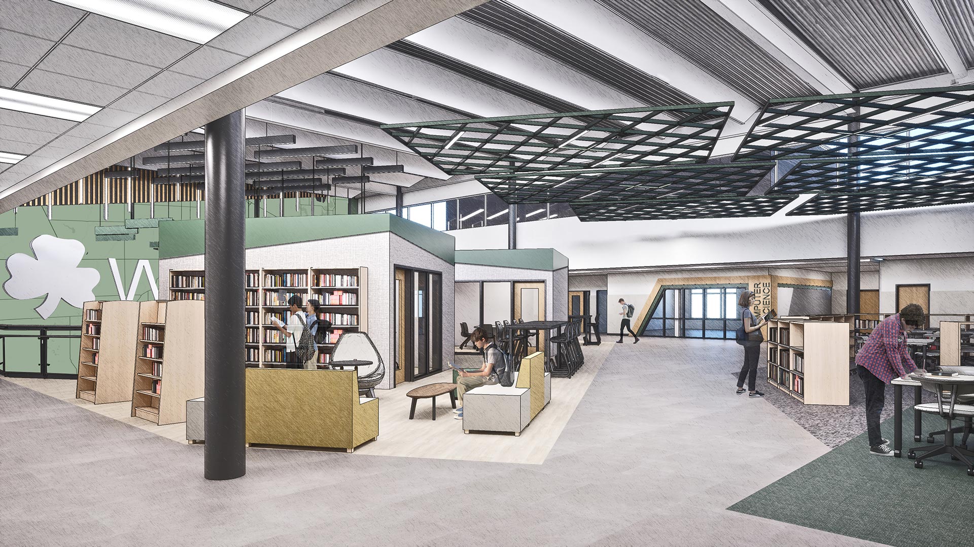
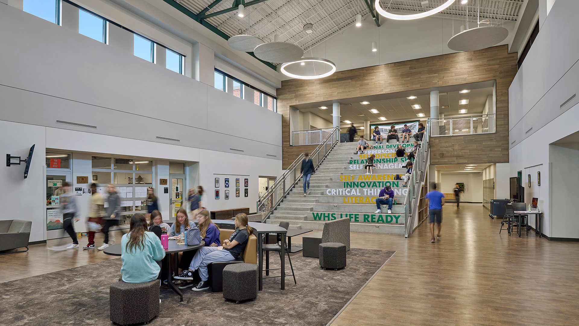
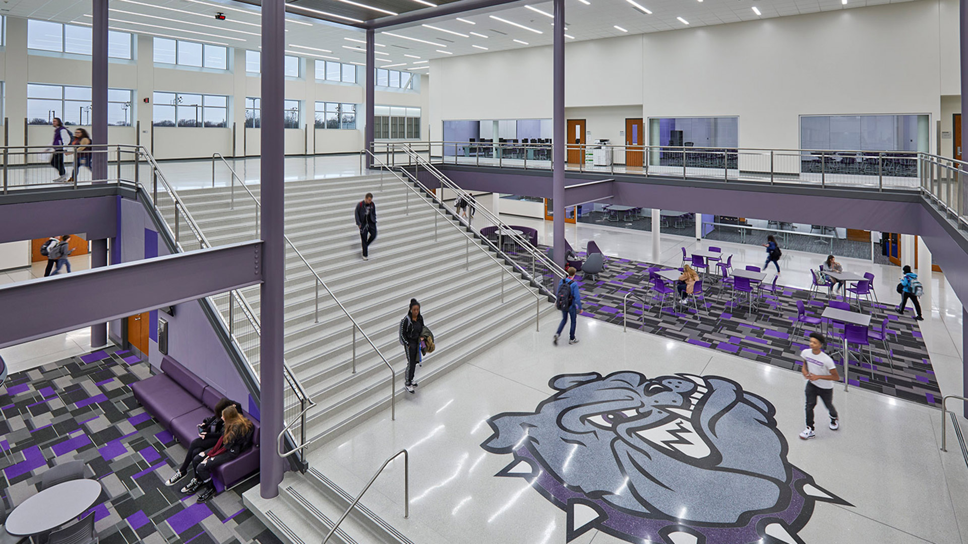
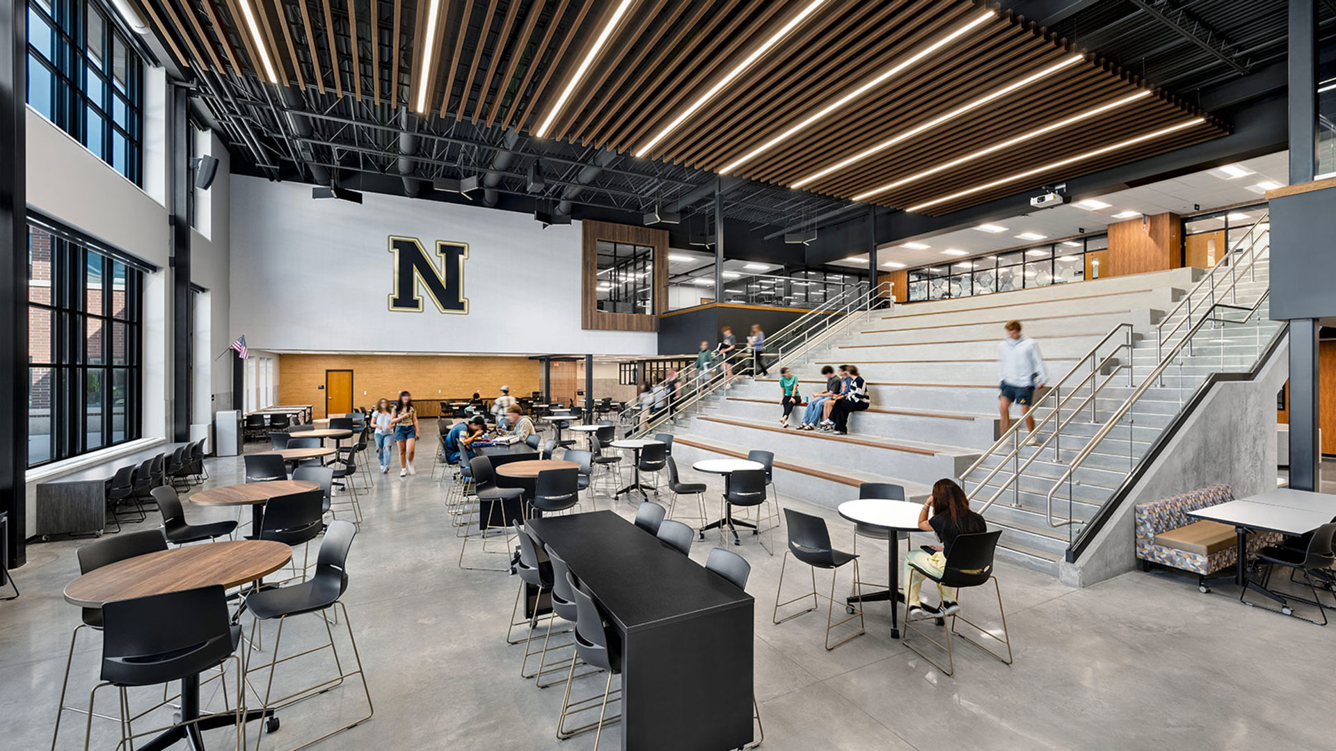
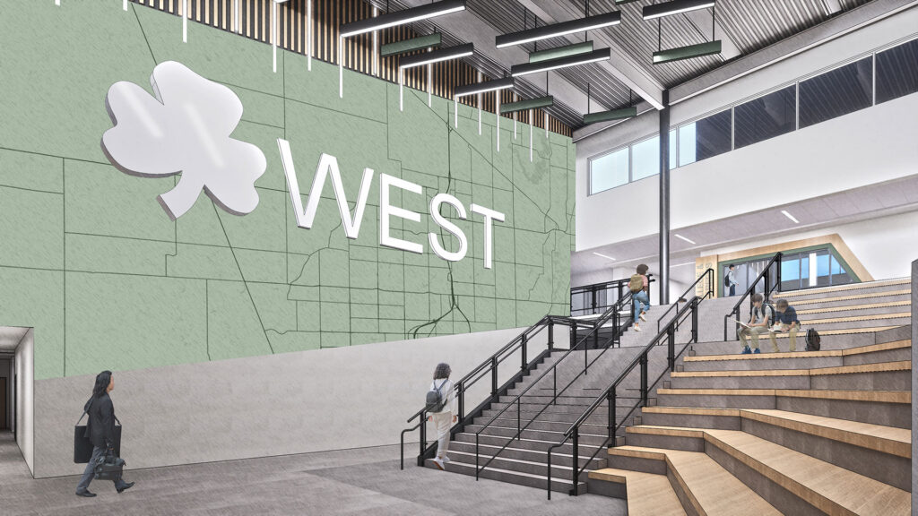
At the center of the school is a cafeteria on the first floor with a large gathering stair leading up to the media commons.
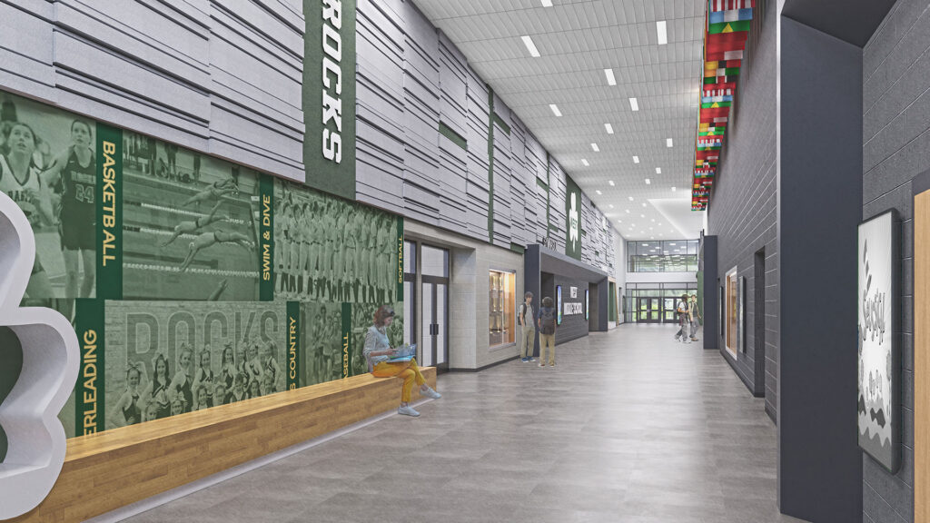
Strategic Separation of Spaces
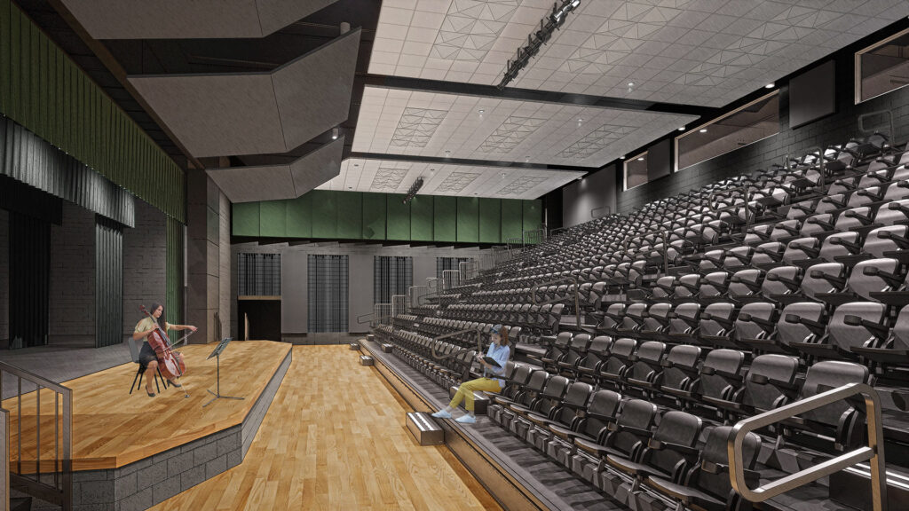
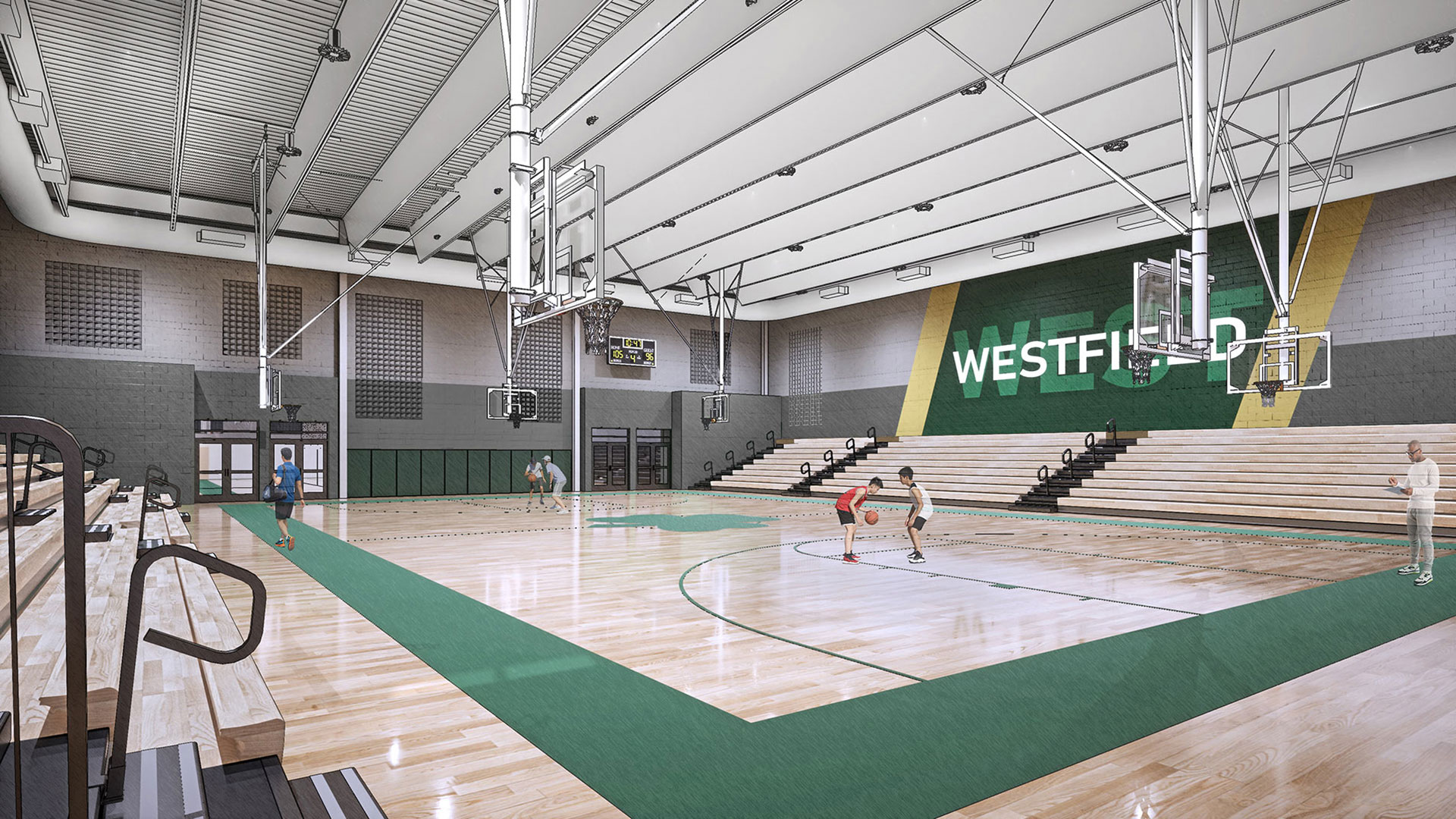
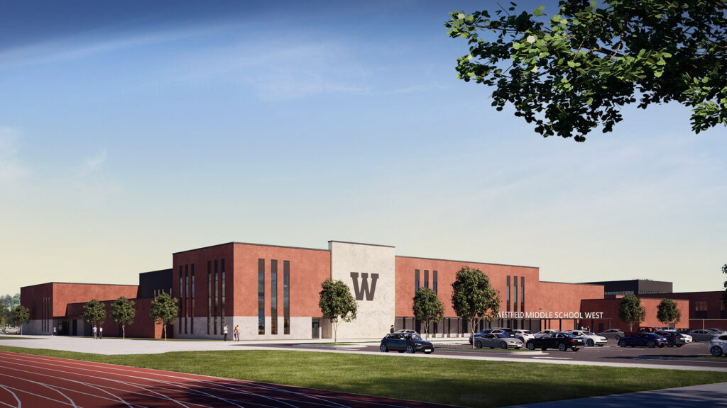
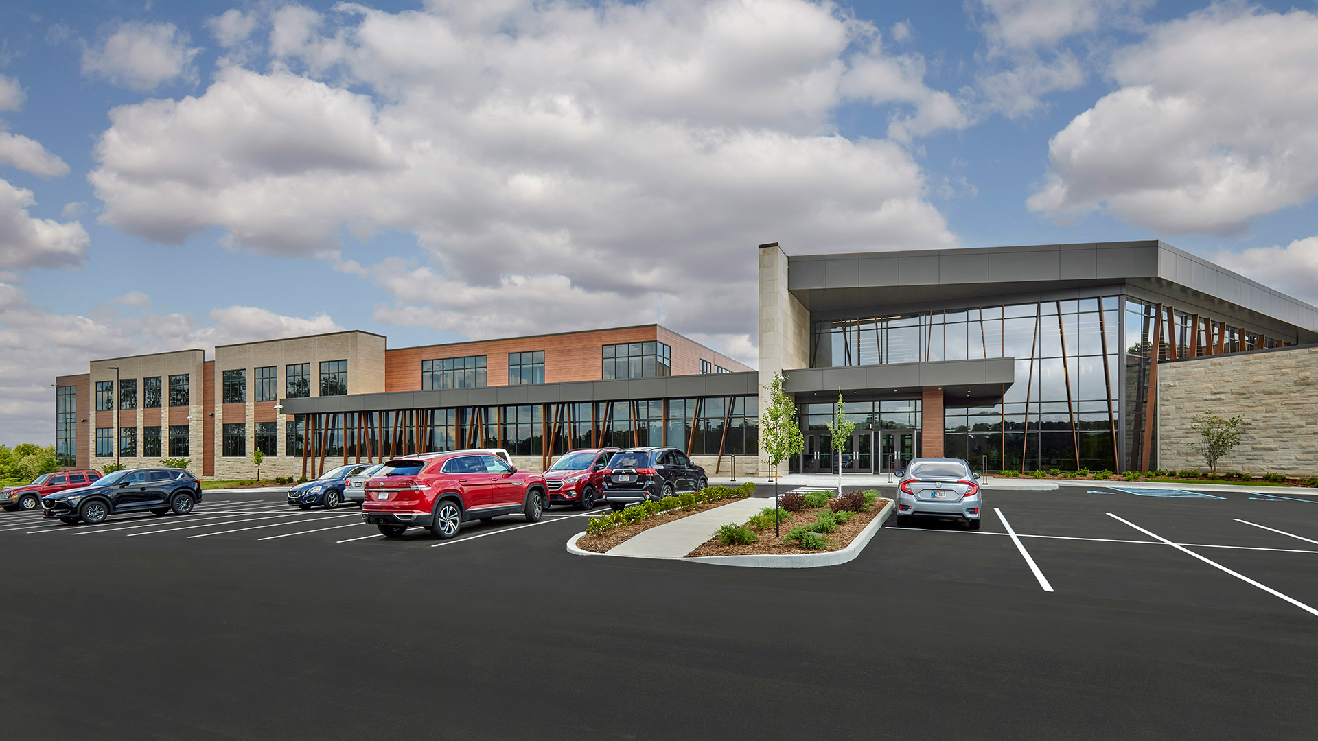
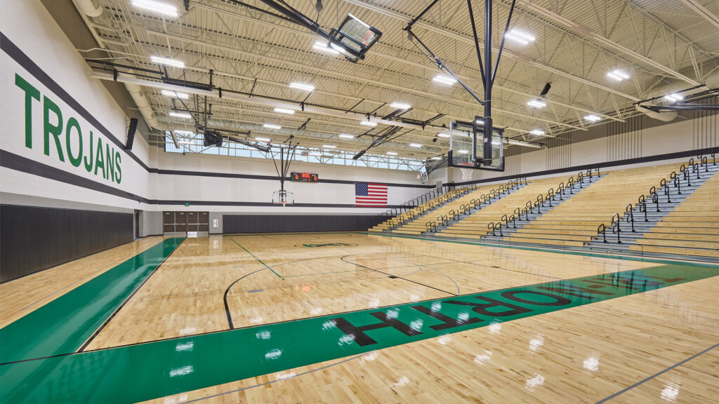
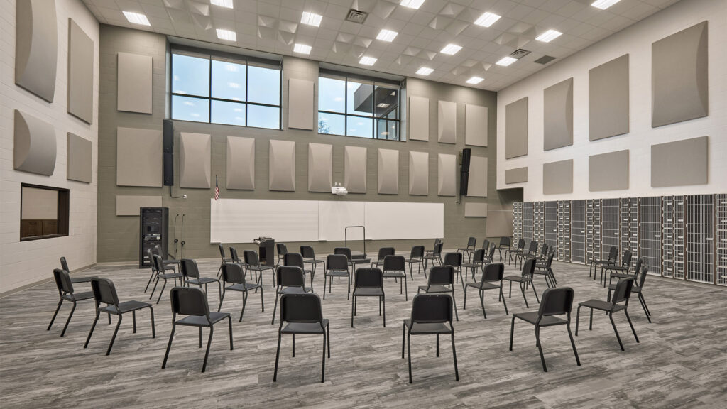
The far end of the building houses athletic and performing arts spaces, including a flexible theater and two gymnasiums.
,
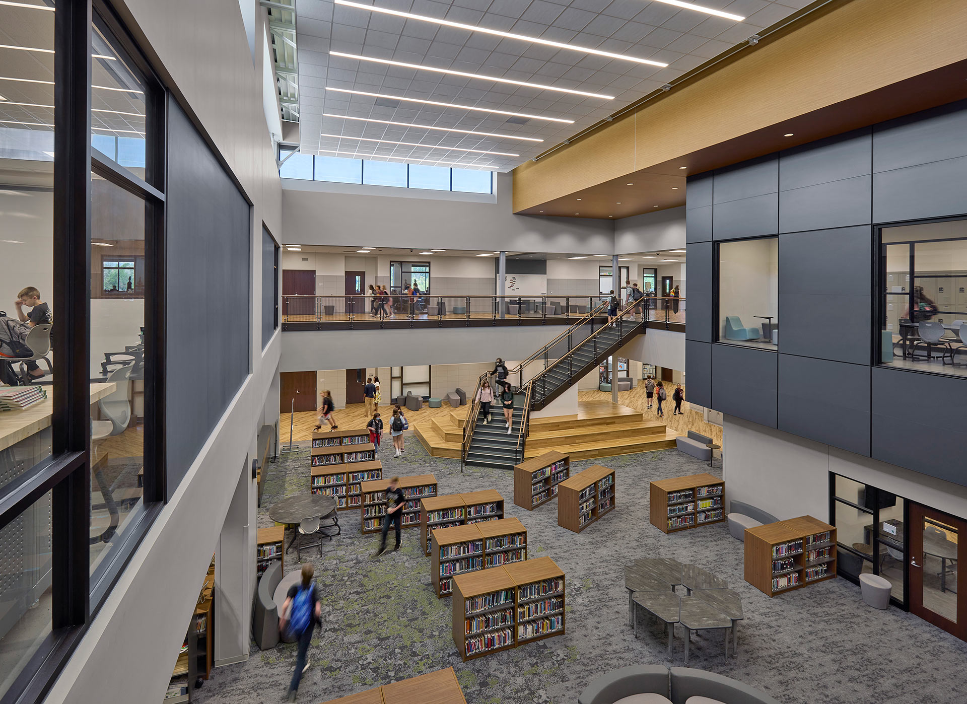
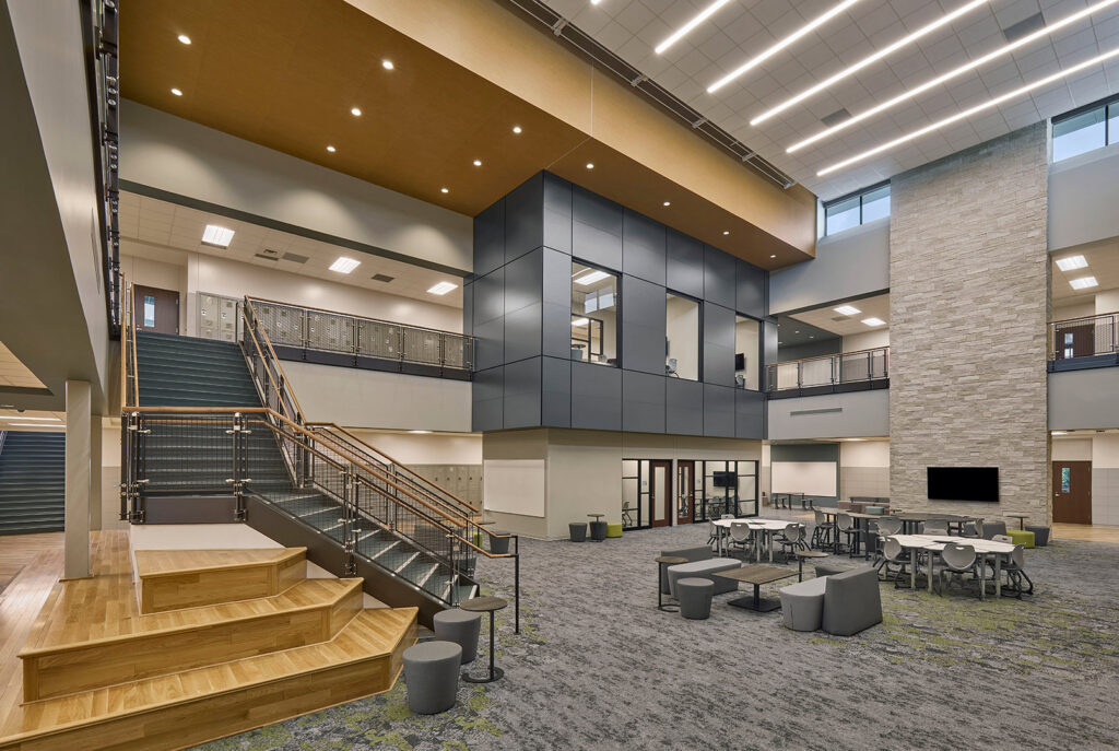
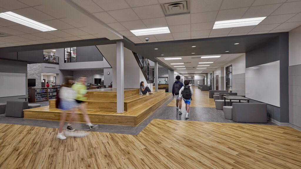
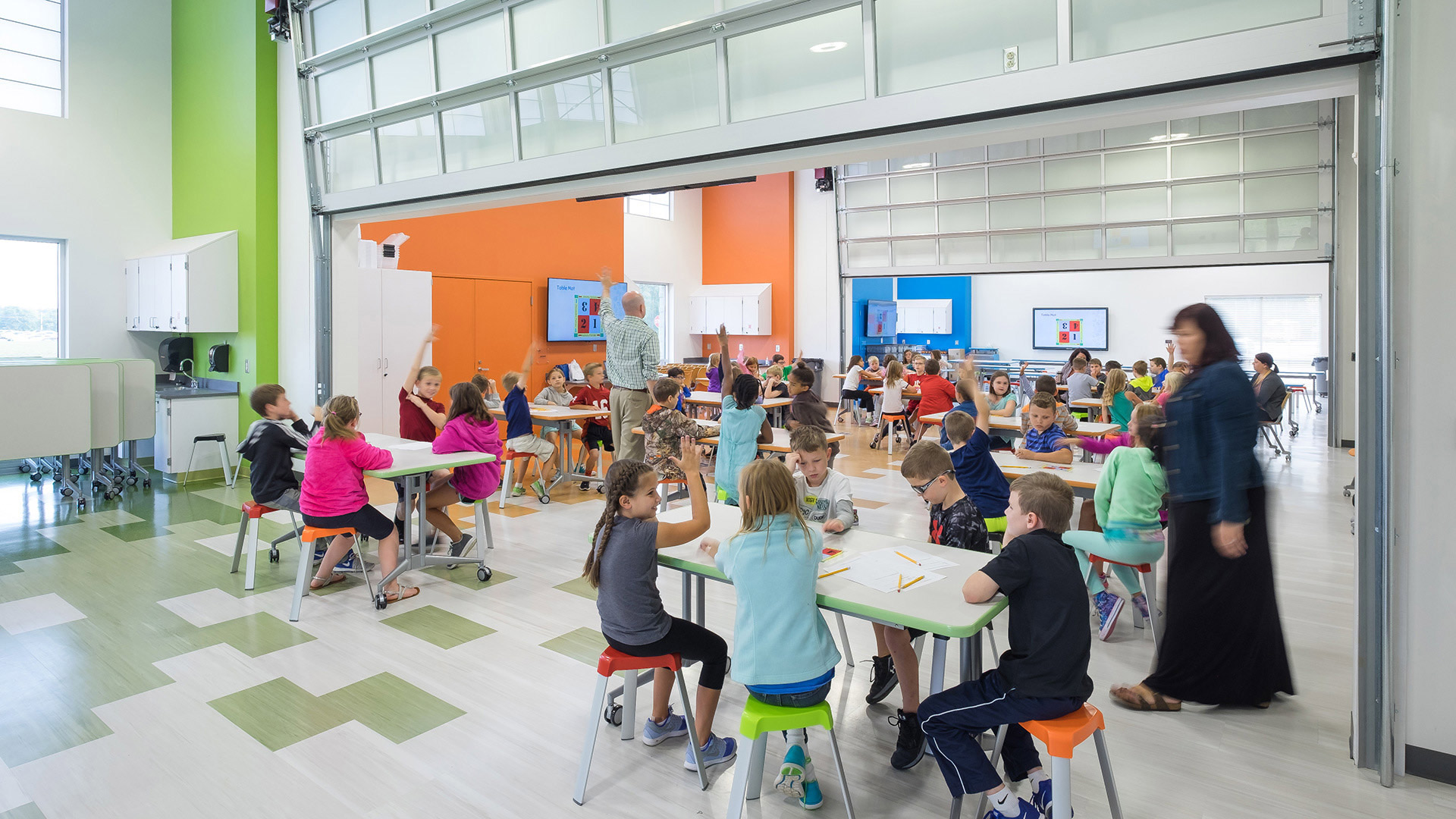
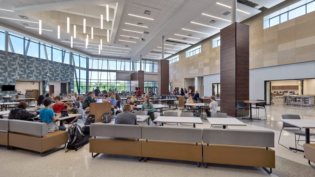
In place of a standard cafeteria, a large student commons serves multiple purposes throughout the day as a gathering space for students before and after school, an event space, or an instructional space during school hours.
Learning on Display
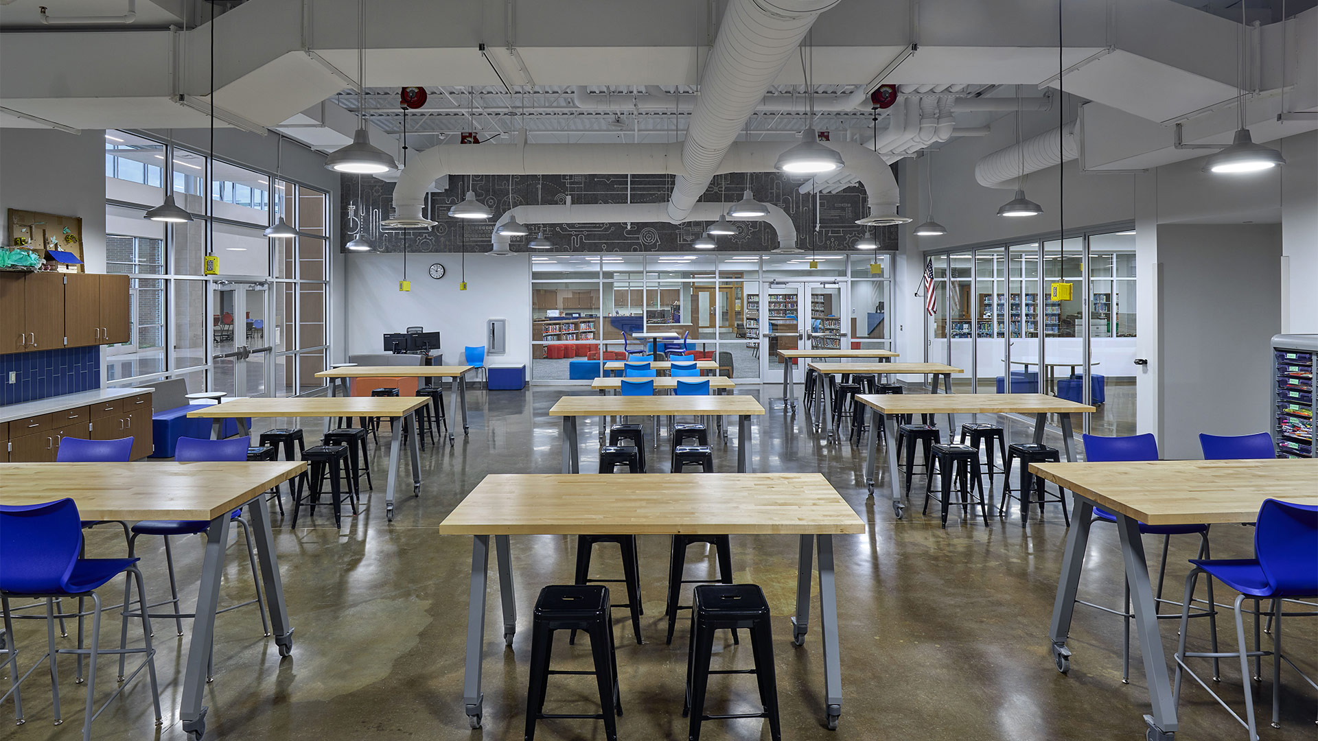
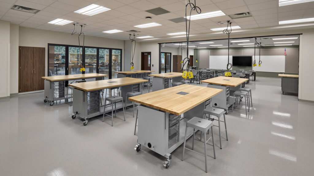
STEM labs overlook the Student Commons with foldable glass doors that open up to connect the two spaces.
Designed for Maximum Flexibility
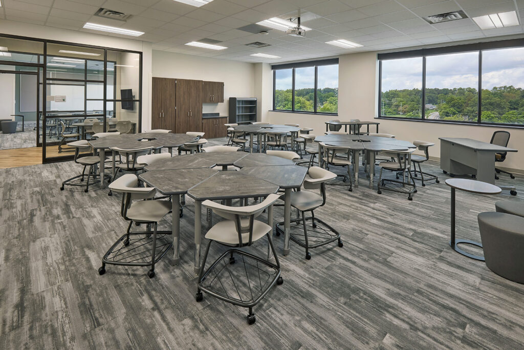
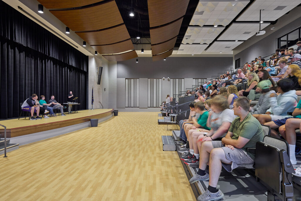
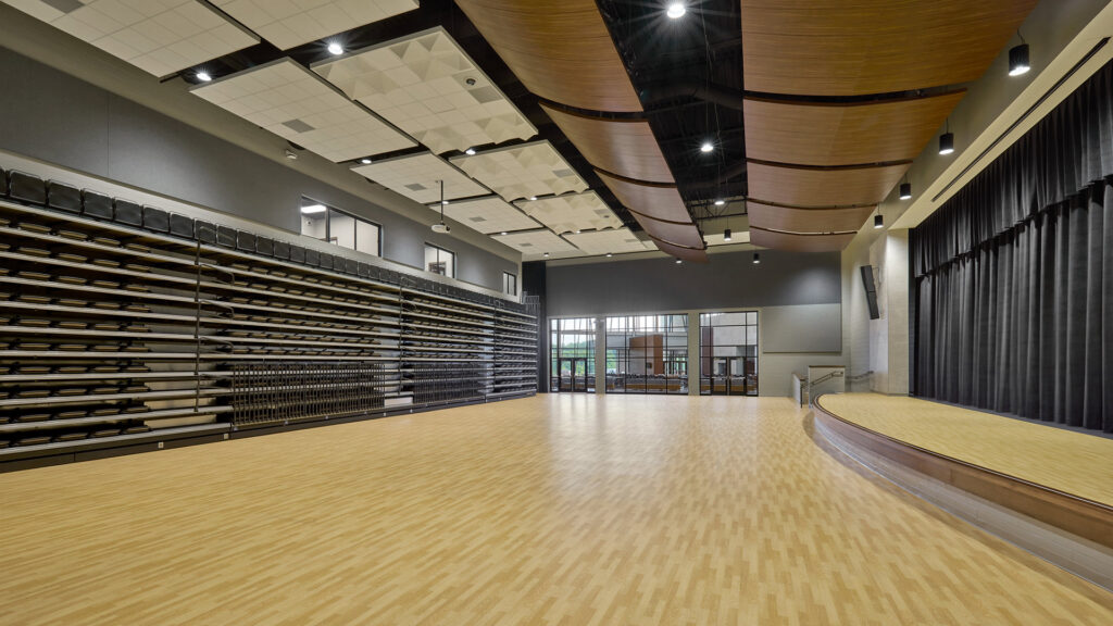
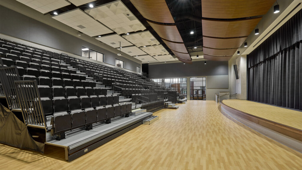
A multi-purpose performance / large group instruction space features retractable theater seating and padded athletic flooring, allowing the space to be used for overflow from the main gym, large student gatherings, or community events.
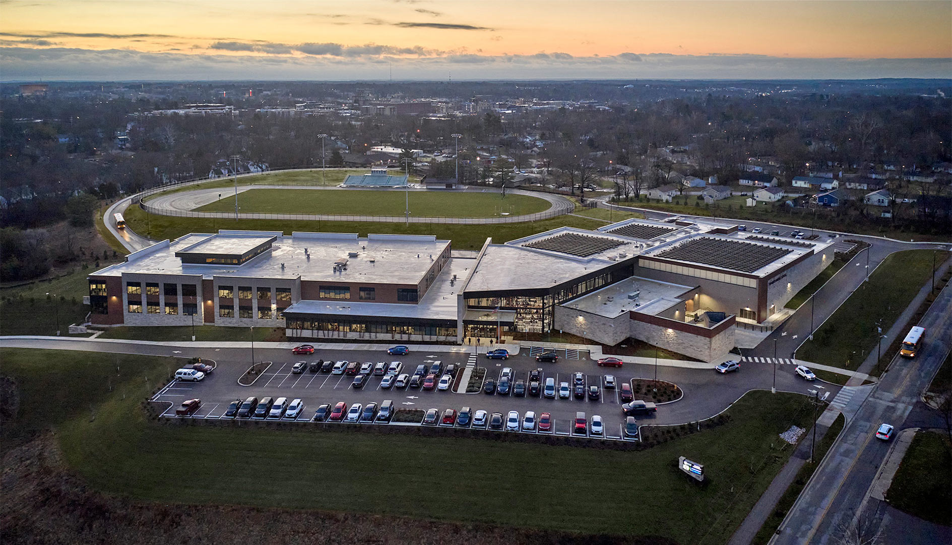
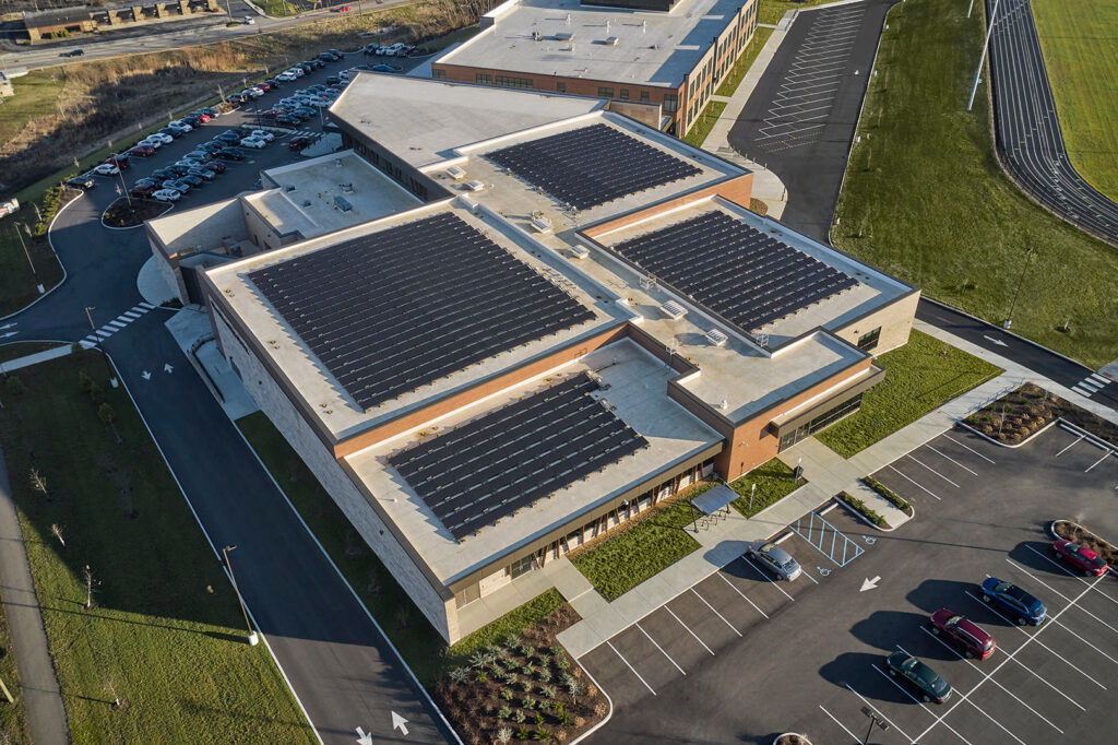
Sustainable design is integrated throughout the building with features such as a solar array, geothermal heat pump system, locally-sourced Indiana limestone, low-E windows, and a digital display that allows students to track energy consumption in real time.
,
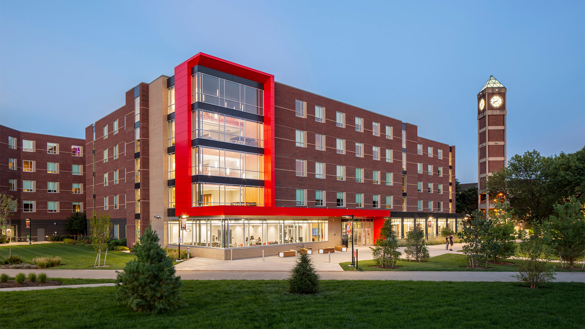
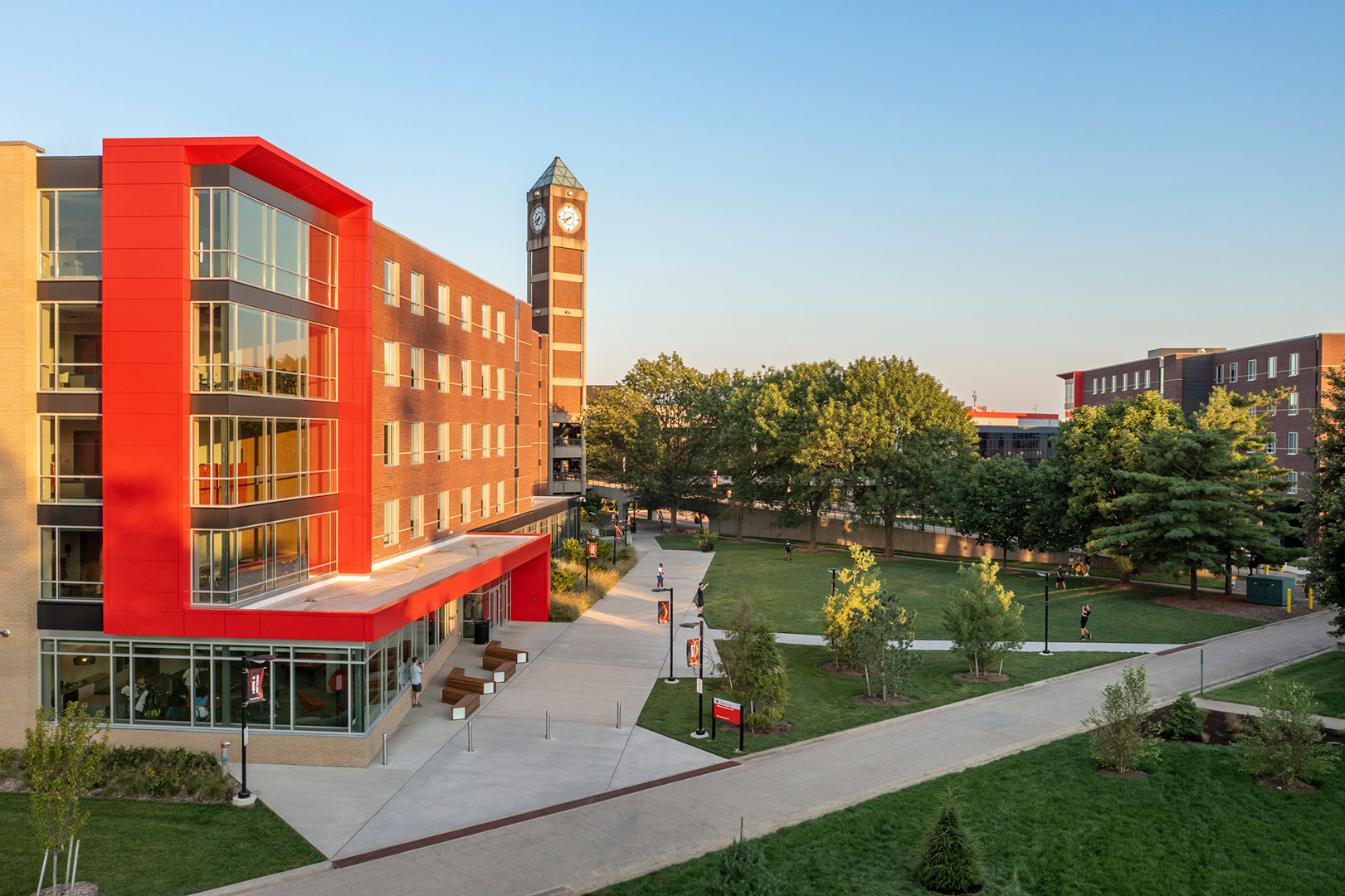
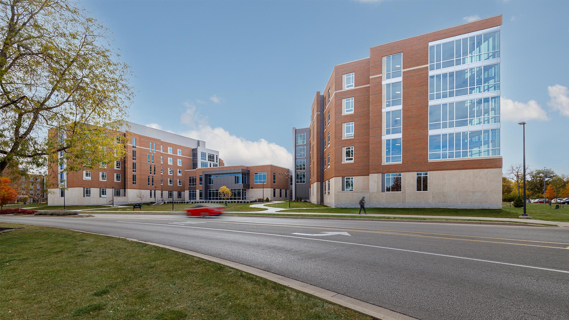
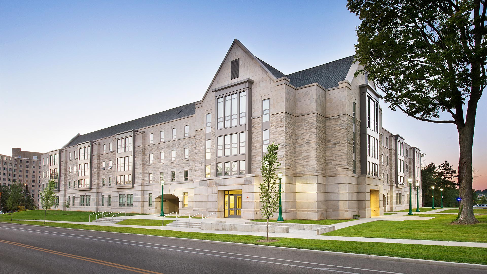
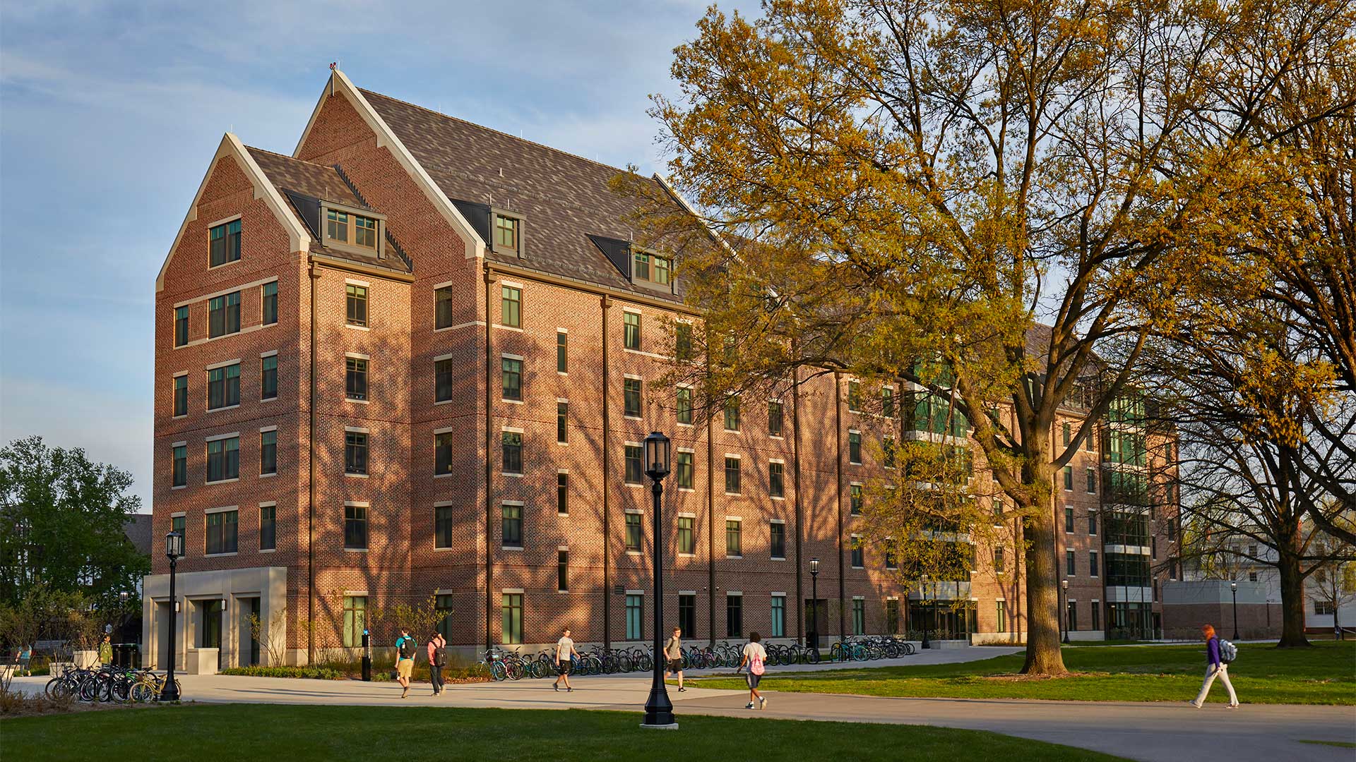
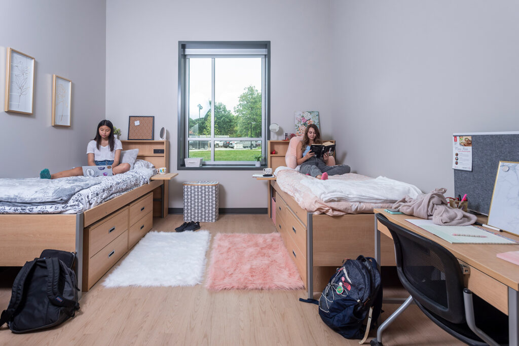
For the purpose of efficiency, floor plans for each phase are similar and include traditional-style double- and single-bedroom units arranged around a group of private-use bathrooms.
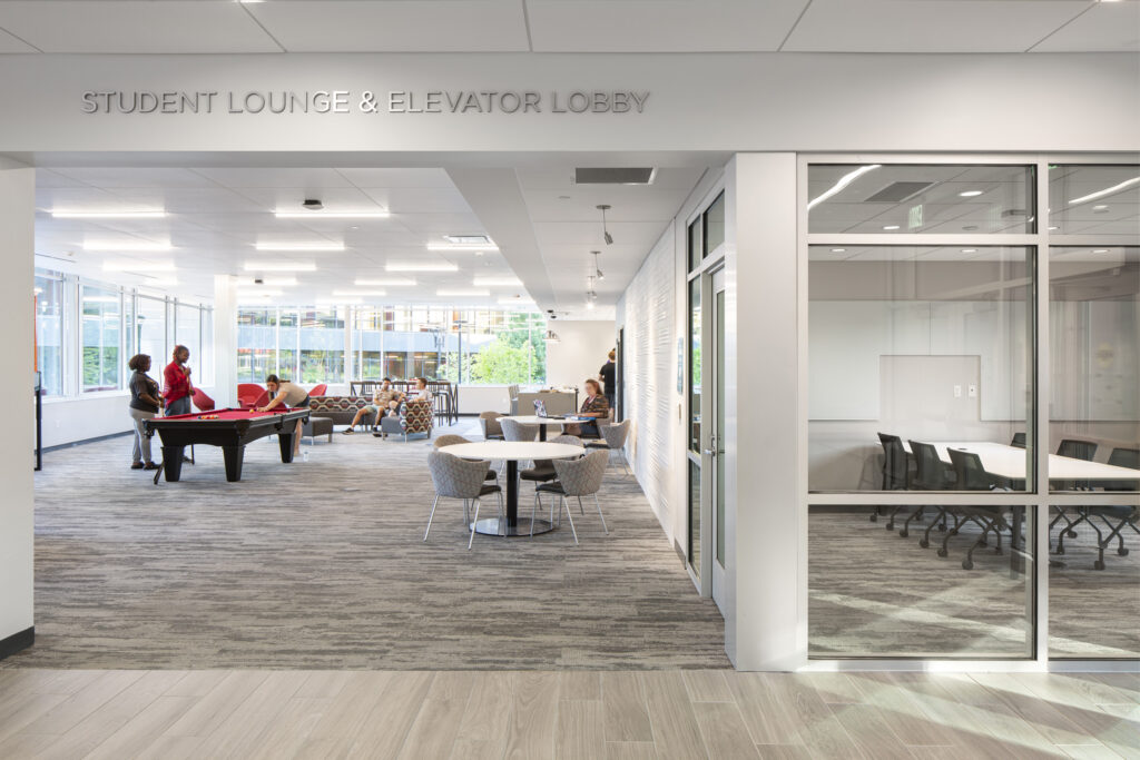
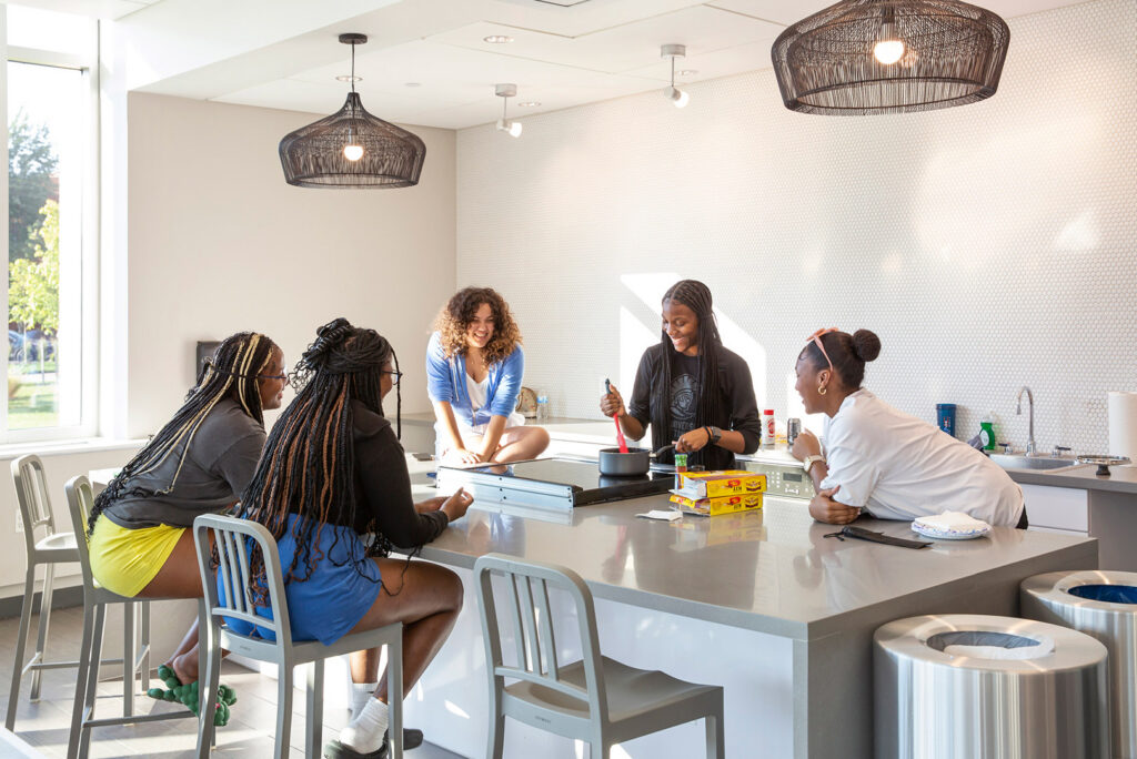
Amenities for each new facility will include a large multi-purpose room, collaboration spaces, a recreation/game room, a community kitchen, and multiple student lounges.
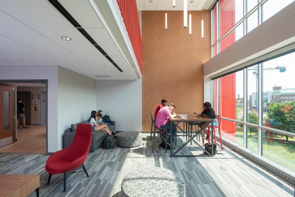
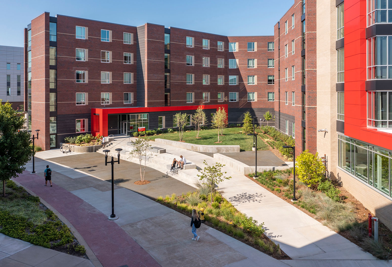
The buildings are designed to maximize the use of exterior spaces and to engage the students in active areas of living and learning.
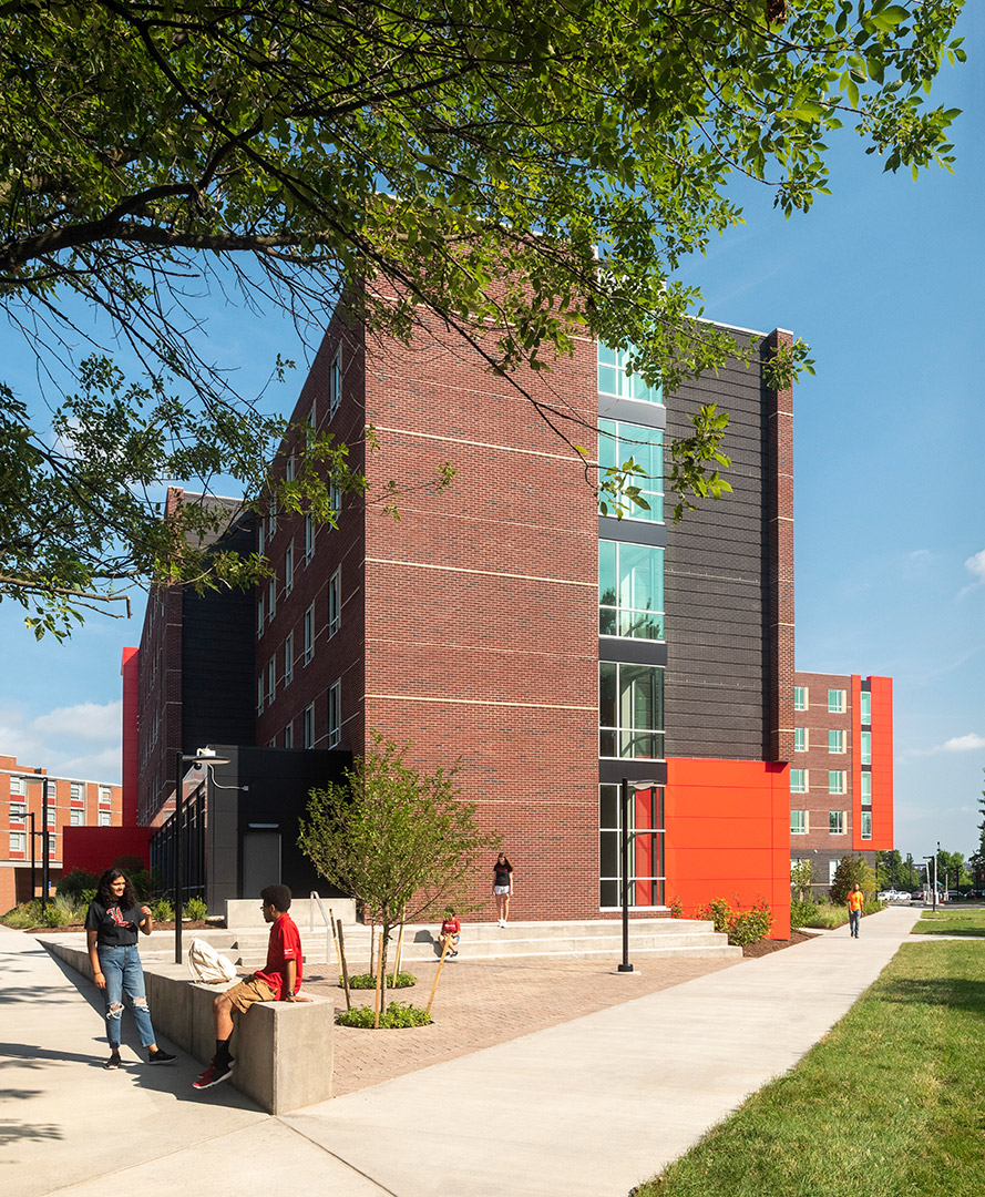
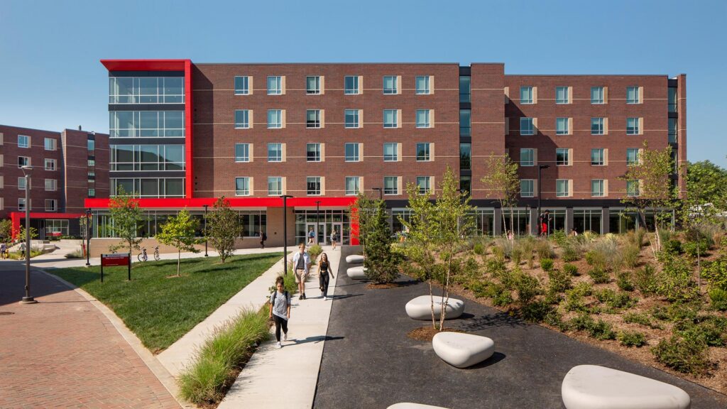
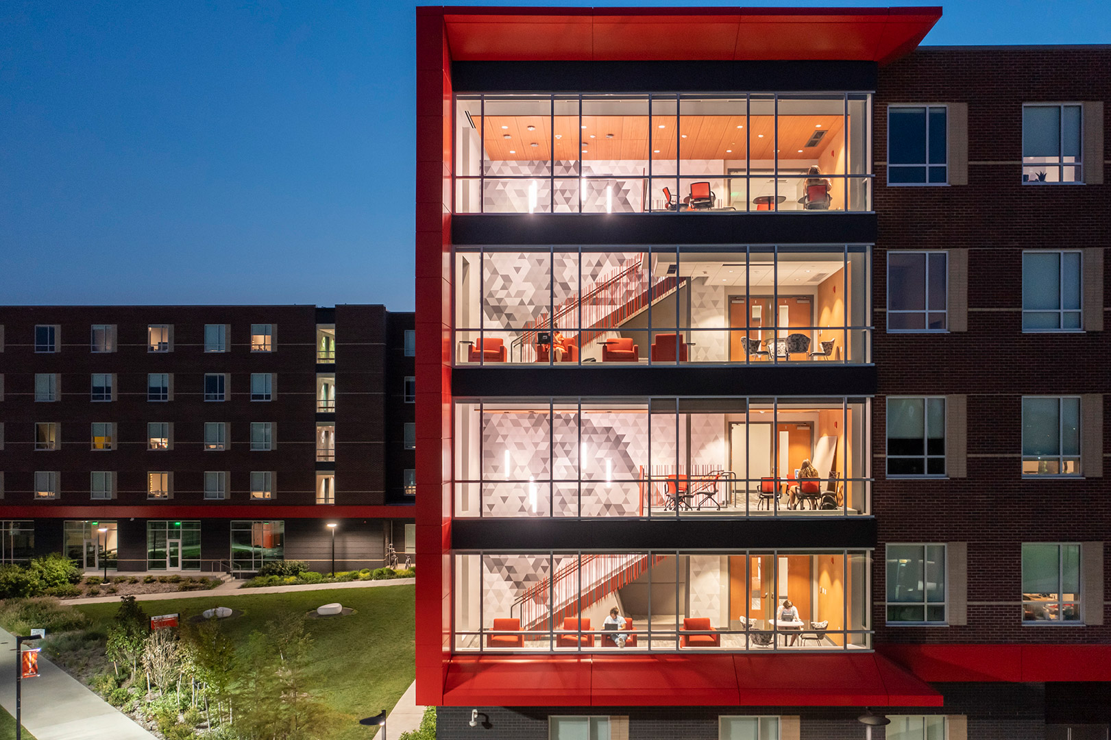
As Design Architect on the project, CSO teamed with JRA Architects, of Louisville, as the architect of record for the project.
,
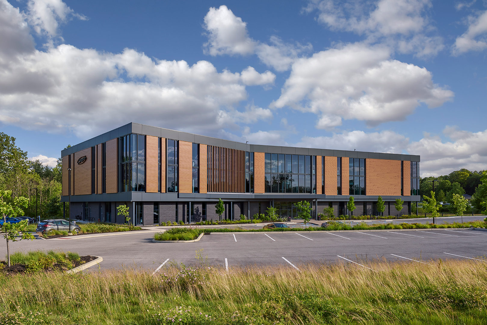
Key architectural features, such as the random rhythm of the facade’s vertical lines, mimic the complexity, order and rhythms found in nature. This design statement allows the building to become one with the site while simultaneously establishing a strong brand presence to passing traffic on US 31.
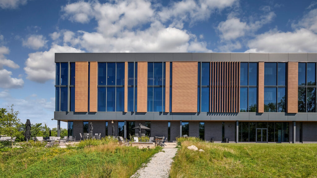
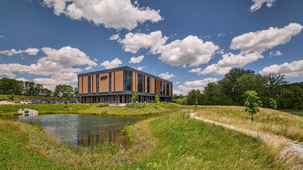
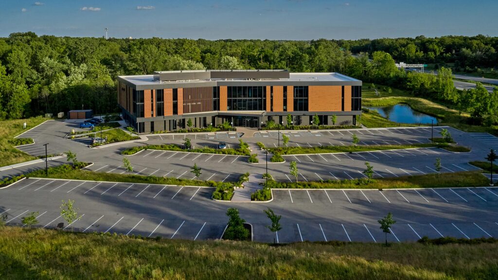
In addition, the large ribbons of glazing provide views and capture reflections of the adjacent protected wetlands and wooded surroundings, reinforcing the connection of SEP’s “forever home” to nature.
CSO designed the project holistically, integrating the building’s design with its rolling site and context. The parking fields were strategically scaled and designed as a series of smaller areas of paving separated by stands of native plantings and grasses. This site master stroke, which mimics natural sedimentary rock outcroppings, worked with the site’s topography to minimize the visual impact of parking and to provide a creative opportunity to address storm water management.
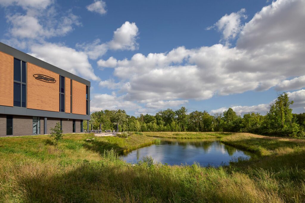
The gentle bend in the building’s footprint also responds to and leverages the natural features of the site by nestling the building against the woodlands and pond in order to maximize views for the building’s inhabitants.
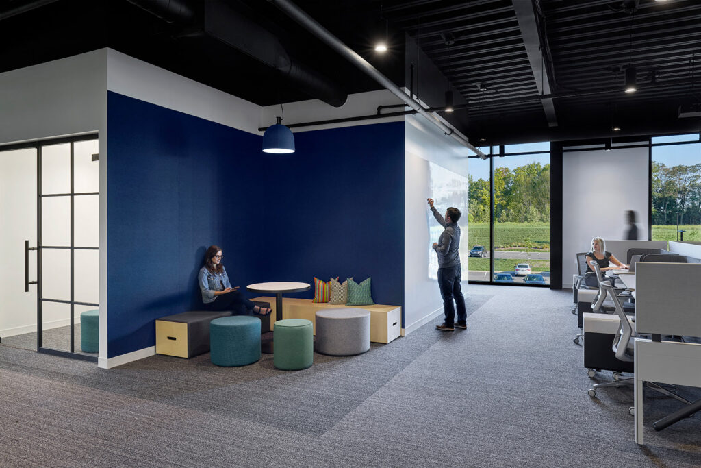
Workstyle as Inspiration
Designers found inspiration and drew a connection between the view-accenting architecture and the company’s preferred style of work: scrum. In this method, employees will apply large numbers of post-its to walls. The shape of a post-it on a wall mimicked the shape of the building footprint, and designers used this connection to influence key design features
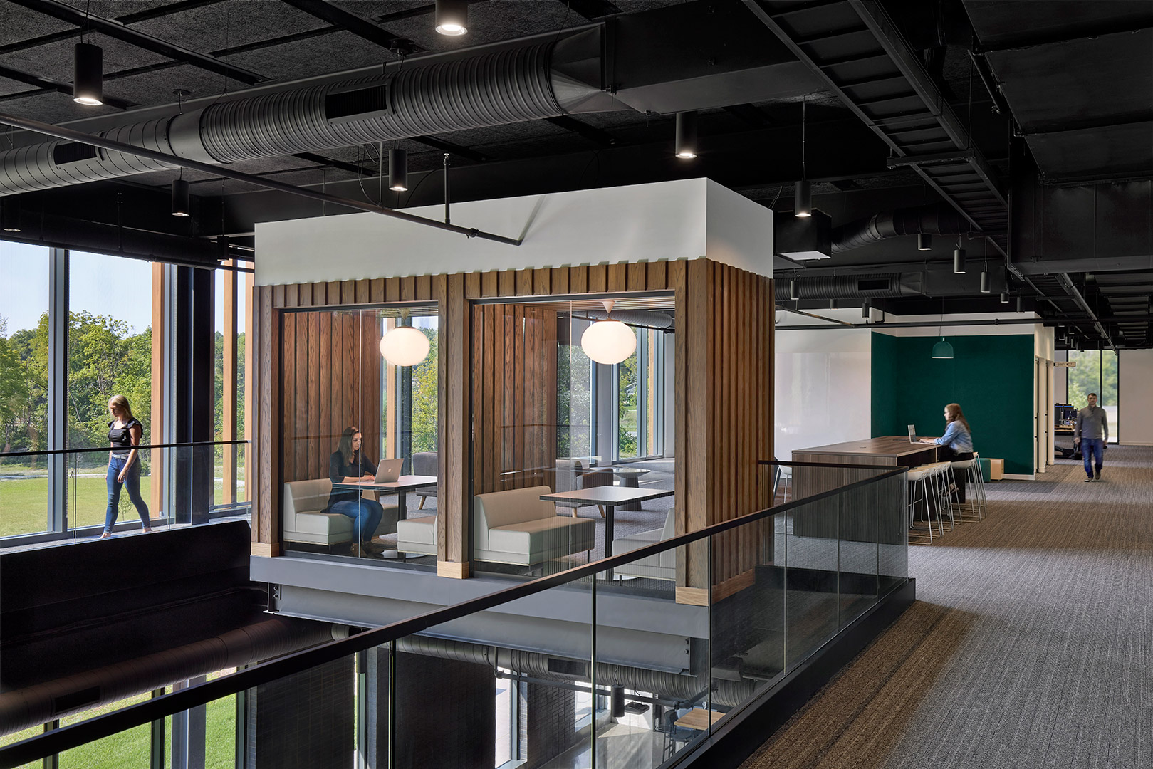
The design team worked seamlessly from exterior to interior to further enhance the user and visitor experiences. The symbolic rhythm found on the façade was “tuned” in order to contribute in specific ways to the various interior work environments – enhancing collaborative spaces, piquing curiosity, and inspiring ingenuity. Biophilic design intentionally introduces nature into everyday spaces through calming, restorative options.

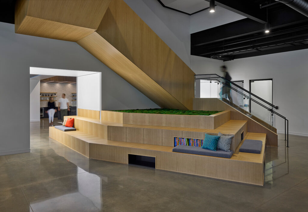
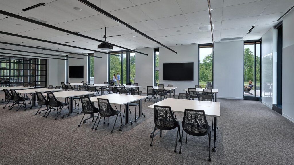
The biophilic concepts of prospect and refuge work together to create spaces that feel both open and secure. Prospect refers to the ability to see across a space or landscape—providing awareness, orientation, and a sense of opportunity. Refuge offers a place of enclosure or protection where one can feel sheltered and at ease. When thoughtfully balanced, these elements mirror environments humans have historically sought in nature, such as a protected spot overlooking a clearing.
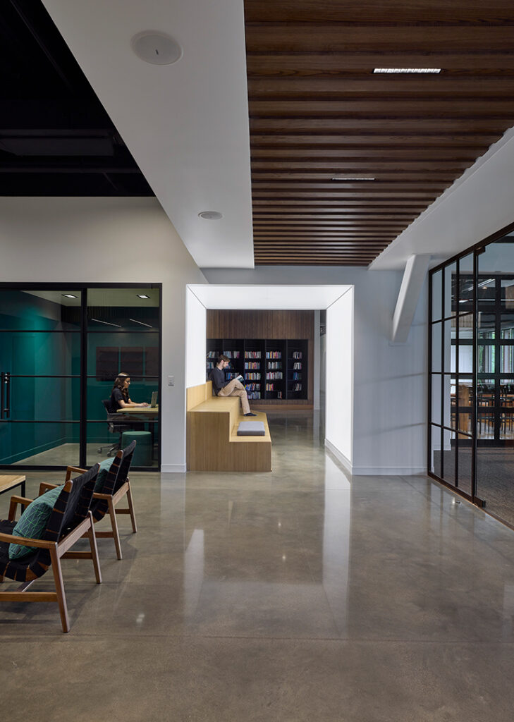
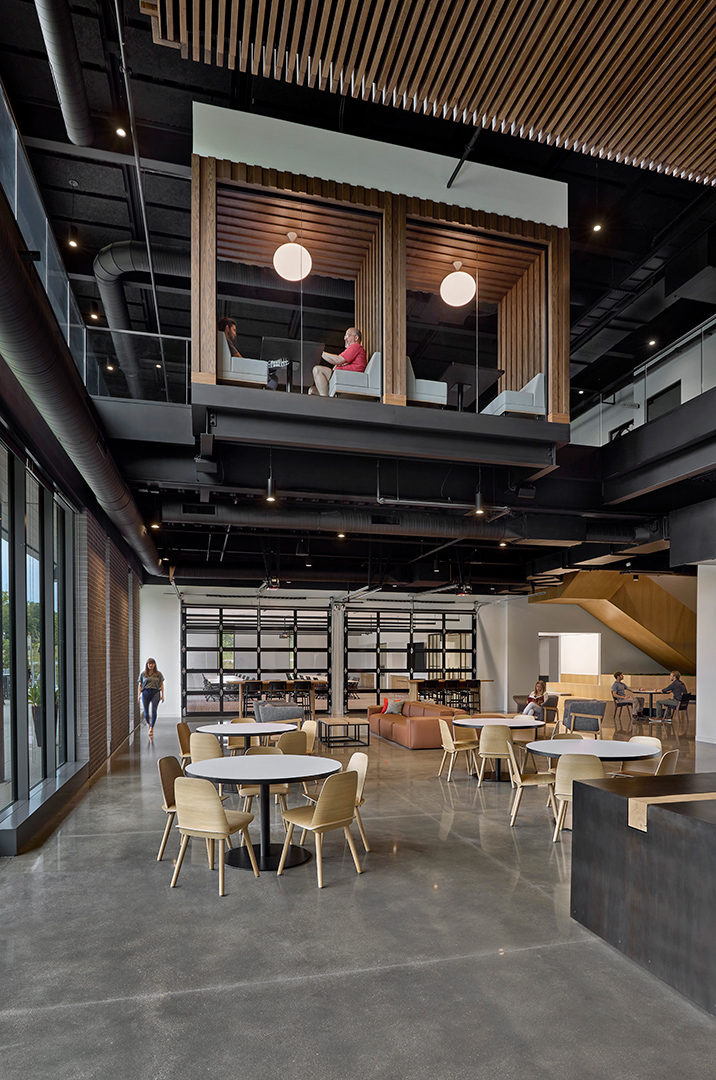
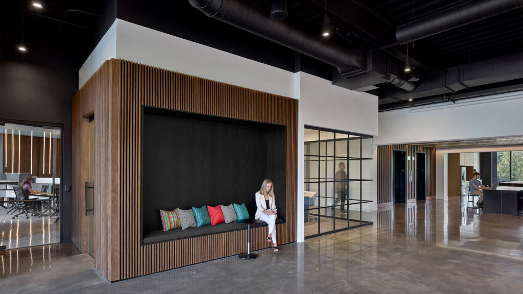
Upon arrival visitors will notice an artful series of back-lit metal tabs peeling from a feature wall. This artistic expression pays homage to the scrum process while serving as a subtle branding component of the design. The design team further embraced the holistic design approach by crafting one-of-a-kind furniture pieces from timbers sourced from the SEP site.
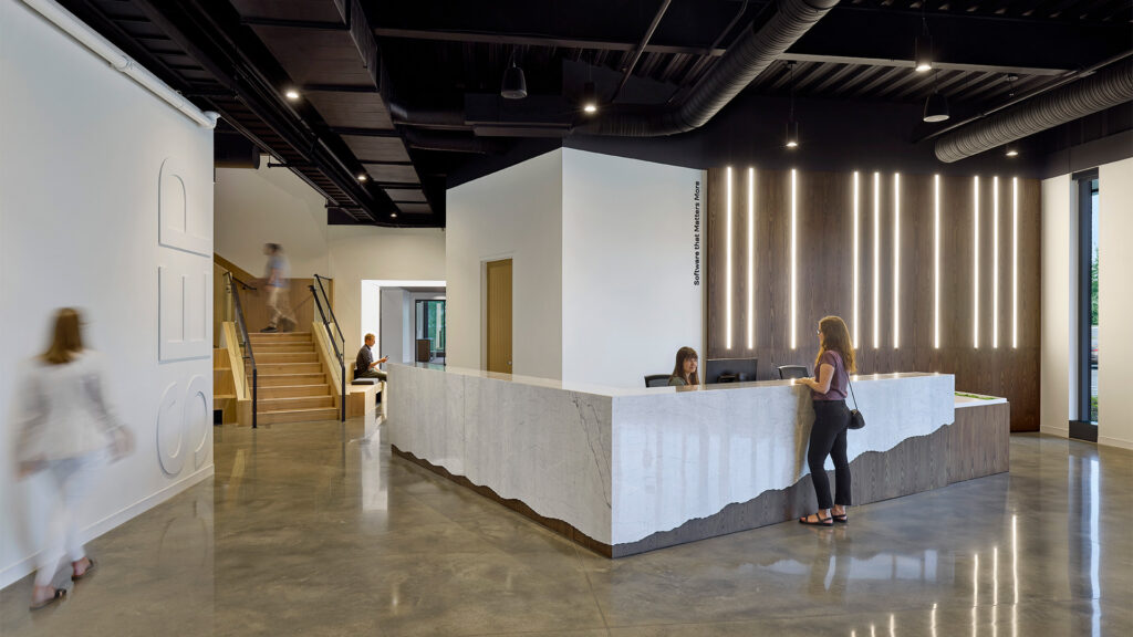
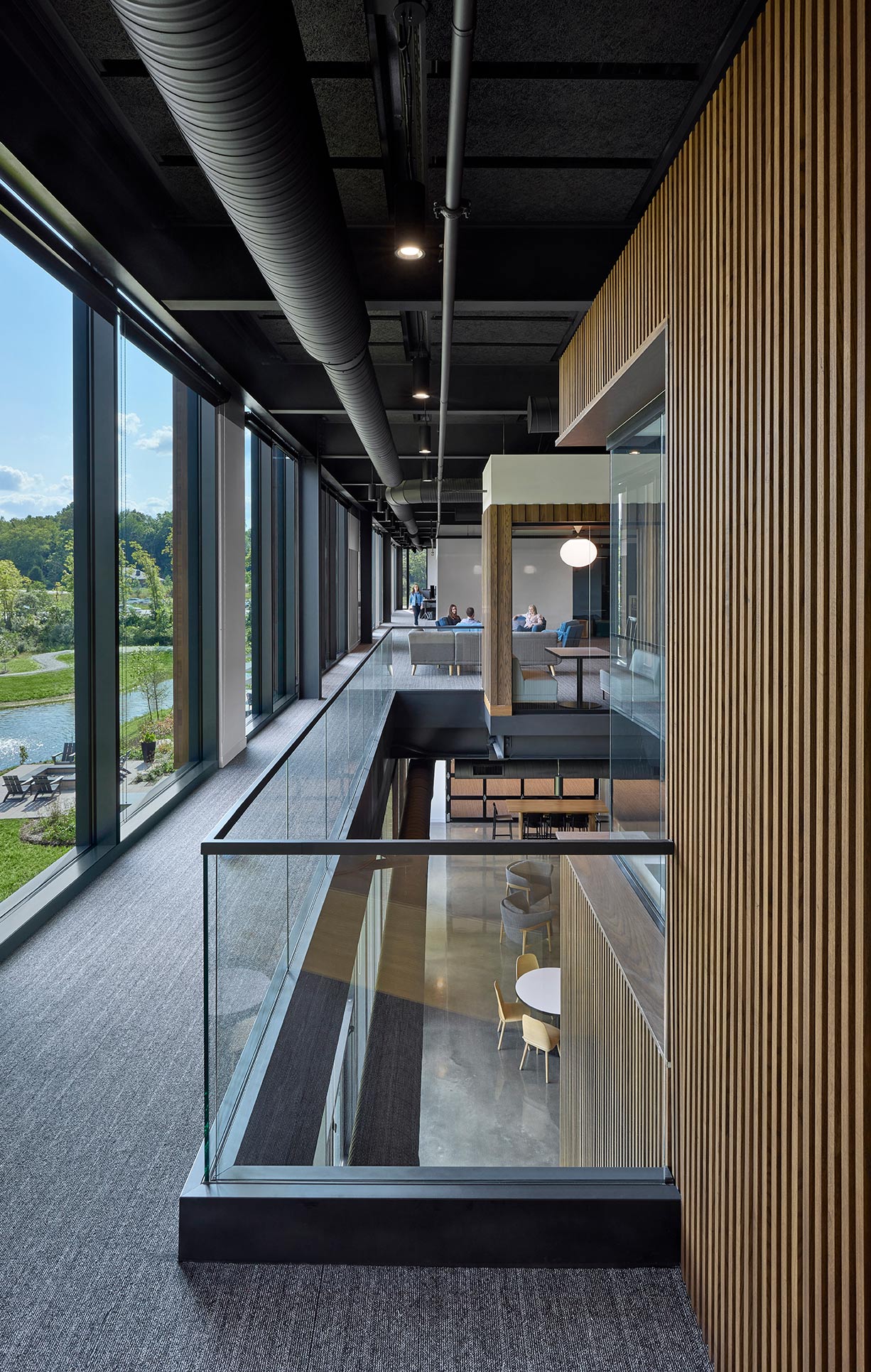
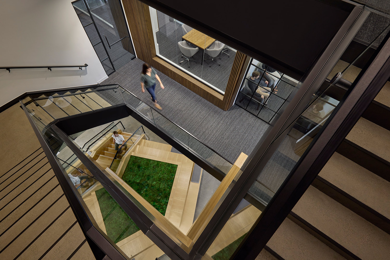
The unapologetic blend of nature and technology is evident within the new SEP headquarters. Today’s technology infuses a sense of hustle, and SEP challenged this notion by creating a space to be present within. It is a space in which to relax and find refuge. It is space in which to collaborate and nurture new ideas. It is space in which to entertain and to welcome clients and friends. It is a space that is uniquely SEP, and in their own words, it is their “Forever Home”.
,
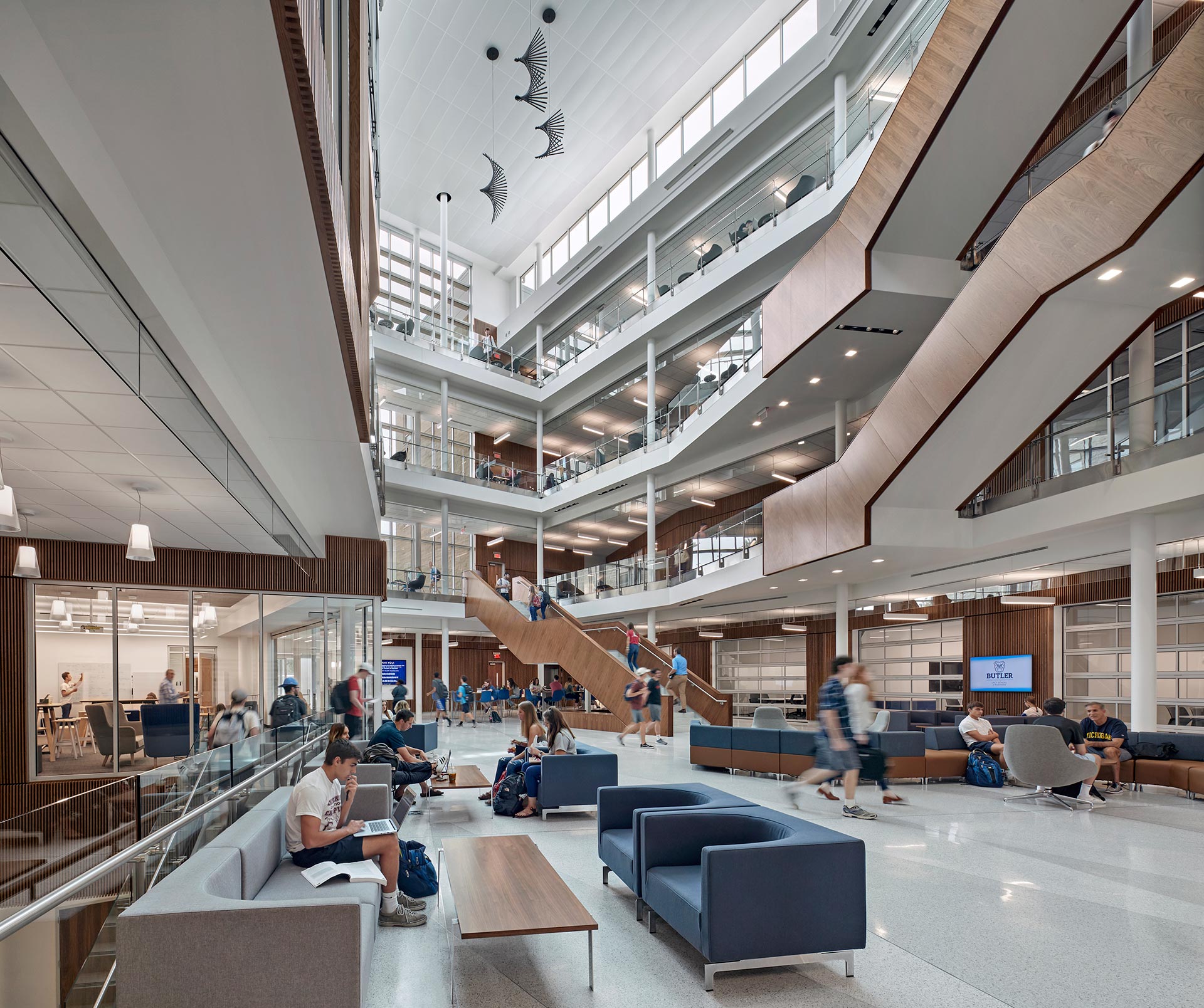
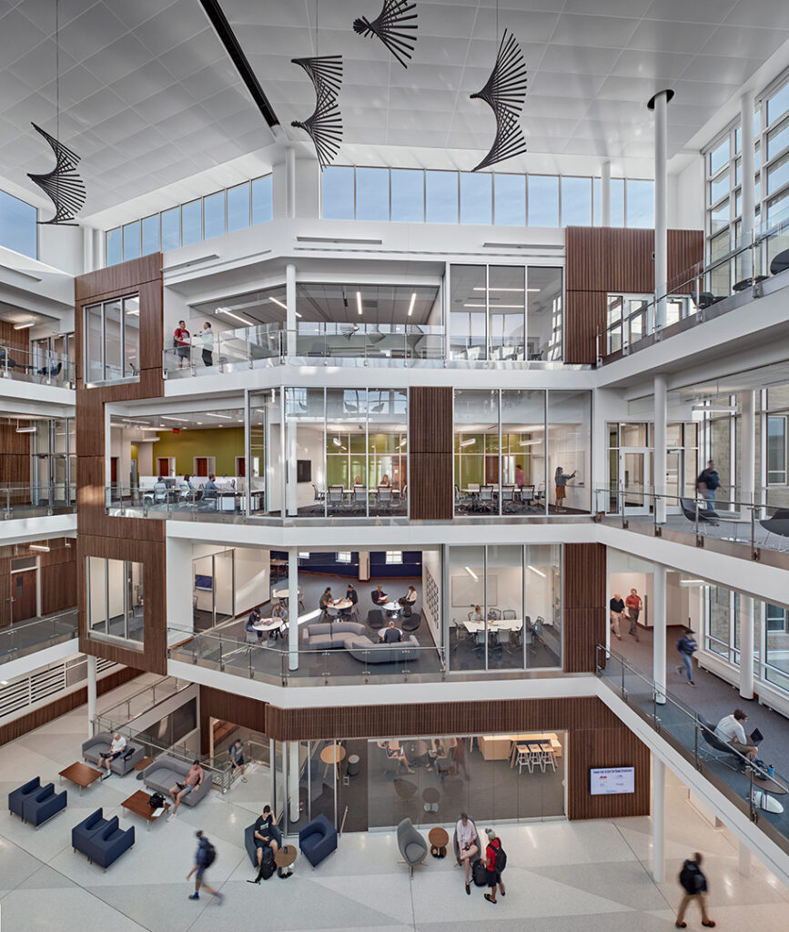
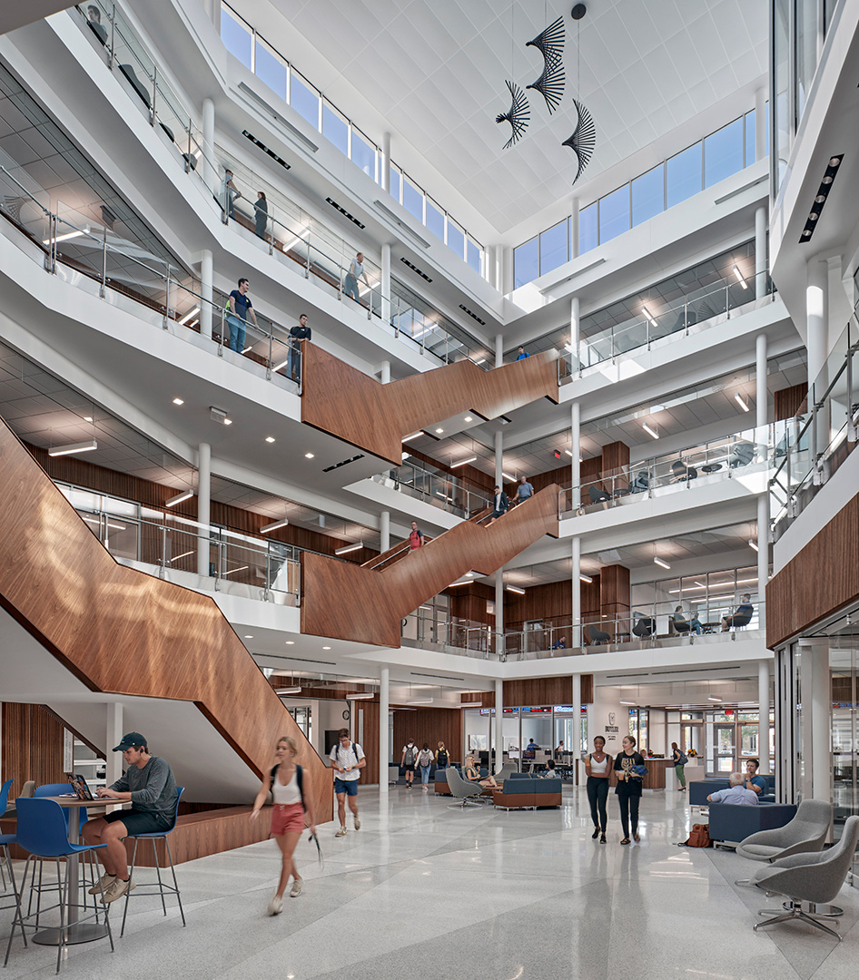
The design provides visibility by creating transparent spaces that invite participation in central locations around the multi-story atrium at the heart of the building. In addition, the central, broad, open stairs and generous balconies encourage creative collisions as students, faculty, and visitors move and interact throughout the building.
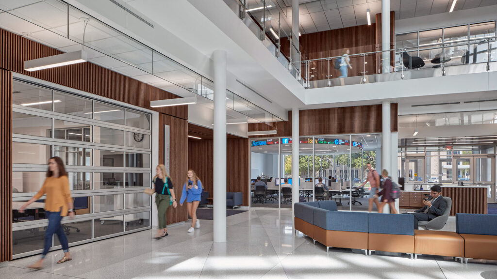
The Innovation Commons, which opens onto the central atrium, is equipped for students to start and run their own businesses as well as a wide range of other types of experiential learning. The Centers, distributed around the main level, provide space where business professionals, faculty, and students work together to solve business challenges. Glass overhead doors open to connect to the atrium and convey the importance and vitality of that work to the school and its guests.
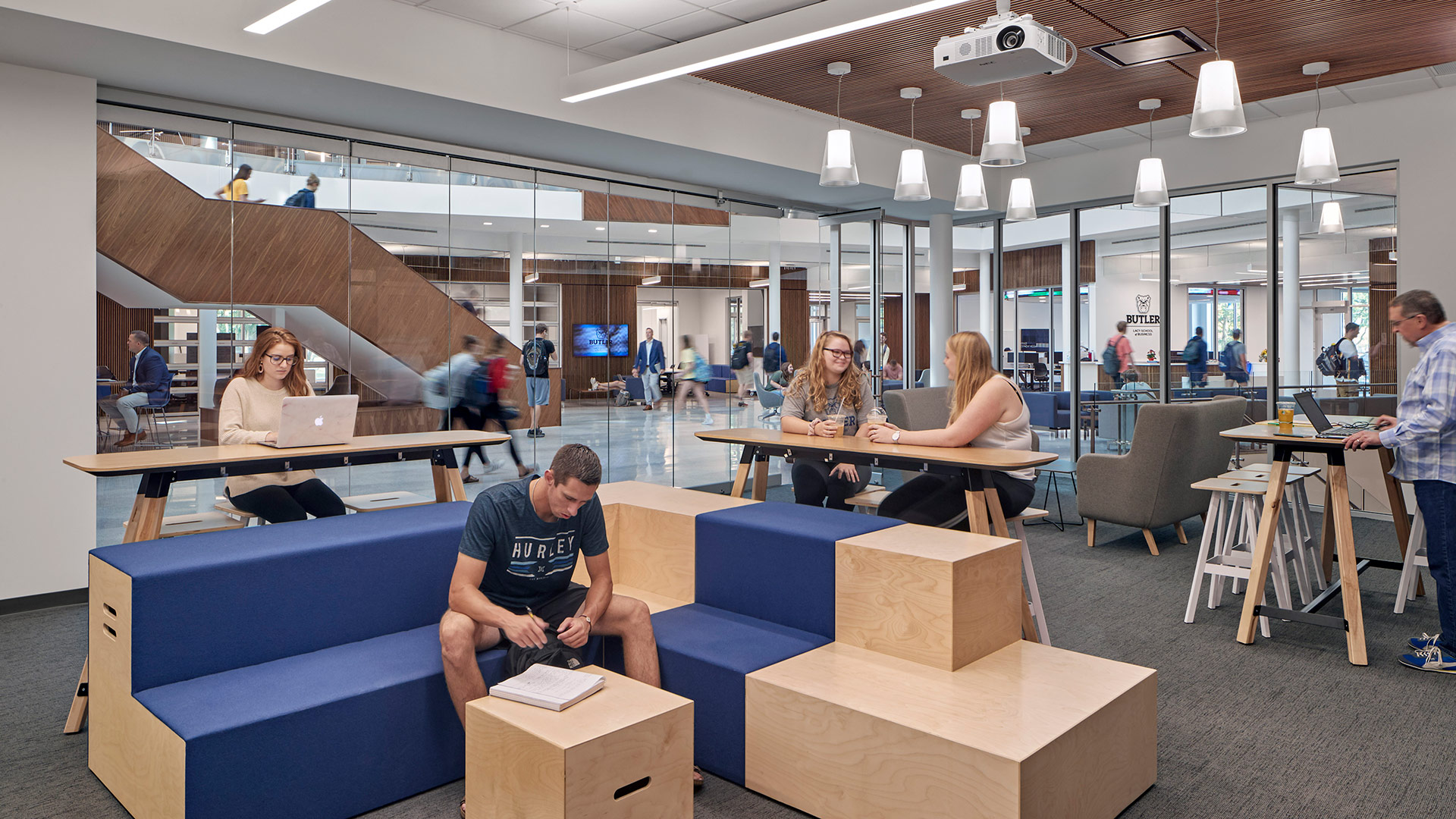
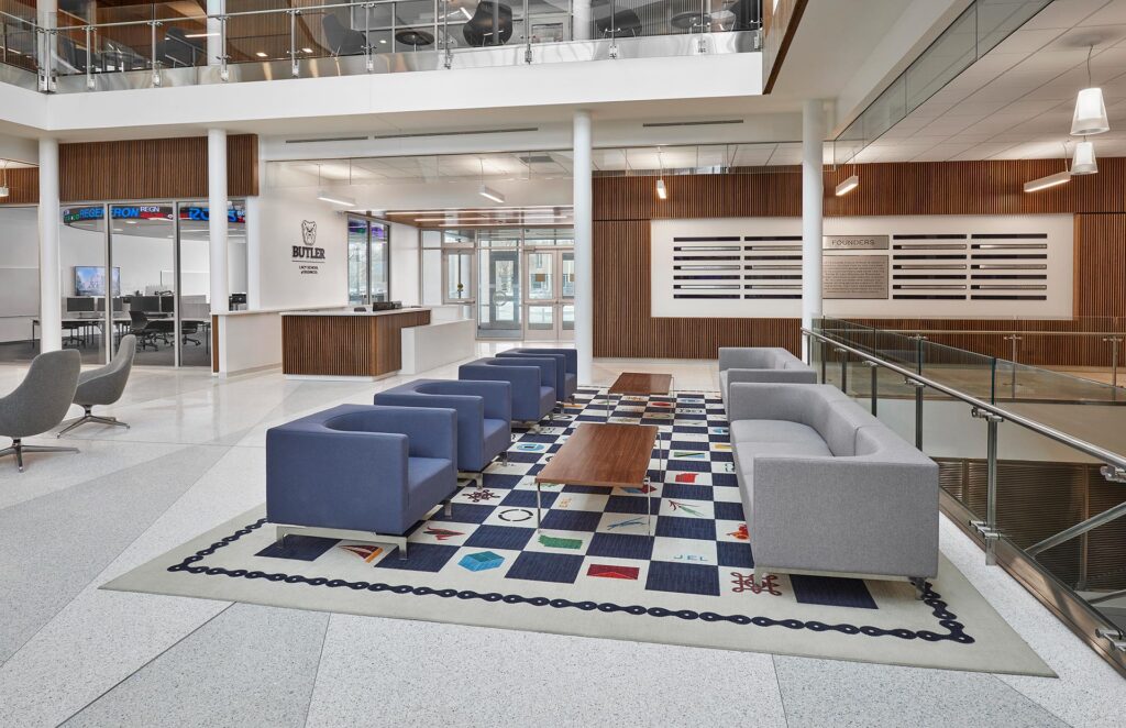

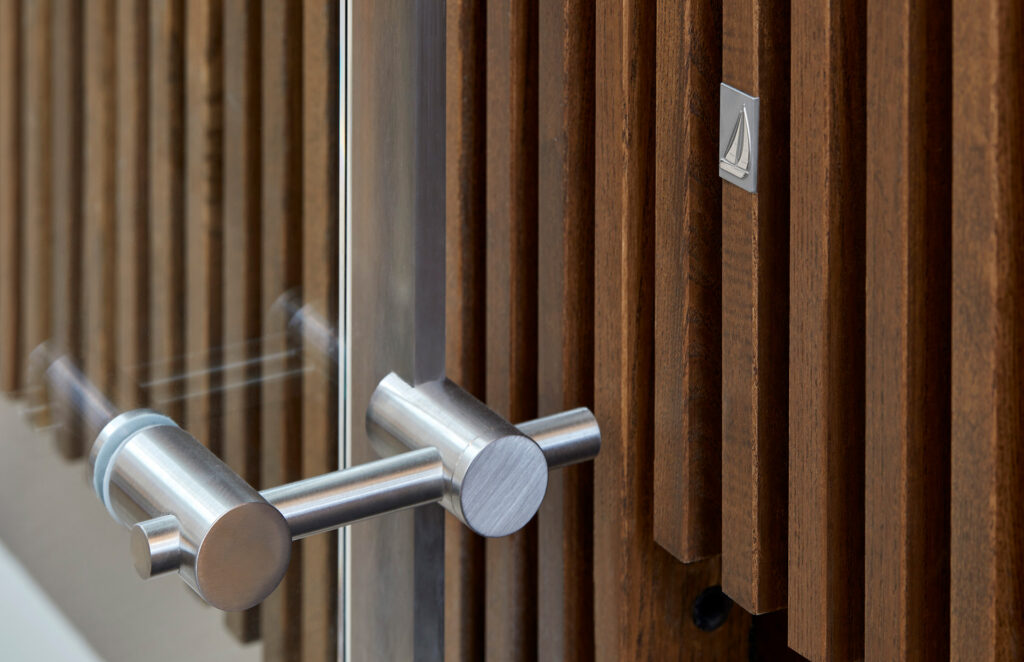
The Butler Business School is named in honor of Andre B. Lacy, a local, successful entrepreneur and philanthropist, as well as a committed family man and daring adventurer. CSO’s design honored his life with a series of installations that incorporate a collection of custom-designed icons representing his many facets. The icons appear throughout the building as design elements in areas such as the rug in the main atrium and small medallions that are hidden throughout the building.
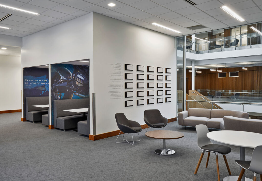

A timeline of Andre Lacy’s life takes the form of 25 envelopes, connecting his first job in a mailroom and the endowment gift, reminding students that their humble beginnings can build to something great.
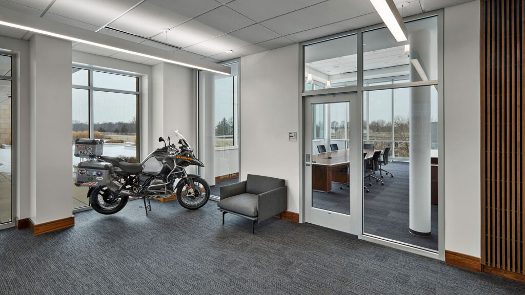
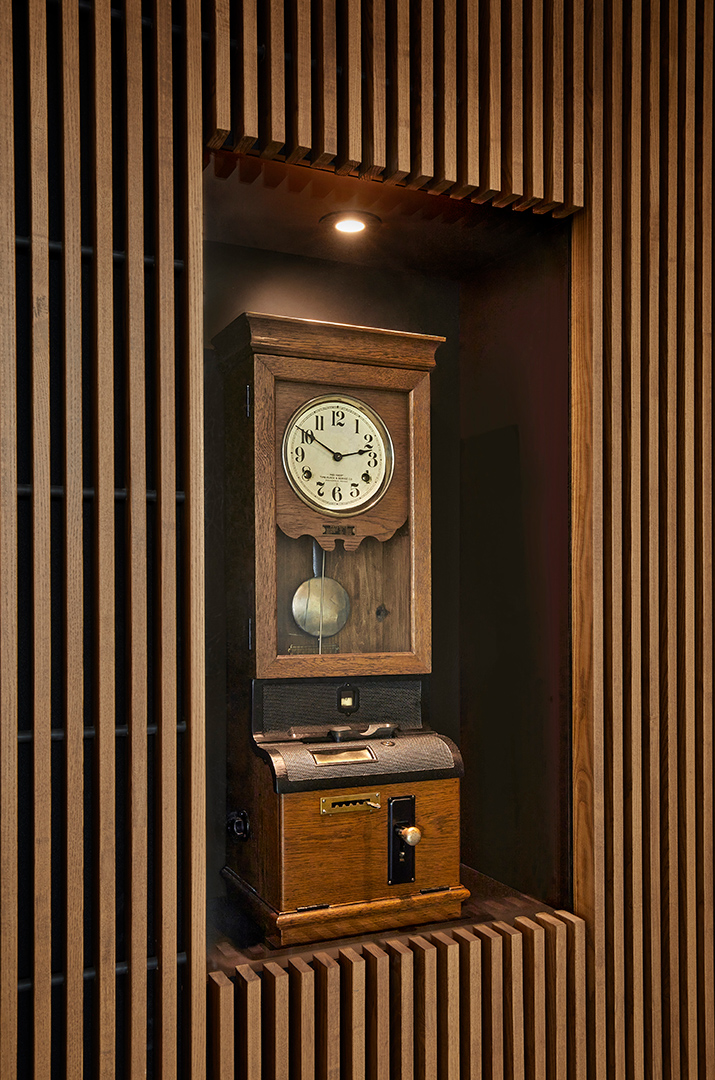
The design team also featured objects that were important to Lacy – the time clock Lacy once used to clock into his job and the motorcycle he rode across continents. These were both gifts from the family who were intimate collaborators on the project.
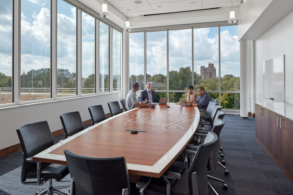
The conference table in the board room adjacent to the Dean’s office features the Lacy family knot and is a duplication of a table that exists at Lacy’s corporate headquarters.
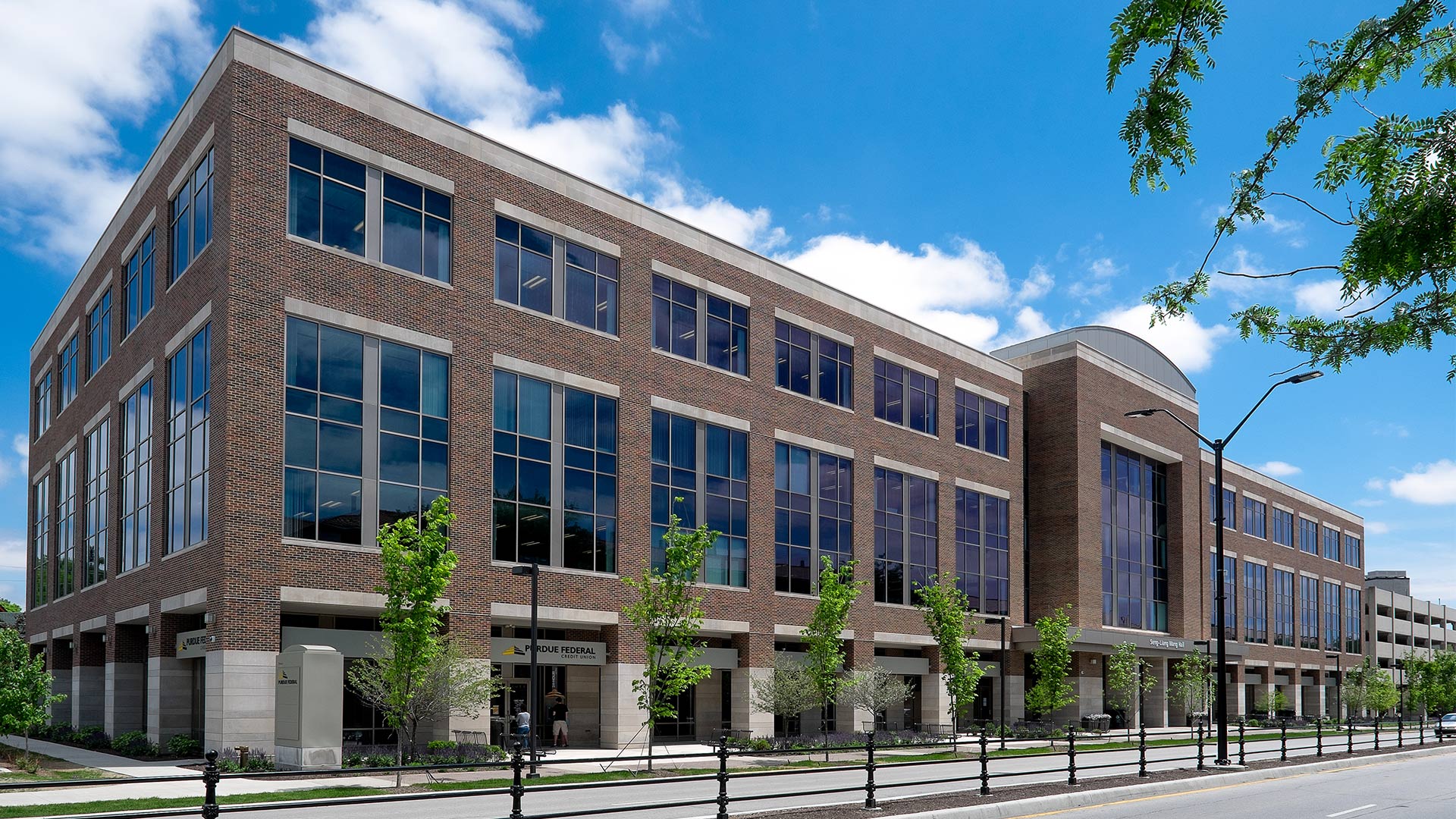
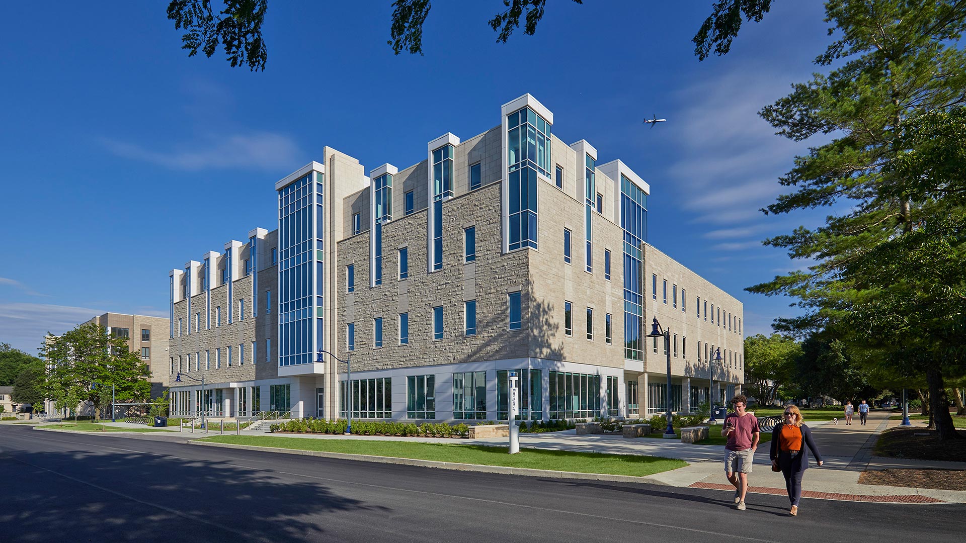
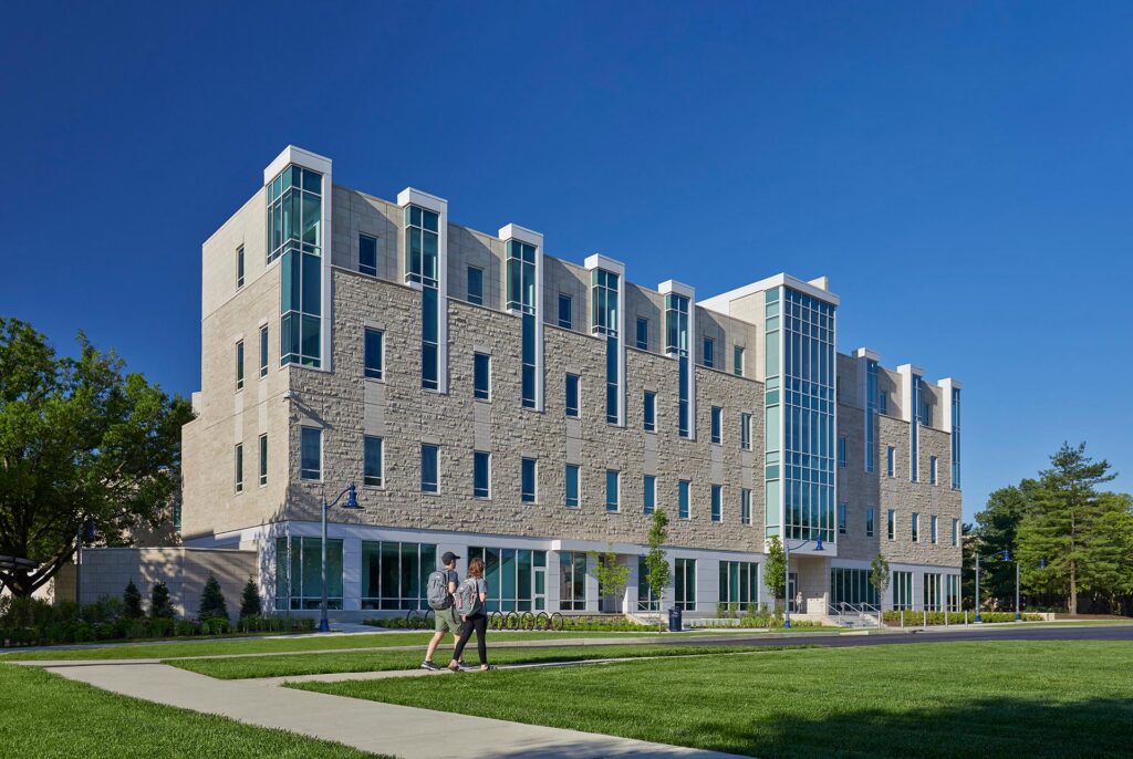
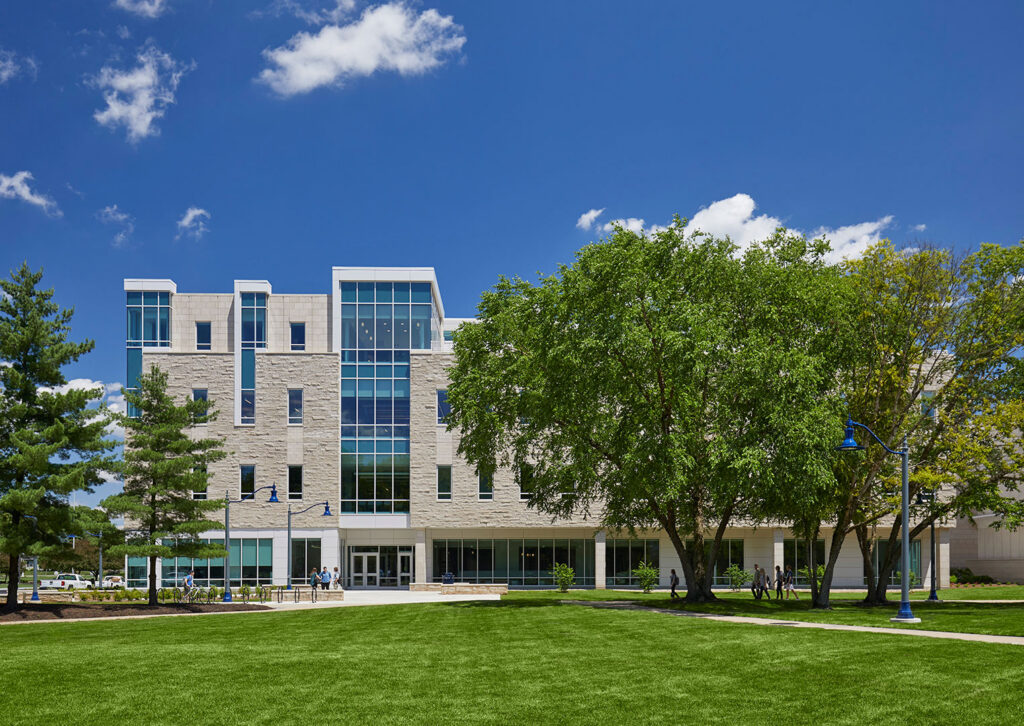
Located in a prominent place on the campus, visible from the east entrance, the building completes the cross axis of the original campus masterplan. The building’s vertical towers and active silhouette reflect the characteristics of the much-loved historic campus. The building replaces a parking lot and defines the intersection of the two major green spaces at the center of the campus. CSO completed this project in collaboration with Goody Clancy.
,
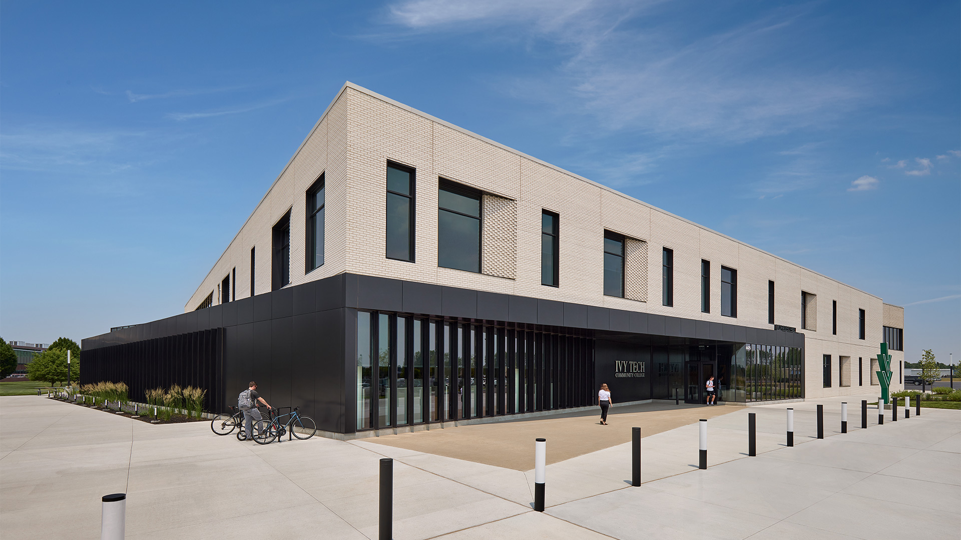
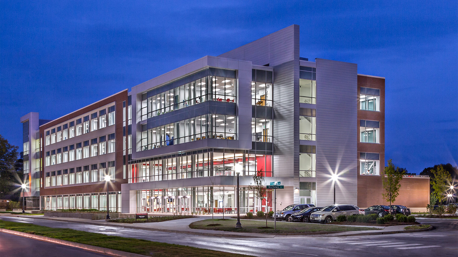
In addition to classrooms and laboratories, this two-story facility contains a student commons, offices for enrollment and advising services, as well as administrative spaces.
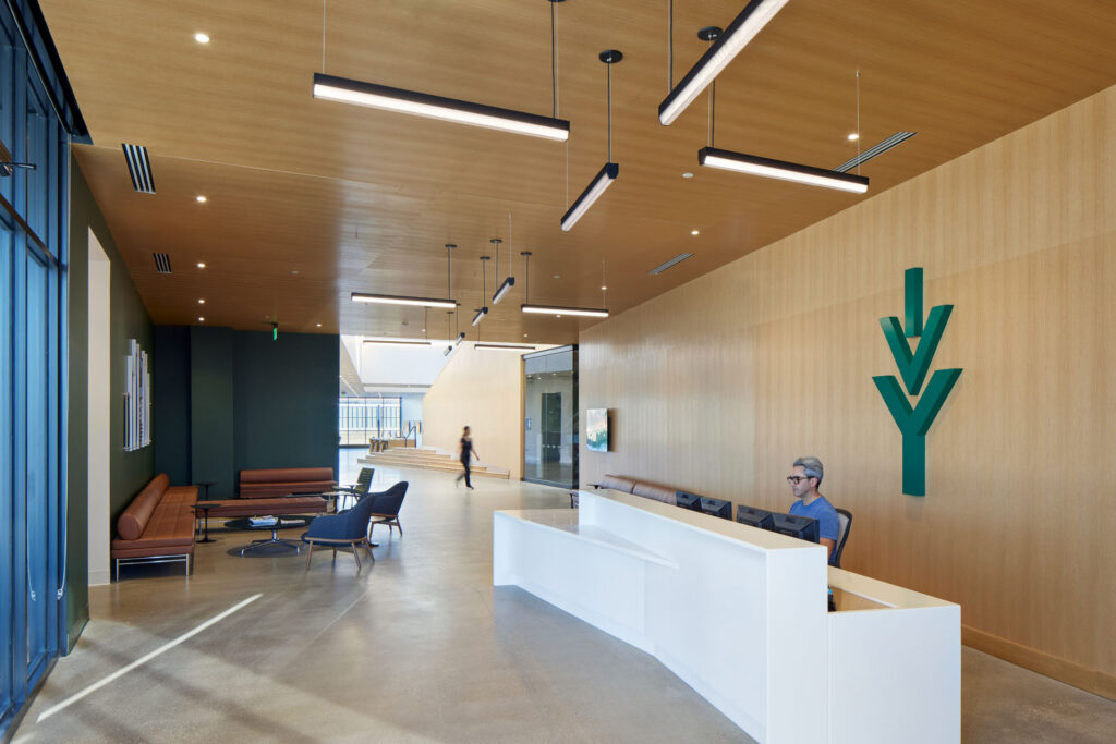
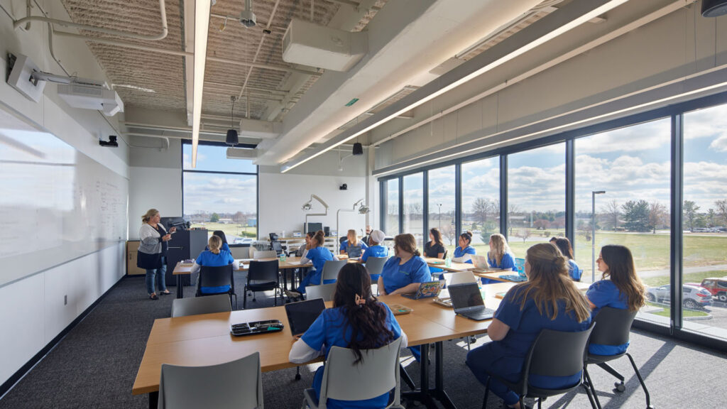
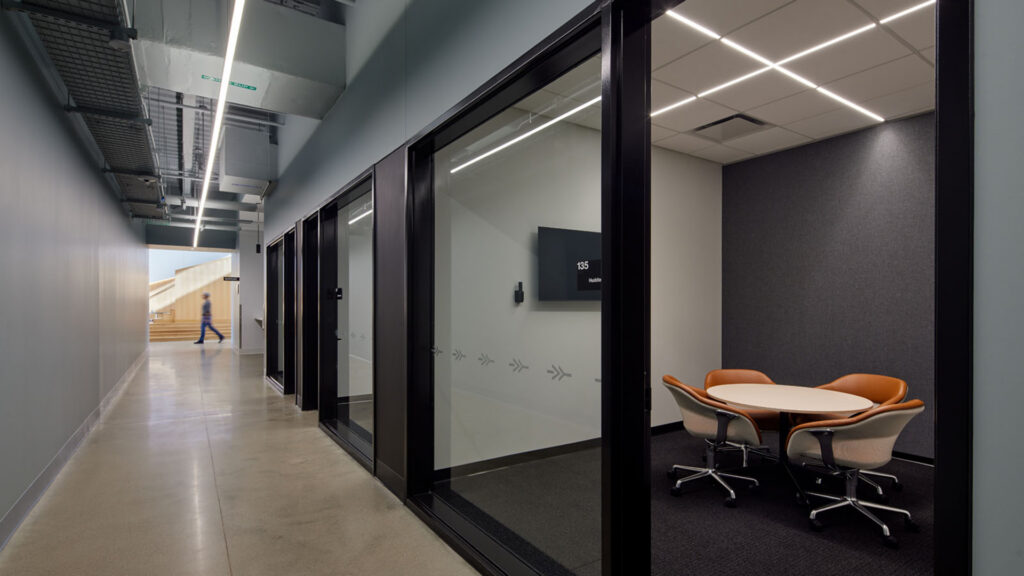
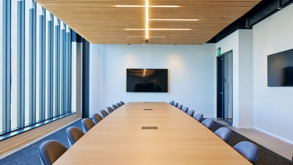
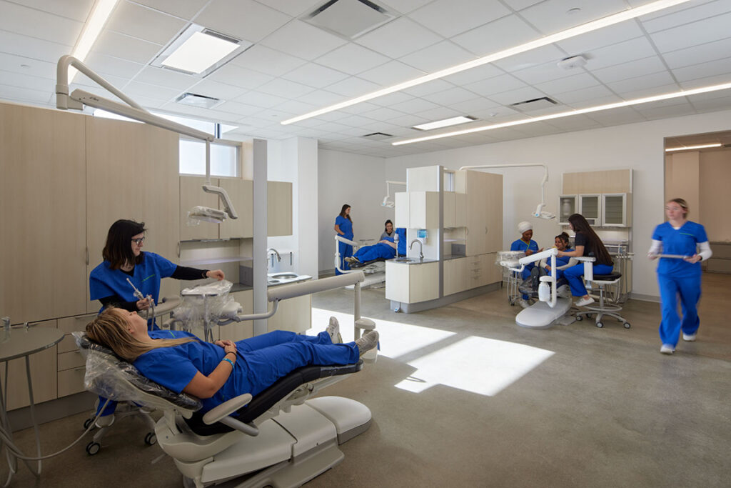
The academic courses at this campus focus on healthcare sectors, including nursing, dental assisting, medical assisting, phlebotomy, and surgical tech with labs for health science and visual communication programs as well as a flight simulator for the aviation program.
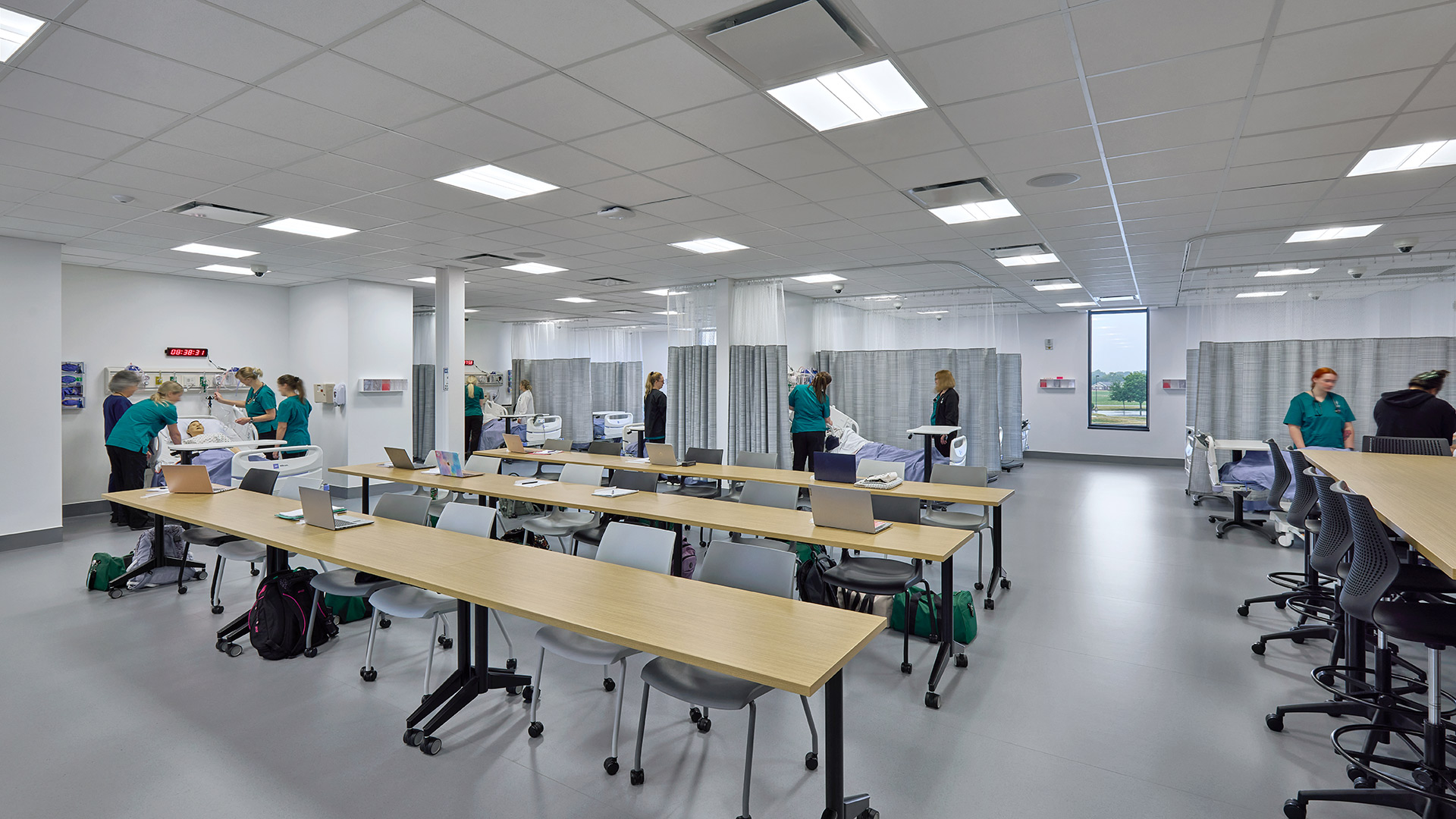
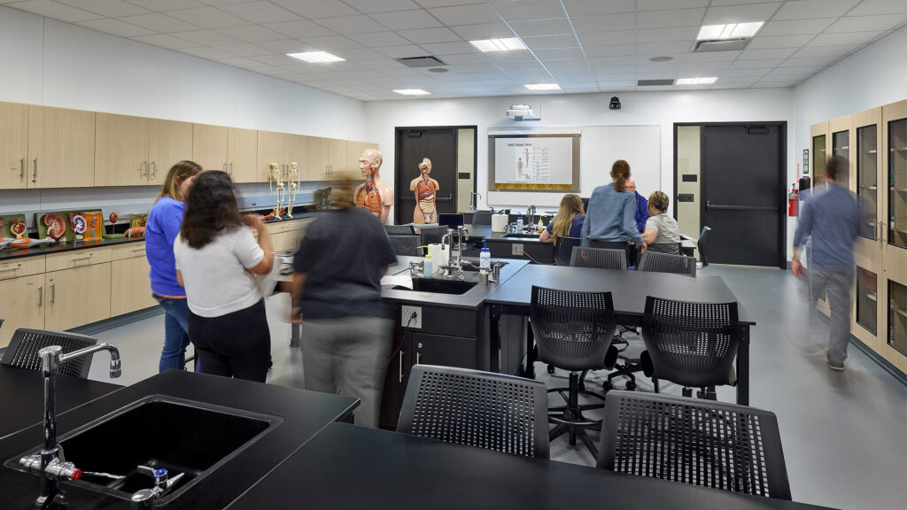
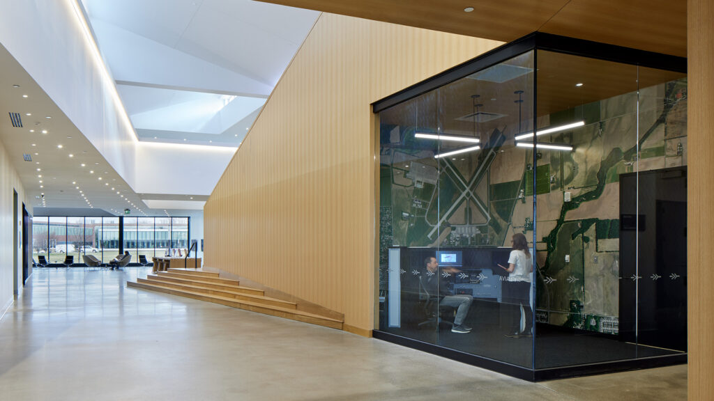
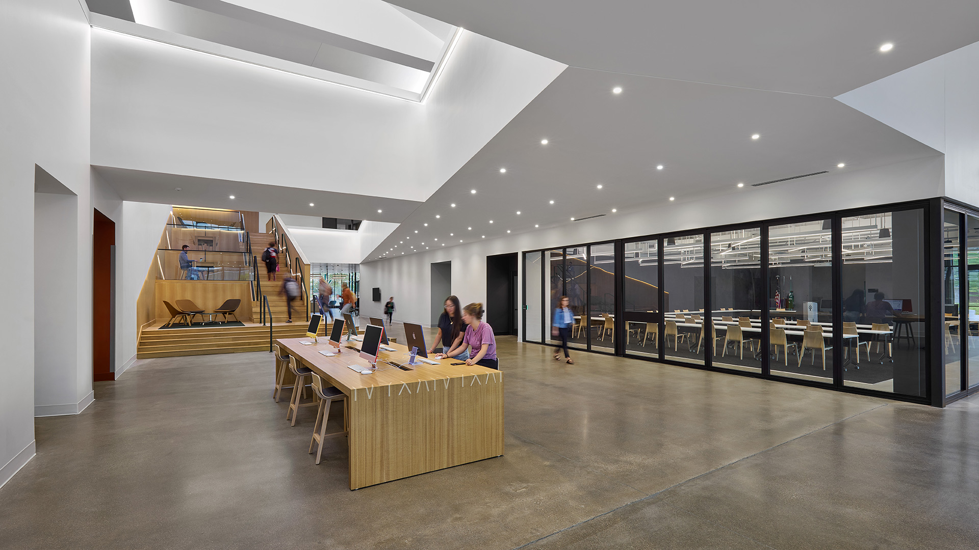
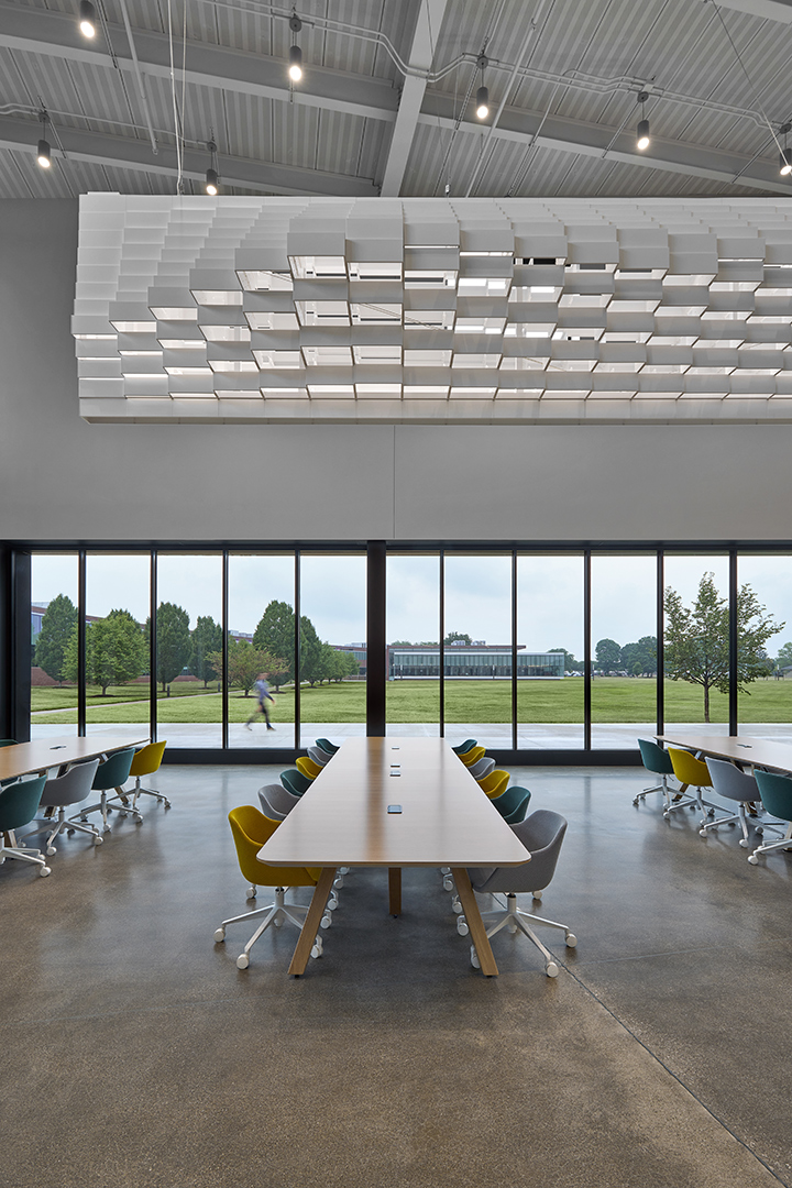
The building design revolves around a central, two-story spine that has a social stair as its focus. This is not only a communicating stair but provides intermediate landings for study and collaboration. Above the social stair are three large roof monitors which provide ample daylight to the center of the building.
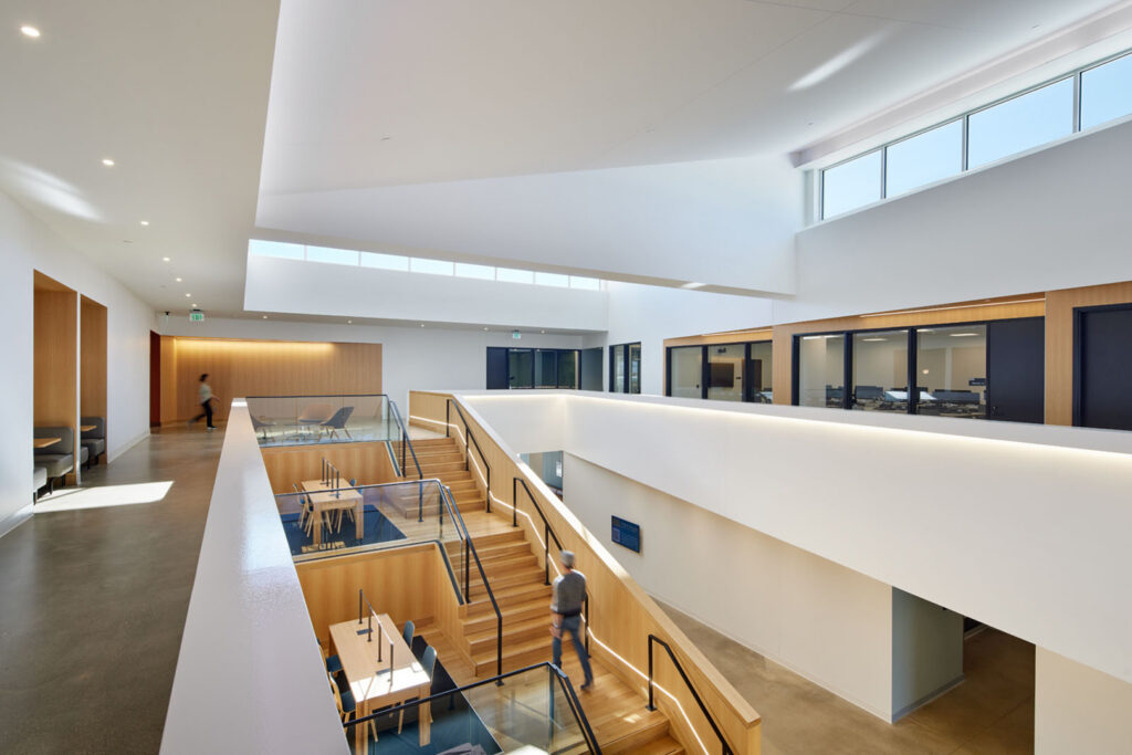
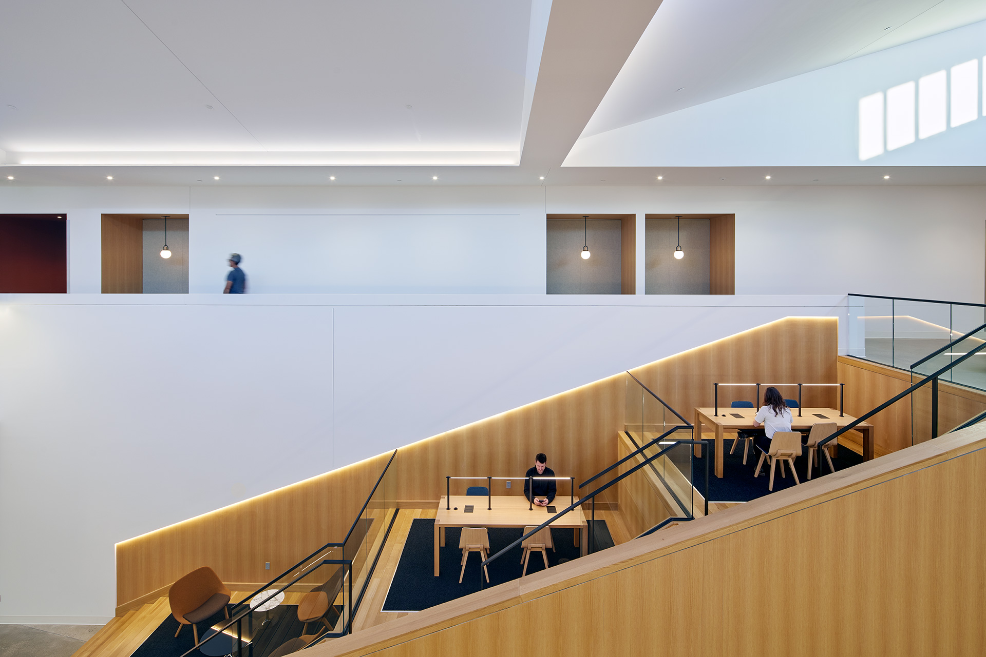
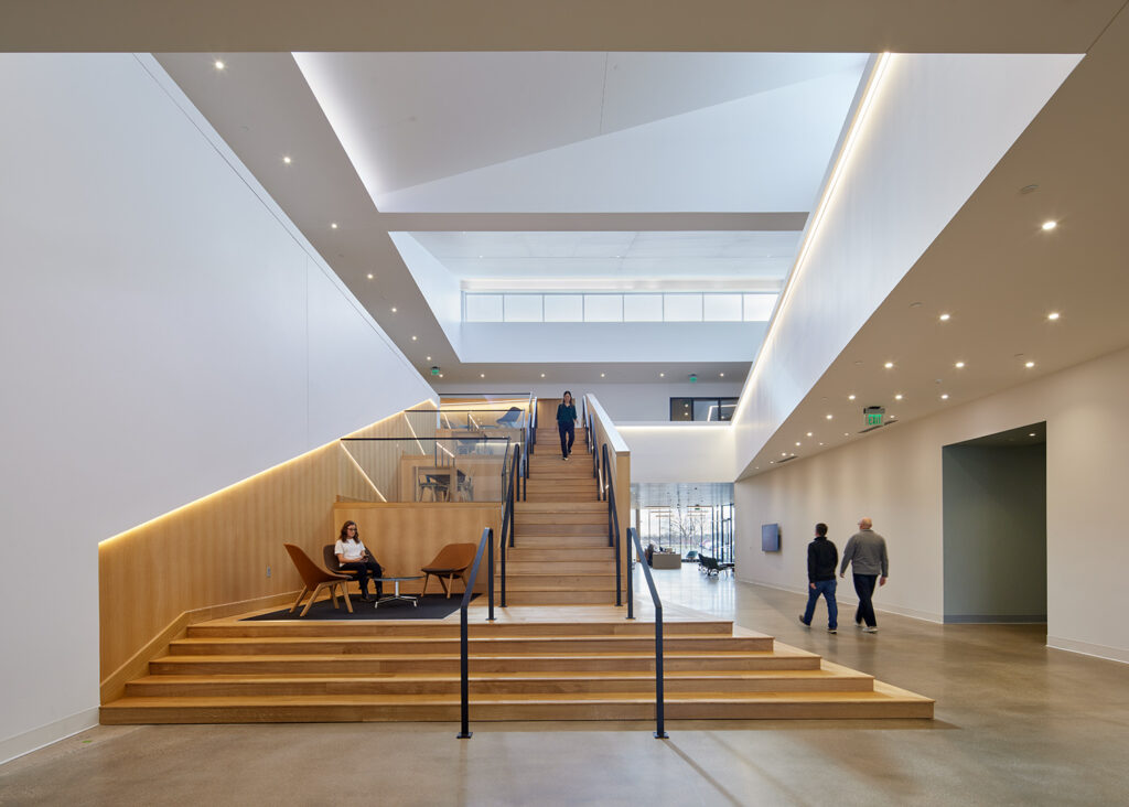
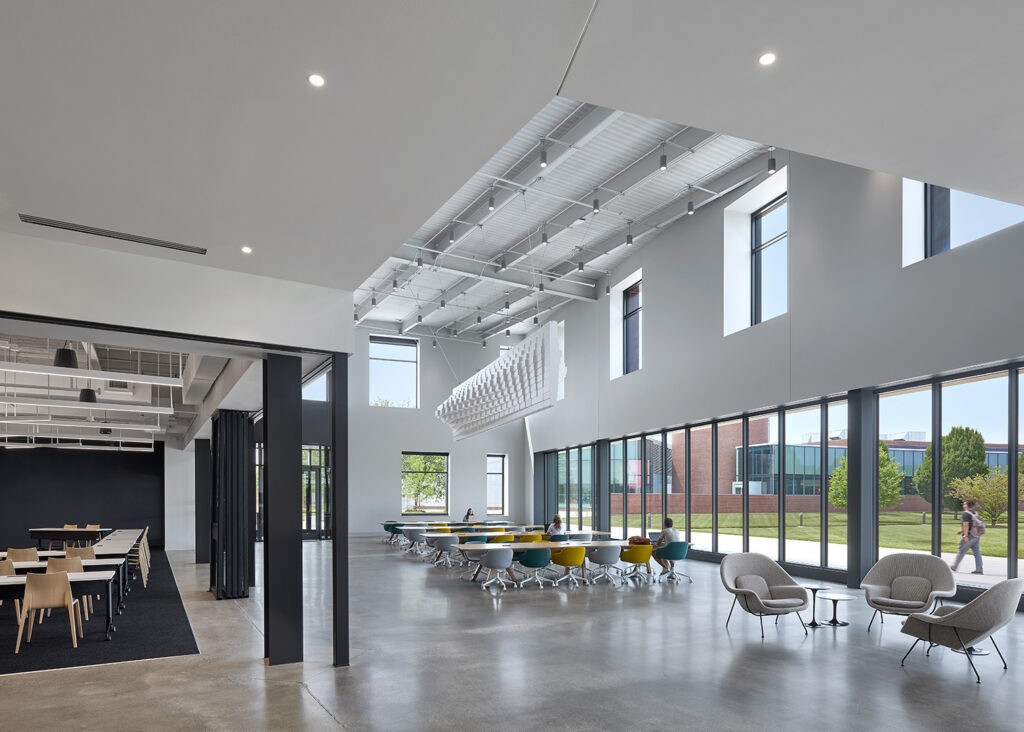
The stair anchors a large Student Commons on the first floor, which is used for a variety of college events. Immediately adjacent to the Commons is a 156-seat Community Room, which has sliding doors on the corner allowing these spaces to be combined for larger events.
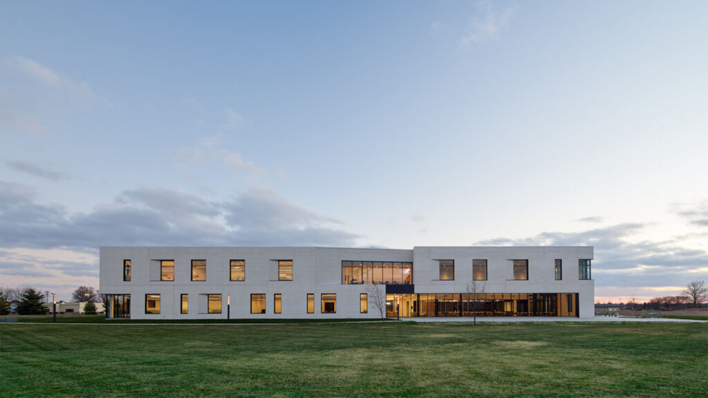
CSO collaborated with IwamotoScott Architecture on the design of this project. Design for the project started in February 2020 and continued uninterrupted through the COVID-19 Pandemic. Most of the design, approval and documentation was conducted remotely. Ivy Tech contracted directly with CSO for architect-of-record, engineering and furniture selection & procurement services then selected IwamotoScott Architecture via a design competition sponsored by the Cummins Foundation. This project was part of grant funded by the Cummins Foundation Architectural Program in 2019.
,
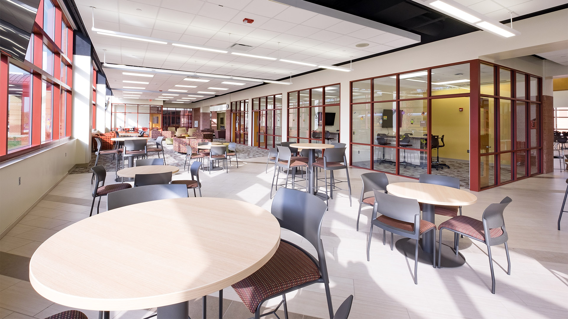
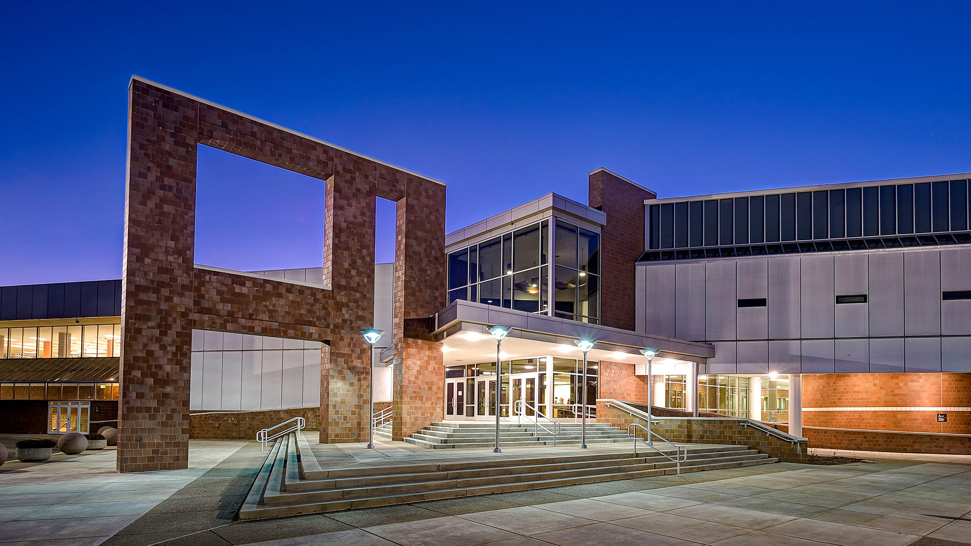
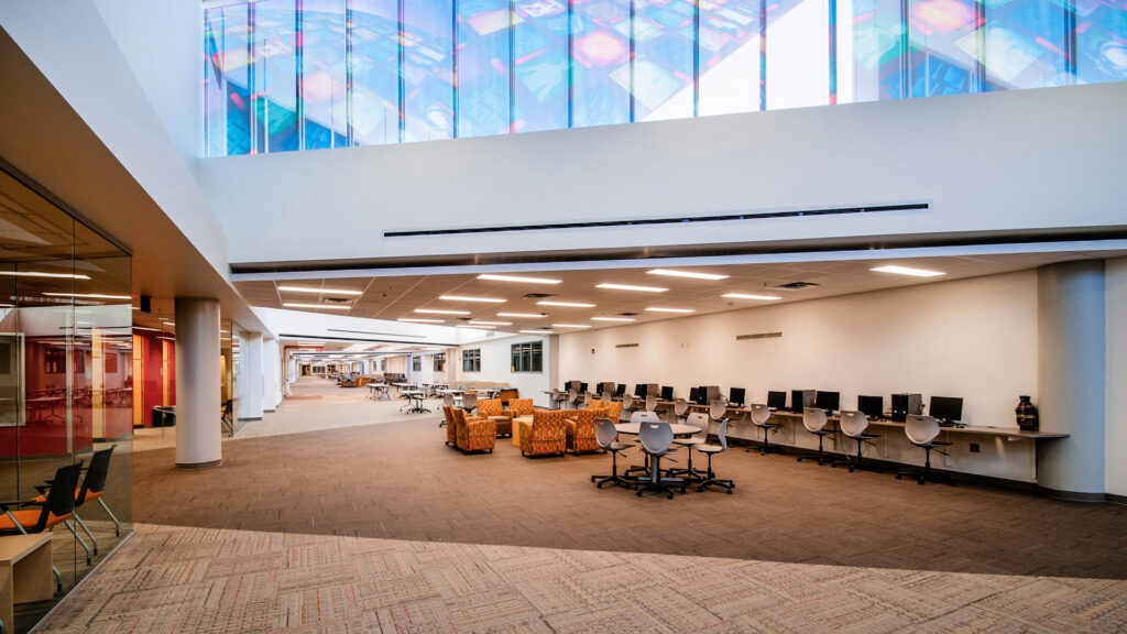
Fishers High School College and Career Academy
Fishers High School received 185,831 square feet of additions and 20,774 square feet of renovations.
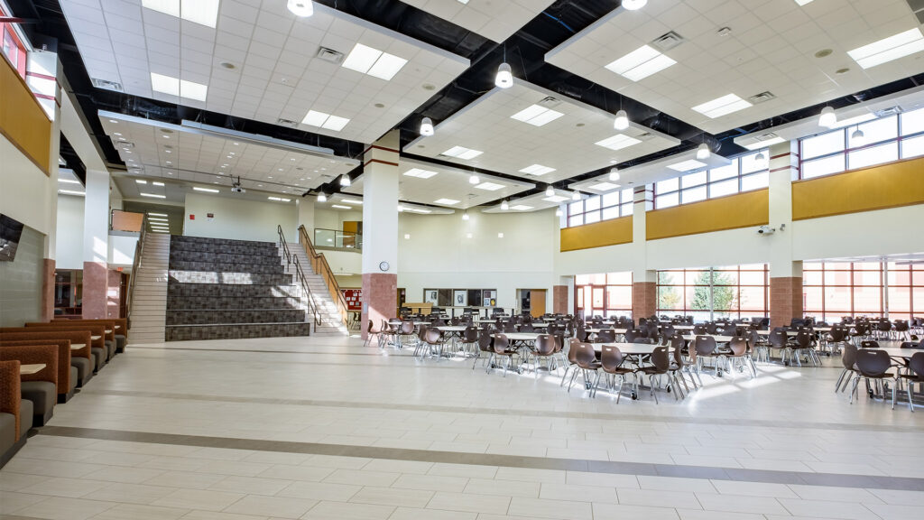
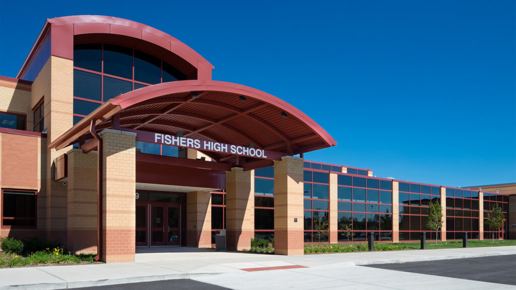

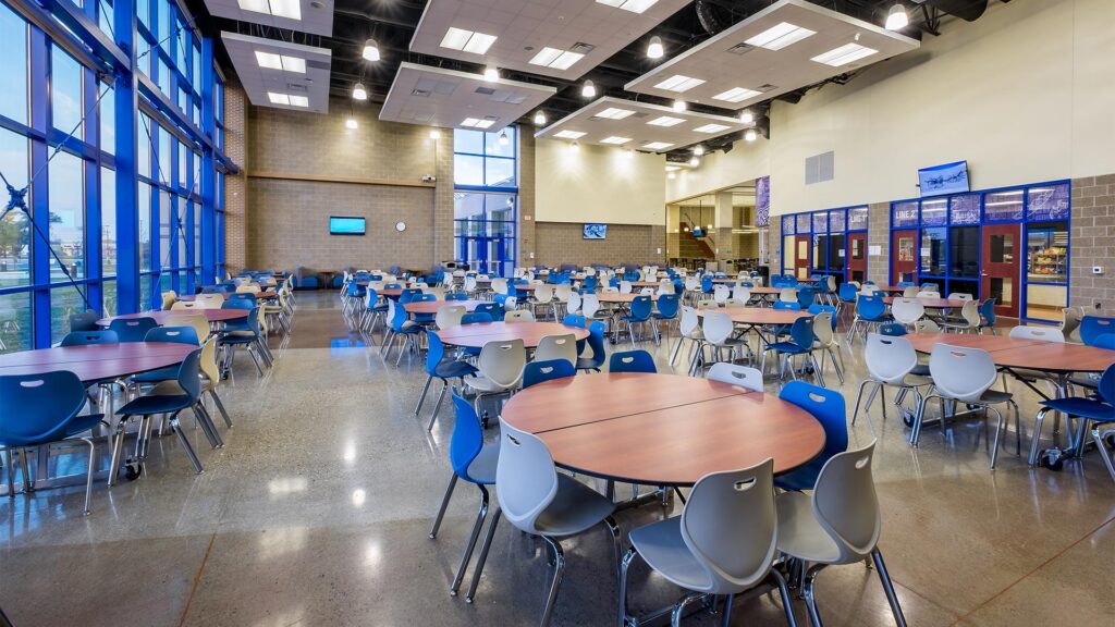
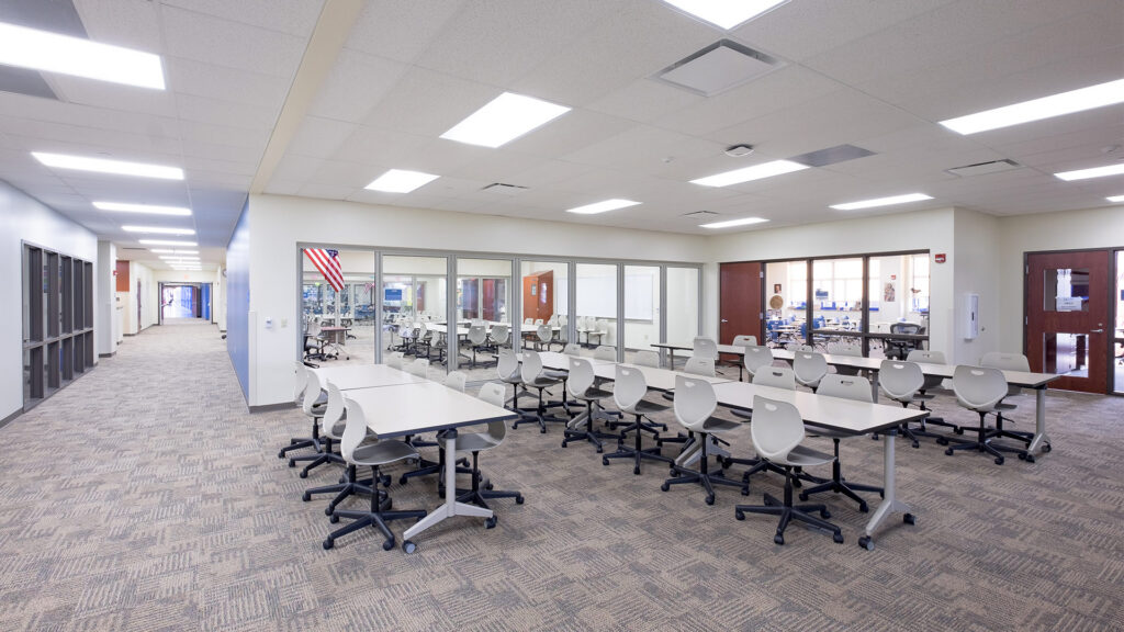
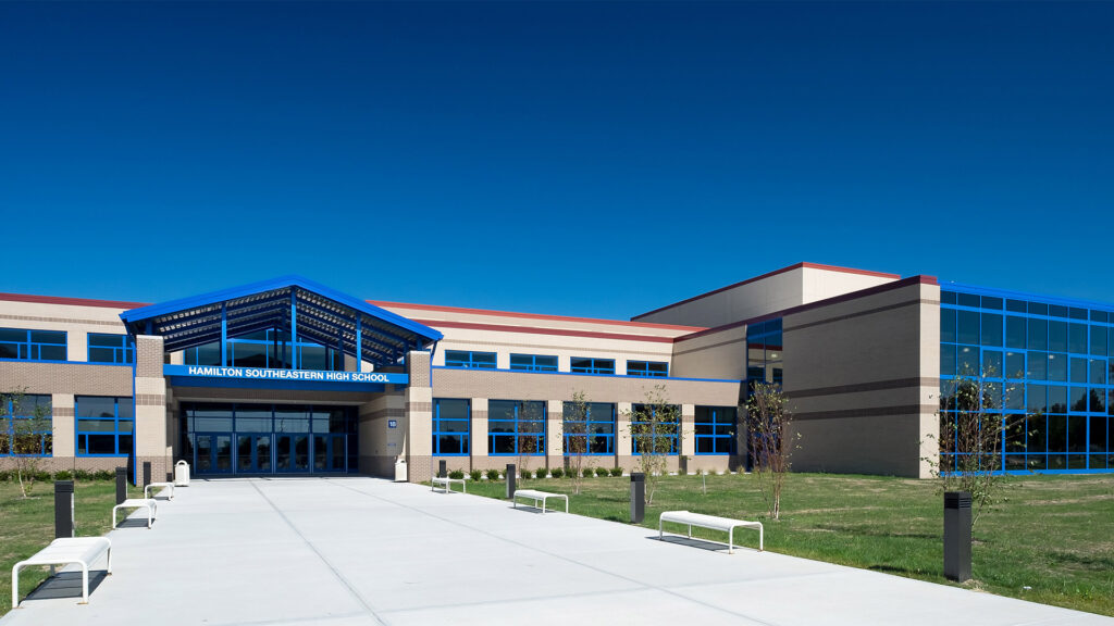
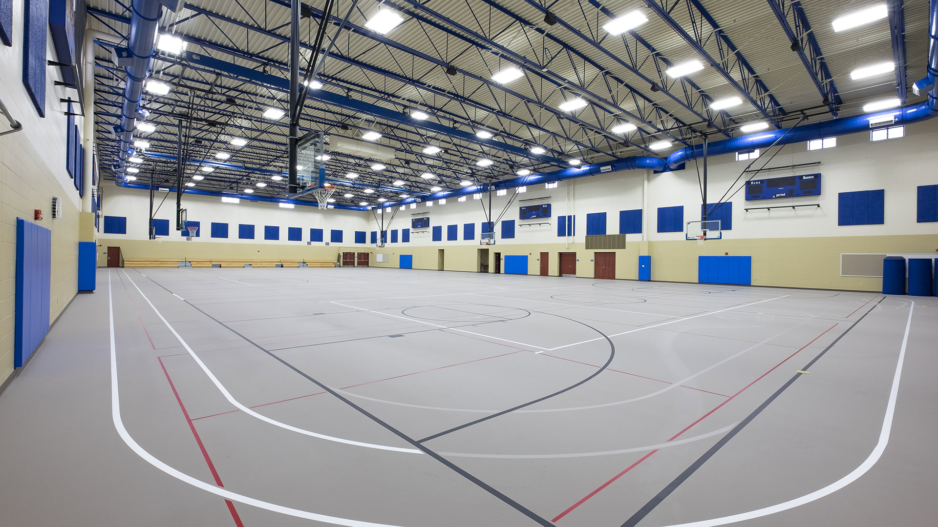
Hamilton Southeastern High School College and Career Academy
Additions at Hamilton Southeastern High School totaled 179,852 square feet along with 56,397 square feet of renovations.
,
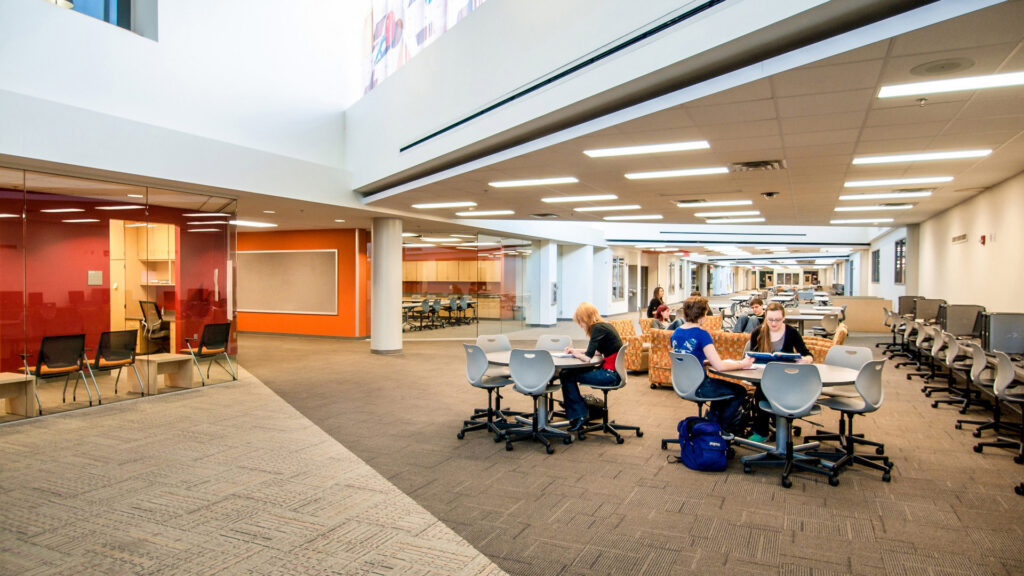
Upgraded, Flexible Learning Environments
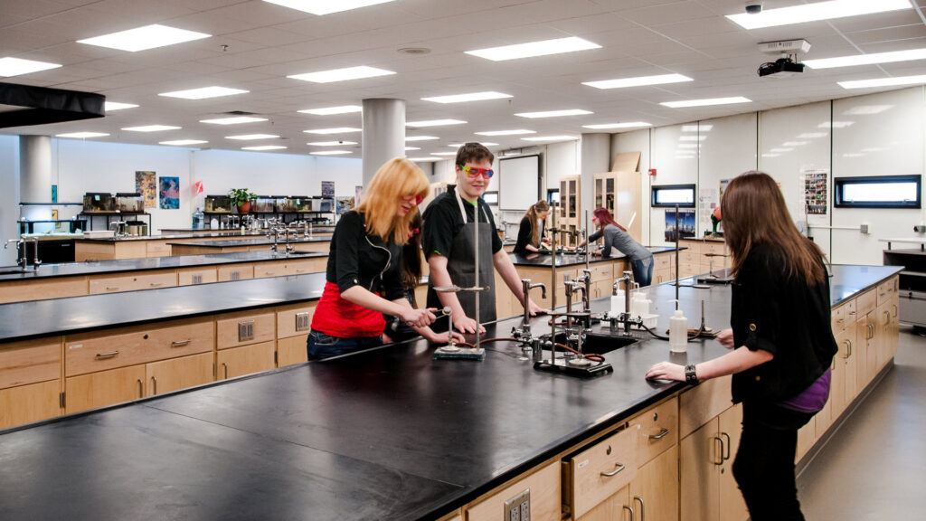
Classrooms throughout the building were renovated and new flexible furniture supports a variety of learning types.
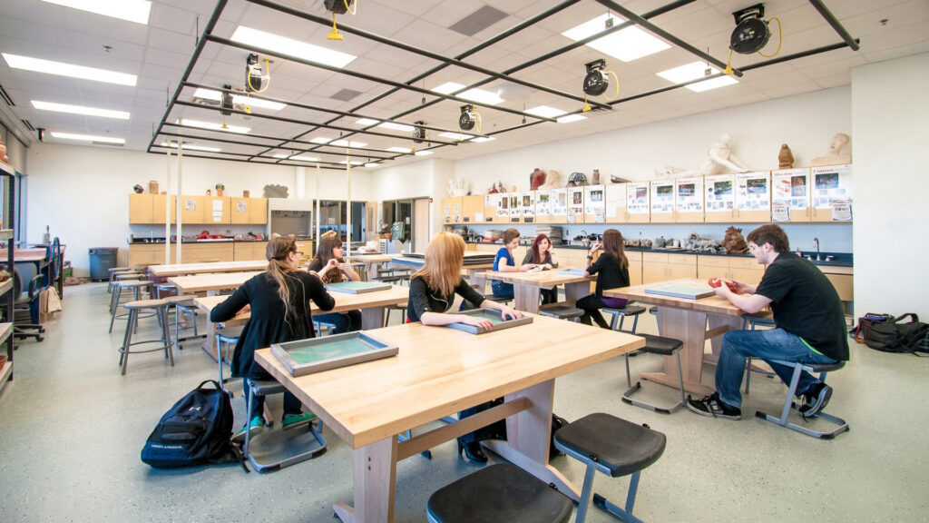
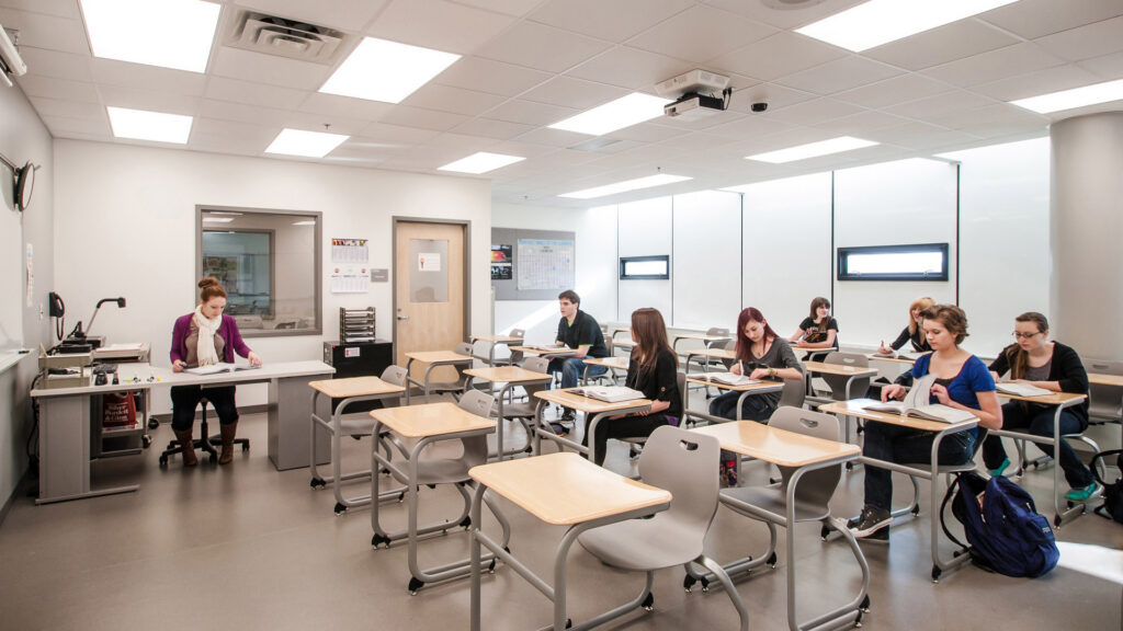
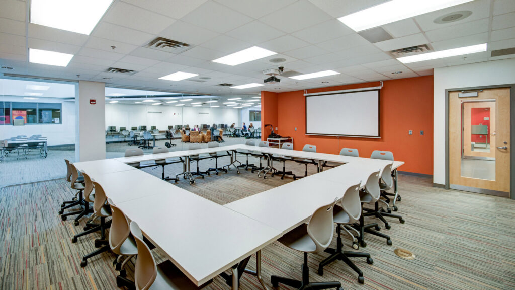
Modernized Aquatics and Athletic Spaces
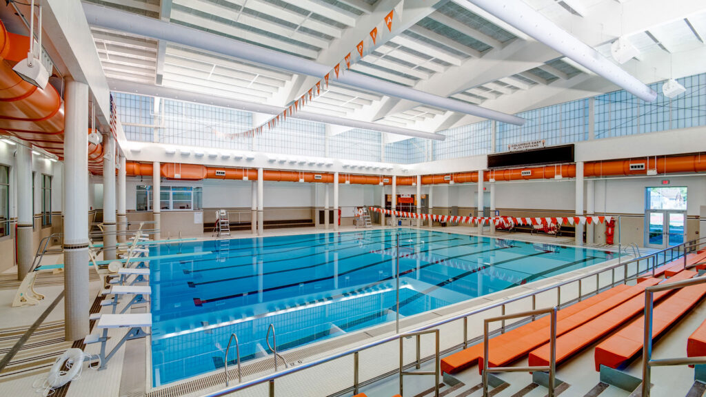
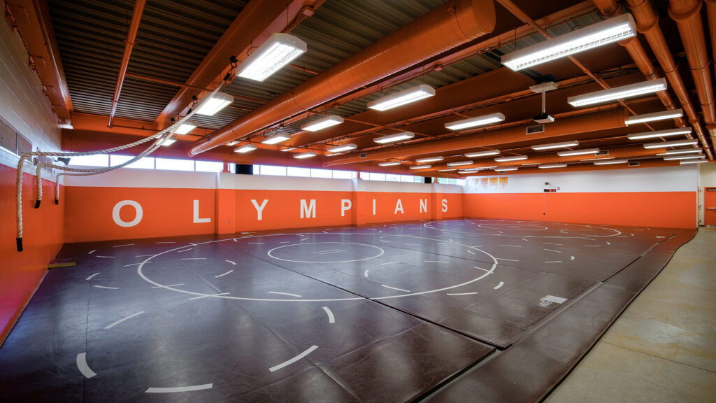
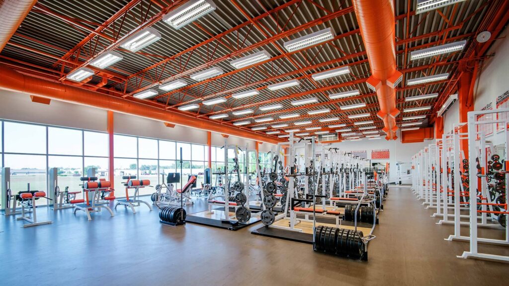
The existing pool structure was completely renovated and the pool replaced. A new addition to the PE and athletic building provides space for the school’s fitness and wrestling programs.
,
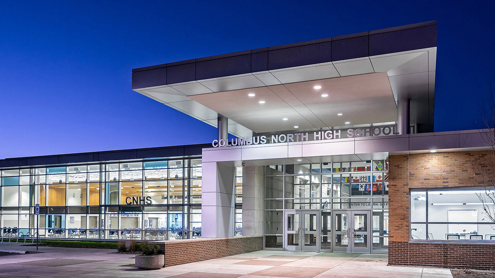
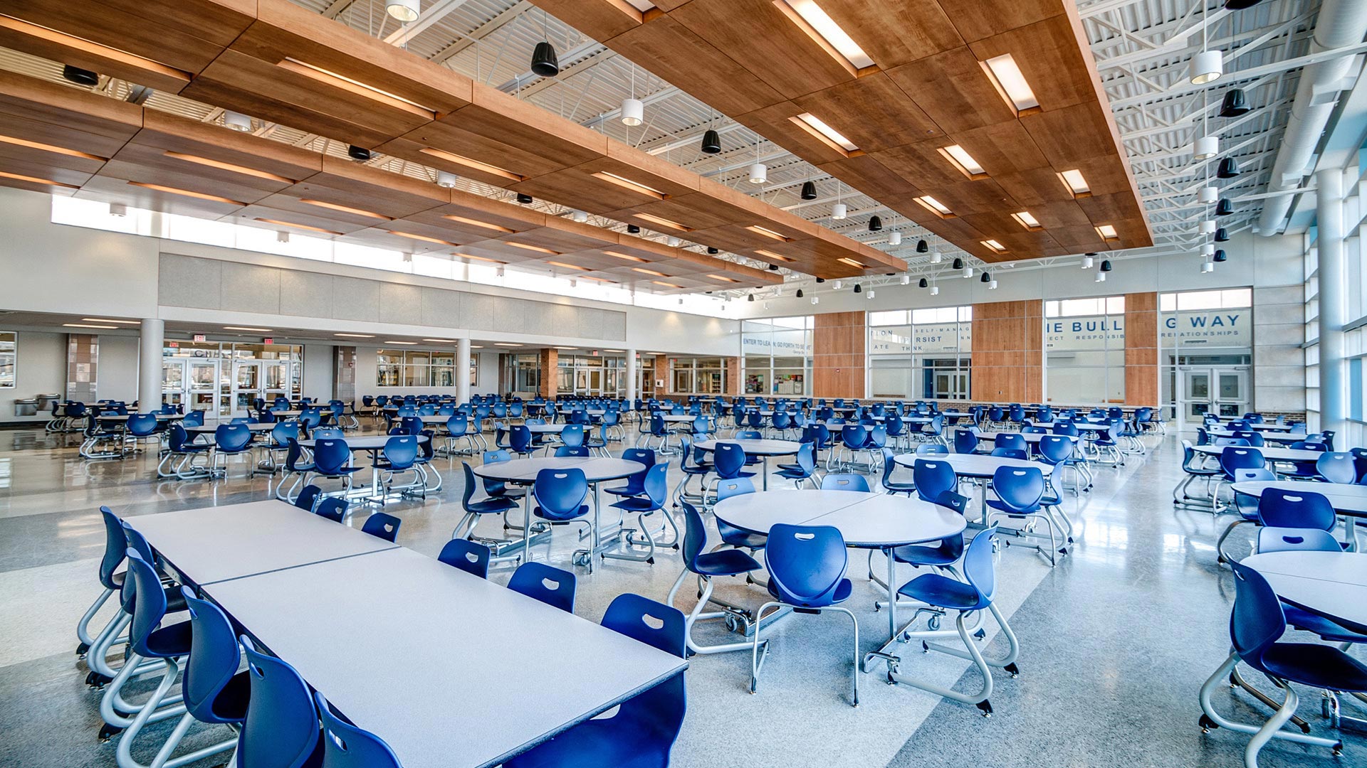
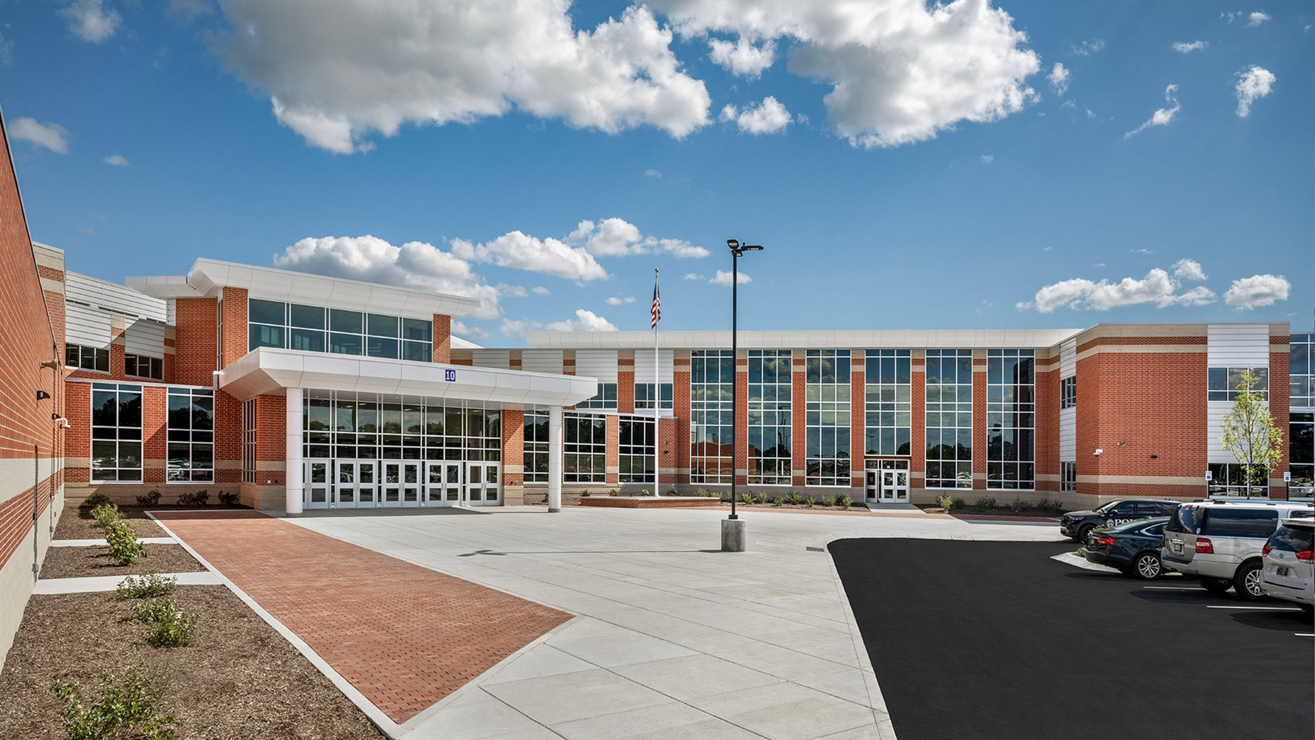
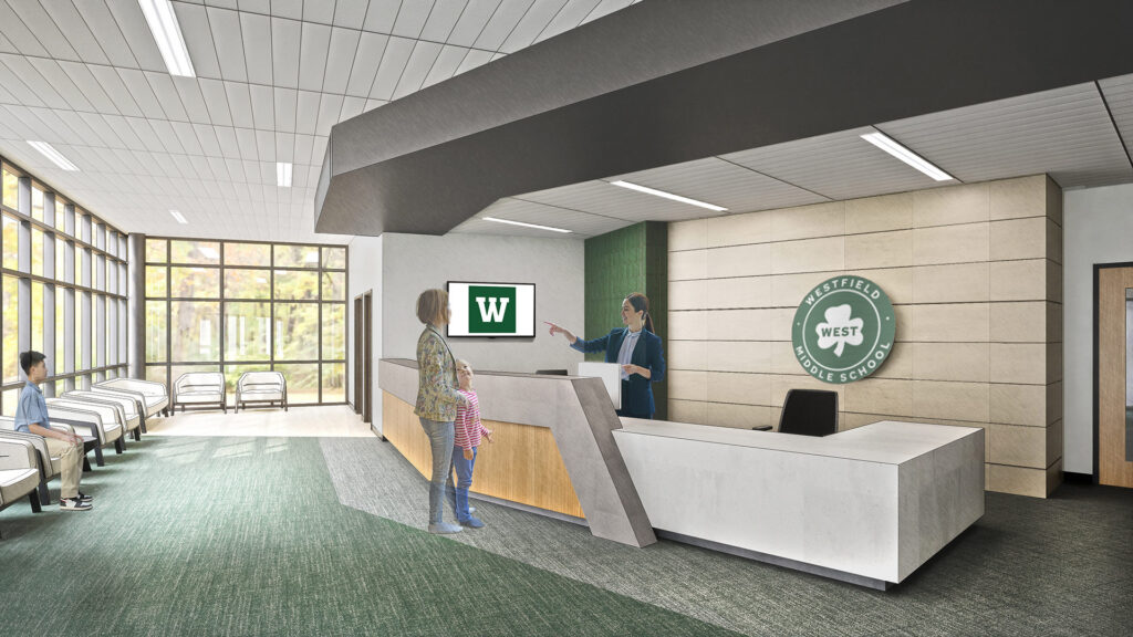
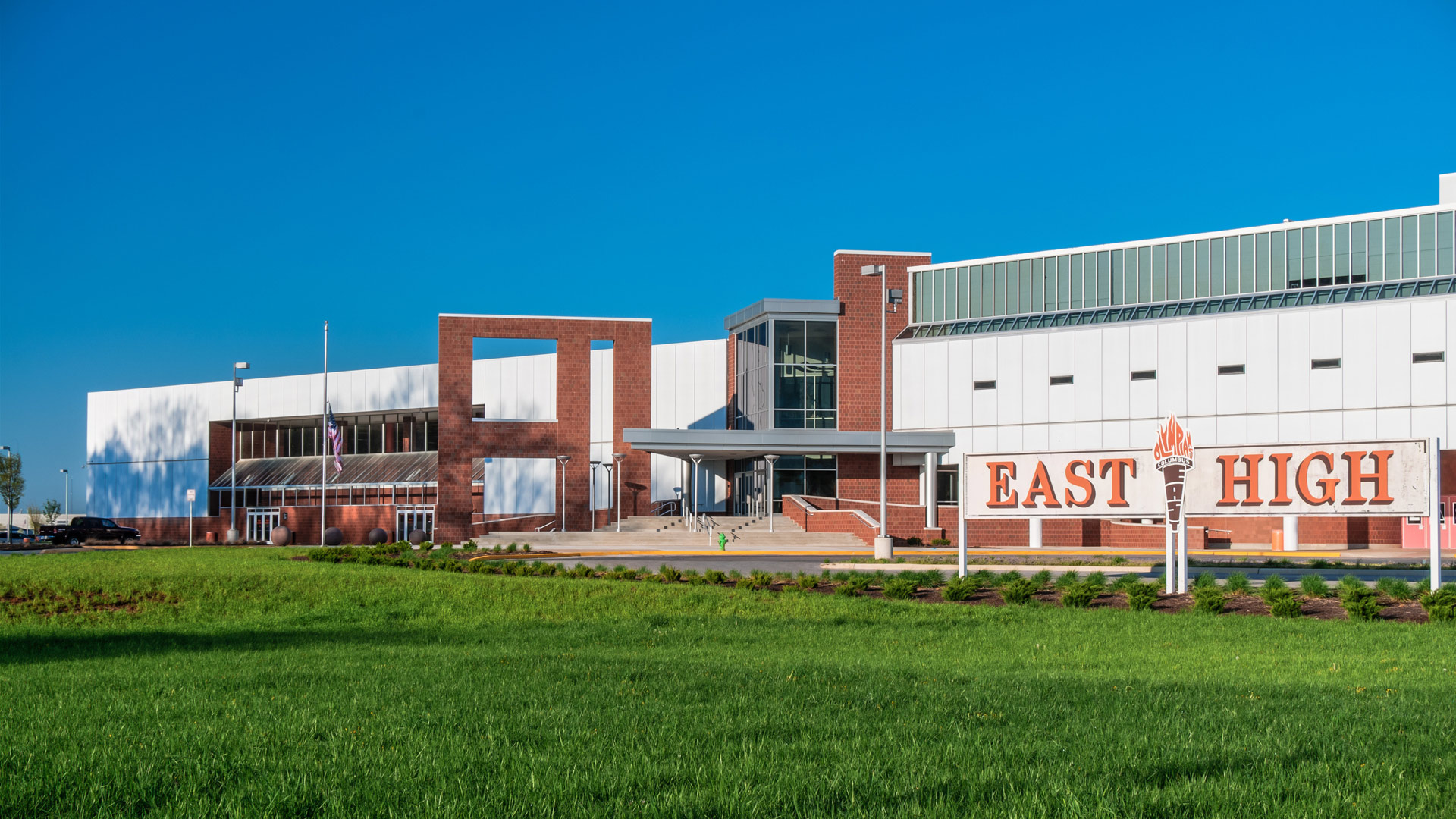
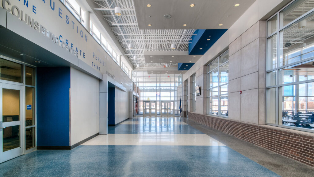
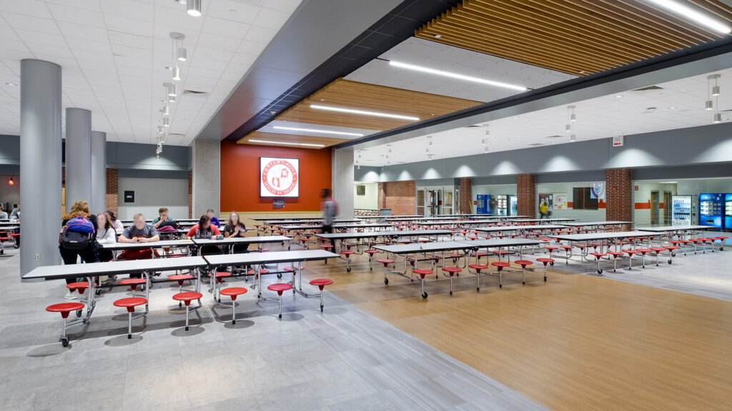
The main entrance, previously located on the south side of the building, was relocated to the north addition. The clearly identifiable, secure entry strategically creates a division between the new cafeteria and the administration area. This arrangement allows for secure, public access to the cafeteria in the evenings when needed.
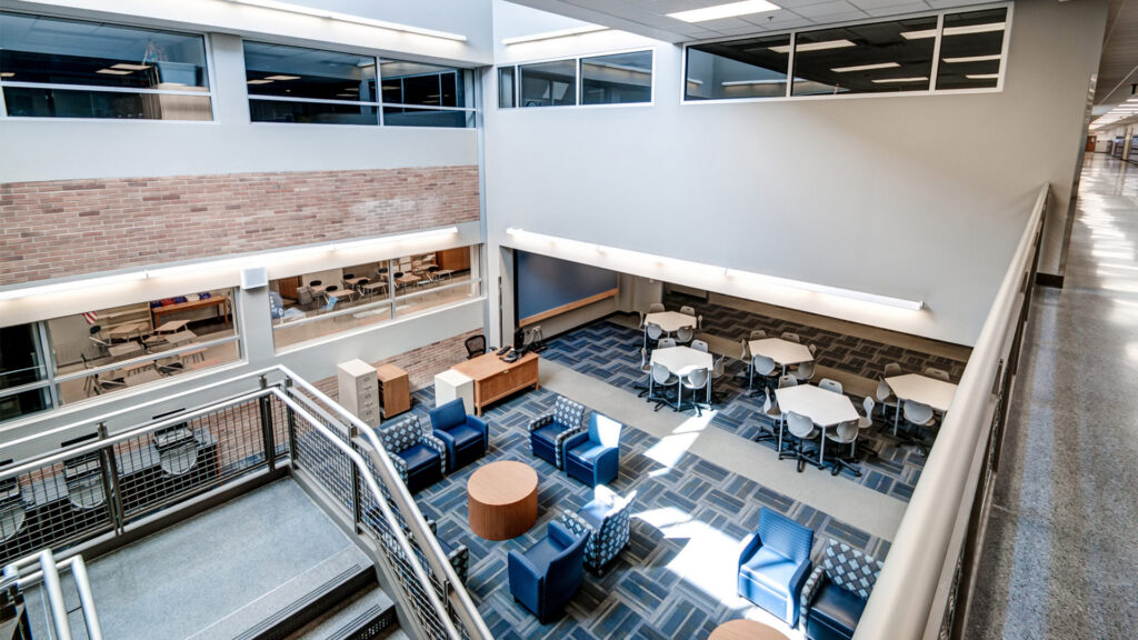
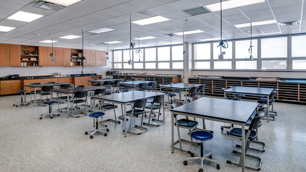
One of the primary goals identified was to create teacher and student areas that inspire creativity, collaboration, problem solving and innovation. This was achieved by designing Resource Areas located in the center of the Academic portions of the building along the main circulation spine. Flexible furniture within the classrooms provides additional opportunities for collaboration.
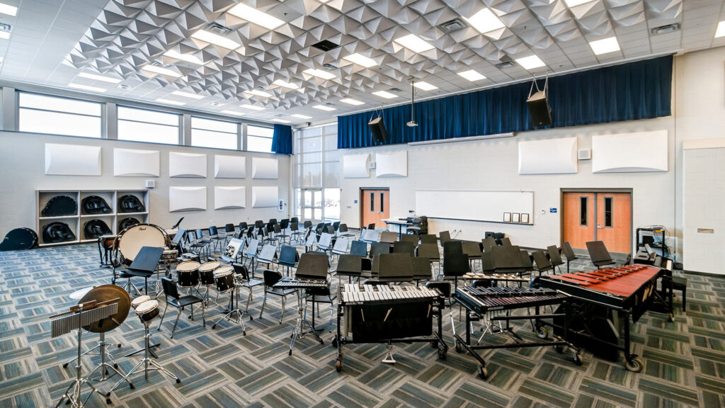
From the Classroom to Center Stage
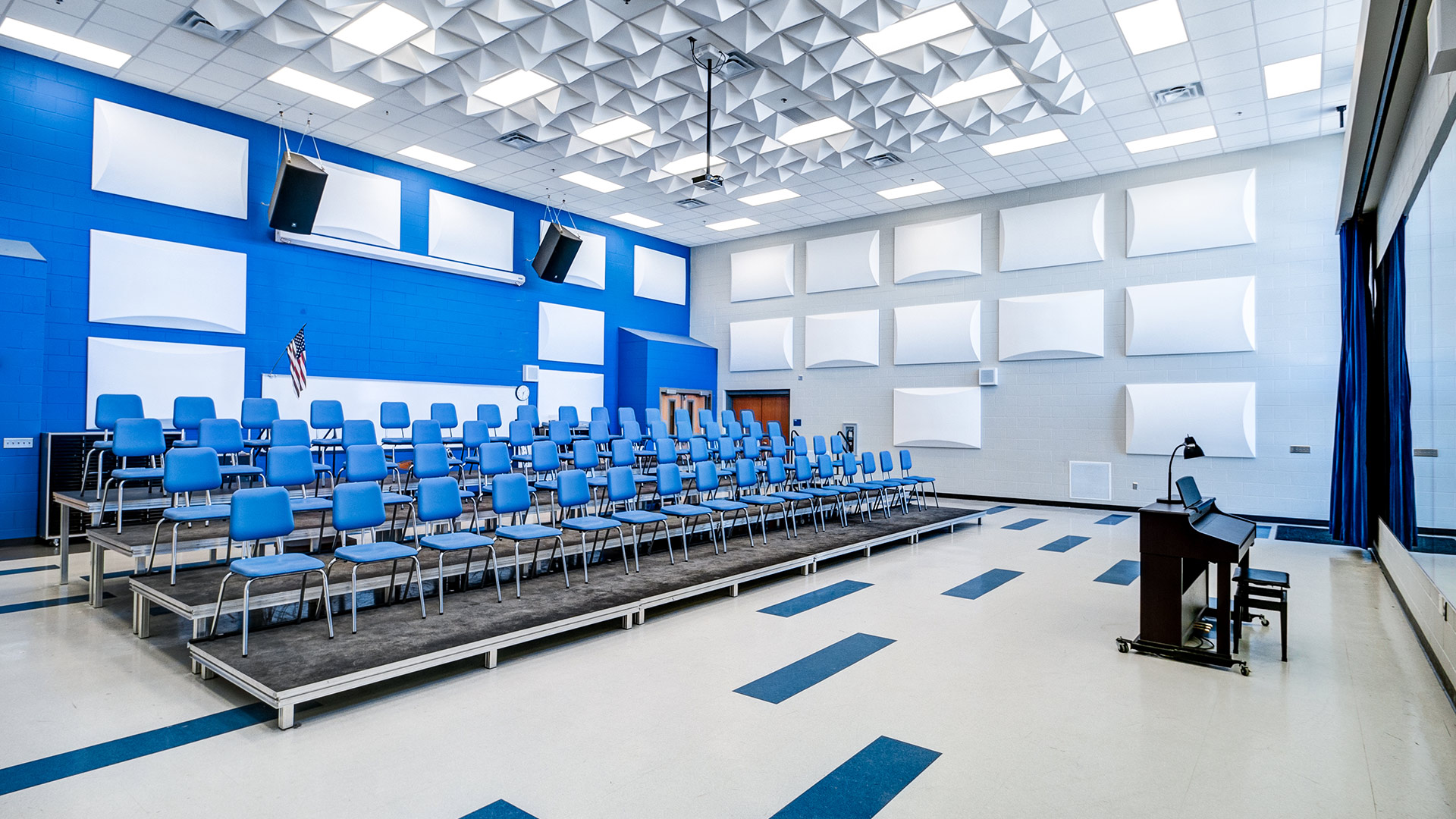
New Performing Arts spaces offer much needed acoustics, storage, and larger classroom spaces to accommodate the popular show choir, orchestra, and jazz programs.
,
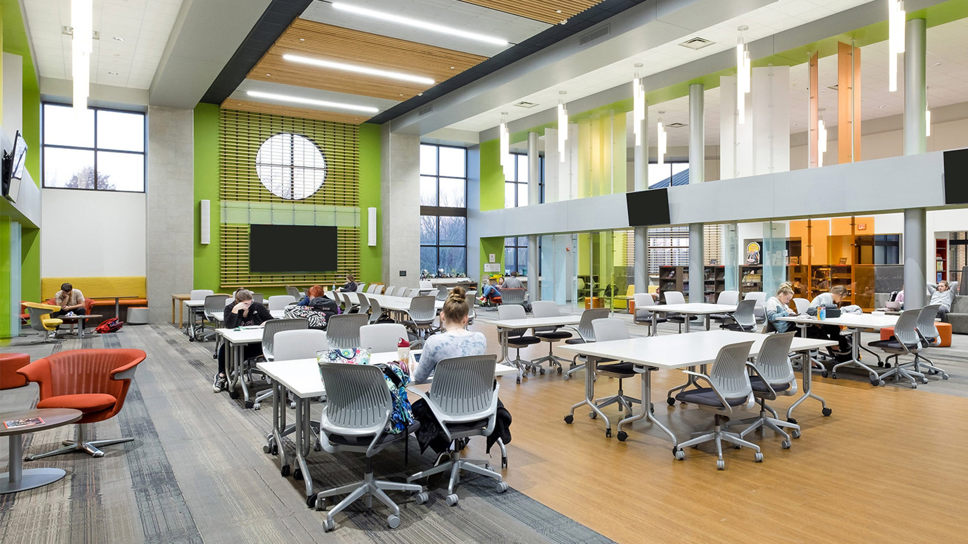
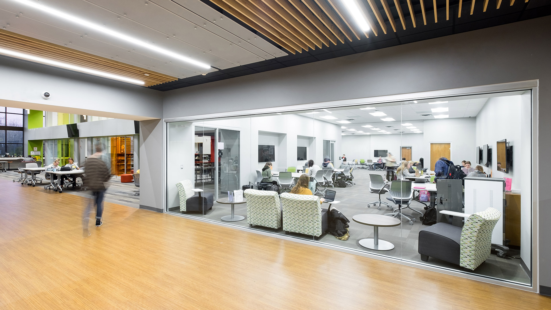
Flexible Spaces for Student Connection
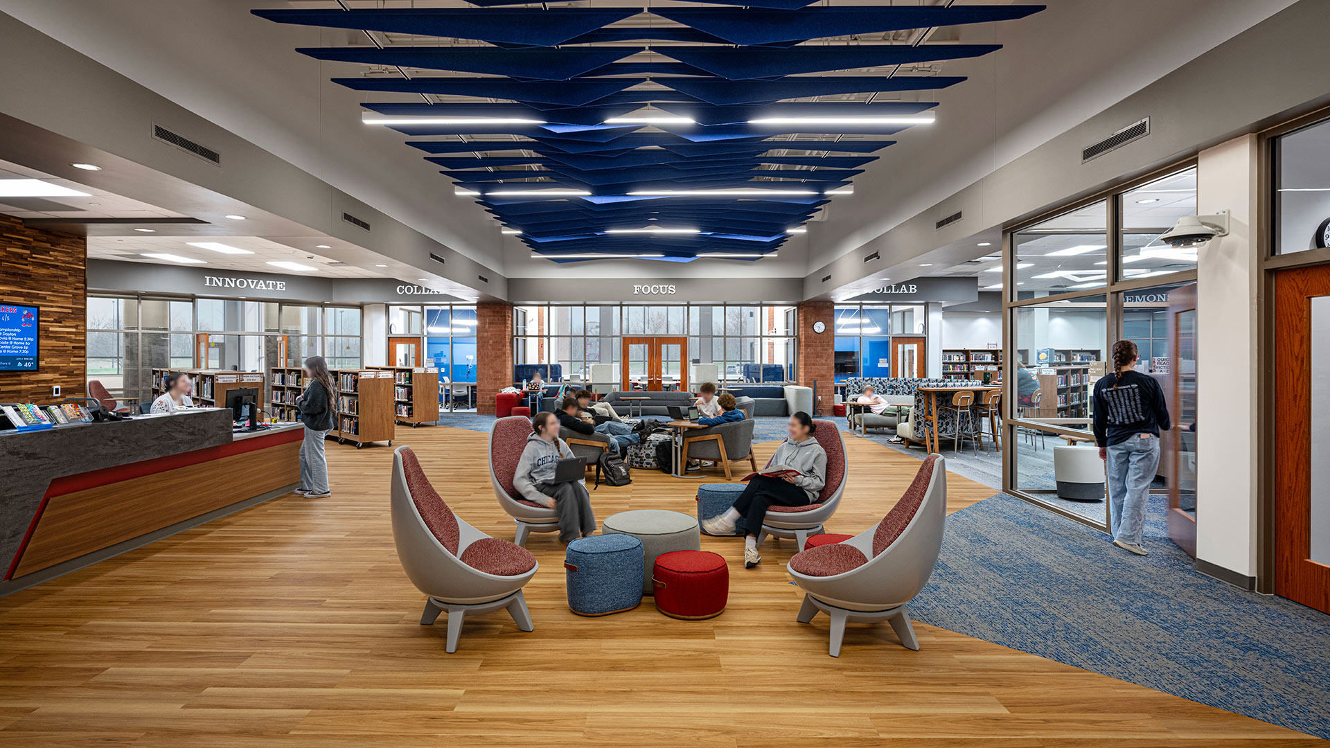
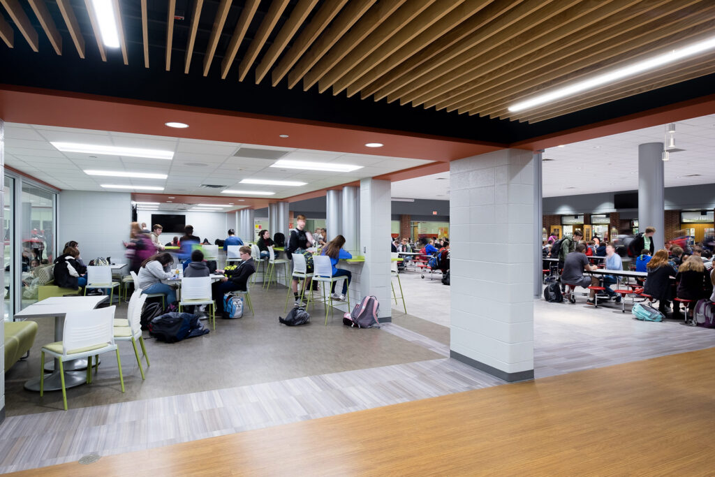
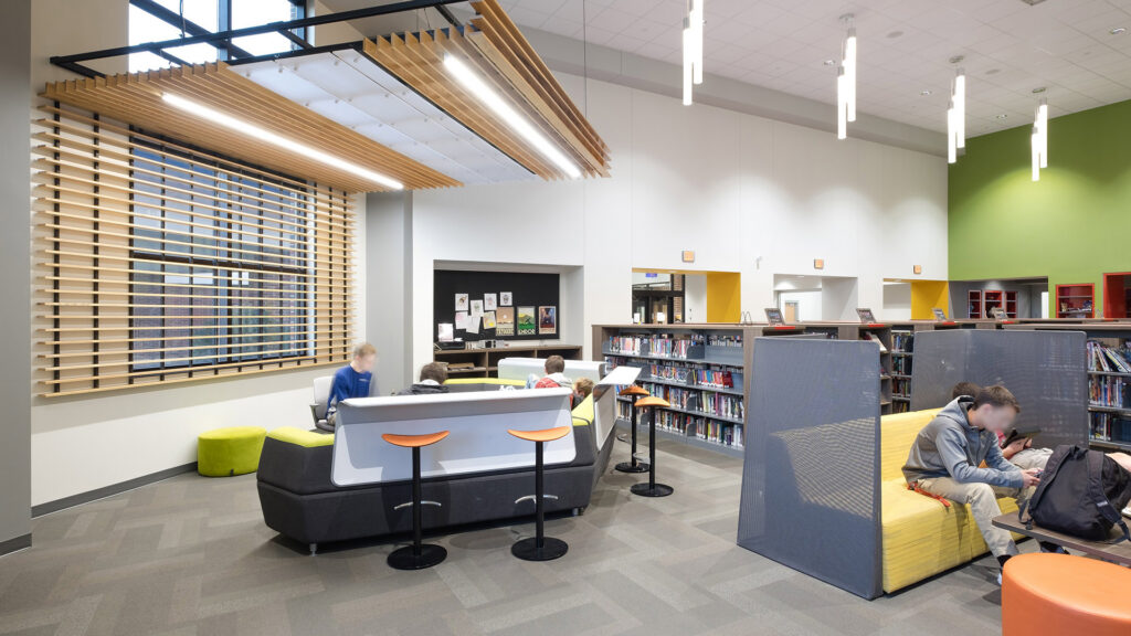
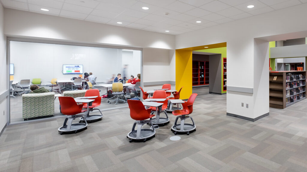
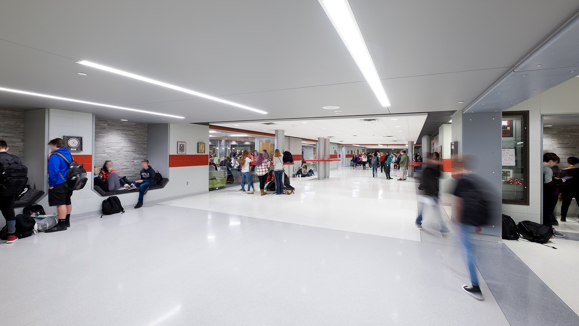
New informal student learning areas throughout the building provide students with multiple venues and opportunities for collaboration.
,
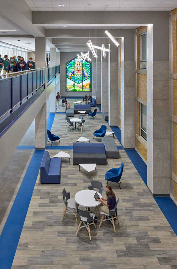
Previously, there were not spaces within the school that allowed for classes to break out into smaller groups or spaces to accommodate informal study sessions with direct access to instructors. A new study area now provides a space for students to break out of the adjacent classrooms to work on group projects and study after school as a group or individually.
Where STEM Learning Meets Real-World Innovation
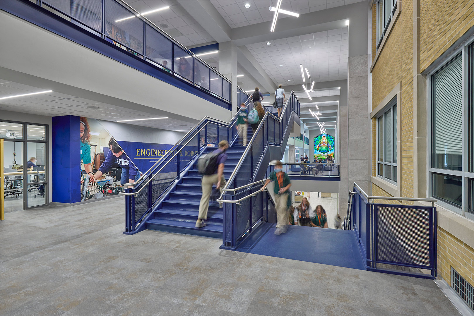
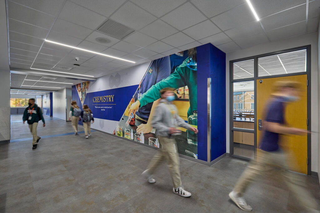
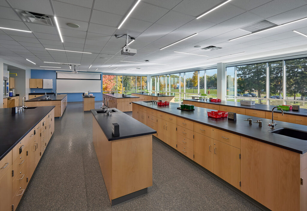
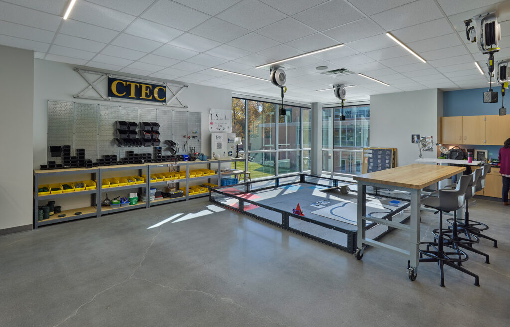
The Innovation Center is home to modern STEM classrooms and laboratories for Cathedral’s Math & Science Academy, engineering and robotics programs, and more.
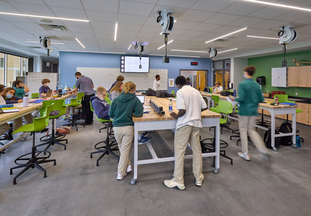
In Cathedral’s previous traditional education model, the classroom and lab areas were separate spaces within the same classroom, forcing one of the areas to go unused. The new design accommodates multiple labs and classes at the same location, increasing collaboration and allowing for an increase in efficiency in new and existing spaces.

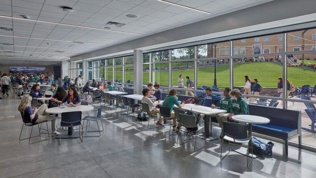
New Cafeteria Creates a Destination for Students
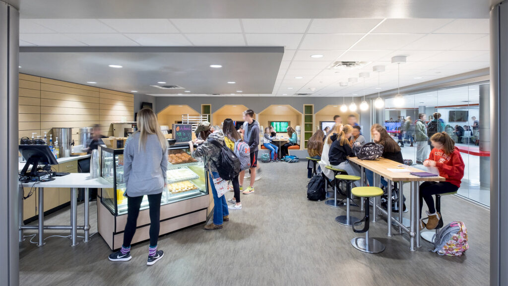
The Innovation Center also contains the relocated dining and kitchen space in the lower level, allowing students a more flexible approach to food service and more options to the traditional lunch period. An additional Café allows students to utilize a “grab-n-go” concept during the day.
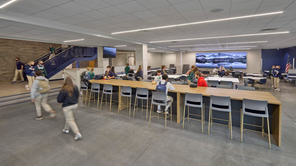

CSO’s unwavering commitment to understanding Cathedral’s goals for the project resulted in an Innovation Center design which exceeded the school’s expectations. We could not have worked with a better team, They were responsive to our wants and needs, quick to respond, and extremely professional. The whole process was easy. “
–Grace Rodecap, Cathedral High School Director of Marketing
As quoted in Building Excellence Magazine
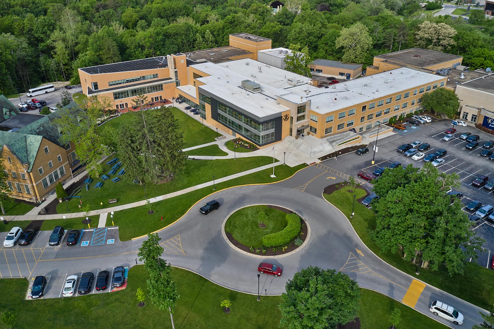
A New Front Door to Campus
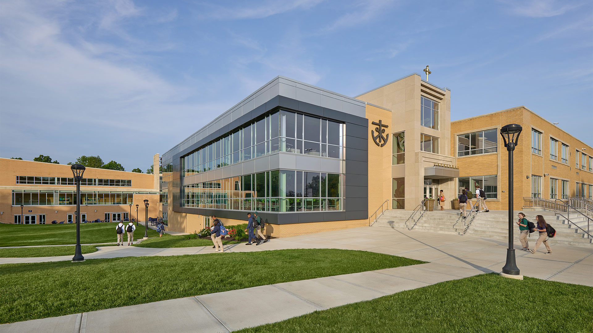
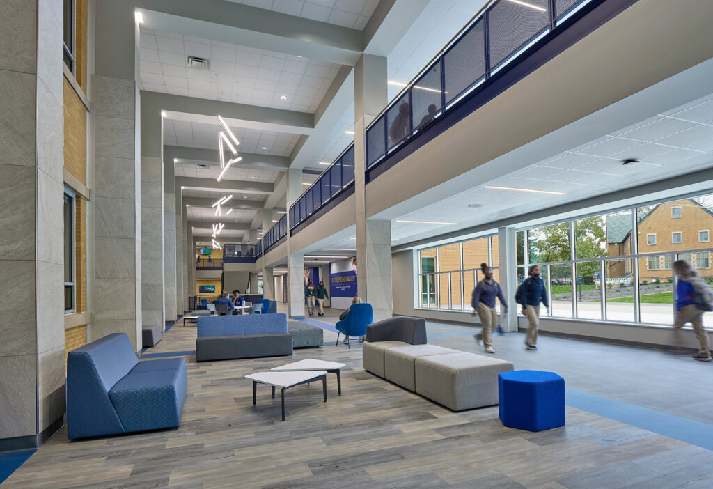
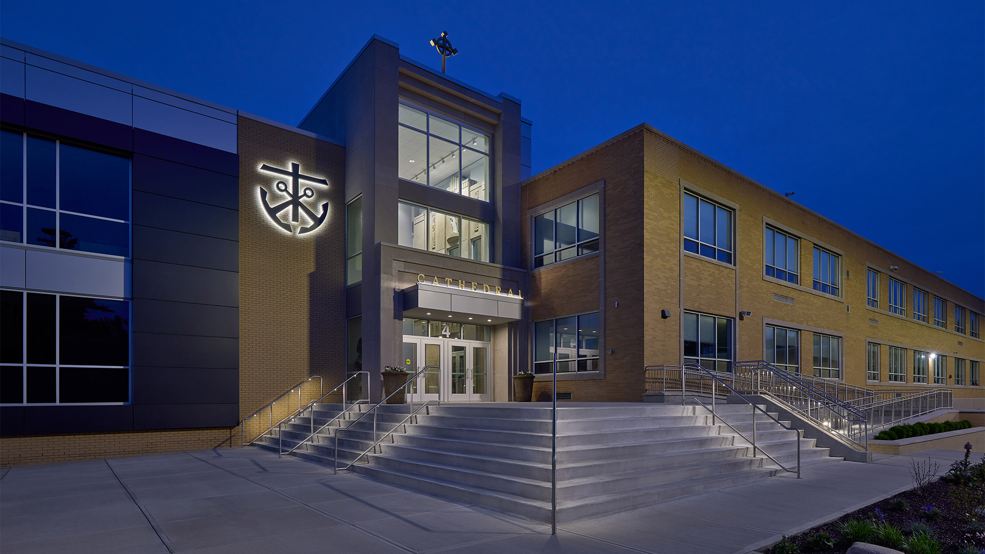
The Innovation Center was designed and constructed as an addition to Kelly Hall. To acheive the square footage goals of the project, the existing main entry would need to be replaced.
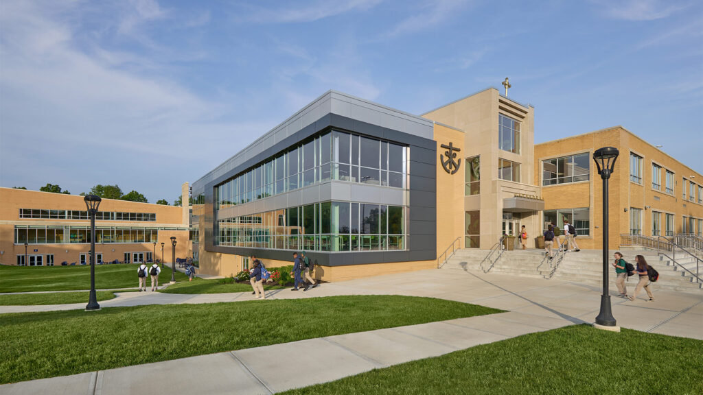
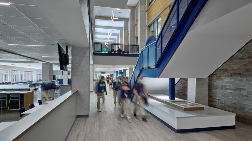
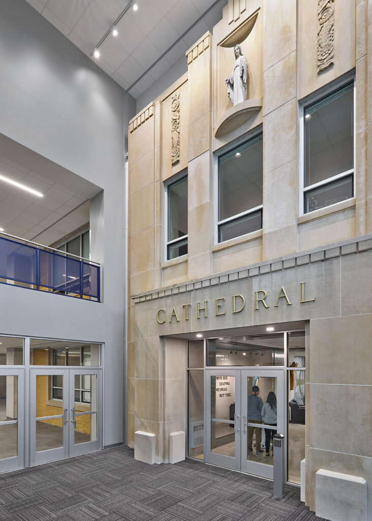
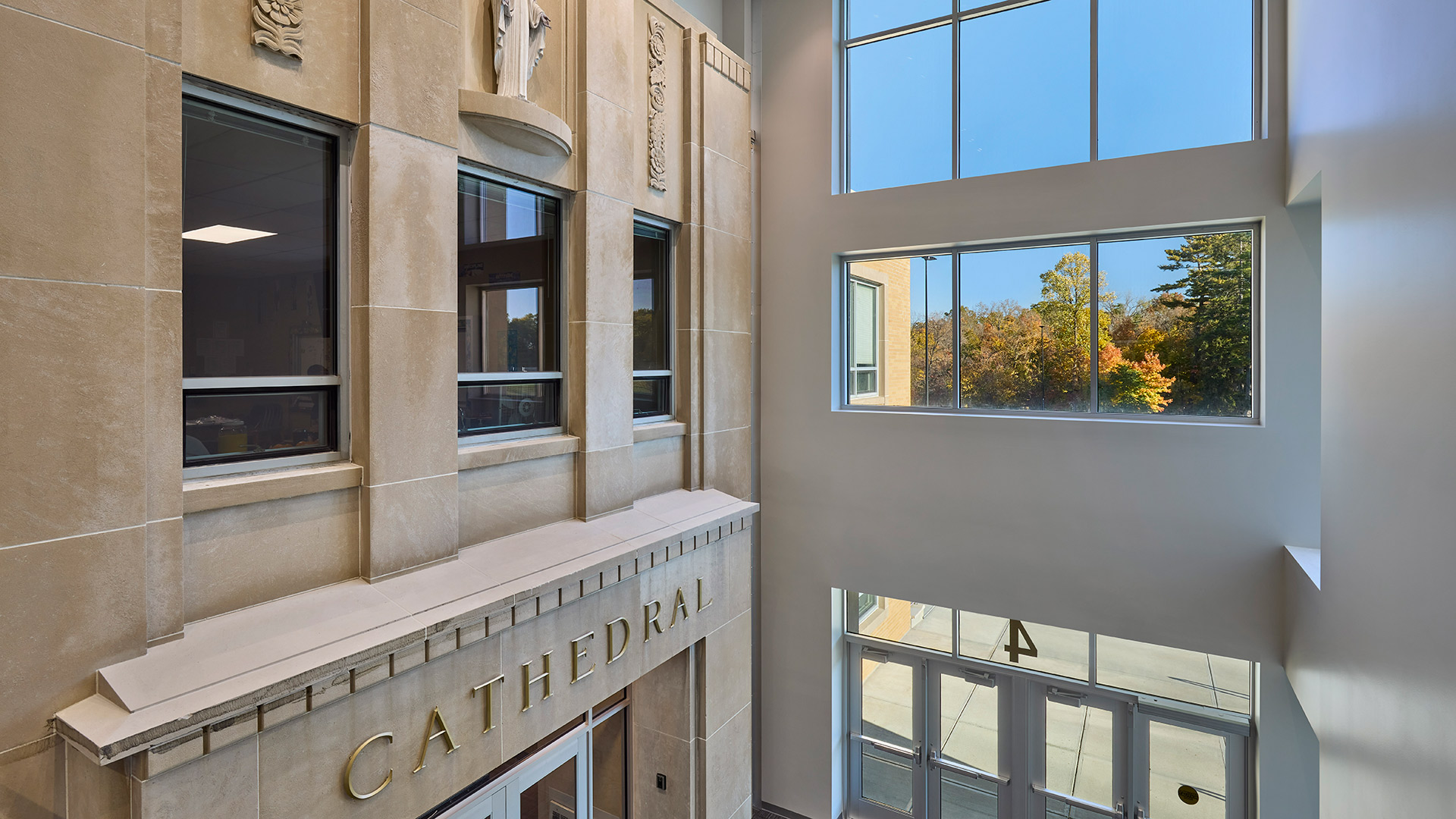
Generations of Cathedral students and staff entered the building through the main entry in Kelly Hall. When it was determined that the addition would encompass the main entry, designers opted to retain the original entry and original access to Kelly Hall by incorporating it into the new design. The new addition incorporates a three-story open atrium between the old Kelly Hall and the architecture of the new addition. Exterior materials used on the addition are blonde brick (same used on SLC), glass, metal panel and stone veneer panels. The old limestone façade of Kelly Hall was preserved as a feature of the new, glass-enclosed front entrance.
,